Major League Baseball – Did Banning “The Shift” work?

Positioning of infielders under new rules'
image from https://www.mlb.com/glossary/rules/defensive-shift-limits

Abstract

in 2023 Major League Baseball made a rule restricting certain defensive players being in certain portions of the field (See here for the actual definition of the rule). This was done to combat “The Shift“, a defensive technique which was popularized by the Tampa Bay Rays in 2006, where one side of the field is overloaded with players.

I had the notion at the time that banning the Shift was just a band-aid measure and would have no impact. Since the ban was in 2023, we have had one full season to evaluate any impact of the ban.

History of The Shift

The idea of shifting players to counter power hitters’ tendencies to pull the ball to one side goes to the early parts of baseball. It disappeared for a long time, however, until Originally, the Rays’ had the idea on how to shut down David “Big Papi” Ortiz of the Boston Red Sox, a left handed hitter who had great power pulling the ball down the right side of the field. Joe Maddon, the manager of the Rays, used Sabermetrics to identify that Ortiz hit nearly every time to the right side, and mostly to the outfield. The ploy was effective and Ortiz, who had hit over .300 from 2004 to 2006 moved to .265 midway through the 2006 season after multiple teams started copying the Rays’ technique against him.

The Shift attracted a lot of fan attention because it was often deployed against the most well-known power hitters and was seen as stifling to the offensive aspect of the MLB. Eventually, it was banned (limited, actually, see the definition above for detail) and the 2023 season was the first to be held without the old, dramatic version of the Shift.

See below for an image of the Shift being applied by the Angels (there’s an extra person in the shortstop position).

Hypothesis

Image from Wikimedia Commons – By Jon Gudorf Photography – https://www.flickr.com/photos/jongudorf/16802945985/, CC BY-SA 2.0, https://commons.wikimedia.org/w/index.php?curid=112638138

Based on the way the Shift was deployed, I figured that if I wanted to demonstrate if the rule banning the Shift had any effect, I would have to evaluate the performance of elite power hitters both before and after the ban. This is not a perfect approach, though, because what if some other variable was introduced (a new “juicier” ball? Rules restricting pitchers) that impacted hitters’ performance. This means that I would have to evaluate performance differences of groups of “non-sluggers” as well to detect any non-Shift related performance changes.

I’m defining sluggers (the ones most impacted by the Shift) as hitters who have a Slugging Percentage (a common measure that records the total number of bases coming from hits) greater than the league’s average. My inclination is that the true sluggers are the ones who are at least one standard deviation above the mean (i.e., the top 16% of hitters.

Data Gathering

I used the Python library, pybaseball, to scrape some basic data. Pybaseball is useful in that it scrapes multiple baseball stats sites (including advanced pitch-based metrics). I only needed it to pull data on at-bats, hits, doubles, triples, home runs, and walks from 2006 to today’s date in 2024.

The data was pulled in two groups. One represented the “post-Shift” era from 2006 to 2022 and the other represented the “post-ban” era from 2023 to the current date. Data was evaluated by player and then normalized by the number of at bats. Multiple minimum at-bats were used (400, 600, 800) to determine impact of the Shift on players regardless of their usage on the team (but my insight was to not go much lower than 400 at-bats, in the theory that players who had few at-bats were unlikely to have the shift deployed against them (as it appeared to be reputational). Both groups were separated into two types of players, 1) “Normal” players, who’s Slugging Percentage numbers were close to the league mean and 2) “Sluggers”, who’s Slugging Percentage was a) in the top half of the league, b) one standard deviation from the mean (top 16%), c)_two standard deviations from the mean (top 5%), and c) three standard deviations from the mean (top ~1%). The notion is to identify if any of these groups of “sluggers” statistics (Hits, Doubles, Triples, Home Runs, Walks) were statistically different between the pre-Shift group and the post-Shift group.

Results

The first thing I looked at to compare performance from the “Shift Era” to the “Post-Shift Era” was the mean value of a number of common metrics. I selected ones that I felt were most likely to be impacted by the Shift. Hits, Doubles, Triples, Home Runs (the Shift doesn’t really impact Home Runs.. but I was curious), and Walks. I normalized these metrics by the number of at-bats for every player to make sure to keep things consistent.

Top 16% of Sluggers Compared Before and After the Shift was Banned. Also non-Sluggers for Comparison

I did this for a range of Minimum At Bats and Numbers of Standard Deviations away from the mean to define who was a “slugger”. They all looked a bit like this. The first thing I notice is that the period after the Shift was banned sees better offensive performance (and more walks) across the board. Great! We have an answer! No? Of course it’s never that simple. First off, we need to remember these are just the mean values for these eras and the mean of a distribution is not always the best way to describe the whole distribution. Also, we need to understand if these differences are significant or could just be explained away by common variation.

The next step was to apply an algorithm called the Kolmogorov-Smirnov two sample algorithm. This test compares the underlying continuous distributions F(x) and G(x) of two independent samples (pre-ban and post-ban) to determine if they come from the same distribution (our base assumption) or if they were drawn from different distributions. To wit, do the performance metrics before the Shift was banned have a fundamentally different distribution than the metrics after the ban. We will establish a required confidence interval of 95% (the typically accepted number) before we can determine the distributions different.

p-values comparing Sluggers before and after the ban. The red line is our confidence interval. Any bars below the red line indicate that metric is statistically different before and after the Shift

Above you can see the p-value for just Sluggers (top 50% of sluggers on the left, top 16% in the middle, and top 5% on the right) before and after the ban. We already know that the offensive metrics tend to be higher after the ban, this just tells us if that difference is significant and if it extends to the whole distribution.

p-values comparing non-sluggers before and after the ban. The red line is our confidence interval. Any bars below the red line indicate that metric is statistically different before and after the Shift

Analysis of the Results

There are obviously more charts, but these tell the story well enough. In the top chart (comparing Sluggers’ performance), we see that for the top 16% of sluggers, their performance on every metric other than doubles meets our requirements to claim that the differences are statistically significant. However, it’s hit or miss (pun!) for the other two clusters. Hmm.

Then looking at the non-slugger comparisons (we are comparing the hitters in the lower 50%, 84%, and 95%), we see that there are fundamental differences almost in all categories (most of the bars are below our red line, indicating that the performance changes in these metrics are significant), clearly more than with the sluggers! This indicates to me that something OTHER than the Shift has been responsible for affecting offensive performance across baseball. The Shift was rarely or never applied to any players other than pull-hitting sluggers, so it couldn’t be responsible for the performance changes we see in this bottom graph.

Conclusions

  1. It seems pretty straightforward. Offensive performance has changed across the board between the time period from 2006-2022 and the time period from 2023 on. These are a large number of years, and lots of rule changes could have happened.
  2. However, the changes in performance have been consistent across all hitters in MLB, not just the sluggers.
  3. In actuality, the Sluggers seem to have had a less significant increase in performance than the non-Sluggers.
  4. All of this makes me say that the performance impacts was from factors other than the banning of the Shift and that my initial hypothesis that the banning of the Shift had no impact is true.

To see others of my recent sports analytic posts:

Baseball Scoreboard, Part 2

Scoreboard at Chase Field, Phoenix, A

In the previous discussion (Part 1) on the measures seen at a Baseball park, I covered the pitching metrics seen here fairly heavily. It is possible that hitting metrics are reasonably well-known in many places, but there is at least one here on the scoreboard that some explanation may be required.

The Triple Slash Line

Review of the “Familiar” hitting statistics would start with what is sometimes known as the “triple slash line“. This is simply three statistics that are frequently seen shown in order separated by slashes, like this: AVG/OBP/SLG. This refers to, in order, Batting Average, On-Base Percentage, and Slugging percentage. The Batting Average definition is the percentage of at-bats ending in a hit. An at-bat is defined as a plate appearance that ends in an out (excluding sacrifice flies), a hit, a fielder’s choice, or an error. For years, batting average was the preferred statistic for comparing player performance, but in recent years, the other metrics in the triple slash line have increased in prominence due to their impact on scores (and thus, wins). On-Base Percentage is more simply defined… it is the percentage of plate appearances where a batter reaches safely (could be a hit, walk, or getting hit by a pitch), excluding reaching by error, fielder’s choice, or a dropped third strike. This metric goes back to the Hall of Fame manager of the Brooklyn Dodgers, Branch Rickey, who is still beloved for his innovations in baseball (including signing the great Jackie Robinson and breaking baseball’s color barrier). One of the breakthroughs of the Oakland General Manager, Billy Beane, that became famous in the movie “Moneyball” was a stronger reliance on OBP when signing free agents. FInally, Slugging Percentage is a metric designed to give weight to a batter’s power. The formula is (#Singles + 2*#Doubles + 3*#Triples + 4*#Home Runs)/Plate Appearances. This makes slugging percentage useful, but not necessarily perfectly correlated with runs and therefore wins.

As an example of how the triple slash line can aid in evaluating player value, consider these two players (2024 stats as of 6/20/2024).

Aaron Judge (Center Field, NY Yankees): .303/.429/.697

William Contreras (Catcher, Milwaukee): .304/.364/.461

Though these two players (both having very nice seasons) have almost identical batting averages, that doesn’t tell the full story. Aaron Judge has batted in 66 runs this season whereas Contreras has only batted in 48 (on very similar numbers of games played). Judge has 27 home runs to Contreras’ 9. Amazingly, Judge has been walked 30 more times (57 to 27) than Contreras. Obviously this means that in walks alone, Judge has had 30 more scoring opportunities than Contreras. This has translated to Judge scoring 5 more runs this season. But this is at the cost of 20 more strikeouts for Judge. Lots to think about! First, let’s discuss the impact of RBI and HR to wins .

The RBI, short for Runs Batted in, has always been seen as a fairly critical metric in baseball, as it recognizes a hitter’s role in a run being scored for their team. It can result from a hit, a sacrifice fly, or even a walk, but not an error. In a sense it is a really valuable metric because it shows impact on the most important measure, the runs a team scores in a game. In another sense, one may over-reach when comparing players by their RBI accomplishments, because a player who is preceded in the batting order by a player with a stratospheric on-base percentage has a much higher chance of having a hit bat in a run. So RBI isn’t comparing apples and apples. There is a big controversy over the RBI metric amongst baseball nerds due to this. If you want to go deep down this rabbit hole, here is a good article from Bleacher Report back in 2012.

The appearance is that more home runs lead to a greater number of wins for one’s team. The home run (especially one that ends the game!) is exciting and draws fans more than anything else. The modern era of baseball is often referred to as the “Long Ball Era” due to the prevalence of home runs in the game. A method to identify the value of the home run called regression shows that home runs tend to be highly correlated with win percentages. Conceding that home runs are correlated with wins, the next question would be if home runs CAUSE wins. These are two very different things. Ice Cream sales are highly correlated with higher temperatures, but we cannot say that the temperatures cause the sales. The answer to the question about home runs causing wins is a hard one, and there are plenty of scientific papers analyzing this (and doctoral dissertations!). What seems obvious is that teams value the home run highly — even in the face of the higher numbers of strikeouts that power hitters tend to rack up. One thing that we know, though, is that teams express value through the salary they give a player. In this respect, Aaron Judge stands out with his $40M annual salary compared to the $760K that the Brewers are paying Mr. Contreras! (I think he’ll be getting a raise after this season!) Here’s where I found these salaries

The Mystery Metric, OPS

All of this builds up to the final metric on the scoreboard that is less known, OPS. This stands for “On-base plus Slugging” and is actually a combination of two metrics from the triple slash, OBP and SLG. They’re just simply added together. I suppose this metric saves fans time (or the mathematical embarrassment) of adding the last two numbers in the triple slash together. The intent of the OPS is to provide a view into overall effectiveness of a hitter and their potential value for scoring runs. The historical record for OPS was rung up by Babe Ruth (1.16), followed closely by Ted Williams and Lou Gehrig. So clearly it is a measure of the historical greatness of a player. By the way, keep an eye on Aaron Judge’s OPS in 2024 (currently at 1.126), as he is threatening the Babe’s record!


A Quick Tour of a Baseball Park Scoreboard

In the modern era of more and more esoteric baseball metrics, how can one understand what the ballpark is telling us?

Scoreboard at Chase Field, Phoenix, AZ

This weekend I went to the Diamondbacks game at Chase Field, a treat I have enjoyed for a number of years. As a person who likes numbers, it struck me that the stadium was even more awash in statistics than ever. It brought a lot of questions to mind, some of which I’ll explore in this blog entry.

The Scoreboard, Explained

Much of this scoreboard layout looks fairly familiar to someone who may have looked at box scores or attended other big-time baseball games. The score by inning is something that has been featured for years. It tells us something interesting, the rate at which the two teams have been adding to their score. Knowing how pitching assignments work in major league baseball, one can quickly surmise that the White Sox starter got shelled early and seems to have stabilized a bit by the fourth inning. The Diamondbacks’ starter, however, seems to have pitched a fairly solid first four innings, because we can see that he has given up only three hits (less than one per inning). The White Sox scored one run off of him in the third inning, but we can also see that Arizona has one error. Did this error result in the one run? If so, that would be an unearned run and therefore wouldn’t be counted against the Diamondback pitcher’s Earned Run Average. We can see more about the White Sox pitcher, Drew Thorpe, because the scoreboard gives more info about active pitchers in the upper right (the D-Backs were batting when this image was taken). Drew hasn’t had such a good game to this point… in 3 innings he has given up 4 earned runs… that translates to an ERA of 12.0 at the moment. He has also given up five walks (BB) and six hits, which results in a WHIP (Walks and Hits per Innings Pitched) of 3.67. Additionally, his ratio of Strikes to total pitches (strikes plus balls) is 0.52, which is 0.1 lower than the MLB average. Top pitchers typically have numbers like .65, so clearly Drew is way behind the pace of the best pitchers here. All of these measures (WHIP, ERA, %strikes) are very bad for Mr. Thorpe’s year averages and we can get all of this from the scoreboard.

The metric FPS% refers to First Pitch Strike Percentage. The Major League Baseball average is 57% and we can see that Thorpe is sitting at 47%. This is a pretty interesting metric. Weinstein Baseball (here) tells us that “if a big league pitching staff improved their first pitch strike percentage from 57% to 80%, it would translate into 100 fewer runs allowed over the course of a season. That translates into 10 more big league wins.” So what the scoreboard is showing us here is that Drew Thorpe has a control issue today… He’s giving up a lot of walks (per Weinstein, “70% of walks start with first pitch balls”) and possibly in trying to get the ball over the plate “whatever it takes” he may also be giving up some easier pitches to hit.

One other metric regarding pitching that we can take away from the scoreboard here is “MVR”. This is placed just to the right of the Error (E) column. I actually had to Google this one during the game. It’s kind of new and stands for “Mound Visits Remaining”. So Mr. Thorpe has already had more than one mound visit during his first 3 innings and now only has two left. This is probably part of baseball’s desire to speed up the games and make them less tedious. The pitch clock is another similar effort, where there is only thirty seconds allowed between batters. ESPN tells us (here) that the pitch clock has reduced baseball games to an average of 2 hours and 40 minutes (24 minutes shorter) due to the pitch clock. This has also corresponded with a spike in batting average and stolen bases. It seems obvious that penalizing a pitcher by restricting their time between pitches is likely to reward hitters and base runners.

Pitch and Hit Exit Metrics

Another thing that I found very interesting is a display I had never seen before at the ballpark. See below.

I found that this was very distracting, because my brain wanted to identify the patterns of how they were classifying the Pitch Type. There were a number of different labels for pitch type, among these was “four seam fastball”, “cut fastball”, “slider”, “changeup”,”sinker”, “sweeper”, and “curve”. The “Vertical Break” and “Horizontal Break” numbers were very interesting. These data are captured by camera-based systems called Trackman or Hawkeye and are used across many different sports. There’s a great article in Baseball America (here) on how these pitch classifiers are able to label the pitch type. What I found is that the pitch types are calibrated to speed… a pitcher who threw a 100 mph four seam fastball also seemed to have their pitches in the 95 mph range that didn’t “rise” so much classified as a sinker. Whereas other, slower, pitchers may have had sinkers in the 80 mph range. Pretty interesting.

I also found myself looking after ball contact at the launch angle. A launch angle over 40% often indicated that a pitch that looked to the eye like a home run might actually just go to the warning track. Baseball Savant has a nice tool (here) where you can pick an exit velocity and a launch angle and see the actual outcome. For instance, below, 103 MPH exit velocity coupled with 30 degree launch angle was a Home Run 74% of the time!

Conclusion

Baseball parks have become inundated with information visualizations over the last few years. In some cases, advanced sensing and tracking systems like Hawkeye have enabled these new metrics to be collected. In others, new rules like the pitch clock and maximum numbers of mound visits have created demand for new metrics. But overall, baseball has always been a sport focused on its numbers, which is just one reason why many of us number people love it so much!

Link to Part 2 – Hitting Metrics

Update: xG and Luck Update for Premier League

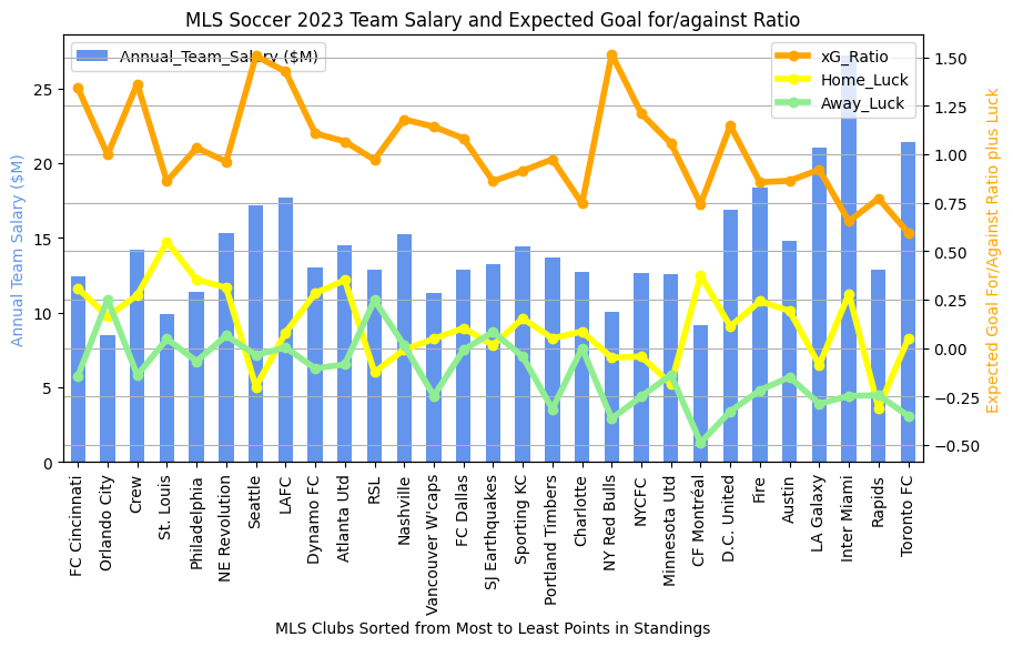
In the previous entry, I compared the expected goals / Luck metrics between the last two completed MLS seasons. Now that the Premier League season has come to a close, we can do the same thing to see if any new patterns jump out at us.

2023-2024 Premier League final results

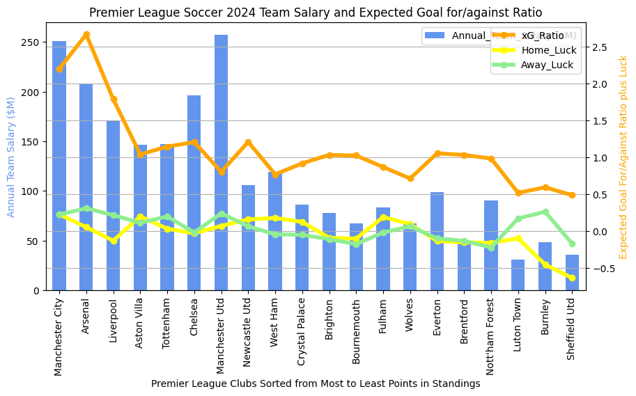
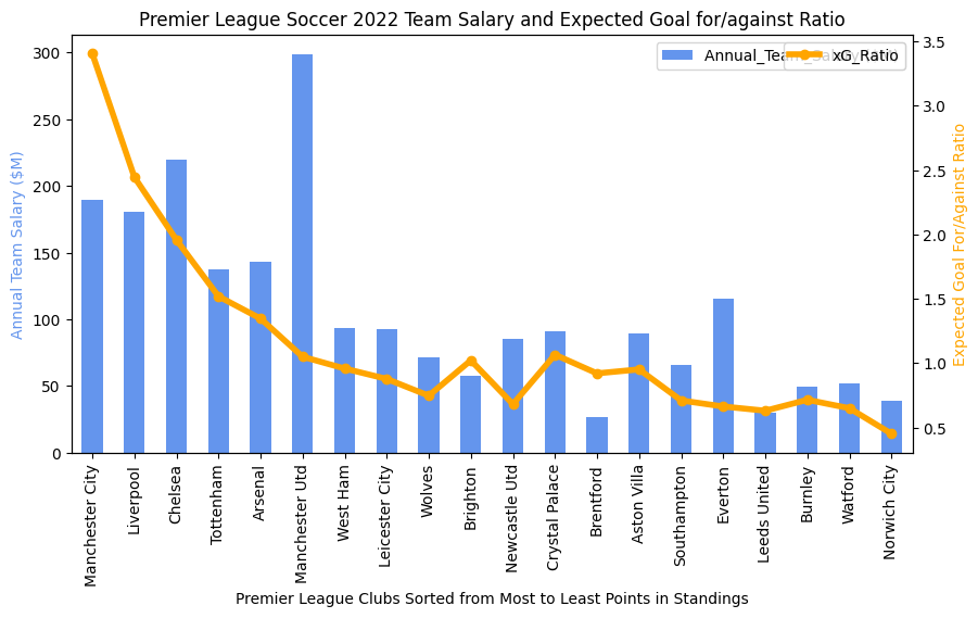
A quick overview of what we see above would go something like this… Manchester City finished at the top of the league in points, followed by Arsenal. The teams are sorted by final point tally from left to right on the chart. The three teams to get relegated are on the far right (Luton Town, Burnley, and Sheffield United). Things I see:

  1. Man City and Man U always have the highest salaries. Lately Man U has been inconsistent in play and has been finishing out of the top four. Their expected goals for/against ratio is a bit lower then their direct neighbors in points (Chelsea and Newcastle). We don’t know exactly why, but it reflects their overall efficiency at taking and preventing good shots. For some reason, Chelsea and Newcastle were a bit more efficient at ensuring that they got more good shots than their competitors in matches. Interestingly, we see West Ham sitting at about 1/2 Man U’s salary but with nearly the same xG ratio. But West Ham finished 8 points lower than Man U. Perhaps there are ways that expensive players help other than in the xG ratio. I might imagine that expensive, ostensibly better players may be slightly more likely to score when taking a good shot or to prevent an opponents good shot from going into the net.
  2. Salary in the Premier League seems to always be more important than in MLS. The top salaries are always in the top 1/2 of the league in points in the Premier League, but this is not as strongly observed in MLS.
  3. Luck. Sometimes there’s an interesting disparity between luck at home and luck on the road (the yellow and green lines respectively). Near the top of the rankings, we see that Liverpool’s home luck is below zero (meaning that they score less goals on average than their expected goals would predict) but their away luck is above zero. I did a quick google on Liverpool and “home luck” and found this. So others have noticed this, but I don’t see that they have observed that most of Liverpool’s luck has been in away venues. On the bad side of the rankings, though, we see large differences open up between home and away luck. All three relegated teams really struggled on the road to score up to their expected goals (i.e., good shots weren’t going in). Clearly this is an important measurement for identifying that your team is in big trouble. Conversely, though, if your team finishes positive on both home and away luck, it seems that this can offset a big salary differential (see Arsenal, Aston Villa, Tottenham, and Newcastle, all in the top half of the league in points).

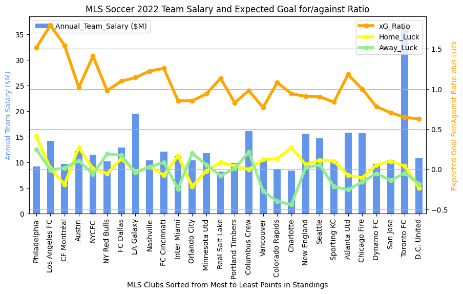
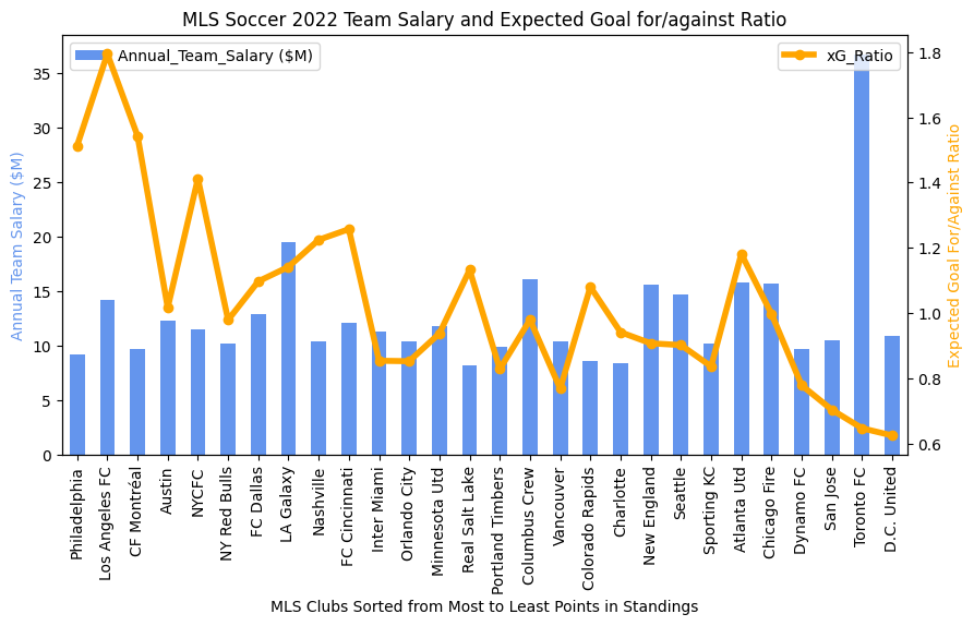
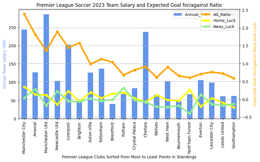
2022-2023 Results for Comparison

2022-2023 Premier League final Results

Stuff to discuss:

  1. Chelsea was a strange outlier during this season regarding salary and final point tally. Their xG ratio is below 1 and both their home and away luck are negative. Efficiency seems to have been an issue. Compare to Fulham who finished 8 points ahead of them with somewhere around 1/4 of the salary. Fulham had lower xG than Chelsea this season but had great luck both home and away. Note that Chelsea finished higher in 2023-24 and Fulham finished much lower as their luck regressed back to the mean.
  2. There’s also a big delta between Nottingham Forest’s home and away luck during this season. They finished just ahead of relegation, but maybe they did so just by the skin of their teeth due to their abysmal away luck (lowest in the league). Note that in 2023-24, Nottingham again skated just ahead of relegation, but both their home and away luck were just below zero. Speaks perhaps to inconsistency in scoring off of good chances, probably a predictor of a future relegation.
  3. We again see a number of teams in the top half where positive away and home luck offsets a salary gap. Note Arsenal, Aston Villa, Brentford, and Fulham all in the top half.

LINKS to Other Soccer Analytics Entries

  1. Soccer Analytics Series Intro
  2. MLS and Premier League Comparison
  3. Home and Away Luck Metric
  4. Does Counterpressing Work? Evidence.
  5. Evaluation of Outcomes using the Luck Metric
  6. More Analysis using the Luck Metric
  7. Soccer Analytics in Practice – Youth Soccer Example
  8. xG and Luck update on recent MLS season
  9. xG and Luck update on recent Premier League season

Update: MLS Latest xG ratio and Luck stats

I haven’t updated the charts in previous entries for the end of the 2023 MLS Season and the 2023-24 Premier League season. I re-ran my stats and here goes, MLS first.

2023 Final MLS season Stats – xG and Luck

Now to make a better comparison, here’s the results for the end of the 2022 season.

2022 Final MLS season Stats – xG and Luck

I like these metrics (xG ratio and Home/Away Luck) because they paint a pretty good picture of an awful lot that happens in a soccer match. As a reminder, xG stands for “expected goals” and the ratio is xG for the team being measured divided by xG of their opponent during the match. Expected Goals are calculated statistically based off of where a shot on goal is taken. Closer and more centered shots have a much higher likelihood of scoring, and therefore count as 0.5 or higher expected goals. The ratio, therefore, gives a pretty good idea of whether a team was getting in position to take good shots and whether they were limiting their opponents to less good shots.

Luck is the comparison of the number of goals scored to the xG. If Austin FC scores 3 goals, therefore, but their xG is only 1.8, then they have a luck of positive 1.2. As you can see, it is quite possible to have a luck of less than zero too (meaning you were just unlucky. You were in position and took good shots, they just didn’t go in). The trend does seem stronger in 2022, though, than it does 2023.

Interesting Trends

  1. I don’t see any Luck trends from 2022 to 2023. This is unsurprising due to the statistical nature of luck, but one always hopes to find a pattern where some team is “making” their own luck.
  2. Since the teams are sorted by number of points (highest on the left), it is not surprising that the xG ratio trends pretty decently with the season points. We would expect teams that win more and therefore get more points for the season to also have better shots overall than they allow to their opponents. in 2023 we do have a few notable outliers (NYRB and Seattle) who had a really strong xG ratio but finished lower in points.
  3. MLS also shows an interesting trend where teams with high salaries (the blue bar) don’t always finish in the upper 1/4 of the league. In 2023, there are quite a lot of high salary teams in the lower 1/4, actually. This is very unlike what we’ll see in the next entry where we review the English Premier league results. Hard to put one’s finger on this completely, unless it has something to do with older European stars coming to MLS at the ends of their careers?

LINKS to Other Soccer Analytics Entries

  1. Soccer Analytics Series Intro
  2. MLS and Premier League Comparison
  3. Home and Away Luck Metric
  4. Does Counterpressing Work? Evidence.
  5. Evaluation of Outcomes using the Luck Metric
  6. More Analysis using the Luck Metric
  7. Soccer Analytics in Practice – Youth Soccer Example
  8. xG and Luck update on recent MLS season
  9. xG and Luck update on recent Premier League season

Update: Soccer Analytics in Practice at the Youth Club Level

I took a bit of a break from this series to go off and capture data. My goal was to see if an xG and Luck-based approach to measurement would be useful at the youth club level. Here’s a quick report on my approach (it is reusable) and the results so far.

Approach

  1. I built a data input sheet that can be taken to soccer games and used without great knowledge of statistics and soccer.
  2. The data input sheet has instructions on the bottom right corner. It’s as simple as putting an ‘x’ on the page where you estimate a shot was taken by your team and an ‘o’ on the page where you estimate a shot was taken by the opposition. If the shot is “on goal” (I make this simple by saying it is on goal if a) it’s a score, b) the goalie touches it, or c) it hits the goal frame) I put a check-mark next to the x or o. If the shot results in a goal, I put a circle around the ‘x’ or the ‘o’. It’s about that easy. Sometimes I’ll put notes near the marks. I like to identify if the shot was the result of a penalty and is a free kick (‘fk’). I also put the scorer’s name near goal marks.
  3. After the game, I add up shots on goal for each team and then multiply each shot on goal by the probability of goal in the region it was taken. You can see the legend shows a range of probabilities. I actually use these probabilities starting with the lowest (green)… [0.05, 0.1, 0.15, 0.3, 0.5, 0.7, 0.8]. My approach is NOT to include penalty kicks in this process because in my opinion, PK’s don’t really speak to what I’m trying to measure, which is expected goals and luck. You might say it demonstrates luck to even get a PK, and I’d agree, but that’s a different kind of luck in my opinion.
  4. The total sum of the shots on goal times their probability of goal number equals the team’s expected goals (xG). Luck is calculated by the actual score minus the xG number. See below for an example scored game.
Example xG score tracker. My team won this game 2-0.

Season Results so Far

I’ve been able to easily collect these metrics so far this season. I believe it is easy enough to delegate to a student team manager (I call them my ‘statistician’) in the Fall season for the school team that I coach. Below are the results for our 2023 club season so far.

Table of Results 2023
Area chart of Results. Wins are to the Left, Losses to the Right.

Analysis

Here are a few things that are probably obvious.

  1. xG appears to be a strong predictor of a win. Note how the higher (light purple) xG for FC Tucson tends to be stronger in wins (left side of the plot) and lower on the right side (ties and losses).
  2. They say you make your own luck, but perhaps sometimes it’s just outside of your control (note my previous analysis of luck due to venues and officiating). Maybe just knowing that the luck might be tilted against your team is positive.
  3. Sometimes you make your own bad luck too… In the game on the plot where the FC Tucson team showed the most bad luck (Slammers FC), our team totally dominated the game in all aspects. Shots on Goal, Possession, and xG. But some of our bad luck was due to the fact that the Slammer’s best players were defenders and our shots were taken further away.
  4. This is a big takeaway… THE SHOT CHARTS ARE REALLY VALUABLE! Though I don’t actually coach this club team I have already been able to sit down with players and parents at their request and describe the flow of the game along with areas where our shot choices were driven by our inattention or even to defensive schemes of the opposition.

LINKS to Other Soccer Analytics Entries

  1. Soccer Analytics Series Intro
  2. MLS and Premier League Comparison
  3. Home and Away Luck Metric
  4. Does Counterpressing Work? Evidence.
  5. Evaluation of Outcomes using the Luck Metric
  6. More Analysis using the Luck Metric
  7. Soccer Analytics in Practice – Youth Soccer Example
  8. xG and Luck update on recent MLS season
  9. xG and Luck update on recent Premier League season

Even More Analysis of Soccer Outcomes using the Luck Metric!

Referee Images - Free Download on Freepik
referee image from https://www.freepik.com/free-photos-vectors/referee

In the previous entry in this series (see link here) we studied if it was possible that the different styles of playing surface might actually be correlated with increased or decreased luck. In this series, we define luck as the number of actual goals in a game that either exceed or fall short of the expected goals metric (which relies on statistical measures of the likelihood of goals given certain measurable activities in a game). We look at luck for both home teams and away teams, because we all intrinsically understand that home teams tend to have better luck when playing at home. See the previous entry to read about what we found.

Today, we’ll do one more evaluation (probably not the last, but definitely one that piques my interest) to determine if individual head referees presence in a game is correlated with greater or lesser luck. The reason we look at head referees only is that I have a data source which lists who the head referee is for a very large set of games. In theory, the head referee controls the flow of the game and contributes the most to uncertainty of the outcome. We’ll look at officiating for both the MLS and the Premier League to see if 1) certain refs affect the luck metric more often and 2) if the impact to luck is significant or not.

MLS 2023

The methodology here in general is to evaluate how both “home luck” and “away luck” can be grouped across the individual head referees. Then we take the mean value of luck and also the standard deviation (how much the luck values tended to vary from game to game that the individual officiated). These are plotted in a similar way to how we plotted the field surface plots. Keep in mind that we’re attempting to describe the entire distribution of games that an individual official was part of. Since we make the assumption that this distribution follows a Gaussian distribution (bell curve) we believe we can describe the impact across all the games with just the mean luck value and the standard distribution. Below we can see the results, where the square describes the mean and the lines describe the variation.

Home Team “Luck” distribution by Head Referee 2023
Away Team “Luck” distribution by Head Referee 2023

Analysis: I’ll analyze the 2023 MLS results and then leave the analysis of the 2022 MLS games and the Premier League games to the reader. What do I see?

  1. Remember we’re evaluating how each official impacts home and away luck (remember, luck describes actual goals in excess of the number of goals we statistically predict using the expected goals metric). We see very different mean values of luck for the individual referees, but it is hard to say that the extra “lucky” goals are causal due to the participation of the referee. It takes much more work than this kind of statistical analysis to determine causality. It could be that the referree’s impact is actually correlated with some other event that is more causal about the lucky or unluckiness experienced. That’s just statistician speech to make sure we don’t all grab pitchforks and torches!
  2. We do see that certain referees are more likely to be associated with higher or lower luck. Some of the referees’ results are close to the average (mean) of the entire distribution of referees. These are mostly the ones in the middle. This means that statistically, the luck experienced during the games are about the same when these “middle” refs officiate.
  3. However, there are officials off on the edge who do seem to have a statistically higher impact on the luck experienced in the games. The two in red (on the home luck chart) actually are two standard deviations away from the mean value of luck across all the refs. This means that their luck outcomes are different than 95% of all the other referees. This tends to show that the fact that these refs are way out on the edges is not due to chance, but is actually due to something the refs are doing different.
  4. Note that there are 4 or 5 refs in the Home Luck chart who have a mean impact in their games of close to one goal! You can see that the error bars for these refs vary, but at least one seems to almost always have a one goal impact on a game. One could say that these officials are more likely to give penalty kicks in the box (a very high probability of a score). That might be a good guess, because the expected goals metric that I use actually excludes penalty shots (because they’re random — and therefore “lucky” — events that cannot be predicted). But maybe this metric shows that with certain referees, penalty shots are more probable and are therefore less random.
  5. Another interesting thing to see is that the luck impact across all the officials is much lower for the away teams. This means that away teams are less likely to be impacted by the presence of individual officials. This is probably reasonable to assert, given the notion that officials in every sport probably have an unconscious bias for the home team (whose fans are screaming about any calls that go against their teams).
  6. We do see one official whose presence is well-correlated with “good luck” for the home team and “bad luck” for the away team. When I dug in to try to understand why this one official stands out, I discovered that they are very rarely the head official (often getting assigned to do video replays). I also noticed that officials that are outside 67% of the other officials likewise rarely get to be head refs. Perhaps the MLS is paying attention to this (see this webpage for details on this).

Other Charts

MLS 2022

Home Team Luck distribution by head referee (MLS 2022)
Away Team Luck distribution by head referee (MLS 2022)

Note the one official that has no error bar? This is most likely because he was the head official only one time in 2022. It’s small data, but observe that it follows the exact opposite trend that we see this official following in 2023! Weird. We also see more dramatic shifts in mean values for the outlier refs in 2022 than we see in 2023.

Premier League 2023

Home Team Luck distribution by head referee (Premier League 2023)
Away Team Luck distribution by head referee (Premier League 2023)

Premier League 2022

Home Team Luck distribution by head referee (Premier League 2022)
Away Team Luck distribution by head referee (Premier League 2022)

Wrapup

So what do you see in the MLS 2022 and the Premier League charts? There are definitely some interesting trends and differences. Feel free to leave comments on what you see and we can dialogue about them!

LINKS to Other Soccer Analytics Entries

  1. Soccer Analytics Series Intro
  2. MLS and Premier League Comparison
  3. Home and Away Luck Metric
  4. Does Counterpressing Work? Evidence.
  5. Evaluation of Outcomes using the Luck Metric
  6. More Analysis using the Luck Metric
  7. Soccer Analytics in Practice – Youth Soccer Example
  8. xG and Luck update on recent MLS season
  9. xG and Luck update on recent Premier League season

Further Evaluations of Soccer Outcomes using the Luck Metric

In a previous article (link) I discussed how to create and evaluate a simple metric that describes the difference between the number of goals a team is expected to make (using the xG metric) and the actual number of goals they score. I’m calling this difference “luck” because it describes how much a team under- or over-performs the expectations made by the way they play a game. Soccer, perhaps more than other sports, is heavily influenced by these over- and under-performances.

I previously discussed how luck seems to be distributed across teams in MLS and the Premier League both when they are the home team and when they are away. We plotted their mean home luck and away luck against their other metrics that we’ve determined to be predictive, 1) the ratio of xG for a team to xG for the opponent (xG ratio) and 2) the amount the team pays in salary. We could see that teams that have favorable luck at home and/or away tend to perform better. Perhaps this is an example of how a team can “make their own luck”, meaning that perhaps in soccer not all luck is purely random chance. Most likely there are elements buried inside this luck metric that are based off of things we can’t easily measure. Stuff like good preparation, team chemistry, and the two things we’ll evaluate next in this series, the venue a team plays in, and the official overseeing the match. Today we’ll discuss venue.

The reason the intersection of “luck” and venue came to my mind was due to a discussion with an MLS player recently about analytics. We were talking about the strange difference between the relationship between the xG ratio and performance across the MLS and the Premier league (see this link to see this difference). He mentioned a number of elements about the MLS that could explain this difference:

  1. The different ways that MLS teams travel (bus, train, commercial air) vs. the ways that Premier League teams travel (more money = much nicer).
  2. The long distances that MLS teams travel and the widely-varying geographies and altitudes that British teams don’t have to face. Sometimes these distances, especially if it is to be a longer bus ride, influence a team’s willingness to “get a game over with”.
  3. The venue. I was not aware of this, but the player mentioned that there were still six teams in the MLS playing on artificial turf. Here’s a wikipedia page providing the details of all MLS stadiums. Sure enough, there are actually seven fields using some kind of turf, ‘Lumen Field’, ‘Providence Park’, ‘BC Place Stadium’, ‘Gillette Stadium’, ‘Mercedes-Benz Stadium’, ‘BMO Field’, ‘Bank of America Stadium’. When I did a simple grouping operation to evaluate the mean luck score for home and away teams on turf and then compare these numbers to games on grass, I see a difference. Stay with me and I’ll describe it.

Breaking down Luck by Playing Surface

2023: Interestingly, in 2023, we see both Home and Away teams performing slightly better in terms of “luckiness” when playing on TURF! This is likely close to how the MLS player imagined the result would be. This means that home teams outperformed their expected goals by a bit more (.229 on turf to .167 on grass) and away teams slightly underperformed their expectations (-0.058 on turf vs. -0.014 on grass). This makes sense that the “turf-based” home team is more familiar with their playing surface and they therefore outperform expectations more then how a “grass-based” team outperforms on their grass surface. Yes, this is confusing, but it appears that turf gives their teams a bigger advantage than grass gives their teams. My guess is that this is based on the fact that there are more grass fields and they are very familiar to all teams. Away teams, however, always seem to underperform compared to home teams and we see this underperformance to be more noticeable on turf. So in essence, in 2023, the data indicates that teams with turf had a measurable advantage at home greater than the advantage teams with grass saw. In 2022, we don’t see these exact results, however, with Home Team luck being a tossup between turf and grass and Away teams still seeing poorer performances (-0.064 on turf vs, 0.161 on grass). Still, this shows a small advantage for the Turf-based teams.

Detailed Views of Luck for 2023 (season still incomplete)

Here are some errorbar plats that will allow us to see some of this detail more clearly. NOTE that stadiums with turf fields have their labels on the plot in red. Other things to be aware of… the vertical lines represent the range of luck results (standard deviation) and the squares represent the mean luck values at each stadium. Nodes with no vertical bars tend to be stadiums where only one game was played, therefore there was no variation of luck. The results are sorted from greatest to least luck.

2023 error bar plot for Home Team Luck by Venue (note Turf playing fields in red)
2023 error bar plot for Away Team Luck by Venue (note Turf playing fields in red)

Detailed Views of Luck for 2022 (season still incomplete)

2022 error bar plot for Home Team Luck by Venue (note Turf playing fields in red)
2022 error bar plot for Away Team Luck by Venue (note Turf playing fields in red)

What Do We See in these Plots??

  1. The “Luck Slope” for both home and away teams is steeper for 2023 than 2022. My guess is that this is due to the fact that the 2023 season is still being played. It will be interesting to see if the difference in luck between the top venues and the bottom ones flattens out as the season progresses.
  2. But even though the season isn’t complete, the data from 2023 is interesting. So far, we can see that for the Home Teams, the “red” venues (these have artificial turf surfaces) tend to be more towards the left of the chart. This is the “higher luck” side. Conversely, the same venues that are positive for the Home teams are on the left side of the Away Team chart, meaning that the turf fields are less lucky for away teams.
  3. If you do a study field-by-field, the “luckier” venues in 2022 are not the same ones seen in 2023. There could be lots of variables other than playing surface that could describe this. Take a look and see what you can uncover! For example, Lumen Field (home of the Seattle Sounders) is incredibly unlucky for the Sounders in 2023 (and is lucky for their opponents!) but in 2022 it was about middle of the road. Despite this unluckiness, the Sounders are 2nd in the MLS Western Division right now! One observation I’d make is that the Sounders are one of a couple of teams where their home luck and away luck do not diverge much. For a good visualization of this, see 2023 chart at this link.
  4. There are a whole lot of different analyses that could be done using this data. Feel free to discuss in the comments section of the blog! I probably haven’t thought yet about what you noticed!

LINKS to Other Soccer Analytics Entries

  1. Soccer Analytics Series Intro
  2. MLS and Premier League Comparison
  3. Home and Away Luck Metric
  4. Does Counterpressing Work? Evidence.
  5. Evaluation of Outcomes using the Luck Metric
  6. More Analysis using the Luck Metric
  7. Soccer Analytics in Practice – Youth Soccer Example
  8. xG and Luck update on recent MLS season


Soccer Analytics: Does Counterpressing Work?

counterpressing example

In soccer, there are legendary coaches who have asserted that upon losing the ball, teams that regain it within five, six, or even eight seconds have a higher chance of keeping the ball, and indeed, scoring. This is the foundation of what Jurgen Klopp called “Gegenpressing” and led to the rise of the RB Leipzig team in the Bundesliga, whose coach Ralf Rangnick stated that goals were most often scored within eight seconds of winning the ball from the opposition. This seems like an amazing statistic, but is it data driven or is it merely legend?

In the 2021 paper “Data-driven detection of counterpressing in professional football” (link) the authors, Pascal Bauer and Gabriel Anzer, describe a method for using supervised machine learning to detect counterpressing in video. If automated detection was possible then they hoped to be able to better evaluate some of these counterpressing rules of thumb.

History of the Research into Pressing Tactics

Much of the data behind the counterpressing strategies started with a man named Charles Reep. He was one of the first who studied the game for the purpose of collecting data that might be able to reveal new insights. He captured piles and piles of data — many of these in hand-written notes — to better understand the game. There is much that can be said about Charles, but this is too short of a post to discuss his successes and miscues. To our question about transition successes, however, in one paper that he authored in 1968 he found that 30% of the time that a team forced a transition and gained possession they were able to make a shot on goal and indeed, 25% of all goals came from regained possessions in the attacking quarter. This data wasn’t much used outside of Reep’s circle but in 1999 A.J. Grant collected data from the 1998 World Cup and confirmed these numbers. This relationship between transition “recaptures” and goals has been confirmed in papers from 2014 and 2018 as well. There have also been studies that learned that teams relied on counterpressing more often when behind in the score than when ahead. This would indicate to me that some teams know of the power of counterpressing, but don’t structure their main strategy around it, much like the press in basketball. Additionally, studies have discovered that teams that recover the ball more quickly after losing it tend to win more games. All of these things seem intuitive, but it’s helpful to see that there are measurements and data behind the notions.

The paper concludes a few things that I find valuable.

  1. First off, researchers have been able to discern counterpressing strategies using machine learning. This is very important, because it reduces the labor required to classify significant events and approaches in soccer.
  2. Using these automated detection methods, these same researchers also found that counterpressing is more likely be successful near the sidelines and that numerical superiority near the ball when it is turned over increases the chance of winning it back. Both of these, of course, makes good sense to me.
  3. Within the German Bundesliga, teams follow very different transition strategies and these differences could be detected by the machine learning. Each of these approaches had different levels of success regarding turnover recovery and goal scoring.
  4. Successful teams—measured against their final ranking—tend to use the counterpressing strategy more efficiently, providing credibility to the coaches that use it as a major offensive counter-attacking strategy.

Conclusion

Though there seems to be data that ties a fast recovery during transition with a higher probabiity of actually scoring, I was actually unable to find any data that actually quantified the number of seconds after a turnover where a transition was more likely to lead to a goal. Perhaps the number is somewhere in the mountains of tablets where Charles Reep recorded his data, or perhaps its just legend. But the data seems very clear that pursuing a counterpressing strategy with players who are highly fit and can fly all over the field (people like Tyler Adams??) allows teams to have a higher probability of scoring in games than teams who do not. Of course if Lionel Messi plays for the non-counterpressing team, all bets are off.

LINKS to Other Soccer Analytics Entries

  1. Soccer Analytics Series Intro
  2. MLS and Premier League Comparison
  3. Home and Away Luck Metric
  4. Does Counterpressing Work? Evidence.
  5. Evaluation of Outcomes using the Luck Metric
  6. More Analysis using the Luck Metric
  7. Soccer Analytics in Practice – Youth Soccer Example
  8. xG and Luck update on recent MLS season


Soccer Analytics: Home and Away “Luck”

Will this improbable shot succeed?

As I mentioned in my first post, the game of soccer, due to it’s many degrees of freedom in play, is very non-deterministic. What does this phrase mean? There’s a philosophical meaning for the word “deterministic” which essentially says that all events, including human action, are ultimately determined by causes understood to be external to the will. There’s also an engineering meaning to the word where a deterministic system is repeatable with very high precision because it is a function of the inputs and the initial conditions. For instance, anti-lock brake systems are designed to be deterministic. We don’t want any surprises there!

The opposite of deterministic systems would be a “stochastic” system which has one or more aspects that could be considered randomly sampled and thus can be analyzed statistically but not precisely predicted. So a “non-deterministic” game like soccer can also said to be “stochastic”, because there are many variables in the game which all have their own probability distributions. Whew! All of this so I can talk about luck!

Luck

Wikipedia’s definition of luck is a pretty good one, “Luck is the phenomenon and belief that defines the experience of improbable events, especially improbably positive or negative ones.” Over the last two block articles about soccer analytics, I’ve described how sometimes unpredictable events result in scoring goals or failing to score goals. These events could be anything from officiating decisions, a player being surprisingly out of position right when the opponents pass comes to him, a gust of wind that causes a ball to just barely tick up off the crossbar, etc. Since goals in soccer are a much more rare event than points (runs, 3 point shots, field goals, touchdowns, hockey goals) scored in other popular sports, when they are impacted by improbable “luck” it is much more noticeable. If a touchdown is scored after a missed pass interference call and the scoring team goes up 35-14, that is just 7 out of 35 points. If a soccer official calls a questionable foul in the box and the offended team scores their penalty kick (70% chance of scoring), that might win the game 1-0. The luck of having the official see the play as a foul essentially won the game for one team and lost it for another.

Measuring Luck in Soccer

Note that it is impossible to measure the factors that caused the official above to call the contact in the box as a foul (perhaps he ate to many burritos before the game? Maybe his attention was distracted by a low-flying seagull? Perhaps he just hates the color green?). What we hope to do is find a proxy for the measurement of luck that “mostly” captures events when teams are expected to score a certain number of goals but either fail to achieve that number or exceed that number. So in this case, actual goals scored minus the number of expected goals could be seen as outperformance of the expectations for whatever reason. I’ll just call that overperformance “luck”. I also see the opposite where an opponent’s expected goals minus the number of actual goals scored could be viewed as your team’s defensive luck. Averaging the offensive luck and defensive luck will constitute overall luck.

Charts (of course)

In the charts below, I’m measuring the overall luck for teams when they are playing at home vs. when they are playing away. This luck is averaged across all games in the season. I’ve overlaid these two new lines (the yellow and the green) on top of the blue annual salary bars and the orange “no penalty expected Goals” ratio. These home and away luck lines augment the orange xG ratio by bringing in the disparity between xG and actual goals (which, as I’m suggesting, can be seen as luck)

MLS 2022 Season xG, Salary, Home Luck, Away Luck
English Premier League 2022 Season xG, Salary, Home Luck, Away Luck

Conclusion

So what new information does the two luck features add to these charts? We have already noticed that:

  1. The Premier League clearly has a different financial structure than MLS (more on this in a later article)
  2. Therefore, a team’s annual salary is more indicative of success in the Premier League than in the MLS.
  3. xG ratio is predictive of success in both leagues, but more so in the Premier League
  4. Total points during the season is also highly correlated with overall success.

Now we look at the two luck lines to see what they add. What do we see?

  1. Having either Home Luck or Away Luck being smaller than zero is bad for the team’s performance. This is pretty obvious when you think about it, because it shows that the team is failing to convert on opportunities that are expected, whether on offense or defense or both. Why are they failing? Probably for unmeasurable reasons (the team is not getting along, the refs hate the coach, no fans are showing up at home, the team is practicing too hard and is tired during the game, etc.). The teams above the half-way point in the standings all have either a Home or an Away luck average higher than zero. The very top teams tend to have both Home and Away Luck averages above zero.
  2. It seems that a big divergence in Home and Away Luck, especially when one is in negative territory, indicates poorer performance. Note the last 6 teams in the Premier League chart. They all have a fairly large gap. The very worst teams see this gap at Home, and the next worst teams (Southampton and Everton) see the worst luck Away. But all have a pretty large gap between the home and the away. We see similar things in the MLS, where the very worst team by points (DC United) has the worst Home Luck in the league. Orlando City has the next worst Home Luck, but they make up for it through having one of the very highest Away Luck numbers (might be interesting to look into this club).
  3. What do you see? Weigh in on this in the comments? I answer them all to the very best of my ability.

LINKS to Other Soccer Analytics Entries

  1. Soccer Analytics Series Intro
  2. MLS and Premier League Comparison
  3. Home and Away Luck Metric
  4. Does Counterpressing Work? Evidence.
  5. Evaluation of Outcomes using the Luck Metric
  6. More Analysis using the Luck Metric
  7. Soccer Analytics in Practice – Youth Soccer Example
  8. xG and Luck update on recent MLS season