The Hidden Information that can be Extracted from Texts

The above title might sound boring, but it’s probably the area of “Artificial Intelligence” that I’m most excited about. If you squint just right, you can probably understand what I mean when I say that Texts are generated by Topics filtered through the human mind. What if we could uncover some of those Topics by processing the Texts in some way? What if we could also uncover information about the human mind that is evaluating those Topics?

Here’s a great link that gives some insights into the questions above in bold. It comes from Radiolab (NPR) and presents a couple of really interesting examples:
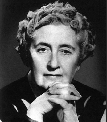
Agatha Christie.png
https://commons.wikimedia.org/wiki/Category:Agatha_Christie#/media/File:Agatha_Christie.png
  1. The story of Agatha Christie’s novels. A researcher conducted word frequency analysis (probably something like the tf-idf technique) and found that Agatha’s first 72 novels had very similar statistics around word choice and vocabulary. But the 73rd novel showed a huge shift that revealed something that was likely happening in Agatha Christie’s brain. This has a lot of interesting implications! Click the link above to listen to or read the story on Radiolab.
  2. A similar story about an amazing study done by the University of Minnesota on something over 600 nuns over the years that involved memory capacity and status assessments. At some point the dataset of “entrance essays” from each of the sisters was discovered and the researchers learned that information and grammar in the essays — written in the sisters’ youth — had correlation to memory issues in their older ages. This is correlation, not causality, of course, but still fascinating.

These are the kinds of analyses that I like to do on all sorts of text. There are techniques that allow me to uncover hidden (or “latent”) topics from large quantities of text and sometimes what these reveal is spooky! There are all sorts of other kinds of analyses like the word frequency ones from the Agatha Christie study as well as from the grammar and idea density metrics used in the University of Minnesota study. This may well be one of the most useful near-term applications of AI that we have today, one that is even able to reveal hidden truths about our own selves.


1/3/22: A View of Omicron a Couple of Weeks in

Here’s a bunch of views from the Arizona Dept of Health Services.

Cases per Day

Arizona cases per day, from AZDHS Data Dashboard, 1/3/22

“As you get further on and the infections become less severe, it is much more relevant to focus on the hospitalizations as opposed to the total number of cases,” Dr. Anthony Fauci

Hospitalization Stats (by Day)

Inpatient and ICU Bed status – COVID and non-COVID patients. From AZDHS. 1/3/22

Discharges are one of the best data points for showing positive trends in hospital capacity. Normally, discharges peak right before the hospital bed use peaks. There was a peak of discharges around 12/1 that signaled the bed use decrease you can see to the right of the chart above. I wonder if the second discharge peak we’re seeing now signals a larger bed use decrease?

COVID Hospital Discharges by Day, AZDHS, 1/3/22

Deaths

Deaths were already trending lower before Omicron arrived, but they might be trending much lower (need another week or two to know for sure).

AZ COVID Deaths by Day, AZDHS, 1/3/22

Other Visualizations

Here’s my standard Case Rate (color) and Acceleration (Diameter) chart. What do we see here? It does seem like the higher rates and accelerations are in the more dense parts of the country. Prior to Omicron’s arrival, the brighter colors were trending in the northern (colder) parts of the country. It appears like the case breakouts are trending more southern now. We can see big outbreaks in Miami, Denver, El Paso, and NYC.

Case Rates and Accelerations, 1/3/22

Data Tables

Note that a lot of states seem to not be reporting (Delta_Active is very unlikely to be zero right now). Case Rates (IROC_confirmed) are through the roof for most states. Deaths appear very low considering the case acceleration.

State Data Table, 1/3/22

Things that make you scratch your head

Here are two charts that I put together a while back when it became clear that the states with higher vaccination rates were doing much better than the ones with the lowest vaccination rates. Now we see opposite behavior during Omicron. I’m not really sure how to explain this. Weather differences?

Cases per 1000 per Day – States with Lowest Vaccination Rates 1/3/22
Cases per 1000 per Day – States with Highest Vaccination Rates 1/3/22

What do we see here? Pretty much all of these states (not New Mexico) is sharply accelerating cases per 1000 right now. The states on the top are accelerating at a much lower rate. My guesses are weather and higher density, but those are just guesses. Other ideas??