

In the modern era of more and more esoteric baseball metrics, how can one understand what the ballpark is telling us?

This weekend I went to the Diamondbacks game at Chase Field, a treat I have enjoyed for a number of years. As a person who likes numbers, it struck me that the stadium was even more awash in statistics than ever. It brought a lot of questions to mind, some of which I’ll explore in this blog entry.
The Scoreboard, Explained
Much of this scoreboard layout looks fairly familiar to someone who may have looked at box scores or attended other big-time baseball games. The score by inning is something that has been featured for years. It tells us something interesting, the rate at which the two teams have been adding to their score. Knowing how pitching assignments work in major league baseball, one can quickly surmise that the White Sox starter got shelled early and seems to have stabilized a bit by the fourth inning. The Diamondbacks’ starter, however, seems to have pitched a fairly solid first four innings, because we can see that he has given up only three hits (less than one per inning). The White Sox scored one run off of him in the third inning, but we can also see that Arizona has one error. Did this error result in the one run? If so, that would be an unearned run and therefore wouldn’t be counted against the Diamondback pitcher’s Earned Run Average. We can see more about the White Sox pitcher, Drew Thorpe, because the scoreboard gives more info about active pitchers in the upper right (the D-Backs were batting when this image was taken). Drew hasn’t had such a good game to this point… in 3 innings he has given up 4 earned runs… that translates to an ERA of 12.0 at the moment. He has also given up five walks (BB) and six hits, which results in a WHIP (Walks and Hits per Innings Pitched) of 3.67. Additionally, his ratio of Strikes to total pitches (strikes plus balls) is 0.52, which is 0.1 lower than the MLB average. Top pitchers typically have numbers like .65, so clearly Drew is way behind the pace of the best pitchers here. All of these measures (WHIP, ERA, %strikes) are very bad for Mr. Thorpe’s year averages and we can get all of this from the scoreboard.
The metric FPS% refers to First Pitch Strike Percentage. The Major League Baseball average is 57% and we can see that Thorpe is sitting at 47%. This is a pretty interesting metric. Weinstein Baseball (here) tells us that “if a big league pitching staff improved their first pitch strike percentage from 57% to 80%, it would translate into 100 fewer runs allowed over the course of a season. That translates into 10 more big league wins.” So what the scoreboard is showing us here is that Drew Thorpe has a control issue today… He’s giving up a lot of walks (per Weinstein, “70% of walks start with first pitch balls”) and possibly in trying to get the ball over the plate “whatever it takes” he may also be giving up some easier pitches to hit.
One other metric regarding pitching that we can take away from the scoreboard here is “MVR”. This is placed just to the right of the Error (E) column. I actually had to Google this one during the game. It’s kind of new and stands for “Mound Visits Remaining”. So Mr. Thorpe has already had more than one mound visit during his first 3 innings and now only has two left. This is probably part of baseball’s desire to speed up the games and make them less tedious. The pitch clock is another similar effort, where there is only thirty seconds allowed between batters. ESPN tells us (here) that the pitch clock has reduced baseball games to an average of 2 hours and 40 minutes (24 minutes shorter) due to the pitch clock. This has also corresponded with a spike in batting average and stolen bases. It seems obvious that penalizing a pitcher by restricting their time between pitches is likely to reward hitters and base runners.
Pitch and Hit Exit Metrics
Another thing that I found very interesting is a display I had never seen before at the ballpark. See below.
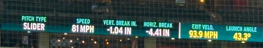
I found that this was very distracting, because my brain wanted to identify the patterns of how they were classifying the Pitch Type. There were a number of different labels for pitch type, among these was “four seam fastball”, “cut fastball”, “slider”, “changeup”,”sinker”, “sweeper”, and “curve”. The “Vertical Break” and “Horizontal Break” numbers were very interesting. These data are captured by camera-based systems called Trackman or Hawkeye and are used across many different sports. There’s a great article in Baseball America (here) on how these pitch classifiers are able to label the pitch type. What I found is that the pitch types are calibrated to speed… a pitcher who threw a 100 mph four seam fastball also seemed to have their pitches in the 95 mph range that didn’t “rise” so much classified as a sinker. Whereas other, slower, pitchers may have had sinkers in the 80 mph range. Pretty interesting.
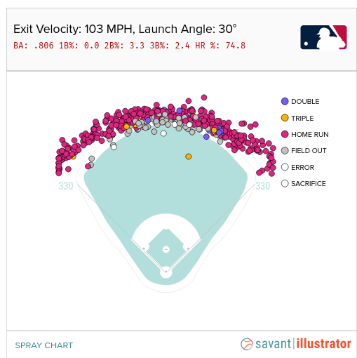
I also found myself looking after ball contact at the launch angle. A launch angle over 40% often indicated that a pitch that looked to the eye like a home run might actually just go to the warning track. Baseball Savant has a nice tool (here) where you can pick an exit velocity and a launch angle and see the actual outcome. For instance, below, 103 MPH exit velocity coupled with 30 degree launch angle was a Home Run 74% of the time!
Conclusion
Baseball parks have become inundated with information visualizations over the last few years. In some cases, advanced sensing and tracking systems like Hawkeye have enabled these new metrics to be collected. In others, new rules like the pitch clock and maximum numbers of mound visits have created demand for new metrics. But overall, baseball has always been a sport focused on its numbers, which is just one reason why many of us number people love it so much!