Major League Baseball – Did Banning “The Shift” work?

Positioning of infielders under new rules'
image from https://www.mlb.com/glossary/rules/defensive-shift-limits

Abstract

in 2023 Major League Baseball made a rule restricting certain defensive players being in certain portions of the field (See here for the actual definition of the rule). This was done to combat “The Shift“, a defensive technique which was popularized by the Tampa Bay Rays in 2006, where one side of the field is overloaded with players.

I had the notion at the time that banning the Shift was just a band-aid measure and would have no impact. Since the ban was in 2023, we have had one full season to evaluate any impact of the ban.

History of The Shift

The idea of shifting players to counter power hitters’ tendencies to pull the ball to one side goes to the early parts of baseball. It disappeared for a long time, however, until Originally, the Rays’ had the idea on how to shut down David “Big Papi” Ortiz of the Boston Red Sox, a left handed hitter who had great power pulling the ball down the right side of the field. Joe Maddon, the manager of the Rays, used Sabermetrics to identify that Ortiz hit nearly every time to the right side, and mostly to the outfield. The ploy was effective and Ortiz, who had hit over .300 from 2004 to 2006 moved to .265 midway through the 2006 season after multiple teams started copying the Rays’ technique against him.

The Shift attracted a lot of fan attention because it was often deployed against the most well-known power hitters and was seen as stifling to the offensive aspect of the MLB. Eventually, it was banned (limited, actually, see the definition above for detail) and the 2023 season was the first to be held without the old, dramatic version of the Shift.

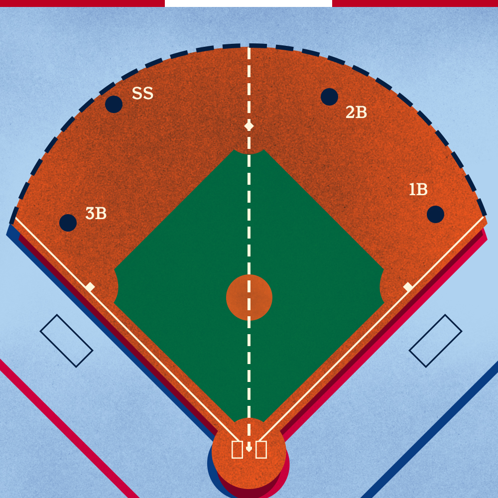
See below for an image of the Shift being applied by the Angels (there’s an extra person in the shortstop position).

Hypothesis

Image from Wikimedia Commons – By Jon Gudorf Photography – https://www.flickr.com/photos/jongudorf/16802945985/, CC BY-SA 2.0, https://commons.wikimedia.org/w/index.php?curid=112638138

Based on the way the Shift was deployed, I figured that if I wanted to demonstrate if the rule banning the Shift had any effect, I would have to evaluate the performance of elite power hitters both before and after the ban. This is not a perfect approach, though, because what if some other variable was introduced (a new “juicier” ball? Rules restricting pitchers) that impacted hitters’ performance. This means that I would have to evaluate performance differences of groups of “non-sluggers” as well to detect any non-Shift related performance changes.

I’m defining sluggers (the ones most impacted by the Shift) as hitters who have a Slugging Percentage (a common measure that records the total number of bases coming from hits) greater than the league’s average. My inclination is that the true sluggers are the ones who are at least one standard deviation above the mean (i.e., the top 16% of hitters.

Data Gathering

I used the Python library, pybaseball, to scrape some basic data. Pybaseball is useful in that it scrapes multiple baseball stats sites (including advanced pitch-based metrics). I only needed it to pull data on at-bats, hits, doubles, triples, home runs, and walks from 2006 to today’s date in 2024.

The data was pulled in two groups. One represented the “post-Shift” era from 2006 to 2022 and the other represented the “post-ban” era from 2023 to the current date. Data was evaluated by player and then normalized by the number of at bats. Multiple minimum at-bats were used (400, 600, 800) to determine impact of the Shift on players regardless of their usage on the team (but my insight was to not go much lower than 400 at-bats, in the theory that players who had few at-bats were unlikely to have the shift deployed against them (as it appeared to be reputational). Both groups were separated into two types of players, 1) “Normal” players, who’s Slugging Percentage numbers were close to the league mean and 2) “Sluggers”, who’s Slugging Percentage was a) in the top half of the league, b) one standard deviation from the mean (top 16%), c)_two standard deviations from the mean (top 5%), and c) three standard deviations from the mean (top ~1%). The notion is to identify if any of these groups of “sluggers” statistics (Hits, Doubles, Triples, Home Runs, Walks) were statistically different between the pre-Shift group and the post-Shift group.

Results

The first thing I looked at to compare performance from the “Shift Era” to the “Post-Shift Era” was the mean value of a number of common metrics. I selected ones that I felt were most likely to be impacted by the Shift. Hits, Doubles, Triples, Home Runs (the Shift doesn’t really impact Home Runs.. but I was curious), and Walks. I normalized these metrics by the number of at-bats for every player to make sure to keep things consistent.

Top 16% of Sluggers Compared Before and After the Shift was Banned. Also non-Sluggers for Comparison

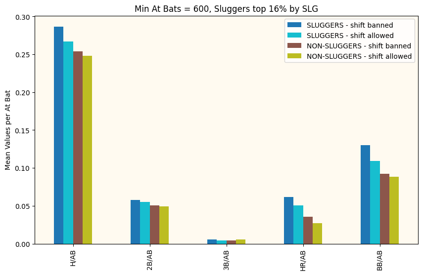
I did this for a range of Minimum At Bats and Numbers of Standard Deviations away from the mean to define who was a “slugger”. They all looked a bit like this. The first thing I notice is that the period after the Shift was banned sees better offensive performance (and more walks) across the board. Great! We have an answer! No? Of course it’s never that simple. First off, we need to remember these are just the mean values for these eras and the mean of a distribution is not always the best way to describe the whole distribution. Also, we need to understand if these differences are significant or could just be explained away by common variation.

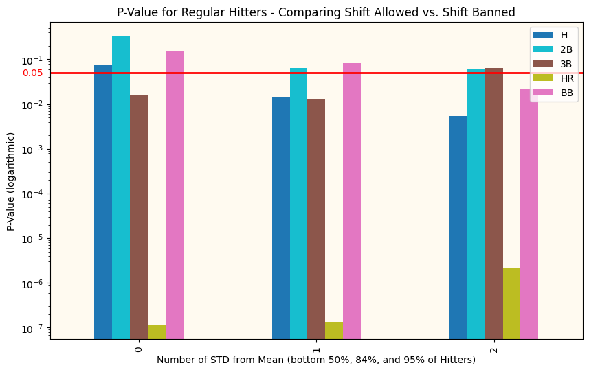
The next step was to apply an algorithm called the Kolmogorov-Smirnov two sample algorithm. This test compares the underlying continuous distributions F(x) and G(x) of two independent samples (pre-ban and post-ban) to determine if they come from the same distribution (our base assumption) or if they were drawn from different distributions. To wit, do the performance metrics before the Shift was banned have a fundamentally different distribution than the metrics after the ban. We will establish a required confidence interval of 95% (the typically accepted number) before we can determine the distributions different.

p-values comparing Sluggers before and after the ban. The red line is our confidence interval. Any bars below the red line indicate that metric is statistically different before and after the Shift

Above you can see the p-value for just Sluggers (top 50% of sluggers on the left, top 16% in the middle, and top 5% on the right) before and after the ban. We already know that the offensive metrics tend to be higher after the ban, this just tells us if that difference is significant and if it extends to the whole distribution.

p-values comparing non-sluggers before and after the ban. The red line is our confidence interval. Any bars below the red line indicate that metric is statistically different before and after the Shift

Analysis of the Results

There are obviously more charts, but these tell the story well enough. In the top chart (comparing Sluggers’ performance), we see that for the top 16% of sluggers, their performance on every metric other than doubles meets our requirements to claim that the differences are statistically significant. However, it’s hit or miss (pun!) for the other two clusters. Hmm.

Then looking at the non-slugger comparisons (we are comparing the hitters in the lower 50%, 84%, and 95%), we see that there are fundamental differences almost in all categories (most of the bars are below our red line, indicating that the performance changes in these metrics are significant), clearly more than with the sluggers! This indicates to me that something OTHER than the Shift has been responsible for affecting offensive performance across baseball. The Shift was rarely or never applied to any players other than pull-hitting sluggers, so it couldn’t be responsible for the performance changes we see in this bottom graph.

Conclusions

  1. It seems pretty straightforward. Offensive performance has changed across the board between the time period from 2006-2022 and the time period from 2023 on. These are a large number of years, and lots of rule changes could have happened.
  2. However, the changes in performance have been consistent across all hitters in MLB, not just the sluggers.
  3. In actuality, the Sluggers seem to have had a less significant increase in performance than the non-Sluggers.
  4. All of this makes me say that the performance impacts was from factors other than the banning of the Shift and that my initial hypothesis that the banning of the Shift had no impact is true.

To see others of my recent sports analytic posts:

1/3/22: A View of Omicron a Couple of Weeks in

Here’s a bunch of views from the Arizona Dept of Health Services.

Cases per Day

Arizona cases per day, from AZDHS Data Dashboard, 1/3/22

“As you get further on and the infections become less severe, it is much more relevant to focus on the hospitalizations as opposed to the total number of cases,” Dr. Anthony Fauci

Hospitalization Stats (by Day)

Inpatient and ICU Bed status – COVID and non-COVID patients. From AZDHS. 1/3/22

Discharges are one of the best data points for showing positive trends in hospital capacity. Normally, discharges peak right before the hospital bed use peaks. There was a peak of discharges around 12/1 that signaled the bed use decrease you can see to the right of the chart above. I wonder if the second discharge peak we’re seeing now signals a larger bed use decrease?

COVID Hospital Discharges by Day, AZDHS, 1/3/22

Deaths

Deaths were already trending lower before Omicron arrived, but they might be trending much lower (need another week or two to know for sure).

AZ COVID Deaths by Day, AZDHS, 1/3/22

Other Visualizations

Here’s my standard Case Rate (color) and Acceleration (Diameter) chart. What do we see here? It does seem like the higher rates and accelerations are in the more dense parts of the country. Prior to Omicron’s arrival, the brighter colors were trending in the northern (colder) parts of the country. It appears like the case breakouts are trending more southern now. We can see big outbreaks in Miami, Denver, El Paso, and NYC.

Case Rates and Accelerations, 1/3/22

Data Tables

Note that a lot of states seem to not be reporting (Delta_Active is very unlikely to be zero right now). Case Rates (IROC_confirmed) are through the roof for most states. Deaths appear very low considering the case acceleration.

State Data Table, 1/3/22

Things that make you scratch your head

Here are two charts that I put together a while back when it became clear that the states with higher vaccination rates were doing much better than the ones with the lowest vaccination rates. Now we see opposite behavior during Omicron. I’m not really sure how to explain this. Weather differences?

Cases per 1000 per Day – States with Lowest Vaccination Rates 1/3/22
Cases per 1000 per Day – States with Highest Vaccination Rates 1/3/22

What do we see here? Pretty much all of these states (not New Mexico) is sharply accelerating cases per 1000 right now. The states on the top are accelerating at a much lower rate. My guesses are weather and higher density, but those are just guesses. Other ideas??

Have COVID-19 Strains become Less Virulent?

Virulence: Virulence is a pathogen’s or microorganism’s ability to cause damage to a host. In most contexts, especially in animal systems, virulence refers to the degree of damage caused by a microbe to its host. The pathogenicity of an organism—its ability to cause disease—is determined by its virulence factors. (Wikipedia)

Here’s some Images from the Arizona Dept. of Heath Services data dashboard that I think tell a story that could indicate decreased virulence of the Delta variant.

  1. COVID Cases by Day in Arizona – Entire Pandemic: In the image below we see the cases per day since around April of 2020. You can easily see three surges of cases. The first happened in the summer of 2021 and coincided with a huge, relatively uncontrolled outbreak in Northern Mexico. Many of the cases during this time occurred in border counties of Arizona. The second surge occurred in the winter of 2020 where the entire U.S. saw a spike of cases that correlated with the average daily low temperatures dropping to below 40 degrees. The latest surge corresponded with the more-transmissible Delta variant and has seen two spikes. This surge has been less of a spike and more of a “slog” where perhaps we are seeing the combination of the arrival of the Delta variant in the late summer merge with the more traditional cold-weather pattern for a virus where the night-time temperatures drop. Understandably, the lack of relief is wearing out health care workers and challenging hospitals. Note that the number of cases per day for the second spike of the Delta outbreak is roughly equivalent to the first summer outbreak.
COVID-19 Cases by Day (https://www.azdhs.gov/covid19/data/index.php#confirmed-by-day) – 12/21/21

2. Hospitalization – Cases by Day: Below you can see hospitalization for the three major outbreaks. The winter outbreak hospitalization by day far exceeded the first summer outbreak. Likewise, the first summer outbreak’s hospitalization per day is just under double the peak of the Delta variant outbreak. The only problem with the Delta outbreak is that it is lingering. Similar cases per day and less hospitalization per day. Just over a longer time. This naturally creates problems in hospitals processing sick people through their system due to the need to navigate bottlenecks that form. Just like in a factory, bottlenecks are going to be less of a problem in a quick surge of production than they are in long, tiring runs of production where errors and inefficiencies compound.

3. Deaths per Day: In the image below, we see similar patterns to hospitalization. If you look closely, you can see that the peaks of the deaths are a week or two behind the peaks of hospitalizations. Again, we see the same pattern as we see with hospitalization. Though cases during the Delta wave are roughly equal to the first summer wave, the deaths are around half.

COVID-19 Deaths by Date of Death (https://www.azdhs.gov/covid19/data/index.php#deaths) – 12/21/21

Thoughts

Does this data show that Delta variant is less virulent than the preceding variants?

Perhaps. It’s quite possible that during the first summer wave we did a worse job of measuring cases. COVID tests are pretty ubiquitous now in late 2021 and maybe we’re collecting a higher percentage of the cases. Conversely, it’s also possible that people have inferred or imagined that Delta is less of a risk to them and are not getting tested if they experience mild symptoms. Either of these could be true and both would impact the usefulness of the case number. Additionally, the new variable of COVID vaccinations that was introduced in early 2021 has certainly reduced the impact of the Delta variant. It would take some work to decipher whether the virulence of Delta to unvaccinated people was equal or less than previous variants.

This is one of the challenges of measuring cases for the purpose of scientific analysis. It is very hard in a real-world study to control for the measurement variables across numerous regions and measurement authorities (governments, hospitals, universities). This is one of the reasons why we still don’t know much about this virus, despite having measured it for around a year and a half.

My Opinion: Oftentimes the concerns around measures will balance out when data is considered in very large batches (“big data”). My suspicion is that human nature is the constant across the measurement of all of these surges and we can take what is presented to us and assume that Delta is less virulent than the previous strains, either due to the virus itself or due to the boosts to our immune systems from either natural immunity or the COVID vaccines that most people have received.

Omicron and the future: We’ll continue evaluating the hospitalization and death metrics in the context of cases. My suspicion is that as Omicron arrives, it will dominate and gradually eliminate Delta and previous variants still lingering out there. If Omicron is less virulent, perhaps then we’ll see a leveling off of the cases to some background number and then we can say that COVID-19 has become endemic. If Omicron is not less virulent, then we’ll have a rough month or two ahead of us.

Welcome to the Era of Omicron

I took a bit of a pause on monitoring COVID during the Delta outbreak as at some point, people seemed to be much less interested. However, I’m hearing folks with questions now that a new, more contagious variant has emerged. A recent pre-print paper (not peer reviewed yet, so might be revised in the future) shows that the omicron variant multiplies 70x faster in airways but 10x slower in lungs. This explains why the variant appears to be more contagious but less threatening than Delta. See here for a pretty good description of the findings.

Might Omicron be a Good Thing or a Bad Thing?

Some reports predict that the faster-spreading variant will create more risk for humans, especially since it seems to evade the defenses from vaccinations to some degree. Others are reminding us that most pandemics end with a very virulent but less threatening variant that out-competes all of the more deadly variants. This is how the Spanish Flu ended. Hopefully the latter possibility is true, but time will tell. There are already reports from South Africa that hospitalizations (or at least severe ones requiring oxygen) are significantly down under omicron than they were during a similar period of the delta outbreak there.

Latest Data – Before the Wave from Omicron Hits

Here’s the latest data by state. I’ll include some recent state data tables later in the post for comparison’s sake. Note that the case rates have peaked up a bit in cold states over last week’s data. Perhaps this is the effect of Omicron or perhaps it’s just due to cold weather. Some states (like Arizona) have fallen down the list in the last two weeks.

State Data Table, sorted by case rate. 12/16/21

Arizona County Comparisons

Here’s a view on the death rates and case rates across the top Arizona counties by population since about June of 2020. I found it pretty interesting for comparison’s sake. I see a couple of interesting things here:

  1. Pima County, Maricopa County, and Pinal County all show nearly identical rates throughout the pandemic. Why is this interesting? Pima County — at least to my eye — has taken much more stringent public health measures than the other two counties from day one. Pinal County in particular seems to have gone out of its way to take as few public health measures as possible. But their rates and numbers are very similar (although Pinal County has fewer deaths per 1000 persons than Pima or Maricopa). What does this mean? No one knows for sure, but there is a strong indicator here that the measures we humans think will keep a virus at bay may not be very effective in the real world (vs. the lab).
  2. Yuma County had the steepest surge during the summer of 2020, but the case and death rates have been very flat ever since. This could be due to a higher vaccination rate on this border county or might even be due to natural immunity. I have no idea.
Case Rates across top AZ Counties by Population – 12/17/21
Death Rates across top AZ counties by population – 12/17/21

Older State Data Tables for Comparison

Perhaps the below will be interesting to data nerds now or in the future.

State Data Table from 12/8/21

State Data Table – 12/8/21

State Data Table from 11/30/21

State Data Table – 11/30/21

State Data Table from 11/20/21

State Data Table – 11/20/21

Delta Surge Update – Demographics Focus 8/13/21

Hospitalization (Arizona)

One question that hasn’t been well addressed in the media (all political bents) is whether the COVID Delta surge was driving hospitalization and who, indeed, was being hospitalized. My thinking is that this is our prime metric of the danger of a COVID surge these days. Here’s a chart showing the Arizona hospitalization numbers by demographic. It’s a bit messy for a couple of reasons: 1) Arizona keeps “catching up” on hospitalization numbers by dumping large count backlogs into a single day. I suspect this is a hard metric to keep up with due to all the hospital systems in the state and their state of enthusiasm (?) about reporting data… 2) I stopped capturing the daily snapshot from AZDHS’ web site sometime in May when the data got really boring and moved to weekly (or so). This means my trends aren’t as granular as before, but they’re still accurate.

Arizona Hospitalization (beds used) Data by Age – AZDHS data, collected by T.N. – 8/13/21

What do we see above? Note that at the left of the chart, the hospitalization by age is fairly random and driven by low numbers and statistics. However, if you can ignore the glitch in the middle, the trend is pretty clear towards the right (the Delta Surge). Hospitalization numbers are clearly trending up (but are still not significantly higher than in May. What does this trend reveal? Surprisingly, the over65 age group is still getting hospitalized at much higher rates than their percentage of the population would indicate. No way to know if these are vaccinated people or not. That’s a big gap in the data. They’re matched in numbers by the much-larger 20-44 age group and followed closely by the 45-54 and 55-64 groups. The under 20 age group remains the least hospitalized. This seems to go against some of the news reports that are indicating that the Delta variant is having more severe outcomes in the youngest cases. That doesn’t seem to be the case right now in Arizona at least.

Below I’m showing the hospitalization numbers for all age demographics. As you can see, the Delta surge (furthest right) has not been surging in the hospitals the same way the earlier two surges did. Keep your eye on this chart as things move forward.

AZ Hospitalization since 4/20 (https://www.azdhs.gov/covid19/data/index.php#hospitalization)

Cases – Pima County

In my county (Pima) the Delta surge has resulted in proportionately less cases than in the much-larger Maricopa County. My suspicion is that this is due to the notably higher vaccination rates in Pima County. But again, the big question is which demographics are getting infected during the current surge?

Pima County Cases by Age Demographic – 8/13/21

Again, ignoring the loss of granularity by my moving to weekly data capture, you can see the trending on cases from the lows of May until now. It’s no surprise that the 20-44 age group is leading the case counts. In general, across Arizona, this group is much less likely than older demographics to get vaccinated. Plus, there’s more of them. However, the most interesting part of this chart is that the under 20 group is the next highest increase in cases. This group is largely unvaccinated, but it’s not clear how many of them are between 12 and 20 and how many are under 12. This is an error in data collection “strategy” that’s been a problem throughout COVID. Perhaps no one expected at the start that the under 16 demographic (school age) would be so interesting for this pandemic. The rest of the demographics (more vaccination and older) are barely seeing any case rate uptick since May. So, again, fairly surprising that the youngest demographics are the primary ones getting the Delta variant of COVID. No doubt “breakthrough” cases are happening in vaccinated people, but perhaps they’re not symptomatic enough to get counted. Or maybe there are just very few of them (despite what the headlines would indicate).

I just show Pima County here, but statewide, the trend is similar. At the state level, the case rates in the older demographics are slightly higher than Pima county and the younger demographic case rates are noticeably higher. This, again, is driven by the much higher rates and lower vaccination in huge Maricopa County.

Deaths

There isn’t much change to death rates during the Delta surge from the low period of May. Deaths are still very low, as you can see from the height of the stacked blue and red bars in the chart below. The only thing that *might* be interesting is that the ratio of deaths in the over65 demographic to deaths in every other demographic is much lower now. Sometimes we see this when deaths are low, but during the two previous surges, this ratio trended between 2.5 and 4. Right now it ranges around 2 or lower. This ratio is the green line in the chart below (and the red bars are “over65” deaths and blue bars are “under65” deaths). What might this mean? Again, I suspect it is the power of the vaccine to limit deaths in the over 65 community. I keep tracking this number and I hope that it doesn’t trend up again.

COVID Case Rates in heavy- and low-vaccinated States – 8/5/21

This may not be surprising at all, but the states with the lowest rates of vaccination are seeing case accelerations but the states with the highest rates of vaccinations are only seeing linear case rates. See below.

States with Lowest Vaccination Rates (as of 8/5/21)
States with Highest Vaccination Rates (as of 8/5/21)

I’m not sure what to make of the interesting spread in cases per 1000 across the 8 highest vaccinated states. Perhaps this makes the case that different approaches to state intervention yielded different results. New Mexico, for instance, had some of the more disruptive lockdowns and you can see that they flattened out earlier than New Jersey or Washington. But regardless, you’ll note that only a couple of these states have any case rate increase at all right now. However, the top chart shows states that have tended towards less government intervention and perhaps this is the reason their vaccination rates are low.

By County in AZ

I also see this result by county in Arizona. The highest vaccinated counties are all near the border (Yuma, Pima, Santa Cruz, Cochise) or near large Native reservations (Apache, Navajo, Coconino).

You’ll notice on the table and map below that these counties all have the lowest case rates and accelerations. In the map, the warmer colors represent higher case growth rates and the bubble diameter represents Zip code population. This shows the higher case rates are all in the counties with lower vaccination rates.

AZ State Data Table – 8/5/21
Arizona Zip Code COVID growth since April 2021.

Death Rates

I’m not including any slides on the death rates. They’re still low across the board compared with earlier outbreaks, but the states with lower vaccination rates do have slightly higher slopes, it seems.

Hospitalization (ICU beds)

# of ICU beds in use by COVID patients – 8/5/21 (https://www.azdhs.gov/covid19/data/index.php#specific-metrics)

It’s hard to know what’s going on with the ICU bed usage rates… You may notice that for about a week the numbers have plateaued. This could be a data collection issue, or it could be that the hospitalization rate for ICU beds has slowed. I have noticed that COVID discharge rates seem very strong, so this might be a testament to hospitals improvements in treating serious COVID cases. I continue to track this metric.

Update on the Delta variant Surge – 7/31/21

As always, I’m capturing the state of the COVID pandemic through data. See below for the latest data across the US on the “Delta Surge”.

Current US State Status

State Data Table – 7/31/21

Above is the standard Data Table that I build from the Johns Hopkins COVID data. You might note that the Case Rates (IROC_confirmed) and Case Accelerations (dIROC_confirmed) are increased over the previous two posts here and here. The rate that Lousiana’s case rate is increasing is surprisingly high… perhaps the highest acceleration I’ve seen yet for a whole state. This may be another data point demonstrating how quickly this delta variant spreads.

Hot Spot Counties

Hotspot County Data Table – 7/31
Hotspot County Map – 7/31/21

Above we can see a number of interesting things about the current Delta outbreak. First, the Louisiana Parishes at the top have really high rates and accelerations. This is one of the big reasons the whole state of Louisiana is surging. The top three parishes are all medium sized parishes that sit in between Baton Rouge and the New Orleans area, so perhaps their outbreaks are related.

The case rates and accelerations continue to inch upwards in the previous hotspot areas (Missouri/Arkansas border and Jacksonville, FL, area) but they’re not racing up anywhere near as quickly as Louisiana.

Finally, despite all these new cases, death rates are still extremely low… about 5 to 10 times lower rates of deaths per 1000 persons per day than back in January during the winter outbreak. For instance, Apache County, AZ, had the highest case rate in the state at this time (.728) but had a death rate of .033. Compare to any of the counties in the table above. They all have higher case rates than Apache County during January of 2021 and the highest death rate I see is .0082 in Phelps County, MO.

All I can take away from this is that 1) the Delta Variant is less deadly than the variant spreading in January, 2) our medical system has gotten much better at treating COVID, or 3) the deaths are lagging and we’ll start to see them showing up later. Of course we have the variable of vaccinations present now which could be impacting 1) above by making the virus less deadly in a society of a mix of vaccinated and unvaccinated victims.

Hospitalization Status in AZ due to COVID

ICU Hospital Bed Capacity (https://www.azdhs.gov/covid19/data/#hospital-bed-usage) – 7/31/21

Above is the current status from the state of Arizona of hospital beds. The Arizona case numbers are creeping up but are still relatively low (see below). Hospitalization (ICU) due to COVID is increasing, but it hasn’t yet hit the rates that were seen even in April of 2020. The trend here will be a good indicator of how serious this Delta outbreak is.

Arizona State Data Table – 7/31/21

Delta Variant Updates – US States – 7/24/21

Here are the latest updates for those of you who want to see the data.

COVID by State

State Data Table sorted by Case Rate – 7/24/21

The most interesting thing to note from above is that the acceleration column (dIROC_confirmed) is getting larger in the top 15-20 states ranked by their Case Rates (IROC_confirmed). See my post from July 15 to see the difference. You’ll also note that the case rate is increasing pretty much across the board, but for most of the lower-ranked states, it’s a small increase. So where (which counties) are driving these increases?

COVID by County

County Data Table sorted by Case Rate – 7/24/21

So we’re continuing to see a large case rate in some rural Missouri and Arkansas counties. Nassau and Duval Counties in Florida have jumped onto the list. These two counties are both in the Jacksonville metro area. If you add Camden County, Georgia, (just north of Nassau county) into the mix, it looks like some sort of local spread event, perhaps. The outbreak might have begin in Camden County and worked it’s way down… This article from mid July indicates that only 28% of eligible people in Camden County had been vaccinated. This Jacksonville, multi-state metro area has an overall case rate and acceleration that might be driving much of the overall Florida numbers.

Therefore, I see basically three major local events in the top 20 or so counties: 1) Arkansas, Missouri, Oklahoma border area 2) Jacksonville, FL, metro area, and 3) Midland, TX (why?). This leads me to believe that this variant IS extremely transmissable — it has spread pretty quickly in these areas, but I believe these areas have relatively low vaccination rates.

Arizona COVID by County

Arizona Data Table – Sorted by Case Rate – 7/24/21

Above is the data for Arizona as of 7/24. Here we see the bottom four counties in case rate (and all with pretty low accelerations too) along the border. Note in the NYT visualization below that Pima, Santa Cruz, and Coconino Counties all have pretty dark colors, i.e., high vaccination rates. Mohave, Pinal, Maricopa, Greenlee, and Yavapi Counties all have the lowest vaccination rates. This is similar to what we see above… the Delta variant seems to be growing fastest in low-vaccination areas. I’m not sure if this trend holds… things may change. But for now it does seem like Delta is very transmissable, but very localized (and possibly highly correlated with low-vaccination areas). And fortunately, as you can see, deaths remain very low as of this date.

NYT Vaccination Map – 7/24/21 (https://www.nytimes.com/interactive/2020/us/covid-19-vaccine-doses.html) – Note that the tan color (GA, WV, VA, etc.) represents missing data.
COVID Case Rates and Accelerations (diameter) – 7/24/21

Above you can see in my map of case rates and accelerations by counties there are a couple of large regions of outbreak. One hovers over the Arkansas, Missouri, and Oklahoma border areas and the other hovers over Jacksonville and S. Georgia. This is a pretty good picture of how non-uniform the current COVID Delta Variant outbreak is. The outbreaks also appear to correlate strongly with the low vaccination (light green) areas on the NYT visualization.

COVID Update – 7/15/21: Is the Delta Variant Running Rampant??

I’ve been seeing lots of articles alleging that the rate of infection is shooting up across the country. LA County is re-ordering the wearing of masks indoors, even by people who have been vaccinated. Does any of this make sense?

State Data Table: 7/15/21

Above you can see the current rates. Anyone who has read this blog for a while is likely to notice that the case rates for each state (IROC_Confirmed) are still quite low (see the table for April 28th here for a comparison). If you look around at my older reports you’ll find that Arkansas’ rate of .229 cases per thousand persons is a pretty low rate compared to previous leaders which were 3 or more times higher. But are the rates growing each day (accelerating)? In some states we see non-trivial accelerations. Nevada’s acceleration (dIROC_Confirmed) is causing the case rate to increase by .0171 cases per thousand every day. Missouri is at .0182. However, most states’ accelerations (while they are non-zero) are fairly small. Texas is pretty close to zero. My guess is that their case rate is falling. California doesn’t even show up on this list (their case rate is .031 and their acceleration is .0021).

I suspect that some of the panic amongst our journalists is the fear of the case rates doubling or tripling again like they did last summer. Or perhaps there’s just not enough to write about? If you look below, you can see that there ARE some counties that have really high rates. Most of these are in Arkansas and Missouri. As these states share a border, this appears to be a local situation more than a US national trend. You can see that the case rates in Baxter County, Arkansas (in the north of the state near the Missouri border), are about 4 to 5 times higher than the overall state rate. The second highest case rate is in Taney County, Missouri, which is quite close to Baxter County. I can’t figure out why the case rate is high in Midland County, Texas. There’s nothing about an outbreak on their County COVID website, so who knows.

Do take note however, that the rate of deaths is extremely small. This is likely to do with the better resistance that vaccinated people’s immune systems make to an infection.

County Data Table: 5/17/21

Los Angeles County Case Rates over Time

Below you can see the Confirmed Case curve for Los Angeles. An increase in slope is barely perceptible today, but you can see that cases have essentially been flat since about February.

COVID-19 Updates: Jun 2021

As COVID numbers slow in my state (Arizona) and across the US, it’s difficult to see much in the way of trends. Here’s a quick update since the news outlets aren’t talking about the data much anymore.

Arizona Overview

Table: All Counties in AZ sorted by Case Rate (IROC_Confirmed) – 6/12/21

Things to note. 1) The case rate is very low, even in the highest county (Mohave). I do believe this is a strong indicator of “herd immunity” through vaccination and natural immunity. 2) The counties at the top of the list are fairly rugged, individualist counties. I’m not sure their vaccination rate, but I could imagine that it might be lower. 3) Maricopa (more permissive) and Pima (more strict) had very different approaches to governmental restrictions about COVID. But at this point, their numbers are pretty much identical when normalized by population. There are a lot of papers coming out evaluating the effectiveness of governmental action during COVID. They’re not being highlighted much, but in general there’s not much confidence that the governmental actions accomplished much. Here’s a small sign that might demonstrate that point. 4) Yuma and Santa Cruz are both border counties that have the highest cases and deaths per 1000 persons. They appear to have been most affected by unconstrained outbreaks in Sonora, Mexico. This may point to the outcomes experienced with little to no government action (on the part of Sonora). Combined with the point from 3) above, this might demonstrate that there is an effect from some level — even small — of government measures, but that at some point, government action becomes ineffective.

US Statistics

Tqble: Top 22 US States/Territories sorted by Case Rate – 6/12/21

This table shows us that the case rate is very, very low for the majority of US regions. The only two regions with any rate growth (acceleration) are New Jersey and Puerto Rico. The rest of the states have essentially zero change in their case rates (which as stated before, are already very low). New Jersey is very interesting, as they’ve had the most consistent rate growth of any state through the whole COVID pandemic. When other states’ rates would flatten out, New Jersey’s would keep creeping upward. They also have the highest death count per 1000 persons of any other state. No idea why this might be.

Chart: Top 8 states by Deaths per 1000 – 6/12/21
Chart: Cases per 1000 for selected states – 6/12/21

The above two charts represent 1) the top 8 states by deaths per 1000 persons and 2) Cases per 1000 for a selection of “interesting” states. I include the deaths chart just to show the crazy effect of the big outbreak in the Northeast during the first few months of the pandemic. It took most of the others in the top 8 until November 2020 to catch up to the death rates that New York and New Jersey had in July. The other chart shows that high cases and high deaths are not correlated. Note that the top three on this list don’t appear in the top 8 deaths chart. New Jersey and New York are the only two states that appear in both charts. Of interest is New York’s and New Jersey’s unique case slope. They is mostly linear between November of 2020 and May of 2021 where all the other states here experience steep surges offset by plateaus. No idea why this might be.

World Data

Table: World data sorted by Number of Cases on previous day – 6/12/21
Table: World Data sorted by Normalized Case Rate (IROC_c_n) – 6/12/21

These two tables sum up the two stories around countries around the world. The first shows the ones with overwhelming numbers (India, Brazil, Columbia, etc.) that make the news. The second shows countries that are disproportionately affected. In many cases, small countries like the Seychelle and Maldive Islands top the list, but you can see that Sweden, Czechia, and Chile are crowding them. These all have pretty high case counts for their populations. Finally, below you will note the countries that are experiencing high death rates normalized by their population sizes. These are places where deaths are very disproportionate. Note that Brazil and their near neighbors are high on this list and India is missing. The large numbers of deaths in India are just as tragic as deaths anywhere, but the ratio of deaths to people in Peru and Brazil are likely more overwhelming to those countries.

Table: World data sorted by Normalized Death Rates – 6/12/21