COVID-19 Arizona: Where are the New Cases?

I decided to evaluate the new cases from the current outbreak differently. Previously I was interested in where case growth as a percentage of previous cases. This may be a useful metric, because it signifies anomalous case growth in a specific location. Presumably that info could be used by a public health organization to target localized outbreaks.

However, perhaps much more interesting would be Zip Codes where high case growth per 1000 residents is happening. The chart below shows this metric. Both the cumulative number of cases (blue) and the last month’s case growth (orange) are normalized by the population of the Zip Code.

What does this chart tell us?

  1. On the left of the chart, we see the zip codes (see table below for better visibility into this portion of the chart) that have had the largest number of cases per 1000 residents cumulatively (since the beginning of COVID). A couple of these regions have seen very high growth in the last month. But as your eyes move rightward, you can see some regions that had experienced high COVID cases in the past that had lower numbers of outbreaks in the last month. And of course, other areas (the peaky orange lines) have experienced very high numbers of cases in the last month. It would be good to understand why some regions have had worse outcomes over the last month than other regions. We’ll evaluate some of this below looking at the table.
  2. The general trend does seem consistent, though. Regions that experienced higher numbers of cases during the summer outbreak are in general experiencing higher numbers of cases during the current outbreak. I was hoping to see a different trend (that might have indicated immunity in some regions) but will keep watching for that trend to emerge.

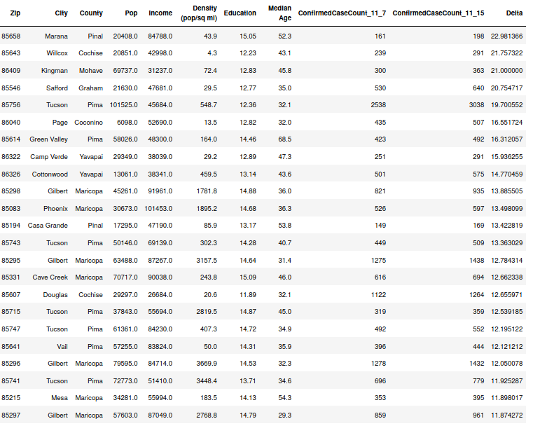
Details of the Normalized Case Growth

The below table is sorted by the Cumulative Cases per 1000 in a Zip Code. The Growth-Norm column represents growth in Cases per 1000 over the last month. Note that some regions that have experienced high case growth up to this point didn’t have nearly as large of Case Growth as other regions that had experienced similarly high cases in the past. These are circled in green. You can also see regions with larger than expected case growth circled in red. Are there any factors that might be correlated with this lower and higher amounts of growth?

The first thing that I rule out is Education and Median Age. These on the surface don’t seem to be related. Some regions with lower median age are right next to regions with 15 or so years higher in median age. The same applies for education. What I do see, however, is a trend with population density, where regions with higher population density seem to be seeing lower COVID case growth per 1000 people. This might make some sense if you think about how regions with high density generally always have high populations, and therefore, a larger denominator in the growth per 1000 person equation… However, this also means that the numerator (the change in case count over the last month) is disproportionately low. Which, I think is interesting. Why would there be less cases than expected in regions with higher density? Thoughts:

  1. I wonder if this might be an indicator of the effectiveness of government interventions (mandatory masks, school restrictions, etc.)? Since all the data I’ve seen indicate that school restrictions aren’t resulting in large numbers of case reductions (regardless of whether they’re in school or not, every study seems to be showing that people under 15 don’t really transmit the virus), and most regions don’t have restaurant/gym/bar closures now, I’m assuming if it is anything it is the mandating (and compliance!) with the mask restrictions. Unless someone can chime in with a different idea…. Compliance is an interesting thought, because it seems like in a more populous area, there appears to be more social pressure to comply with COVID restrictions. Whereas, my observation is that in less dense areas, the social pressure is much less.
  2. Also interesting to me is the resurgence of cases on the border. These regions were very quiet ever since the summer wave slowed down and generally went from having the highest case rates in the country down to the very lowest. But now we see Yuma and Santa Cruz counties experiencing case growth again. Also, the South Mountain region of Phoenix (85042) is also experiencing another surge in cases. But looking at the highest number of new cases per 1000 over the last month, we see some interesting places. Page (up near Lake Powell), Cottonwood (near Prescott), and Douglass (on the border, but only lightly affected during the summer border rash of cases) all are near the top of the list with 85350 in Yuma.
Zip Codes Sorted by Density (orange) with last Month’s Case Growth in Blue.

Interesting COVID-19 Chart – Comparing County Results with State Testing Rates

The chart below looks complicated, but don’t let the looks deceive you. Here’s Pima and Maricopa Counties cumulative Cases per 1000 people (and the trend lines) compared to the number of daily tests in the state (it’s trend line is the orange, dotted U-shaped line.

  1. You can see the weird bump around 9/20 or so on the Pima County line. That is the first few days U of A tested out their homegrown antigen test on lots of students. The bump represents the excessive false positives in the test (they fixed it, I think). Remember, just because you test positive for something doesn’t mean you have it!
  2. The U trend on the tests is really interesting to me. Even as the summer wave was accelerating (far left) we see the trend in tests decreasing. Then when the cases are largely flat we see the trend reverse and start increasing. This could be some sort of psychological effect or maybe the number of tests is some sort of a leading indicator of case rates? This seems like an informative chart, so I’ll post it every week or two.
  3. Maricopa’s normalized case rate is around 7 cases per 1000 persons higher than Pima County. This has been sustained since mid-May. Not sure what it reflects, but it could be the greater adherence to government mandates (mask, distancing). Or it could have some demographic cause? It does seem that activity/going to work results in infections, because the normalized infection rates (per 1000 persons) are identical across the whole “working-aged” 20 to 64 age range. The 65+ population has just over 1/2 the rate per 1000 of the working-age group and the under 20 population has just over 1/3 of the rate per 1000 of the working age group (see second chart below).

COVID-19 Update: The Latest on the Current Outbreak – 11/17/20

Here’s the latest update on the current COVID-19 outbreak with backing data. I’ll show a number of different views of the data, including some extra focus on the Arizona data since I have my best data from my own state. Always happy to take requests from folks from other states.

Arizona COVID-19 case growth by Zip Code – 11/7 through 11/15

Note below that we’re still not seeing a whole lot of repeats in the top 30. I think that some geographic areas are surging and then slow down. This week a new zip code from Pinal County is now at the top with 20 percent growth, but since their numbers were already very small, it’s probably not as relevant as 85756 in Pima County, which is the first county that has shown up recently in the top 30 this fall that had significant cases in the summer. It is a relatively large zip code in population, as evidenced by the large orange bubble below. If you look closely, it does appear that the majority of the top zip codes have a relatively young median age. The main exception is 85614, which is a Green Valley zip code and has a median age of 68.

Top 30 zip codes by COVID-19 Case growth from 11/7 to 11/15
Table of top zip codes by COVID case growth – 11/7 to 11/15

Case Growth Across Arizona over the Last 2 months

Note that 85719 (home of the U of Arizona) stands out over the last 2 months. Fortunately, due to the low median age in this zip code, there appear to have been no deaths and few hospitalizations in this zip code for all these cases. It’s also fairly certain that many of the cases in this region were false positives due to this zip code being the first to use the U of A’s antigen tests, which have been demonstrated to have high false positives. 86001 in Flagstaff also has a major university, and thus, higher case growth over the last 2 months. Initially, during September, 85009 from SW Phoenix had high case growth, but it slowed down and this zip code is no longer in the top zip codes for case growth.

Table of top zip codes by case growth from 9/12 to 11/15

Arizona Cumulative Case and Death Curves

I like looking at the data this way because it becomes clear if growth rates are linear or if they are increasing non-linearly (the upward curve). Right now, we’re seeing nonlinear growth in Arizona cases, but probably more like linear growth of deaths. Deaths seem to be increasing at a rate of about 23 per day, which seems to be just slightly above the average since 9/11. Cases however are increasing non-linearly and the instantaneous slope today is around 2100 new cases per day. It’s hard to tell at this stage because things can change quickly, but it’s possible that the slope of this phase of the outbreak is lower than the slope from the start of the summer outbreak (around June 14th).

Arizona Hospitalization Status

I have been hearing word that the hospitals are heavily burdened by COVID cases again. This is likely very true and may be different in different localities. However, at a state level, there is still no need to be afraid. Here is the ICU Bed status for the State from the state Dept of Health Services dashboard. The increase of COVID patients has been nonlinear since October, but the numbers are still around 20% of the state’s ICU bed capacity. I expect that the grey bars will get squeezed by COVID before this outbreak is over (much like it did in early July).

US State Case Growth Rates

These tables allow you to see case growth rates as well as cumulative case and death numbers per 1000 people. Note that North and South Dakota are still right in the middle of the fight and their case acceleration rate is still quite high (Montana is catching up).

COVID-19 Update 11/7/20: The Latest on the Winter Outbreak

I think until this current outbreak slows that I’ll continue to do weekly data dumps for people who need to see the latest data in a unvarnished, non-manipulated form. Again, I’ll have better data for Arizona since I live in that state and have collected data from the state Dept. of Health Services for much of 2020. Of course, they don’t make it easy to collect the data in any form except the current day, so I have to go back every day and capture the latest. However, by doing so, I feel like I have insights that many don’t have. One of my reasons showing the Arizona data in such detail is that I feel that the behavior of the virus is similar in all regions and perhaps the Arizona results can provide insight into COVID activity in other states.

Zip Code Data

I feel that the Zip Code case data (wish I had deaths/hospitalizations by zip code too, but that is not provided) is valuable at understanding how the outbreaks are trending. For instance, we continue to see the largest case growth for this current Arizona winter outbreak in areas that weren’t hit very hard by COVID during the spring or the summer. This raises a couple of questions… 1) Why is it just hitting these regions now? Some of them are places that people from Tucson or Phoenix travel for vacation. I would have expected the case growth to have occurred along with the big outbreak in Arizona over the summer. The second question this raises is if this is an indicator that we’re seeing the effect of immunity in the areas that were hit hard over the summer (Yuma, SW Phoenix, S. Tucson, Nogales). See the latest charts below on the case growth in the last week across Arizona. Note in the table that there aren’t any obvious patterns in this wave (see my zip code correlation study from July here which demonstrated a number of patterns in the summer outbreaks)

Top thirty zip codes by Case Growthfrom 10/31 to 11/7. Red bubbles are the areas of highest growth. Diameter of the bubbles represents population of the zip codes.
Top 20 Zip Codes by Case Growth – Table of Info

Deaths Per Day

I think a lot of people are fairly aware that deaths have decreased in count since the big COVID waves in the Northeast this spring. I was curious how the “Daily Death” count in Arizona compared between the over 65 and the under 65 age demographics through the big summer outbreak and now in the winter outbreak. The plots below that perform this comparison are stacked bar plots. You can see three things in each bar, the under 65 deaths that day (the height of the blue bar on the Y-axis), the over 65 deaths that day (the difference between the height of the red bar and the blue bar), and the total deaths (the height of the stacked blue-red bar for the day). Hopefully that’s clear enough. But it’s a pretty useful chart, especially for visualizing differences between 2 or 3 groups.

The first plot shows raw numbers of deaths (blue is under 65, red is over 65). Therefore you can see that on the highest day for deaths during July we saw somewhere over 50 deaths in the under 65 demographic, around 120 deaths in the over 65 group, and about 170 deaths total. This is a good way to view the data and it reveals that on most days, there are many more deaths in people over 65. However, this isn’t that informative of a visualization, because the blue bars represent 87% of the state’s population. Therefore the second graph shows the death data normalized by the population of the group. I’m representing it as deaths per 100,000 people in the age grouping so the numbers aren’t too small to be meaningful. Therefore, now you can see that on the same day that we saw the 170 deaths, on the chart with normalized data, this represented about 13 deaths per 100,000 persons over age 65 and just under 1 death per 100,000 persons under age 65. This is a good way to visualize the true impact across age groups. If I separated the age groups under 65 it would be evident that the deaths are far more rare under age 45.

Cases

Now that I’ve demonstrated normalizing by population, here is how the cumulative case curve looks when normalized by the population of each age grouping. You can read this as that the 55-64, the 20-44, and the 45-54 groups all currently have cumulatively reached 45 cases per 1000 persons in their group. Note that this is just the cumulative count, not the number of cases currently active! What this shows us is that case growth for the three groups above has tracked almost identically since June. The interesting points to note, however, is that the over 65 case count when normalized by the over 65 population numbers is much lower (even though their deaths are much higher) and the under 20 normalized case counts is even lower. This tells us a few things. Cases are rarer in the 65+ population and even rarer in the under 20 population. The fact that 65+ deaths have been so much higher on a smaller number of cases shows that getting COVID is much more deadly proposition for this age group.

Case rates normalized by age demographic population – Arizona – 11/7/2020

Hospitalization

A while back, the Arizona DHS improved their hospitalization status chart by adding the COVID cases in. Here’s an example of the ICU bed usage across the state. The other types of hospital bed usage charts look basically the same, but you can find them by following the link above. We see the peak from the summer hitting and the non-COVID ICU patients were squeezed out. Utilization never really went over 90% because of the hospitals’ ability to manage their beds. Then as the hospitalizations from COVID crashed in late July, new patients flooded into the ICU beds to keep the overall utilization around 80%. Now it’s creeping up again due to an uptick of COVID patients. I’m curious (and hopeful!) if the increase in COVID hospitalizations will be more gradual during this outbreak. It seems likely to me, but we’ll have to watch.

AZ ICU hospital bed usage by type (COVID vs. Other) – 11/7/2020

COVID-19 US State Table

The below is sorted by the “acceleration” of cases per day. Therefore, North Dakota is seeing an increase of 0.0388 cases per 1000 persons every single day. Therefore their case velocity (IROC_confirmed) of .9640 cases per 1000 persons will likely increase to around 1.03 cases per 1000 per day tomorrow and 1.0688 the following day. This acceleration metric (dIROC_confirmed) is a useful indicator to determine when an outbreak is slowing in a state. When Arizona was number one on this list last summer this metric is exactly where we first noticed the change.
As you can see, the midwestern states are currently seeing the largest case growth, but right behind them are the Northeastern states. I’m hoping and praying that the daily Delta_Deaths metric in all of these regions remains lower than it tended to be during the spring.

COVID-19 Update 11/1/20: Case Rates Increasing all over

Since the trend is once again toward increasing case rates, I’ll just put out there a bunch of graphics and tables so you can see what’s happening.

Arizona Zip Code Case Counts

Since I live in Arizona and have followed it more closely than any other state, it might be interesting to see the trends in Arizona. My suspicion is that other states are seeing similar trends. Our first trend turns out to have been relatively low case rates and high deaths due to infections in communities at higher risk, such as our nursing homes and reservations. During this time period the whole state went into lockdown. Case rates were relatively low and constant throughout this lockdown period and a few weeks after. The second AZ trend was the summer outbreak, which I’m quite confident occurred in conjunction with a large outbreak at the same time in Mexico. During this time, we saw cases increase polynomially and mask rules were implemented across the board but did not slow down infections. If you look back in time on this site, you’ll see that the most heavily hit communities during this timeframe were the ones that had significant ties to Mexico (SW Phoenix, S. Tucson, Border Region). Now we’re in the third outbreak and what we’re seeing is the virus sweeping through the communities not touched during the first two outbreaks. Though case rates are increasing, death rates remain relatively low.

Top 30 zip codes by COVID case growth from 10/21 to 10/31. Color represents % growth and size of bubble represents the population of the zip code
Table of data relating to the Zip Code Chart

In the above two diagrams, note that none of the heavily-infected zip codes from the summer are present. These are generally areas that haven’t been hit hard yet. This makes me suspect that in this wave there is some element of immunity to COVID being expressed by the harder hit zipcodes from the summer. Perhaps this is a normal balancing we should expect.

Data on Each County from Arizona

The above table confirms the above. The top 5 counties all have had lower case rates to date (see their cases per 1000 numbers). You can also see how the death rates range from the high in Apache and Navajo Counties, both of which were hit hard back in the early days of the outbreak when deaths were higher, all the way down to tiny Greenlee County. Maricopa and Pima Counties, which have the large populations, are somewhere in the middle.

Other US States

State COVID Data sorted by Case Rate Acceleration (dIROC Confirmed) – 11/31/20
State COVID data sorted by Death Rate Acceleration (dIROC_deaths) – 11/31/20

The above two tables show the states that currently have the highest accelerations of their case and death rates. Acceleration means that the slope of cases (# cases per day) is getting larger or smaller over time. As you can see, North Dakota is in the unfortunate position of having the largest case acceleration (an increase of 0.038 cases per day, every day) and the largest death acceleration (.0035). Interestingly, though South Dakota has tracked right with North Dakota on cases, the death rates are much lower in South Dakota. This makes me suspect that in ND the virus got into a community somewhere that was highly susceptible but in SD it didn’t. Note that ND’s death acceleration is almost 3x the next highest (Iowa). Fortunately, in this latest outbreak, deaths continue to be rare.

Additionally, we can see the Northeastern states creeping back up to the top of the case and death rate lists. In other regions, it seems like when COVID comes back a 2nd or 3rd time the death rates are much smaller, so what’s happening in the Northeast is puzzling. I’d have to look closer at those states (i.e., by zip code) to figure out exactly what is happening.

World Data

I’ve shown the below diagram a few times throughout the COVID outbreak and interestingly, the trend continues that the virus is unusually inactive or unmeasured between about 10 degrees South and 30 degrees north. The below shows the cases and deaths per 1000 since the start of the outbreak by latitude. Other than the growth in 20 to 10 degrees South (Brazil) and 20-30 degrees North (India) not much has changed. Note that despite, India’s large COVID numbers, the overall number of cases and deaths per 1000 people is still much lower than other regions.

Normalized number of cases and deaths per 1000 people by latitude.

And below shows current states for countries + US States sorted by normalized case growth rate (IROC_c_n). We see tiny Andorra at the top of the list, but a number of European countries are moving back up the list. Note that in Belgium (the country in Europe that had the highest death rate), the current death rate (IROC_d_n) is a good bit lower than Czechia, a country that was largely missed by the first round of COVID.