Baseball Scoreboard, Part 2

Scoreboard at Chase Field, Phoenix, A

In the previous discussion (Part 1) on the measures seen at a Baseball park, I covered the pitching metrics seen here fairly heavily. It is possible that hitting metrics are reasonably well-known in many places, but there is at least one here on the scoreboard that some explanation may be required.

The Triple Slash Line

Review of the “Familiar” hitting statistics would start with what is sometimes known as the “triple slash line“. This is simply three statistics that are frequently seen shown in order separated by slashes, like this: AVG/OBP/SLG. This refers to, in order, Batting Average, On-Base Percentage, and Slugging percentage. The Batting Average definition is the percentage of at-bats ending in a hit. An at-bat is defined as a plate appearance that ends in an out (excluding sacrifice flies), a hit, a fielder’s choice, or an error. For years, batting average was the preferred statistic for comparing player performance, but in recent years, the other metrics in the triple slash line have increased in prominence due to their impact on scores (and thus, wins). On-Base Percentage is more simply defined… it is the percentage of plate appearances where a batter reaches safely (could be a hit, walk, or getting hit by a pitch), excluding reaching by error, fielder’s choice, or a dropped third strike. This metric goes back to the Hall of Fame manager of the Brooklyn Dodgers, Branch Rickey, who is still beloved for his innovations in baseball (including signing the great Jackie Robinson and breaking baseball’s color barrier). One of the breakthroughs of the Oakland General Manager, Billy Beane, that became famous in the movie “Moneyball” was a stronger reliance on OBP when signing free agents. FInally, Slugging Percentage is a metric designed to give weight to a batter’s power. The formula is (#Singles + 2*#Doubles + 3*#Triples + 4*#Home Runs)/Plate Appearances. This makes slugging percentage useful, but not necessarily perfectly correlated with runs and therefore wins.

As an example of how the triple slash line can aid in evaluating player value, consider these two players (2024 stats as of 6/20/2024).

Aaron Judge (Center Field, NY Yankees): .303/.429/.697

William Contreras (Catcher, Milwaukee): .304/.364/.461

Though these two players (both having very nice seasons) have almost identical batting averages, that doesn’t tell the full story. Aaron Judge has batted in 66 runs this season whereas Contreras has only batted in 48 (on very similar numbers of games played). Judge has 27 home runs to Contreras’ 9. Amazingly, Judge has been walked 30 more times (57 to 27) than Contreras. Obviously this means that in walks alone, Judge has had 30 more scoring opportunities than Contreras. This has translated to Judge scoring 5 more runs this season. But this is at the cost of 20 more strikeouts for Judge. Lots to think about! First, let’s discuss the impact of RBI and HR to wins .

The RBI, short for Runs Batted in, has always been seen as a fairly critical metric in baseball, as it recognizes a hitter’s role in a run being scored for their team. It can result from a hit, a sacrifice fly, or even a walk, but not an error. In a sense it is a really valuable metric because it shows impact on the most important measure, the runs a team scores in a game. In another sense, one may over-reach when comparing players by their RBI accomplishments, because a player who is preceded in the batting order by a player with a stratospheric on-base percentage has a much higher chance of having a hit bat in a run. So RBI isn’t comparing apples and apples. There is a big controversy over the RBI metric amongst baseball nerds due to this. If you want to go deep down this rabbit hole, here is a good article from Bleacher Report back in 2012.

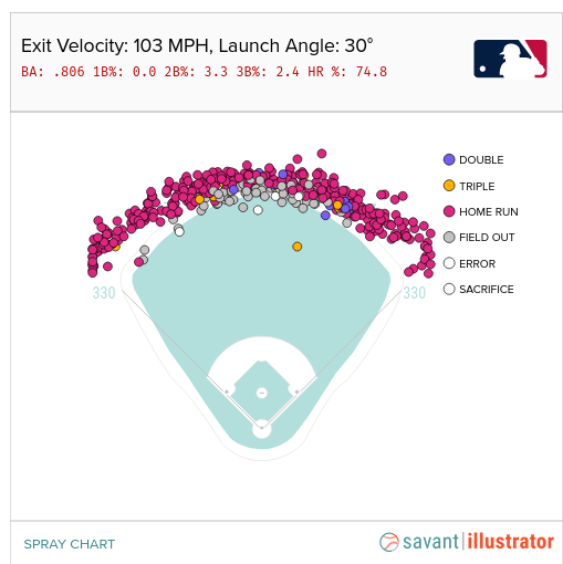
The appearance is that more home runs lead to a greater number of wins for one’s team. The home run (especially one that ends the game!) is exciting and draws fans more than anything else. The modern era of baseball is often referred to as the “Long Ball Era” due to the prevalence of home runs in the game. A method to identify the value of the home run called regression shows that home runs tend to be highly correlated with win percentages. Conceding that home runs are correlated with wins, the next question would be if home runs CAUSE wins. These are two very different things. Ice Cream sales are highly correlated with higher temperatures, but we cannot say that the temperatures cause the sales. The answer to the question about home runs causing wins is a hard one, and there are plenty of scientific papers analyzing this (and doctoral dissertations!). What seems obvious is that teams value the home run highly — even in the face of the higher numbers of strikeouts that power hitters tend to rack up. One thing that we know, though, is that teams express value through the salary they give a player. In this respect, Aaron Judge stands out with his $40M annual salary compared to the $760K that the Brewers are paying Mr. Contreras! (I think he’ll be getting a raise after this season!) Here’s where I found these salaries

The Mystery Metric, OPS

All of this builds up to the final metric on the scoreboard that is less known, OPS. This stands for “On-base plus Slugging” and is actually a combination of two metrics from the triple slash, OBP and SLG. They’re just simply added together. I suppose this metric saves fans time (or the mathematical embarrassment) of adding the last two numbers in the triple slash together. The intent of the OPS is to provide a view into overall effectiveness of a hitter and their potential value for scoring runs. The historical record for OPS was rung up by Babe Ruth (1.16), followed closely by Ted Williams and Lou Gehrig. So clearly it is a measure of the historical greatness of a player. By the way, keep an eye on Aaron Judge’s OPS in 2024 (currently at 1.126), as he is threatening the Babe’s record!


A Quick Tour of a Baseball Park Scoreboard

In the modern era of more and more esoteric baseball metrics, how can one understand what the ballpark is telling us?

Scoreboard at Chase Field, Phoenix, AZ

This weekend I went to the Diamondbacks game at Chase Field, a treat I have enjoyed for a number of years. As a person who likes numbers, it struck me that the stadium was even more awash in statistics than ever. It brought a lot of questions to mind, some of which I’ll explore in this blog entry.

The Scoreboard, Explained

Much of this scoreboard layout looks fairly familiar to someone who may have looked at box scores or attended other big-time baseball games. The score by inning is something that has been featured for years. It tells us something interesting, the rate at which the two teams have been adding to their score. Knowing how pitching assignments work in major league baseball, one can quickly surmise that the White Sox starter got shelled early and seems to have stabilized a bit by the fourth inning. The Diamondbacks’ starter, however, seems to have pitched a fairly solid first four innings, because we can see that he has given up only three hits (less than one per inning). The White Sox scored one run off of him in the third inning, but we can also see that Arizona has one error. Did this error result in the one run? If so, that would be an unearned run and therefore wouldn’t be counted against the Diamondback pitcher’s Earned Run Average. We can see more about the White Sox pitcher, Drew Thorpe, because the scoreboard gives more info about active pitchers in the upper right (the D-Backs were batting when this image was taken). Drew hasn’t had such a good game to this point… in 3 innings he has given up 4 earned runs… that translates to an ERA of 12.0 at the moment. He has also given up five walks (BB) and six hits, which results in a WHIP (Walks and Hits per Innings Pitched) of 3.67. Additionally, his ratio of Strikes to total pitches (strikes plus balls) is 0.52, which is 0.1 lower than the MLB average. Top pitchers typically have numbers like .65, so clearly Drew is way behind the pace of the best pitchers here. All of these measures (WHIP, ERA, %strikes) are very bad for Mr. Thorpe’s year averages and we can get all of this from the scoreboard.

The metric FPS% refers to First Pitch Strike Percentage. The Major League Baseball average is 57% and we can see that Thorpe is sitting at 47%. This is a pretty interesting metric. Weinstein Baseball (here) tells us that “if a big league pitching staff improved their first pitch strike percentage from 57% to 80%, it would translate into 100 fewer runs allowed over the course of a season. That translates into 10 more big league wins.” So what the scoreboard is showing us here is that Drew Thorpe has a control issue today… He’s giving up a lot of walks (per Weinstein, “70% of walks start with first pitch balls”) and possibly in trying to get the ball over the plate “whatever it takes” he may also be giving up some easier pitches to hit.

One other metric regarding pitching that we can take away from the scoreboard here is “MVR”. This is placed just to the right of the Error (E) column. I actually had to Google this one during the game. It’s kind of new and stands for “Mound Visits Remaining”. So Mr. Thorpe has already had more than one mound visit during his first 3 innings and now only has two left. This is probably part of baseball’s desire to speed up the games and make them less tedious. The pitch clock is another similar effort, where there is only thirty seconds allowed between batters. ESPN tells us (here) that the pitch clock has reduced baseball games to an average of 2 hours and 40 minutes (24 minutes shorter) due to the pitch clock. This has also corresponded with a spike in batting average and stolen bases. It seems obvious that penalizing a pitcher by restricting their time between pitches is likely to reward hitters and base runners.

Pitch and Hit Exit Metrics

Another thing that I found very interesting is a display I had never seen before at the ballpark. See below.

I found that this was very distracting, because my brain wanted to identify the patterns of how they were classifying the Pitch Type. There were a number of different labels for pitch type, among these was “four seam fastball”, “cut fastball”, “slider”, “changeup”,”sinker”, “sweeper”, and “curve”. The “Vertical Break” and “Horizontal Break” numbers were very interesting. These data are captured by camera-based systems called Trackman or Hawkeye and are used across many different sports. There’s a great article in Baseball America (here) on how these pitch classifiers are able to label the pitch type. What I found is that the pitch types are calibrated to speed… a pitcher who threw a 100 mph four seam fastball also seemed to have their pitches in the 95 mph range that didn’t “rise” so much classified as a sinker. Whereas other, slower, pitchers may have had sinkers in the 80 mph range. Pretty interesting.

I also found myself looking after ball contact at the launch angle. A launch angle over 40% often indicated that a pitch that looked to the eye like a home run might actually just go to the warning track. Baseball Savant has a nice tool (here) where you can pick an exit velocity and a launch angle and see the actual outcome. For instance, below, 103 MPH exit velocity coupled with 30 degree launch angle was a Home Run 74% of the time!

Conclusion

Baseball parks have become inundated with information visualizations over the last few years. In some cases, advanced sensing and tracking systems like Hawkeye have enabled these new metrics to be collected. In others, new rules like the pitch clock and maximum numbers of mound visits have created demand for new metrics. But overall, baseball has always been a sport focused on its numbers, which is just one reason why many of us number people love it so much!

Link to Part 2 – Hitting Metrics

Update: xG and Luck Update for Premier League

In the previous entry, I compared the expected goals / Luck metrics between the last two completed MLS seasons. Now that the Premier League season has come to a close, we can do the same thing to see if any new patterns jump out at us.

2023-2024 Premier League final results

A quick overview of what we see above would go something like this… Manchester City finished at the top of the league in points, followed by Arsenal. The teams are sorted by final point tally from left to right on the chart. The three teams to get relegated are on the far right (Luton Town, Burnley, and Sheffield United). Things I see:

  1. Man City and Man U always have the highest salaries. Lately Man U has been inconsistent in play and has been finishing out of the top four. Their expected goals for/against ratio is a bit lower then their direct neighbors in points (Chelsea and Newcastle). We don’t know exactly why, but it reflects their overall efficiency at taking and preventing good shots. For some reason, Chelsea and Newcastle were a bit more efficient at ensuring that they got more good shots than their competitors in matches. Interestingly, we see West Ham sitting at about 1/2 Man U’s salary but with nearly the same xG ratio. But West Ham finished 8 points lower than Man U. Perhaps there are ways that expensive players help other than in the xG ratio. I might imagine that expensive, ostensibly better players may be slightly more likely to score when taking a good shot or to prevent an opponents good shot from going into the net.
  2. Salary in the Premier League seems to always be more important than in MLS. The top salaries are always in the top 1/2 of the league in points in the Premier League, but this is not as strongly observed in MLS.
  3. Luck. Sometimes there’s an interesting disparity between luck at home and luck on the road (the yellow and green lines respectively). Near the top of the rankings, we see that Liverpool’s home luck is below zero (meaning that they score less goals on average than their expected goals would predict) but their away luck is above zero. I did a quick google on Liverpool and “home luck” and found this. So others have noticed this, but I don’t see that they have observed that most of Liverpool’s luck has been in away venues. On the bad side of the rankings, though, we see large differences open up between home and away luck. All three relegated teams really struggled on the road to score up to their expected goals (i.e., good shots weren’t going in). Clearly this is an important measurement for identifying that your team is in big trouble. Conversely, though, if your team finishes positive on both home and away luck, it seems that this can offset a big salary differential (see Arsenal, Aston Villa, Tottenham, and Newcastle, all in the top half of the league in points).

2022-2023 Results for Comparison

2022-2023 Premier League final Results

Stuff to discuss:

  1. Chelsea was a strange outlier during this season regarding salary and final point tally. Their xG ratio is below 1 and both their home and away luck are negative. Efficiency seems to have been an issue. Compare to Fulham who finished 8 points ahead of them with somewhere around 1/4 of the salary. Fulham had lower xG than Chelsea this season but had great luck both home and away. Note that Chelsea finished higher in 2023-24 and Fulham finished much lower as their luck regressed back to the mean.
  2. There’s also a big delta between Nottingham Forest’s home and away luck during this season. They finished just ahead of relegation, but maybe they did so just by the skin of their teeth due to their abysmal away luck (lowest in the league). Note that in 2023-24, Nottingham again skated just ahead of relegation, but both their home and away luck were just below zero. Speaks perhaps to inconsistency in scoring off of good chances, probably a predictor of a future relegation.
  3. We again see a number of teams in the top half where positive away and home luck offsets a salary gap. Note Arsenal, Aston Villa, Brentford, and Fulham all in the top half.

LINKS to Other Soccer Analytics Entries

  1. Soccer Analytics Series Intro
  2. MLS and Premier League Comparison
  3. Home and Away Luck Metric
  4. Does Counterpressing Work? Evidence.
  5. Evaluation of Outcomes using the Luck Metric
  6. More Analysis using the Luck Metric
  7. Soccer Analytics in Practice – Youth Soccer Example
  8. xG and Luck update on recent MLS season
  9. xG and Luck update on recent Premier League season

Update: MLS Latest xG ratio and Luck stats

I haven’t updated the charts in previous entries for the end of the 2023 MLS Season and the 2023-24 Premier League season. I re-ran my stats and here goes, MLS first.

2023 Final MLS season Stats – xG and Luck

Now to make a better comparison, here’s the results for the end of the 2022 season.

2022 Final MLS season Stats – xG and Luck

I like these metrics (xG ratio and Home/Away Luck) because they paint a pretty good picture of an awful lot that happens in a soccer match. As a reminder, xG stands for “expected goals” and the ratio is xG for the team being measured divided by xG of their opponent during the match. Expected Goals are calculated statistically based off of where a shot on goal is taken. Closer and more centered shots have a much higher likelihood of scoring, and therefore count as 0.5 or higher expected goals. The ratio, therefore, gives a pretty good idea of whether a team was getting in position to take good shots and whether they were limiting their opponents to less good shots. Luck is the comparison of the number of goals scored to the xG. If Austin FC scores 3 goals, therefore, but their xG is only 1.8, then they have a luck of positive 1.2. As you can see, it is quite possible to have a luck of less than zero too (meaning you were just unlucky. You were in position and took good shots, they just didn’t go in). The trend does seem stronger in 2022, though, than it does 2023.

Interesting Trends

  1. I don’t see any Luck trends from 2022 to 2023. This is unsurprising due to the statistical nature of luck, but one always hopes to find a pattern where some team is “making” their own luck.
  2. Since the teams are sorted by number of points (highest on the left), it is not surprising that the xG ratio trends pretty decently with the season points. We would expect teams that win more and therefore get more points for the season to also have better shots overall than they allow to their opponents. in 2023 we do have a few notable outliers (NYRB and Seattle) who had a really strong xG ratio but finished lower in points.
  3. MLS also shows an interesting trend where teams with high salaries (the blue bar) don’t always finish in the upper 1/4 of the league. In 2023, there are quite a lot of high salary teams in the lower 1/4, actually. This is very unlike what we’ll see in the next entry where we review the English Premier league results. Hard to put one’s finger on this completely, unless it has something to do with older European stars coming to MLS at the ends of their careers?

LINKS to Other Soccer Analytics Entries

  1. Soccer Analytics Series Intro
  2. MLS and Premier League Comparison
  3. Home and Away Luck Metric
  4. Does Counterpressing Work? Evidence.
  5. Evaluation of Outcomes using the Luck Metric
  6. More Analysis using the Luck Metric
  7. Soccer Analytics in Practice – Youth Soccer Example
  8. xG and Luck update on recent MLS season
  9. xG and Luck update on recent Premier League season