At some point in early 2021 the more mediocre articles about COVID in the popular media started to slow down and memes in social media began to disappear. Much of the focus in these places turned to vaccines and the new US administration’s approach. It seemed like a good time to slow down my COVID updates and instead spend time watching. For a while I have been concerned that overwhelming people with data and analytics about COVID was contributing to the overall problem of fear and distrust (although it seemed necessary in light of the poor communication from government and media). However, I’ve continued to collect data and run analytics. Here’s the latest data for those who are interested.
Topics:
- United States Situation
- World Situation
- The Latest on Interesting Analytics
United States

The above is the table that I have shown throughout the Pandemic. You can scroll back a few pages and see this table during the different outbreaks for comparison sake. Right now there is one big outlier, Michigan, interestingly one of the states with the most restrictive (or at least publicized) COVID policies. The good news is that Michigan’s current case rate is still only about half of what the highest state was during the winter outbreak. The next highest regions have significantly lower slopes. This is an unusual trend and may be indicative of the success of the vaccination policies that the states have put in place.

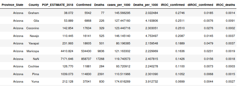
Arizona has significantly lower Case Growth than other states right now. The highest counties in the state are those who were spared a bit more during the recent outbreak. This has been a pattern throughout… the virus finds regions that haven’t been hard hit and then runs for a while until it runs out of targets or temperatures move outside the virus’ comfort zone.

One metric that I have been tracking is the ratio of deaths in groups over age 65 to deaths in groups younger than 65. In Arizona, only around 13% of the population is over 65 but this ratio is still somewhere about 3:1. This is a sign of how overwhelmingly COVID has impacted the over 65 age group. During the first large summer outbreak in AZ we saw a ratio of about 2.3:1. During the most recent winter outbreak, we saw the ratio peak up over 3. This increase might mean that right now there are less susceptible people under 65 than there was during the summer of 2020. The green line on the chart above is the moving average of this ratio. The recent peaks in this line are primarily due to the small numbers of deaths being recorded now.

Here we see the case growth curves for both Maricopa and Pima counties with the number of COVID tests per day superimposed. This metric (number of tests) is not a perfect metric but it appears to be a solid indicator of upcoming acceleration or deceleration in the COVID case curve. You can see for yourself that when it starts trending in a direction, a change in the case curves comes 4-5 weeks later. Currently the number of tests is approaching the low water mark but this remains a good number to keep watching to give us an idea of whether there will be summer outbreaks again this year.

This chart shows the percent of tests conducted yesterday with positive test results. The blue dots are the daily results and the gray curve is the best-fit line that describes the trend. The tests positive number hovered near 50% for a while and now is stable around 8-10%. It is concerning to observe that the curve shows signs of turning up again. If true, this may be an indicator of another summer outbreak in Arizona.
World Data

India has been in the news recently for their large number of new cases and deaths. 323K new cases in a day would be enough to intimidate anyone. The raw numbers seem scary, but note that the case slope (IROC_c_n) is very low for India (.2724). What this means is that right now, as a percentage of their population, the rate of new cases is quite a bit lower than other countries (see below). If one considers case acceleration (dIROC_c_n), we still see that India’s number of an increase in .008 cases per 1000 persons every day is small compared to countries like Turkey, Columbia, and Argentina.

We can see that India isn’t even in the top 10 in the world with regard to normalized case slope (IROC_c_n). Turkey, however, is very interesting with both a high raw count of cases and deaths, but also a very high normalized Case Slope. Turkey also has a very large population, but not nearly as many as India, so their numbers of new cases each day will be shocking (43K yesterday), but not as difficult to comprehend as the 323K new cases yesterday in India. So even though India isn’t as fully-saturated with COVID as Turkey or some of the South American countries, it’s still a problem for the world. India is one of the largest manufacturers (maybe the largest) of pharmaceuticals in the world. COVID vaccine manufacturing has dropped significantly since the start of India’s second wave. This is an example of how COVID can drive non-linear effects.
Updates on Interesting Analytics

I have showed the above a number of times during the pandemic. The trend still holds where the latitudes between -10 and 20 have experienced very few cases and deaths due to COVID.

I have also shown multiple revisions of my correlation studies over the last year. In the above we are demonstrating the levels of correlations of various measurable features with cases per 1000 for countries across the world. The top factors associated with COVID cases continue to be smoking and BMI metrics. What this says is that in regions where smoking rates and Body-Mass Indicies are high, we have seen larger numbers of COVID cases. It may not be surprising to see this. Population over 65 is also another feature highly correlated with Cases per 1000 and the inverse correlation of COVID cases with the prevalence of Tuberculosis in a country is still quite interesting. I know there were some studies into whether TB innoculations were somehow providing protection against COVID, but I lost track of those.

The above correlation is for death counts per 1000 persons. As with the Case correlation project, we see that smoking and BMI measures are strongly correlated with COVID deaths. Population size over age 65 is also (unsurprisingly) correlated with COVID deaths as well. For some reason, the growth rate of the country is inversely correlated with COVID deaths. Perhaps this is because a region that is growing is adding infrastructure like hospitals? This might seem to contradict the observation above that the number of hospital beds is correlated with COVID deaths, but my suspicion all along has been that countries with large hospital bed counts are probably recording more COVID deaths that go unrecorded elsewhere.


Tod,
As always, great analysis. As I continue to track and monitor AZ’s COVID cases, there continues to be a statistical difference by county regarding the number of positive case results as a percentage of the population. For example, Pima county where we live, is the 11th ranked of 15 counties from a ratio of positive cases perspective, but is the 2nd most populous county in the state.
Pima County has over the past month or so has continued to trend flat (around the mean) while Maricopa County has seen a statistical uptick since Mid-March. This is when I look at 7 and 15 day moving averages of positive cases. Pima county is beginning to shape a statistical trend down on the 15 day moving average.
Nice analysis… I’ve been very interested too when I see divergence between Maricopa and Pima.
Tod.