I haven’t looked at the zip code data in a little while so I was curious to see if the case growth was coming from different places. Here’s the top 20% of zip codes by case growth in the last month and a half (Note that I’m not showing the growth percentages… they range from 945% down to about 350% in these locations). Interestingly, some of the areas with the lowest case growth are the border counties that had the highest case growth back on 6/14. This indicates, obviously, that case growth is slowing in these counties.
Plots of top 20% of Zip Codes in AZ by COVID-19 Case Growth. Color represents total number of cases. Size of bubble represents population in the zip code. Note that all zip codes with less than 100 cases were removed from consideration
This is a more interesting way to look at the data than I had suspected. I add another dimension to the visualization by only including the top 20% of zip codes by case growth. Now we can see total number of cases (the color), the size of the zip code (bubble diameter) and case growth (the fact it’s on this chart).
What do we notice here?
1. We can see that a handful of zip codes with medium numbers of cases are apparently growing fast (the light green and orange).
2. We can also see that there’s large case growth on the fringes of the Phoenix metro area in zip codes that hadn’t been affected much (dark blue bubbles). This appears to include a handful of wealthier zip codes.
3. There is also a pretty large cluster of cases now in the East Valley of Maricopa County that didn’t exist before. This cluster stretches down to Florence, the location of the State Prison, which had a large number of cases per capita a month ago.
4. Both Pinal and Pima county are mostly absent from the top 20%, with only a couple of zip codes in Pinal (San Tan Valley and Apache Junction) and one zip code in Pima (Oro Valley) included. In the case of Oro Valley, the zip code (85737) just barely broke my 100 case limit for consideration, so their growth has been small in numbers, but larger in percentage.
5. Some of the large SW Phoenix zip codes (Maryvale, Laveen, Tolleson, South Mountain) are now missing from the top growers. This goes the same for the border counties in Yuma and Santa Cruz Counties
Conclusion
I have been wondering if there’s a mechanism that the virus “burns itself out” in a region/population. Perhaps there are some people who are many times more susceptible of getting infected who get infected first and then eventually things tail off. There could be a number of reasons for this: pre-existing conditions, personal and work situations, and perhaps even mild immunity coming from memory in T-cells or other mechanisms in the immune system (this seems pretty likely to me for a number of reasons… see this link from Nature.com). For whatever reason, the chart above does present the possibility that the current outbreak has burned out (new number of cases per day has slowed) in the previous AZ hotspots.
Update on Maricopa and Pima COVID Cases. Above is the chart I showed a few weeks ago. Not much has changed but here’s what I can see:
1. Cases are now growing at a noticeably lower rate than they were a week or 2 ago in Maricopa. Pima County rate is also lower. Note, though, that both are still increasing. Just at a lower rate. This COULD be a sign of a flattening or maybe it’s just a pause.
2. Tests have decreased (yellow dashed line) since the peak. This is kind of a chicken and an egg thing. It could be that less tests are being done therefore we have less cases confirmed. OR, it could be that there are fewer people feeling sick and therefore less people getting tests. We can’t really know since the state doesn’t have a randomized testing strategy.
3. From the state’s data dashboard, the percent of tests that are positive is still around 12% (and the trend is decreasing). This may be the source of our County Supervisor’s mysterious 11% “transmission rate” that he announced in the letter that recommended schools not reopen… If so, it’s not a very good metric for much of anything, much less school reopenings. All it means is that 12% of the people in the state who feel sick and get a test are coming up positive for COVID. The problem, again, is that the testing is biased towards people who feel sick or who work in professions where there’s a high likelihood that they will get exposed. I won’t go into it, but you can probably imagine other reasons why this isn’t a very solid metric.
4. If you look closely at either the Maricopa or the Pima County datapoints, you’ll note that the acceleration trend turned into a deceleration trend around July 2nd. This was hard to see until recently, but it seems pretty clear now. The interesting thing is that July 2 is about 2 weeks after both counties made a mandatory facemasks in public proclamation. This is pretty interesting and provides some measure of evidence of the impact of facemasks on a region’s case numbers. Of course it’s just an unplanned natural experiment and I can’t find a good control county (i.e., no facemask proclamation) to compare to. But still, interesting.
In the chart above, I’m showing the death trends since 6/13 by the youngest 3 demographics. Blue is under 20, red is 20-44, and yellow is 45-54. I’m leaving out the folks over 55 because their death rates are higher than these three and make these 3 look very minimal. Note that each of these groups has ~200 deaths or fewer since the start of the outbreak. The interesting thing to me is that the older two groupings both have slight exponential growth (curving upward). You can see this by the 2nd order polynomial fit that is about as close to perfect as a curve fit can be. The x-squared term shows the small magnitude of the acceleration of these rates. HOWEVER, the under 20 group is best fit with a straight line. It is not exponentially growing and indeed is barely growing at all. There could be a bunch of reasons for this, but I find it very interesting. First, many individuals in this group are more likely better protected because they’re not going to school, to the grocery store, or to camps (because most of those have been cancelled). Maybe this would mean that when they get infected it is with a lighter dose? Second, however, it is possible that this is an indicator of what the papers are suggesting and that is that people under 15 are relatively unaffected by this virus.
Above is the similar hospitalization chart for these 3 groups. When I fit the data points on the hospitalization chart, all three age groups are a linear fit. This means that though cases are accelerating and deaths are accelerating (slightly) for the older two groups, the hospitalization rates are steady. I presume that has something to do with the load management ability of hospitals.
AZ Cases, Deaths, and Hospitalization normalized by age group population
The above shows these numbers normalized by the population of each age grouping in Arizona. How to read this: Looking at the Under 20 column, this says that 9 out of 1000 people under 20 have had Confirmed COVID-19 Cases. 1.02% of these people with confirmed cases (.0927 out of 1000 people in the group) were hospitalized. 0.06% of the people in this group with confirmed cases died (0.0051 out of 1000 people in the group).You can see why I don’t show this chart much… in many cases the numbers are really too small to wrap our brains around. To help with understanding this, raw numbers for the under 20 demographic since the start of the outbreak are 11 deaths and 199 hospitalizations out of a population of 2.15 million people under age 20. * Note that the numbers the state provides for hospitalization by demographic seem to be in bad shape… not sure how trustable they are right now.
I saw an interesting article in the LA Times that indicated that the suburban counties of the LA area were seeing case growth higher than LA county. This seemed interesting, because the last time I looked it was no where near the case. I investigated, and thought it might be good to write about, because it’s another example of the lack of data science knowledge in the people that are influencing our opinions with their reporting.
The actual Data from California
Califormia COVID-19 Table – 7/19/20
Here’s the standard US State data table I use. This is the top 14 counties in California sorted by the instantaneous rate of change of their Confirmed Case curve. This is a measure that allows us to find the slope of a curve at any given day. I prefer this approach to averaging the last 7 days of cases, which is what a lot of the media are doing. This post will point out why the averaging approach can be misleading.
So What Do We See Here?
First, it seems like Riverside and San Bernardino Counties both have a higher Case rate of change than LA county. You can see that by their ranking. But it does seem like LA County still has a higher rate of change than Orange county, but by just a little bit… We can also see that LA county has a pretty high cumulative number of cases per 1000 persons. This is measured since the outbreak started whereas the rate of change just measures the current trend. So we would assume that San Bernardino and Riverside counties, who both have lower cumulative numbers than LA county, were probably much lower a while back, but are now catching up.
Cumulative deaths per 1000 are very low across California compared to back East. LA County has significantly more deaths per 1000 persons than Riverside, San Bernardino, or Orange County, but also significantly less than Chicago or New York City.
Imperial County is still the most impacted county in California. This is a border region near Mexicali, Mexico, where there is a very large outbreak right now. I have read that Imperial County hospitals were quickly overwhelmed with US Citizens who live in Mexico but preferred to be treated for COVID in the US. Many of these people have been transferred to LA area hospitals. Imperial County has the largest number of infections and deaths per 1000 people in the state and also has the highest case rate of change.
Why Does the Article Indicate that COVID is spreading Faster in Orange County?
The article indicates that the Inland Empire counties and Orange County all rescinded their mask orders and reopened earlier than LA County. The conclusion is that their case growth since then has been due to this. I think this is a fascinating natural experiment, but am not sure if there’s enough information to make this conclusion. Here’s the chart that the LA Times uses to make their case:
From the LA TImes, July 17
This looks pretty compelling at first. As with any chart, you need to read the fine print. They’ve been averaging the number of cases over the last 14 days and LA county has held pretty much between a 14 day average of 300 and 400 since 7/1. You can see that the trends for Orange County and the Inland Empire Counties have both increased faster than LA County. But taking a 14 day average of cases might present some problems. If I had 1000 cases each day last week and 200 cases each day this week, my 14 day average will be (7000 + 1400) / 14 = 600. There’s nothing wrong with that number, but clearly it doesn’t tell the story of my region. The story is that I had really high cases last week and something miraculous happened and my cases went way down this week. You can’t tell that story when looking at a 14 day average. Here’s a picture of what has happened in LA County and Orange County that kind of goes against the LA Times narrative:
Orange County Confirmed Cases from 3/18 to 7/17/20LA County Confirmed Cases from 3/14 to 7/17/20
See what happened in the Orange County case curve? Starting about Memorial Day, they had explosive growth in Cases, which started flattening around 7/10. There’s a pretty impressive shift in case growth from that day until the present. About half of the 14 day window the LA Times uses to average is “explosive case growth” and the other half is the new rate that they’ve maintained for a week. Therefore, if they had chosen the more standard 7 day average window (or even better, my preferred approach of instantaneous rate of change) then their chart would have told a completely different story. Who knows why the LA Times chose 14 days? Perhaps it was to make a political point or possibly (my preference) they just didn’t have the experience in house with data science to question their numbers and understand how to present data.
Conclusion
Even though I make this point on the LA Times data science approach, the fact does remain that the suburbs do seem to be catching up to LA county, and this is concerning. Like in AZ, where I have done quite a bit of research into the details of this recent surge in cases, there is probably a very complex story that can’t be simplified into a headline.
Backup – Inland Empire Counties charts
Note that we don’t see the same flattening in Riverside and San Bernardino that we do in OC. Also, the Death curves are below. When normalized by population, LA County and OC are about equal on the Instantaneous Rate of Change for Deaths. Riverside County is the highest for these four counties and San Bernardino has the lowest death rate of change (by a factor of 2).
Riverside Counties Cases from 3/24 to 7/17San Bernardino County Cases from 3/26 to 7/17
Table showing Regions ranked by rate of growth of cases per 1000 persons – 7/13/2020
Just a brief post to show who has the largest case rates. Arizona is in the lead. Note that everyone at the top of the list has very hot weather right now! Some, like AZ, Bahrain, Oman, Qatar, Nevada, Chile, and Utah have significant desert regions. Others like Panama, Florida, Louisiana, Texas, and South Carolina are hot and humid. This is probably not coincidence…
I’ve shown raw numbers of cases by age demographic in the past. Here’s a different way to look at it. In all of the charts below I have normalized each age group’s numbers by the total numbers of members of that age group in the state. For instance, the 65+ line in the “Cases per 1000” chart represents the numbers of people in the 65+ category who have been confirmed as having COVID-19 divided by the number of thousands of 65+ people in the state. Therefore, you can see that as of yesterday, there have been just over 20 Confirmed Cases per 1000 persons over 65 in the state. This is the same as saying that 2% of all persons in Arizona over 65 have been formally diagnosed with COVID-19 since the start of the COVID era. This doesn’t mean that 2% have it right now, of course, as these numbers are cumulative.
Arizona COVID-19 Confirmed Cases per 1000 Age Group MembersArizona COVID-19 Hospitalizations per 1000 Age Group MembersArizona COVID-19 Deaths per 1000 Age Group Members
What you may notice in the top chart (“Cases”) is that three of the groups have been tracking together since about 6/11 (note that since I have to collect this data from the state dashboard by hand every day, I only have back to 6/11, the day I started this practice). These groups even seem to follow the same exponential curve. When not normalized by the age group, these three all look much differently due to the difference in the populations (there are many more 20-44 year olds). This makes the case that the virus affects this range from 20-64 in a very similar way. You’ll also note, however, that the 65+ group and the <20 group are very different. This is interesting so lets reason about this.
Why are the 65+ and >20 groups different regarding Case rates?
I think there are two different stories here. For the 65+ group, one just has to look at the deaths chart to note that they are the group that is much more at risk than any other. This is widely known by all including people in this age group! My guess is that they are the age demographic that is being the most cautious about COVID. If true, then their efforts (distancing, masks, etc.) appear to be effective. The second group that is being affected less as a proportion of their population is the under 20’s. This grouping is a bit unfortunate, as it includes both children and adults (I wish they would provide case numbers for under 13 as well as 13-20). Regardless, it does seem like this grouping is far less likely to get infected with COVID-19. My suspicion is that most of the infections that do occur in this group are in the 17-20 age range, but I can’t prove that. I would also guess that the significantly lower incidence of infection in this group is due to a combination of the lower mobility that people under 16 have and a more optimal immune system response.
Case Growth Linearity
Although the case growth appears non-linear when viewed by raw counts, only the groups between 20 and 64 appear non-linear when normalized. The 65+ and under 20 groups both appear to be mostly linear. What this means is that the rate of growth (i.e., 40 cases per day) stays consistent and doesn’t go from 40/day one week to 50/day the next week and so forth. This is interesting and probably indicates some sort of resistance to infection, either through natural causes or practical effort.
Government Measures to Slow the Rates
There have been a number of measures taken by state and local governments during this period that have attempted to slow the case growth rates. Many of these started on or around 6/19/2020 when both Maricopa and Pima Counties unveiled new mask ordinances. My expectation was that I would see case rates decrease (i.e., “flattening the curve”) about 10 days after the measures were put in place. As you can see, there is very little indication of any effect yet on case growth (or hospitalization or deaths). There is a slight slope change in Case Growth over the last 2 to 3 days, but there’s a good chance that’s just due to data collection issues. From my experience, I don’t trust any trend in the data that I can’t see over a full week.
A few reasons that might explain the lack of an effect from the recent COVID state and county ordinances:
Possibly people in these regions (especially the most affected parts of these counties) are not being consistent in their compliance to the new rules. In the areas around my home (a zip code that has been very lightly affected by COVID) I observe very impressive compliance, but I’ve noticed in other regions of the state that there is significantly less diligence around COVID-19 safety measures. How to measure this kind of compliance is interesting and this would make a good social study…
Perhaps it still to early to observe an effect (and hopefully the three-day trend we can start to see will become more pronounced). My assumption that the lag between infection and symptoms and the lag from positive test to data being published would sum to something less than 2 weeks may have been wrong. If so, then we should be able to measure an impact and evaluate the lag times at some point in the future.
It’s possible that there is a different method of transmission that we’re not considering where people are getting infected in times when their masks are off and/or their social distancing is more lax. I’ve been thinking about heating, air conditioning, and ventilation for quite a while and was studying the aerosolization of the virus very early on. This might be one example of an unexpected transmission route. If this is true, then it might mean that the CDC and the State/County/City governments may need to re-evaluate their recommendations.
One Arizona county where there may be some measurable effect due to the Government measures is Pima County. It’s not dramatic, but it is a visible change in the slope of the 20-44 age grouping approximately two weeks after the county mask ordinance and new state measures were ordered. See chart below where I show raw case counts (not normalized… this is why it looks different). Unfortunately this effect is not seen very clearly yet in Maricopa County or Pinal County data.
Pima County Cases by Age Demographic – raw case counts – 7/13/20
Hospitalization Curves
It is interesting how the different age groups are seeing clear separation in their age-normalized hospital rates (whereas 3 of the groups had pretty identical case rates). Each age group (except the under 20 group who is seeing little growth at all) is seeing mostly-linear growth in hospitalizations, but based on evidence from people working in the hospitals (the hospitals don’t publish data they’re not required to publish, so we’re left with stories from their workers) the combination of these is enough to overwhelm the limited resource of hospital beds and staff.
Death Curves
Deaths have been increasing over the last week or so and you can see that one of the reasons is that there is a slight acceleration of deaths in the over 65 group. To date, this group has accounted for over 85% of the deaths in the state. The fact that their death rate has accelerated over the last 10 or so days is concerning. Not really sure what to attribute this acceleration to (hospitalization was pretty linear for the two-three weeks prior to the acceleration starting).
It has been interesting to see that the distribution of Confirmed COVID cases in AZ has followed the Pareto Principle. This principal is also sometimes called the 80/20 law and essentially refers to a process where 80% of the effects result from 20% of the causes. There are lots and lots of examples of this in nature and society, such as:
20% of criminals commit 80% of crimes
80% of the world’s wealth is held by 20% of its population
Microsoft found that 20% of Software bugs resulted in 80% of the crashes
20% of drivers cause 80% of all traffic accidents
80% of pollution originates from 20% of all factories
20% of a companies products represent 80% of sales
20% of employees are responsible for 80% of the results
20% of students have grades 80% or higher
Why is this principal useful? Not all issues follow this principal but a surprisingly large number do. Lots of business gurus have a strong intuition for problems that might be Pareto problems, because that gives them an easy place to attack (the 20%) in order to realize lots of gains (the 80%).
How does this apply to the current summer Arizona COVID-19 outbreak?
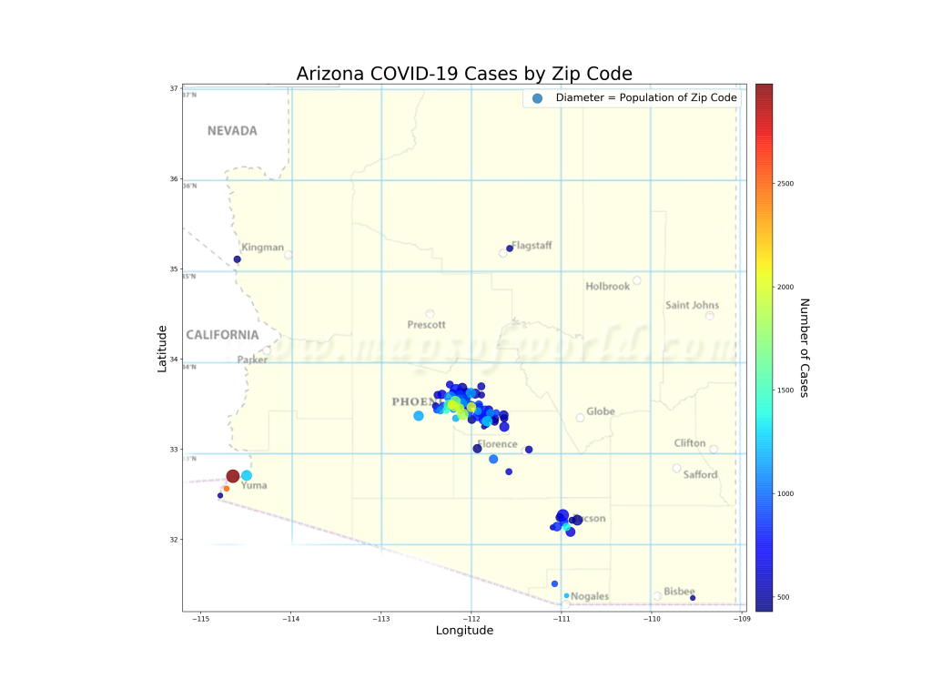
The map below shows the 20% of zip codes in Arizona that account for 80% of the cases (by the way, I checked, the top 20% of zip codes for cases per 1000 people also comes out to 80% of the cases). If I were running the state response, these are the zip codes I’d be focusing on. Probably my start would be to flood the areas with low- or zero- cost tests so I’d know exactly where the outbreaks are occurring in those regions and hopefully what the transmission vectors are. Perhaps that’s actually what is happening. If true, of course, it reinforces the perception of the problem because now testing would be non-uniform, focused mostly on the problem areas. But in the world of limited testing resources, I suppose this is the least-bad problem.
The 20% of Arizona Zip Codes that have accounted for 80% of the state’s COVID-19 Cases. Color of bubble represents number of cases (red=Lots, dark blue=Least) and diameter of bubble represents zip code population.
Analysis
First, you can see that the zip codes do correspond with large population centers. This makes sense since in this chart we’re evaluating raw numbers of cases. The light green and red colors inform us where the larger outbreaks in these population centers are. You can see that SW Phoenix, South Tucson, and the border regions (Yuma, Nogales, Douglas) are the highest affected areas. We also know that most of the cases in Arizona are people between 20 and 44 years old. One can assume that the 20% zip codes with the most cases may have even higher 20-44 representation than the rest of the state. I wonder if we’ll see these regions hit “herd immunity” (if that exists for this virus) earlier than the large numbers of zip codes that have low numbers of cases?
I have read multiple reports recently that the Arizona outbreak is primarily a mutation of the coronavirus that is characterized by high transmission and low mortality. I have no idea if this is really true, but if so, it does explain why the state has had so many cases with a correspondingly low number of hospitalizations and deaths (of course these are still occurring, but they’re only increasing on the order of 20-150 per day whereas cases have been increasing on the order of 2000-4000 a day for a few weeks now).
This makes me curious if this is the same mutation that is rampant in Northern Mexico right now. There is evidence (just see the map above) that areas with lots of essential travel to Mexico have very high numbers of COVID-19 cases. Sonora, Mexico, just over the border from Arizona has very, very close ties with our state. They are advertising just over 10,000 cases (to Arizona’s 116,000) with 987 deaths (to Arizona’s 2151). Arizona’s population is over 2.5 times larger than Sonora, so if you scale these numbers by population you see Nogales reporting 3.5 cases and 0.34 deaths per 1000 people. Arizona is reporting 15.9 cases per 1000 people and 0.29 deaths per 1000. If all things are equal, this indicates that Sonora is likely under-reporting their cases by about a factor of 5 (at least… I hold that Arizona’s case numbers are at least 2x too low due to testing bias). This makes sense, as Arizona is testing like crazy and finding a lot of cases that are less-symptomatic, whereas I imagine Sonora may not be doing this. The spread of the virus between the US and Mexico (probably both directions) is also interesting because it reflects the culture of constant commerce and relationships between Mexico and Arizona and gives insight into how this virus travels a very complex route.
Haven’t posted on this for a while specifically for US states… Reminder that the blue/salmon chart is cumulative numbers (i.e., since day one), so it reflects counts from the whole epidemic. The second chart (green/orange) represents current case and death growth rates.
Therefore, the first chart shows the total damage by latitude but the second chart shows the current hot-spots.
US Cases per 1K and Deaths per 1K by Latitude band – 6/30/20
The first chart doesn’t tell us what we don’t already know. Since about February the latitudes from 40-45 have taken the brunt of the COVID-19 outbreak and experienced the highest number of cases and deaths. These numbers include the recent outbreaks in the southern parts of the US, so despite that attention, they’re still lagging way behind the Northeast in total case and death count.
The second chart tells us part of what the newspapers have been saying. Latitudes 30-35 (Arizona, S. California, Dallas) have seen very high case growth but very low growth in deaths. Same for 25 to 20 (South Texas, Florida). The hardest hit regions in the Northeast, however, are seeing very little case growth or death growth. Lots of thoughts as to what this represents, but very interesting to see that the latitude effect is still in place, the latitude bands are just starting to shift. One thing that I observe, however, is that during the months the virus raged in the northern latitudes, the temperature was cool, heaters were on, and people were indoors (more or less). Now in the southern latitudes we see the reverse. Temperatures are over 100, air conditioners are on, and people are indoors.
During the early phases of COVID-19 I did some studies to find if there were significant measurable factors (smoking rate, diabetes rate, population density) that had high correlation with COVID case counts or death counts. These studies were revealing and sometimes identified interesting factors that have subsequently emerged as topics of interest regarding their relation to COVID-19.
The current accelerated wave of COVID-19 cases in Arizona has been very interesting from a data science perspective due to the total lack of uniformity of the spread. Hotspots for the virus have included border communities, native communities, inner cities, dense suburbs, and occasionally retirement communities. The inconsistency of spread in these types of regions has been surprising. Some border communities have been overwhelmed while others (Cochise County) have had few cases reported.
AZ Factor Correlation by Zip Codes
This study is to identify if there are factors that we have measured across AZ zip codes that might be correlated with Cases and Normalized Cases (cases per 1000 persons).
Correlation Matrix for Interesting factors across Zip Codes and COVID-19 Cases and Cases per 1000 persons
The above is the overall correlation matrix. Looking across the “Cases” and the “Cases_1000” rows will give the visual impact of correlation of other factors with these target features. See below for a numerical view of the correlations with these two targets.
Correlations of Factors with 1) Cases per 1000 people and 2) total number of Cases
Does this Tell Us Anything?
Question: where did the data come from? I pulled the cases by zip code from the AZ DHS COVID dashboard. The correlating factors are mostly pulled from usa.com, which is a real treasure trove of data from Census data or the American Community Survey data. I built up a dataset by merging these data on AZ Zip Codes. This is useful because it’s a view into a smaller regional area. Maricopa County has hundreds of zip codes and only a dozen or so could be said to be hard-hit with COVID-19 cases. Analyzing at the Maricopa County level, therefore, might not reveal much insight.
Question: Why are the numbers so different between Cases and Cases per 1000? To think about this, you may want to imagine a region with a very large population who is seeing a large number of cases (we’ll call this a “Type One” community) and comparing it with a region with a much smaller population (say, 1/10th as large) that is seeing half the number of cases (we’ll call this a “Type Two” community). There is something noteworthy going on in each. In the first region, you have lots of people’s lives being impacted, but the effect may be uniformly distributed across the broader community. Perhaps the situation isn’t devastating to any particular portions of the community. Some groups in this region may even be completely unaffected despite the large number of affected people. Now compare this to the Type Two region who has less cases but a higher percentage of infection. In this region, the situation may be related to a large factor unique to that community. A good example of this are some of the smaller border regions in AZ, where there is a big, notable causal element (cases in Mexico? ) driving the case growth across the whole region. This might help understand the differences between the correlations for Cases — which may be a more interesting measure for the Type One community and Cases per 1000 — which reflects on the Type Two regions that have been more broadly penetrated by the virus.
Analysis of Cases per 1000 correlation: POSITIVE CORRELATIONS: I notice two factors that have greater than .10 correlation with cases per 1000. These are “Use of Public Transportation”, and “Percent of Zip Code that works in the Transportation Industry”. Both of these are interesting because we all recognize that transportation is a centralizing function that may well be also transporting the virus between people. In NYC and NJ, there has been speculation since March that mass transportation was allowing the virus to spread faster. Similarly, people working in the transportation industry have been hit with Coronavirus outbreaks. In Tucson, the biggest outbreak outside care homes and prisons has been at the central UPS warehouse. Its possible to imagine that Zip Codes that have a higher percentage of people relying on public transportation and have more people who work in the transportation industry (truck drivers, UPS/Amazon delivery drivers, Airport workers, etc.) may be more heavily affected by COVID-19 as a percentage of their overall population. One other positive correlation is the percentage of renters in the zip code. This seems like it might be a way to measure the connectedness of living arrangements. In particular, it does seem like zip codes with large numbers of apartment housing have higher COVID-19 case counts. This might indicate that is a real relationship. NEGATIVE CORRELATIONS: Education, Median Age, Median Income. I had noticed early on a relationship where the zip codes with lower median income had much higher COVID-19 case counts. Indeed, these areas also seemed to be continuing to grow at faster rates. All three of these factors could be interconnected and may represent some causal element behind COVID-19 cases that is related to poverty. Median Age is generally lower in areas with low median income (and is likely one of many causalities for low median income). Same applies to Education. In this study, however, lower levels of education seem to be more strongly related to higher cases of COVID-19 cases per 1000 persons than any other factor.
Analysis of Correlations with Raw Case Count: Population and Density are at the top of this list, which makes sense (and doesn’t mean much). Regions with larger populations are typically more dense and therefore have more people get COVID-19. This describes the Type One community situation. Not much analysis is needed here. However, the percentage of renters pops up very high when correlated with raw cases. This makes the case that a zip code with a high number of renters (and probably large numbers of apartments) is going to be more likely to have a high number of COVID-19 cases. The renters measure seems far more related to overall high counts than high percentages of the population getting infected. It is also interesting to note that the correlation of case count with percentage of public transportation users in a zip code is much lower for raw case counts than it was for cases per 1000. This tells me that a high percentage of renters is driving raw counts of COVID-19 but something else is driving Cases per 1000 people. So maybe we have two different kinds of COVID-19 situations. “Type One” is the large city with large numbers of apartment dwellers… this may be a place with lots of interactions and difficulty in distancing. The second type of community (“Type Two”) is one with a large causal driver (the border, a non-distancing culture, a meat packing plant). It would seem like a single solution may not impact both types of community equally. In the Type One community (high raw counts) Education and Median Age have flipped… it would seem like the median age of this kind of region has grown in importance about COVID-19 whereas education’s correlation is about the same. So my cursory analysis would be that renting and low median age are related (makes sense) and are pretty closely tied to reasons behind COVID-19 in the “Type One” region whereas Education levels and Public Transportation are causal in both types of community. Having lots of workers in the transportation industry is less correlated with COVID-19 for Type One communities than it is for Type Two communities.
Boring things to note: Having lots of people in Service Occupations seems to have low to no correlation with COVID outbreaks in either kind of community. Therefore, I’d surmise that attempting to manage service industry companies and workers with a goal of preventing spread will have very low impact. Communities with high numbers of manufacturing workers seem to have higher numbers of both raw COVID-19 case counts as well as Cases per 1000 numbers. But the correlation is pretty low. This may make the case for governments to maintain some sort of oversight of the healthiness of manufacturing operations, but this data would indicate that closing manufacturing jobs won’t significantly prevent COVID-19 cases. And obviously, an increase in the number of “information workers” results in lower numbers of COVID-19 cases in both Type One and Type Two communities.
Conclusion and Recommendations
First off, my data is getting more granular and informational as I go down into zip codes, but there’s still lots to learn (and more factors to collect). I show manufacturing jobs aren’t driving COVID cases, but I don’t know of the existence of meat-packing plants and if that even qualifies as manufacturing, for instance. However, these results are interesting. It might begin to indicate what knobs to turn to “dial back” outbreaks. Recommendations:
By my estimation, it doesn’t seem likely that gyms and restaurants are appropriate knobs for slowing COVID growth. There’s little effect with high percentages of service employees in a region and wealthier communities (who may be more likely to be going to gyms and restaurants) are seeing much lower case levels.
To control raw numbers of cases, maybe a good knob to turn would be to investigate the role of high-density housing and public transportation and attack root causes that emerge.
For Type Two communities that the data reveals must have a larger causal problem, investigation into the unique qualities of that community might be a more effective intervention than broad shutdowns of their economy.
And finally, the data does show that low education is related to high cases, so doing a better job at educating the communities in relevant ways would be a strong play.