COVID-19 Update: Was the Pandemic Overblown or Not? Three points to Consider.

I’ve been reading articles that have been getting published in the last few days on how the COVID-19 pandemic and the response to it was anywhere in between a hoax or at least an exaggeration, and all the way down to the end of civilization as we know it. Obviously there’s a lot of pent-up fear and frustration on the parts of different folks, but I can’t help but observe that every political side has been able to fit the available data to their position. I’ll try to provide the data and some history here that will help you make up your mind about these new conversations in the hopes that it will be useful.

First, there ARE a lot of deaths

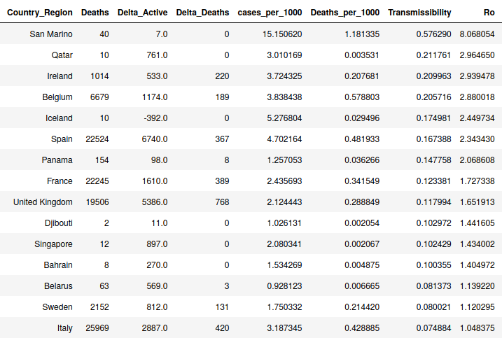
I continue to hear that this outbreak is no different than the seasonal influenza, but I’m not hearing much in the way of details as to why. Yes, in a bad flu year, we might have 60K deaths in the US. We have only had 2-3 months of COVID-19, though, and have hit the 60K mark yet have no idea how it will respond in the future. Additionally, COVID-19 has proved to have rates of reproduction (Ro) that were much higher than influenza (see here for my analysis of this). Really bad flu years (1968, 2009) have seen Ro values for influenza in the 1.5 to 1.8 range while normal years see around 1.2. Of course these are average numbers, but many countries are seeing Ro rates for COVID-19 STILL in the 1.5 range after the peak. Some regions are still seeing Ro between 2 and 3 even now, which implies that the numbers were higher before things started slowing down. The real peak Ro numbers are hard to pin down because we still aren’t totally sure exactly when the pandemic started. After this is all over the NIH will do a large statistical survey and will arrive at some numbers for incident and case fatalities, transmissability, etc., but right now, outside deaths, we just don’t have hard facts. Based off these high transmissability rates and the high death rates, however, it does appear that this outbreak is unique and all the evidence I have indicates it is worse than a bad round of the flu.

Right now there are 12 counties in the USA that have had more deaths in two to three months of 2020 classified as COVID-19 than they had in 2018 due to all diseases except heart disease and cancer. I’ll restate that. In two to three months of COVID-19 across a large number of counties, COVID-19 deaths have exceeded all 2018 deaths due to respiratory diseases, flu, alzheimers, etc. Plus, there are hundreds of counties who are close to this number. This rate may change, there may be no more deaths in 2020 due to COVID-19, etc. We have no idea. But at this point, this essentially means that due to COVID-19 at a minimum disease deaths in these counties will be doubled for 2020. You can see the numbers, it amounts to a few hundred to a few thousand extra deaths per county per year. This is very unusual due to one disease and if we see significant increases in other kinds of deaths like homicides and suicides, it becomes very newsworthy (Chicago). Will these deaths irrevocably change these counties? I suspect that is an exaggeration. But there will be an impact, not least of all psychologically. And of course the economic impact will also not be fully understood for months either.


Counties that have had more disease deaths (not cardiovascular or cancer) due to COVID-19 than all of 2018

Second, this does NOT seem to be like the Spanish Flu

The Spanish Flu was devastating to the world not just due to its large number of deaths, but in who it killed. I heard in a podcast featuring John Barry, who wrote the most important book about the Spanish Flu that the median age of those who died was 27. In some region, this meant that 3% of factory workers died from Spanish Flu. This obviously has far-reaching impact on a region’s productivity, their economy, the number of health care workers and first responders, etc., when people are cut down in their prime contributing ages. COVID-19 is not killing these people by anyone’s measure. The median age in most nations is somewhere around 80 and typically 85-90% of all deaths are over 65. This is not to say there is any difference in the value of lives at different ages (though I have seen recent articles that come close to saying this). But, there is a much more measurable impact on the society when individuals who are counted on to keep the economy running and people fed and cared for are suddenly removed. This is what the Spanish Flu did and what COVID-19 has not done to date.

One other thought on the Spanish Flu. It came in three waves, with the third one being the most devastating. Exposure to the first or second wave did not seem to provide immunity to the third wave.

Third, this DOES point to the Dangers of Society’s not Understanding Science and Statistics

I am not surprised when I see that a model has over-stated an effect. This is a known challenge of models. Most people who build simulations know that “All models are Wrong, but Some Provide Useful Information” and factor that in to decisions. But in society, this seems to be poorly understood, not just by the general public, but especially by politicians, influencers, and journalists. The public’s poor understanding of statistics was exploited repeatedly by news media on both political spectra. If we can’t improve our teaching of statistics at the high school and college levels, then we are probably not going to get out of this bad cycle. I strongly support reimagining how we structure math education in general (the Algebra-Geometry-Algebra II sandwich would be a good place to start).

However, scientists and modelers also need to better understand how to provide predictions to government and journalist groups in ways that are clearer and less likely of being misconstrued or misappropriated. I heard Dr. Chris Murray, director of the University of Washington’s well-respected Institute of Health Metrics and Evaluation (IHME) say on a Nate Silver podcast that the early COVID-19 models in the west were based on Hubei Province data. I think it’s pretty clear by now that Hubei Province data was created by local politicians and did not accurately measure the truth on the ground. So the most important part of that model was fit on data we now know was at best heavily filtered by a Chinese provincial government. I don’t think this was even known outside IHME until recently. My point is that in general, scientists understand the usefulness of their models but struggle to communicate a model’s limitations to a politician or journalist. This is, in a sense, a failing of science to understand how the rest of the world works. This may have gotten us into trouble during the early days of COVID-19, but perhaps there was some willfulness to understand simulation results in the context of a pre-existing bias by leaders and journalists.

COVID-19 Update: Latitude Effects – Comparison of Deaths and Rates by Latitude

Cases per 1000 (light blue) and Deaths per 1000 (salmon) by Latitude Range – 4/28/2020

Notice in the above, it’s barely perceptible, but the latitude effect is still holding regarding latitudes 40-50 which have greater numbers of cases per 1000 and deaths per 1000 than any other latitude range. This has been the case for a while, but the other latitude ranges north of 30 have been catching up for a while. Now take a look at the same graph when we look at the hot spots, i.e., areas that have the highest rates of growth of cases per 1000 and deaths per 1000. It looks a bit different.

Rates of Growth of Cases per 1000 (green) and Deaths per 1000 (orange) by Latitude Range – 4/28/2020

Now you can see one thing that has been obvious to observers, the growth rates in the range from 40-50 N. Latitude which had been hit so hard up until now are clearly slowing. The hottest spot for death rates per 1000 right now is the range from 60-70 N. Latitude. This is largely due to large numbers of deaths in Sweden’s elder care homes. Also node that Latitudes 10-20 S. Latitude are the hottest spot in the Southern Hemisphere. This is almost exclusively due to Brazil. South Latitudes 20-30 barely even show up, which is interesting. These are countries primarily in Southern Africa and the southern-most part of South America like Paraguay, Zimbabwe, and Namibia. They have reported about 20 deaths due to COVID-19 across this whole band. Perhaps this is because there are reasons that COVID-19 isn’t a threat in that region, perhaps it’s because they get lesser world travel, or maybe they have it but haven’t noticed?

Finally, you’ll note that 40-50 degrees S. Latitude is actually showing up as negative. This implies the rate of growth is negative overall, which doesn’t really make sense. See what this looks like below. The negative slope is inaccurate because it has to do with the third order polynomial fit overshooting a bit. But as you can see, case growth is essentially zero in New Zealand. It’s a story of aggressive testing and data collection, honest communications, and attention to detail. See how New Zealand and Australia have fought the virus despite two very different governing styles.

COVID-19 Update: Transmissibility – Simple way to calculate the Reproduction Rate of COVID-19 across localities (with results)

Recently I realized that I have all the information I need to calculate the Reproduction Number – Ro – of the COVID-19 virus across each country. The method to do this was simple, the SIR model. This is a very simple infectious disease model that assumes that each member of a population is either susceptible, infectious (infected with the disease) or recovered from the disease with a specified re-infection parameter. This model, while simple, is seen as appropriate as a very simple model for seasonal influenza, ignoring features such as immunity from past infections.

The thing about Ro that hasn’t been adequately discussed is that it can change from day to day and from location to location. The reason we care about Ro is largely because we desire to compare the rates of infection of various diseases to each other. for example the Ro of measles is very high, about 12 to 15. Influenza’s Ro is often estimated after an outbreak to be between 2 and 3.

In the 1950s, epidemiologist George MacDonald suggested using Ro to describe the transmission effectiveness of malaria. He proposed that, if R0 is less than 1, the disease will die out in a population, because on average an infectious person will transmit to fewer than one other susceptible person. On the other hand, if R0 is greater than 1, the disease will spread. Many news stories in the early phases of this outbreak have speculated that the Ro of COVID-19 was up around 2.5 to 3. This is very simplistic way of looking at transmission, however, due to the existence of “super spreaders” who for unknown reasons may spread infection to hundreds or more people. This type of non-linear spreading is hard to model.

In the SIR model, there is a parameter β that is defined as the disease transmission rate constant. The Reproduction number (Ro) is most simply defined as the transmission rate (β) multiplied by 1/γ (the mean infectious time). This mean infectious time is about 5 days for influenza but I don’t think anyone has a good idea what it is for COVID-19. Due to this, for now, I’m going to go ahead and assume 14 days, which is the standard quarantine number.

To show the math, the SIR consists of three differential equations:

My insight is that I have been calculating the derivatives (dxs/dt) for a while as the instantaneous rate of change for confirmed cases. With that as a known and xs, xi, and xr, being the confirmed cases, active cases, and recovered cases respectively, all I needed to complete that equation was β and the reinfection rate (rR->s), which is anyone’s guess at this point. Therefore, assuming two parameters, 1) the reinfection rate being a small number (0.001) and 2) the mean infectious time to be 14 days, I can now calculate Ro for each locality on any day during the outbreak.

Results

When I ran the above calculations on my COVID-19 data to back out the Ro value for each location I arrive at the below results for the top 15 regions. Again, this is calculated for today’s data. Undoubtedly, Italy and Spain had numbers similar to the top regions on this list about 2-3 weeks ago, but comfortingly, we see Ro go down to one or below once a region has pushed through their first wave of infections.

In the table, Ro is the far right column. Note that San Marino has gotten their deaths under control but they’re going through another large wave of infection (has a lot to do with their small size and communal nature). You can see in the larger countries that a Ro larger than one is leading to large changes in active cases. Also, of note, since transmission is the goal of Sweden, we’re seeing their Ro moving above one too. I suspect theirs will continue to increase for a little while.

Table capturing countries (non-United States) with the largest Rates of Reproduction (Ro) of COVID-19. Data from 4/24/2020

Caveats: First off, because the US isn’t doing well at capturing Recovery numbers, I’m not including them in this table. Second, this is not the most scientific assessment because I have zero control over how the data is collected and barely much more insight into the methodologies of the countries. If I was to be asked what a good general number for the Ro for COVID-19 was I would pick Iceland’s number of 2.45 because I understand their methodologies for counting cases and infections and don’t believe there are large discrepancies. I believe Belgium’s numbers for the most part too, as they’re definitely not undercounting. Nearly all other countries are suspect at some level.

Updates

Note, the table above was from two days ago. When I update for 4/26/2020 data the table changes a bit. Honduras is interesting to watch to see if this is anomalous or not. See below.

Table capturing countries (non-United States) with the largest Rates of Reproduction (Ro) of COVID-19. Data from 4/26/2020

Essay on Virtual School during the COVID-19 Outbreak by my Fifth Grader

Below is an opinion essay written by 10-yr-old Hannah. Maybe this is interesting to see how a fifth grader sees this outbreak?

Is Virtual School a Good Replacement for Traditional School – by Hannah Newman

Did you know that over thirty percent of college students are attending some part of their schooling using virtual technology.  Also, in K-12 education, the fastest growing segment is online virtual classes.  During the COVID-19 outbreak when our “Traditional Schools” were closed, we were all forced to experiment with virtual schools and now we students are able to provide input on how the two approaches compare.  This can be very important to learn how to improve in the future, because most likely, there will always be a virtual part of education  in the future.  From my experience, traditional school that is held on the school campus along with one’s friends is a better way to learn than virtual school using technology from home.  This is because students learn better when physically together with their fellow students, the personal connection to a teacher is important, and distractions are everywhere when doing virtual school.

First, from observation during my time in elementary school, students learn better when learning with their classmates.  A funny quote from a famous psychologist from the early 1900’s named G. Stanley Hall goes as follows, “prolonged solitude tends toward imbecility, especially in the young” (Lesko).  Solitude is something that is definitely experienced at times during virtual school.  When parents are working or are distracted with other siblings’ education, some students spend much of their time working alone.  The solitude feels nice sometimes, but of course there are some downsides.  Loneliness sets in after a while and the student might try to fix this by doing Zoom chats with their friends instead of doing their school work.  An article on the Department of Education website written by a professor at the University of Waikato named Gary Faloon confirms this and states that “Research indicates learners studying at a distance can experience perceptions of isolation and lack of ‘belonging’ and support, which can adversely affect their learning experience and performance.” (Faloon, 128). In addition to the loneliness, virtual school can also miss the fun, surprising turns that a live class with classmates can have.  An article on virtual schooling from the website study.com confirms this by saying “Any teacher who has taught in a real life classroom setting knows that students can change the way a day’s lesson goes. A student can ask a question related to the subject matter that creates the need to pause for a moment and explore an entirely different topic.” (Johnson) This kind of interaction doesn’t really happen in virtual school.

Second, some students don’t learn as well when the teacher is not physically present.  For example, a student like me who has lots of questions finds it hard to get quick responses during virtual school.  The teacher may be distracted by interaction with individuals in the class through technology.  It seems like sometimes teachers have a harder time talking with the whole class at one time than they do talking with individual students.  Due to the technology, it’s harder in Zoom calls, for instance, to ask questions or get individual help than it is in person.  Sometimes the students have to mute their microphones and it’s hard to know when it’s OK to ask questions.  This might be solvable, according to an article in learningsolutionsmag.com, which states “While some elements of in-person instruction translate well to a virtual classroom, others need some adjustment. ‘A lot of what they [instructors] know about really great in-person facilitation applies online,’ said Cindy Huggett, a virtual training consultant. But some skills need to be tweaked or expanded. ‘It’s like, you already know how to drive a car; now you’re learning to drive a truck. It’s the same set of skills, but you add on to it.’ “ (Hogle). This says that teachers should be able to learn how to apply their person to person skills differently online.  The same article continues, “The instructor might need to plan, script—and practice—each session to a greater extent than she/he does for in-person teaching.”  (Hogle). The teachers are still learning these new techniques and eventually students might learn to connect better with their teachers in the virtual environments. 

Lastly, there are many distractions at home that don’t exist in the physical school room.  There are both external and internal distractions that I have had to learn to work through. For example, being on the computer for three or four hours straight is a new experience for students.  This creates lots of distractions because the student feels free on the computer without much oversight.  At school, time on the computer is limited and focused on a specific activity.  It is not possible to play a game or watch a YouTube video on the computer without a teacher knowing when physically at school.  When at home, however, parents sometimes miss catching these distractions.  Additionally, there are challenges with noises from other siblings’ schooling or parents’ work activities.  Add to these challenges the fact that being at home with one’s siblings all day long can be very annoying.  This shows that the learning environment is very important.  An article from the New York Times on remote learning states, “The environment makes the classroom, which is why virtual teaching will never fully replace classroom teaching.“ (Gonchar).  The external distractions are shown above, but one other challenge comes from inside the student and this is in the area of motivation.  When the environment is less structured like in the virtual classroom, a student is more free to avoid work that seems less fun and do easier, more fun activities.  This has been quite a challenge, but this might be a way for a student to learn skills for being responsible for choices that they may not learn in more structured environments.  Overall, though, right now the bad parts of virtual schooling are more obvious than any potential good parts.

Given these points, it seems clear that traditional school room learning is better for students than virtual school.  This is because people need other people and this helps the learning process, teachers are trained for in-person interaction and haven’t learned techniques to use virtual technology better, and the virtual classroom environment is distracting.  Teachers are doing their best in a hard situation to learn new approaches quickly and are motivated to help students.  It is important, however, for the country to apply the lessons of the COVID-19 outbreak to learn better ways to do virtual school in case it is necessary again in the future.

Works Cited

Faloon, Garry.  “Inside the Virtual Classroom: Student Perspectives on Affordances and Limitations”.  Journal of Open, Flexible, and Distance Learning.  https://files.eric.ed.gov/fulltext/EJ1079902.pdf

Gonchar, Michael, and Shannon Doyne. “Has Your School Switched to Remote Learning? How Is It Going So Far?” The New York Times, The New York Times, 30 Mar. 2020, www.nytimes.com/2020/03/30/learning/has-your-school-switched-to-remote-learning-how-is-it-going-so-far.html.

Hogle, Pamela. “Three Key Differences Between In-Person and Virtual Teaching.” Learning Solutions Magazine, learningsolutionsmag.com/articles/2252/three-key-differences-between-in-person-and-virtual-teaching.

Johnson, Amanda.  Study.com, study.com/blog/why-virtual-teaching-will-never-ever-replace-classroom-teaching.html.Lesko, Nancy.  “G. Stanley Hall (1844–1924).” StateUniversity.com, education.stateuniversity.com/pages/2026/Hall-G-Stanley-1844-1924.html

COVID-19 Daily Update – Who’s Not Reporting Data?

An article in the Guardian from a day or two ago detailed how Europe was wringing its hands over China’s potentially misreported COVID-19 statistics. I’ve been watching this for a long time, and in case you might think that China is just slightly under-reporting their COVID-19 deaths then take a look at the diagram below. These are all countries/provinces between 30 and 40 N. Latitude, so there ought not be any huge differences due to their region.

Population and Deaths for Localities in North Latitude 30-40

How to read this chart:

  1. My intent is to show which countries have sizeable populations in this region at the same time as visualizing their COVID-19 deaths. I have sorted from smallest to greatest number of deaths and you can see that plotted from left to right. The pink deaths columns have a transparency that allows the blue population bars to shine through… when this union between the two happens it has a maroon look to it.
  2. Both the left and the right y-axis are in the Logarithmic Scale. I did this because of the huge range of populations and the range of deaths, all the way from 0 (Tibet) to 22,524 (Spain). The Logarithmic scale lets us see all the data. Keep in mind, the logarithmic scale means that the lowest range is from 1 to 10 deaths, the next one ranges from 10 to 100, etc.
  3. Understanding this, we see there are 16 regions in this Latitude Band with less than 10 COVID-19 deaths to date. Of these, 2 are NOT in China (Jordan, Syria) and have a combined population of about 27 Million (and Syria probably has cases/deaths but due to Civil War state they’re likely not keeping records).
  4. This means there are 14 regions in this band with less than 10 deaths that ARE provinces in China. They have a combined population of about 450 million people. This is about 100 million people greater than the entire United States.
  5. So, to believe that China is reporting COVID-19 data responsibly, you also have to believe 1) that only one country on Earth (maybe 2 if you want to count North Korea) has solved this problem across essentially all but one or two of their provinces. (By the way, a chart from 20-30 N. Latitude looks just like this one, with essentially no deaths in Chinese provinces). And as you note from the graph, the population density of the graph is largely clustered on the left, no-deaths side. Therefore, you’d also have to believe that 2) this one country has accomplished this on a monumental scale across over 1 Billion citizens. This would be an amazing accomplishment of organization, communication, and synchronization of data and information across the largest country on Earth. Oh, and also, you’d have to believe that 3) they only had a slip-up in one province, Hubei, where the virus originated (and they’ve already revised death numbers upwards). Perhaps these numbers would be plausible if 4) there was some factor in the genetics of the Chinese people that protected them from COVID-19 or if they had a historical immunity to COVID-19 (in every province except Hubei…) from a previous undocumented outbreak…
  6. To believe that China is faking their data, you pretty much just have to disbelieve any of the above points. They have 5 provinces on this chart totaling 117 million people who are advertising a collective zero deaths right in a latitude range with around 43% of the worlds COVID-19 deaths. Yes, they have a disciplined society and the Communist Party can take a lot of control, but there are countries with similar cultures and governmental organizations that are reporting more believable numbers.

This obviously isn’t helpful as we’re trying to learn more about this virus and its impact. And it’s not even remotely believable. Sure seems like a bad political strategy on the part of China.

Here’s the same chart for the Latitude range from 20 to 30 N. Latitude. As you can see, the results are similar. One difference for this region is that it hasn’t been as hard hit as 30-40 N latitude.

Population and Deaths for Localities in North Latitude 20-30

COVID-19 Special Update – Latest on Factor Correlation with COVID-19 Death Rates

Latest correlation between multiple factors and current Death Rate due to COVID-19

This is the third time I’ve written about results from my ongoing study of factors that might be correlated with COVID-19 death rate. The first two are HERE and HERE.

Why Revisit This?

First, because I’m measuring correlation between these factors across the world and the current Death Rate, things change every single day. In my previous posting on this we examined the relationships between these factors and the death rate at that time. When that was done, Italy, San Marino, and Spain had the highest death rate (numbers of deaths per day) of any countries. What we saw then was a much higher correlation between the death rates at that time and Female Smoking (about 10 points higher then). The correlation between numbers of citizens over 65 and the death rate was also much higher then. This can be explained by looking at the countries that had the highest death rates at that time and realizing that they had very different demographics than the countries leading the list now. For instance, the state of New York has about 16% of its population over age 65 whereas Italy has 23% over that age. Therefore, there was a stronger relationship at that time between the age over 65 factor and the death rate. This is an example (a light one at least) of correlation that may not be causation. The fact that Italy had more people over 65 per capita did not necessarily result in those extra deaths (although it could have been causal) just as the fact that New York has less people over 65 than Italy doesn’t mean that their death rates are any smaller now. It’s just a less correlated factor now because the peak of the outbreak is in NY.

What do we learn now?

As I stated, we still see that the Age over 65 is still correlated with death rate, just not as strongly as before. The same thing applies to Female Smoking. A few weeks ago, countries with higher Female Smoking rates also had higher Death Rates. I postulated at the time that Male Smoking rates have much less variation between countries, so therefore, was less of a factor in potential causality of extra deaths. The correlation between the number of nurses per 1000 people has increased a bit, which still seems counter-intuitive. This may just be correlation without causation because the outbreak currently is peaking in countries with more nurses. If there is causation, I can’t imagine why it would be so. Male mean body mass index has remained more highly correlated than most factors and has stayed at about .15 for the last month. This may indicate that countries with higher BMI’s for men are more likely to be experiencing COVID-19 deaths with the advertised co-morbidity of Obesity. This also is consistent with the numbers from around the world that show a slightly to greatly higher percentage of COVID-19 deaths are men. This might indicate that females with a high BMI are surviving but men with a high BMI are not (since female mean BMI is less correlated with death rates). Density remains correlated with deaths as one might expect. The manners the disease is spread seems to indicate areas of high population density might be more likely to see a higher death rate. We know NYC is a very dense area (See table below) and it stands to reason that this density is correlated with the high death rates there. New York City has 8x the density of the next highest county (Nassau County), and has more than 10x the total deaths and 14x the death rate currently.

Negatively Correlated Factors – What do We Learn from These?

What has stayed the same? Temperature remains negatively correlated with the death rate at about the same level. What this tells me is that either 1) the areas affected both now and a couple of weeks ago were coincidentally at similar relative temperatures or 2) temperature does have some sort of causal effect on the death rates. This seems to have been borne out in some recent studies. Also, the negative correlation with Tuberculosis deaths has remained constant over the last few weeks. This indicates that countries with higher deaths from TB have seen lower COVID-19 death rates. Again, might be due to the fact that countries with higher TB rates have had less COVID-19 deaths due to other reasons (temperature, malaria, deaths to TB that then couldn’t die from COVID-19, etc.). However, it is interesting that this has been one of the more negatively correlated factors for a while. This indicates to me that perhaps there is a small causal effect from something due to a country’s susceptibility to TB that is affecting COVID-19 death rates. There are two studies underway to evaluate whether the BCG vaccine for TB offers some protection for COVID-19, but the WHO is cautioning that the evidence is still undetermined. Diabetes rates also are negatively correlated with COVID-19 death rates. This is surprising as Diabetes is a known co-morbidity. However, it may suggest that the areas with the highest death rates right now have a lesser issue with Diabetes rates. Perhaps this is because the regions getting hit hardest now have histories of excellent health care of patients with diabetes.

Conclusion

Again, there may not be much to learn from doing these correlations, but in general, this is a good practice to evaluate the sensitivity between variables and especially target variables that we care about, such as death rates. This shows a number of unsurprising correlations, some of which likely have some element of causality for COVID-19 deaths (but probably not a high rate of causality). It also reveals some surprising correlations that might present opportunities for further research and evaluation. This is sometimes how great breakthroughs are discovered because they can give us better understanding of the likelihoods of our prior beliefs about a subject. Sometimes (maybe even often) our priors are wrong and unevaluated until we look at the data holistically. This can help break us out of groupthink that is driven by emotional responses and not data-driven responses.

COVID-19 Daily Update: 4/23/20 – Interesting Stuff

New Active Cases and Deaths (raw numbers)

This chart has been uninteresting for a long time because it has shown some variation of US, Italy, Spain, and UK dwarfing all the other countries. The US is still in this position, of course, but there are a number of new countries in the top ten now. The fact that Russia has only started confirming large numbers of cases is very interesting. They’re a large country, so 5000 new cases is a small number when divided by their population. Still, the fact that they’re releasing large numbers now is a sign that perhaps things are getting worse. They seem to have avoided case growth up to this point somehow. We also see Brazil and Mexico creeping up the list. Brazil is also showing around 5K new cases but is also seeing an increase in deaths. Mexico’s numbers are lower, but up until recently, their cases and deaths numbers have tracked with Arizona’s, something that seemed very curious. Their reporting may have caught up to their cases, however, because they have had steep jumps in the last few days.

Sweden barely makes this list, but they have received a lot of press (bad press?) about their strategy to build herd immunity more quickly. As a result, they are only doing targeted social distancing. People who are not in high risk groups are going about their lives and businesses. This seems to make a lot of media people mad. I read a bunch of health department materials and statistics published in Swedish trying to understand what they’re doing (thanks again Google Translate). Essentially, I think I can summarize it this way. First, they ask people with high Body Mass Index and/or who are 70 and over to self-quarantine. Second, they provide instructions on what responses to take to symptoms. If you have lost your sense of taste or smell, then you are asked to quarantine for 7 days and then perform some set of actions with the health department before leaving quarantine, third, they have a network of people who are tracking cases and contacts and providing assistance to those in quarantine. Finally, they are conducting “symptom surveys” to understand where breakouts might be starting and find places to start contact tracking.

The net affect of this is that their strong communications and planning are resulting in a sense of confidence in the citizenry. This is impacting the number of people who are needing hospitalization for COVID-19 to quite a degree. Below I’ve pasted their hospitalization numbers per day. You can see that the numbers are already tapering off, but never reached much higher than 40 cases per day. This is manageable and keeping people out of the hospitals seems to be one of the key factors in keeping the death rate low. Their cases continue to increase, but remember, that’s the strategy! Get the population quickly immune and strongly mitigate symptoms along the way.

Singapore continues to be interesting to me, not least because I’ve seen a number of articles that are expressing shock that Singapore continues to see COVID-19 cases. Here’s one from CNN and one from Bloomberg. The Bloomberg article’s title is kind of irritating, “How Singapore Flipped from Virus Hero to Cautionary Tale.” What that title doesn’t tell you is how Singapore has done such a good job managing their cases. Yes, they are seeing case growth and at one point we were excited that they were one of the first countries to “flatten the curve.” But if you look at the charts below, you can see that any flattening that happened was probably premature. However, despite their numbers of cases, they still have only 12 deaths! They are doing similar things to Sweden and Iceland, and seem to be managing cases outside hospitals and addressing symptoms early.

Singapore cumulative number of Cases.

Finally, back to the theme of strong communications. I was listening to the Peter Attia – Drive podcast the other day and heard his interview of John Barry, who wrote the most important book about the Spanish Flu. I listened to this 2+ hr podcast twice because it was so compelling. One big takeaway from John was that one of the main lessons from the Spanish Flu was the importance of trust in leadership that was established by truthful communications. He also showed cases where the media’s not telling the truth led to larger outbreaks and greater fear. Apparently the Philadelphia media were still saying “nothing to see here” after over 14K people died in 3 weeks. So, in general, then, honest, direct, unbiased communications are critical in a time of uncertainty like this. This is why I continue to try to write about what I see in the data. Hopefully it’s helpful to someone.

COVID-19 Daily Update: 4/22/20

Active Cases (Diameter) and Case Growth (color)

Above we can see the state of confirmed COVID-19 cases across the US. A handful of things have changed. We’re seeing some localities reduce their number of active cases (mostly through recoveries) and thus, their bubbles are getting smaller. The purplish color is an indicator that the number of cases isn’t growing.

Interesting things to note include that Louisiana’s death and case rates have essentially stopped increasing. Michigan is in a similar position. Most of the new cases in Louisiana were outside the two hardest-hit parishes, Orleans and Jefferson. So maybe this is a sign that the first wave is slowing. Washington also seems to be through the worst part of the first wave too. No telling what a second wave will look like, but getting through the first wave is probably notable regardless. Finally, on the sad side, New York State is now approaching a death percentage of 0.1% of their population. This is about double the second highest (NJ) and over 10x of what most other states have seen. I still struggle with the huge disparity here and would love to understand why it came about.

State Data Table from 4/22/20

Below I show Case Growth curves for some states. Louisiana and Washington are both starting to decelerate while Texas is probably getting close. Again, as oft stated here, the case numbers aren’t the best indicator, as most studies are now showing that many, many more people are getting this virus than are being reported. Some of this is due to severity bias (i.e., you get no test and don’t get counted if your symptoms aren’t very severe).

Louisiana’s current Case Growth Curv
Washington’s current Case Growth Curve
Texas’ current Case Growth Curve

Finally, here’s the current US breakdown across 5 degree latitude bands. As you can see, most of the cases and deaths remain in one band.

Normalized Cases and Deaths by 5 degree latitude bands – US States only.

COVID-19 Special Update: Iceland continues to point to the real COVID-19 numbers

Cumulative Flow Diagram for Iceland showing number of active cases decreasing

The above is exactly what I have been looking for in my cumulative flow diagrams… the top line curving over and flattening out while the recovery line (green) steadily increases. When the green and orange lines touch, it will mean that there are no active cases remaining. A couple of interesting things about this diagram.

  1. New cases seem to be shrinking down to zero. This might mean that the infection is close to running its course. There may be new waves, but Iceland is one of the most likely countries in the world to catch it quickly.
  2. The cycle time for recoveries is now slightly longer than the 14 day quarantine period. Not sure what this might mean, unless maybe Iceland has learned that 14 days is too short to declare a recovery?
  3. The death line on this chart (red) looks flat but it actually isn’t… the number is 9. This means the infection rate (ratio of deaths to all infected) is around 0.5% The news outlets are very impatient to present the infection rate in each locality and are rushing forward numbers like 4%-10%. Of course most of us know that’s bogus and irresponsible because no one has any idea (except in iceland) how many people were truly infected. We know that the infection rate for influenza during this COVID-19 period has been between 0.06% and .11% based on the CDC’s estimates and models. I suspect the media outlets are scrambling to document infection rates so they can provide this sensational comparison (or perhaps make a political point in the process.
  4. Case Rates vs. Infection Rates. Above I showed infection rates, which is the total number of deaths divided by the total number of infections. Sometimes the case rate is shown interchangeably with the infection rate, but it is a different thing and is typically defined as the number of deaths divided by the number who report for medical care due to the infection. The case rate, therefore, is very hard to calculate unless hospitals keep good records and release them (something I’m not seeing right now). We know infection rates because the numbers of tests and the numbers who “fail” the test and are infected are both released.
Iceland Statistics from https://www.covid.is/data

In the diagram above we can see some of the same data from my chart, but what is interesting is the low number of the active cases that are hospitalized. This would translate to something like 6% of all the confirmed cases that are getting hospitalized. Only .8% of the cases go to the ICU.

Iceland infections as a percentage of tests conducted from https://www.covid.is/data

The above chart is also interesting. Iceland has two different techniques for testing for COVID-19, the NUHI (government) and the deCODE (private). What’s most interesting, however, is that in the last month, the percentage of tested people who show up as infected has dropped to nearly zero. This might show that the outbreak is dying out there.

Icleand active infections, recoveries, and deaths by age https://www.covid.is/data

Finally, Iceland’s infection demographics is very illustrative for the rest of the world. As you can see above, the age groups that have been confirmed as a COVID-19 infection range largely from 18 to 70. I presume that this is because the outlier ages are quarantined more effectively (not going out to buy groceries, etc.). However, we see most of the deaths in the over 60 age group (consistent with other European findings). What this doesn’t show is that contrary to other news reports, Iceland is seeing essentially zero difference in cases between the genders. It’s essentially 50-50.

Wrapup

What does studying Iceland help us understand? Because they are approaching this outbreak scientifically, they are learning more and faster than any other nation. I’d imagine that this is also preventing their media folks from sensationalizing and being creative with numbers. One of the conclusions from the 1918 Spanish Flu outbreak was that the media’s type of reporting could truly influence the direction the outbreak went in their region. In Philadelphia, the city that was hardest-hit during the Spanish Flu, the media was trumpeting “Nothing to worry about here” even after the city had seen 14K deaths in three weeks. In other cities, the media (and government) focused on telling the hard truth and the outbreak was more controlled.

COVID-19 Special Update – Can Unsupervised Machine Learning Predict Outbreaks?

Maybe that’s a provocative title, but one of the questions I’m exceptionally curious about is if measurable factors about a locality can be used to predict the locality’s response to a COVID-19 outbreak. I’ve attacked this through a correlation study using features measured by WHO and the World Bank (see LINK here). This project is another attempt to address this question.

Background

The Census has a feature online called QuickFacts. This is a really nice tool where you can pull a lot of information about localities in the US (cities, states, counties, etc.). This information covers broad areas of each locality and consists of elements like population, age/race demographics, housing, family/living arrangements, computer/internet access, education, health, economy, transportation, income, business info, and geography/density. As you can see, this amounts to a whole lot of data about specific localities. See image below. The downside of this tool is I haven’t yet found a way to automate the pulling of data, so I had to collect this data on a number of carefully selected counties by hand. My data collection strategy consisted of ensuring I captured data on counties with a wide range of COVID-19 impact as well as counties of different sizes and types. Once I captured a number of counties in the QuickFacts tool I then blended in my data for the Deaths per 1000 population statistic for that county.

Technique

Unsupervised Learning is a form of machine learning which allows one to find hidden structure in data when there isn’t a natural label present. I chose this approach to evaluate whether the Census QuickFact data could be used to build a predictive model for COVID-19 impact because it provides a more visual and explainable way of evaluating the predictive model. Also, I can demonstrate results well despite a small dataset. Both of these reasons should hopefully become more evident a few frames down. QuickFacts provides me 65 different data features for each locality, and this is way too much data to evaluate as one would with normal visualization-based analytics. In general, the human brain is wired for three dimensions of data (x, y, and z; also length, width, height). This is why 3D visualizations are easily consumed by humans. Add a few more dimensions of data, however, and it becomes very hard for our brains to see the patterns. To get around this problem and create a model that lends itself well to human visualization, the first step I take in my approach is running an algorithm called Principal Components Analysis. PCA is a technique that in a nutshell can take X features of data and provide the user with n uncorrelated features. In my case, X is 65 and I choose n to be 2, which will allow me to put the data into a 2D plot. This is a very clever trick that was invented by the great statistician Karl Pearson over 100 years ago. The downside is that when I do a plot where the X axis is Principal Component 1 and the Y axis is Principal Component 2, there’s no obvious mapping of the X-Y relationship in my mind because I have no idea what PC1 and PC2 represent other than orthogonal views of my 65 data features. What you have to keep in mind, though, is that even though we can’t explain to our boss what this relationship really means, we DO know that the Principal Component space represents real information and variation on information from all of those 65 features. If you believe me that the location of a datapoint (a county in our case) in PC-space is important, then you can start to understand why this approach is useful. If you look in the diagram below, this is what plotting these 65 features crunched into 2 Principal Components looks like. To make it clearer which of the datapoints are most similar, I also run an algorithm called K-Means, which is a simple unsupervised learning clustering algorithm where I tell it that I believe there will be X clusters (I chose 6 for this example) and it fits the data to that number of clusters. The clusters are identified on the chart below by the large blue numbers. Note that the crude red and green enclosures and the “Heavily Affected” and “Lightly Affected” labels are done by hand after the plot is generated.

What the Unsupervised Learning Tells us

When I run this algorithm and build this plot, I can see a clear boundary between the counties on the left of the diagram and the counties on the right. At this point, I won’t know what that means until I do a further evaluation, which I show below. I dump all my data including cluster ID’s into a table and then blend in the Deaths per 1000 population numbers for these counties.

Once I sort the data by cluster and apply conditional formatting to the Deaths per 1000 column, I can see a crude trend emerge. In clusters 0, 1, and4 I see more COVID-19 impact than in 2, 3, and 5. Noting this and returning to the PCA chart, you can see that the more heavily affected clusters are on the left side of the chart and the more lightly affected clusters are to the right.

Of course there are exceptions and strangeness that I can’t readily explain here… Maricopa County is clustered with two other large cities (Chicago and Seattle), both of which were hard hit. But when I look at that cluster, it’s not exceptionally tight… there is some Principal Component “distance” between all three. I believe this distance is meaningful. Another strange cluster is number 4, which includes a number of lightly hit suburbs outside the Northeast and the worst-hit county in America, New York. This explains perhaps why it is on the same side of the chart with the more heavily-hit clusters, but I have no idea why they’re together. There’s a reason, but I can’t decipher it without a lot of digging (which I just don’t have time to indulge in). However, overall, this is an interesting trend.

How this could be used

IF I was able to collect significantly more data and I continued to see this trend where location on the PC graph had strong correlation with deaths, then I could run PCA on a number of counties that had very few COVID-19 cases and evaluate where they landed on the PC graph. If a county landed in the area occupied by a hard-hit cluster of counties, there’s an indicator that that county may have similar characteristics to those counties and might be at greater risk to COVID-19. Not a certainty, but even an indicator of risk might trigger extra precautions (and even save lives).

Other Work I’ve done on This Idea

I mentioned that my notion is that the PC distance between counties might also represent something real and have separate correlation with death rates. I did a quick experiment where I calculated the PC distance between each county using the Pythagorean theorem and then graphed the difference in Deaths per 1000 for two counties against the PC distance between those counties. The results are a bit noisy, but I’ll paste the overall results below for you to review. As you can see, there are three major outliers… NYC, which has been crazily hard-hit and Arizona/LA, both of which have been lightly-hit. The coefficient of determination (R2) of .12 tells me that the trend line in the lower portion of the chart is not a good fit. My eyes tell me the same thing… Therefore, I can’t create a good model that relates the Death Rate to the Distance using all the data. I tried different things like removing the outliers and essentially, the trend line on the data in the lower left of this chart gets about as high as a R2 of 0.45, which is interesting, but certainly not compelling.

Stuff that Remains

I’d like to collect more data and do so as the COVID-19 outbreak progresses. There MAY be a better relationship between the deaths and the PC distance, but we may not be able to see it until the disease progresses further. I might spend some calories looking into automating the pull of the census quickfacts data. It’s too time-consuming to do this manually to get the kind of data I think we need.

Supervised learning. There are additional approaches using supervised learning we can try to map the quickfacts features to the deaths per 1000 label. This could also be used to build a predictive model. I chose the Unsupervised approach first so I could demonstrate it with better visualizations, but I have much better algorithms at my disposal using supervised learning. This needs to wait for more data, unfortunately, so stay tuned.