Transforming into a Resilient Digital Business Requires a Data Strategy

During the COVID outbreak, I have written extensively about the impact of the pandemic on regions and individuals. One of the unsurprising outcomes of COVID-19 is that organizations that were prepared and could transform into a full-time “data business” saw great advantages. Conversely, organizations who were not prepared and remained stuck in the old economy struggled mightily.

Grubhub: Data Company Disguised as a Food Delivery Firm

One firm (as we all know) that benefitted from COVID-19 was Grubhub. It’s revenues grew from $1.3B to $1.8B from 2019 to 2020, which comes out to around 38% growth. Their 2021 revenues are likely to be much larger as they saw Q1 revenue of around $550M. Why is this important to know? The leaders in this market segment made lots of money during COVID primarily due to their digital transformation preparation they did in the handful of years leading up to 2019.

Digital Transformation Approach made by the Food Delivery Service sector.

Here are a handful of things that the leaders in this sector thought wise before 2019 and turned into a win during 2020 and 2021. Grubhub in particular is known as a true champion of digital technology. One of the ways it sought to strengthen it’s partner restaurants is through its “Grubhub for Restaurants” data analytics services. At this Grubhub site, the company discusses data insights their partner restaurants can use to revolutionize their own businesses. They list a number of new metrics that can provide their partners with insights into potential areas of growth. Some of these include:

  1. Delivery Speed. This is an interesting metric to me, because it reflects the flow of goods from raw materials to the hands of the customer. In factories, it is common to build large value stream maps that detail all of the value that is added to raw materials through factory operations as the product makes its way through. This can reveal bottlenecks in the factory that fundamentally limit how much money one can make. Grubhub recommends to their partners that they research alternate routes or techniques to shave off minutes of their value stream. I’d imagine that if Grubhub were smart, they would also sell value stream data services to their partners to help them optimize. If they’re not, I ought to offer my services, as this is right up my alley!
  2. Average Order Size. This is another good metric that restaurants ought to collect consistently. It is a measure that can also increase cash flow and profitability, because it measures a company’s ability to upsell. Often, I’d suspect that the goods being upsold are higher profit goods like dessert, coffee, and drinks.
  3. Customer Reviews. I’ve noted that smart firms patrol their reviews carefully and collect these reviews as data, both to improve their performance, but also to demonstrate their business virtue. A respectful and thoughtful response to a bad review could well result in many times more business than one might expect. This data could also be aggregated together and clustered by artificial intelligence techniques like natural language processing to identify the types of feedback.
  4. Order Accuracy: This is another interesting metric. I suspect most restaurants or similar firms don’t collect this data assiduously, but I suspect a strong, good-faith technique to gain order accuracy feedback from customers could result in a really valuable data set. Perhaps offering drawings for free rewards for providing feedback on order accuracy would be low-cost and high-reward to the restaurant.
  5. Average Orders Per Day: This is relatively low-end data… I believe one could greatly improve on this data feature. At a minimum, trends in orders per day combined with other data features like accuracy and review results could result in a small predictive dataset. Ultimately this could be used to make fairly accurate predictions on business trends per day or week. This might help optimize costs like material and labor costs. Given time and information on a firm, I could certainly think up many more valuable data features to measure that could improve the results of these kinds of predictive analytics.

Data Transformation through Data Strategy

Grubhub had a data strategy and collected data for years before COVID hit. This allowed them to make better and faster business decisions when the emergency arose. Companies without a solid data strategy (measuring important, high information data as a matter of doing business) may do fine when the sun shines and skies are blue, but often lack resources to deal with crises.

Have COVID-19 Strains become Less Virulent?

Virulence: Virulence is a pathogen’s or microorganism’s ability to cause damage to a host. In most contexts, especially in animal systems, virulence refers to the degree of damage caused by a microbe to its host. The pathogenicity of an organism—its ability to cause disease—is determined by its virulence factors. (Wikipedia)

Here’s some Images from the Arizona Dept. of Heath Services data dashboard that I think tell a story that could indicate decreased virulence of the Delta variant.

  1. COVID Cases by Day in Arizona – Entire Pandemic: In the image below we see the cases per day since around April of 2020. You can easily see three surges of cases. The first happened in the summer of 2021 and coincided with a huge, relatively uncontrolled outbreak in Northern Mexico. Many of the cases during this time occurred in border counties of Arizona. The second surge occurred in the winter of 2020 where the entire U.S. saw a spike of cases that correlated with the average daily low temperatures dropping to below 40 degrees. The latest surge corresponded with the more-transmissible Delta variant and has seen two spikes. This surge has been less of a spike and more of a “slog” where perhaps we are seeing the combination of the arrival of the Delta variant in the late summer merge with the more traditional cold-weather pattern for a virus where the night-time temperatures drop. Understandably, the lack of relief is wearing out health care workers and challenging hospitals. Note that the number of cases per day for the second spike of the Delta outbreak is roughly equivalent to the first summer outbreak.
COVID-19 Cases by Day (https://www.azdhs.gov/covid19/data/index.php#confirmed-by-day) – 12/21/21

2. Hospitalization – Cases by Day: Below you can see hospitalization for the three major outbreaks. The winter outbreak hospitalization by day far exceeded the first summer outbreak. Likewise, the first summer outbreak’s hospitalization per day is just under double the peak of the Delta variant outbreak. The only problem with the Delta outbreak is that it is lingering. Similar cases per day and less hospitalization per day. Just over a longer time. This naturally creates problems in hospitals processing sick people through their system due to the need to navigate bottlenecks that form. Just like in a factory, bottlenecks are going to be less of a problem in a quick surge of production than they are in long, tiring runs of production where errors and inefficiencies compound.

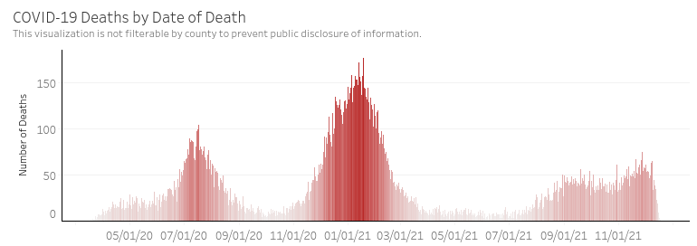
3. Deaths per Day: In the image below, we see similar patterns to hospitalization. If you look closely, you can see that the peaks of the deaths are a week or two behind the peaks of hospitalizations. Again, we see the same pattern as we see with hospitalization. Though cases during the Delta wave are roughly equal to the first summer wave, the deaths are around half.

COVID-19 Deaths by Date of Death (https://www.azdhs.gov/covid19/data/index.php#deaths) – 12/21/21

Thoughts

Does this data show that Delta variant is less virulent than the preceding variants?

Perhaps. It’s quite possible that during the first summer wave we did a worse job of measuring cases. COVID tests are pretty ubiquitous now in late 2021 and maybe we’re collecting a higher percentage of the cases. Conversely, it’s also possible that people have inferred or imagined that Delta is less of a risk to them and are not getting tested if they experience mild symptoms. Either of these could be true and both would impact the usefulness of the case number. Additionally, the new variable of COVID vaccinations that was introduced in early 2021 has certainly reduced the impact of the Delta variant. It would take some work to decipher whether the virulence of Delta to unvaccinated people was equal or less than previous variants.

This is one of the challenges of measuring cases for the purpose of scientific analysis. It is very hard in a real-world study to control for the measurement variables across numerous regions and measurement authorities (governments, hospitals, universities). This is one of the reasons why we still don’t know much about this virus, despite having measured it for around a year and a half.

My Opinion: Oftentimes the concerns around measures will balance out when data is considered in very large batches (“big data”). My suspicion is that human nature is the constant across the measurement of all of these surges and we can take what is presented to us and assume that Delta is less virulent than the previous strains, either due to the virus itself or due to the boosts to our immune systems from either natural immunity or the COVID vaccines that most people have received.

Omicron and the future: We’ll continue evaluating the hospitalization and death metrics in the context of cases. My suspicion is that as Omicron arrives, it will dominate and gradually eliminate Delta and previous variants still lingering out there. If Omicron is less virulent, perhaps then we’ll see a leveling off of the cases to some background number and then we can say that COVID-19 has become endemic. If Omicron is not less virulent, then we’ll have a rough month or two ahead of us.

Welcome to the Era of Omicron

I took a bit of a pause on monitoring COVID during the Delta outbreak as at some point, people seemed to be much less interested. However, I’m hearing folks with questions now that a new, more contagious variant has emerged. A recent pre-print paper (not peer reviewed yet, so might be revised in the future) shows that the omicron variant multiplies 70x faster in airways but 10x slower in lungs. This explains why the variant appears to be more contagious but less threatening than Delta. See here for a pretty good description of the findings.

Might Omicron be a Good Thing or a Bad Thing?

Some reports predict that the faster-spreading variant will create more risk for humans, especially since it seems to evade the defenses from vaccinations to some degree. Others are reminding us that most pandemics end with a very virulent but less threatening variant that out-competes all of the more deadly variants. This is how the Spanish Flu ended. Hopefully the latter possibility is true, but time will tell. There are already reports from South Africa that hospitalizations (or at least severe ones requiring oxygen) are significantly down under omicron than they were during a similar period of the delta outbreak there.

Latest Data – Before the Wave from Omicron Hits

Here’s the latest data by state. I’ll include some recent state data tables later in the post for comparison’s sake. Note that the case rates have peaked up a bit in cold states over last week’s data. Perhaps this is the effect of Omicron or perhaps it’s just due to cold weather. Some states (like Arizona) have fallen down the list in the last two weeks.

State Data Table, sorted by case rate. 12/16/21

Arizona County Comparisons

Here’s a view on the death rates and case rates across the top Arizona counties by population since about June of 2020. I found it pretty interesting for comparison’s sake. I see a couple of interesting things here:

  1. Pima County, Maricopa County, and Pinal County all show nearly identical rates throughout the pandemic. Why is this interesting? Pima County — at least to my eye — has taken much more stringent public health measures than the other two counties from day one. Pinal County in particular seems to have gone out of its way to take as few public health measures as possible. But their rates and numbers are very similar (although Pinal County has fewer deaths per 1000 persons than Pima or Maricopa). What does this mean? No one knows for sure, but there is a strong indicator here that the measures we humans think will keep a virus at bay may not be very effective in the real world (vs. the lab).
  2. Yuma County had the steepest surge during the summer of 2020, but the case and death rates have been very flat ever since. This could be due to a higher vaccination rate on this border county or might even be due to natural immunity. I have no idea.
Case Rates across top AZ Counties by Population – 12/17/21
Death Rates across top AZ counties by population – 12/17/21

Older State Data Tables for Comparison

Perhaps the below will be interesting to data nerds now or in the future.

State Data Table from 12/8/21

State Data Table – 12/8/21

State Data Table from 11/30/21

State Data Table – 11/30/21

State Data Table from 11/20/21

State Data Table – 11/20/21