Here’s a bit of an update on cases/deaths per 1000 population and the growth rates of cases/deaths per 1000 by latitude range. Below are the cumulative numbers of cases and deaths per 1000 summed up by latitude. It’s no surprise that the 40-45 band has been by far the hardest hit region. Now we’re seeing things slow down in these regions.
US Cases and Deaths per 1000 population by latitude ranges
The next chart show the current Case and Death per 1000 rates. You can think of these as the current “hot spots”. These hot spots may have high rates for a while or they may decrease sharply tomorrow. This is just an indicator of where cases and deaths are happening right now.
Growth Rates of US Cases and Deaths per 1000 population by latitude ranges
Overview
The blue-salmon chart at the top is relatively fixed and probably looks the same as it did last time you saw it. The 40-45 latitude is still by far the hardest hit (all the Northeast states, Michigan, Washington state, Illinois are in this band) and it still has a pretty high growth rate. However, we see the 35-40 region (DC, Maryland, Las Vegas) having the highest growth rates at the moment. Does this mean the virus is shifting to other regions? I’m not sure, but things seem to be changing. Rates may still be positive and some rates are increasing, but nothing like they did during the early phases of the outbreak. Deaths, likewise, seem to have slowed significantly in all regions. If this is due to better awareness by the population and better understanding of the disease by the medical world, then it does seem like the lockdown did buy us some time.
I was on vacation for a week. Here is what has happened.
Data from 5/29: This table and the one further below (from 5/22) show the top few states sorted by their COVID-19 Case Growth. Number of new cases is a metric that I’m seeing a lot of news articles show, but it’s not a good one. This metric shows the slope of their case growth, and therefore smooths out unusual spikes (like those due to irregular data collection approaches). STILL, I’m not a big fan of counting cases… it might be fun to do, but it’s not revealing much. Why? 1) We’re testing more now, so clearly cases should be growing. That should not be news. 2) I believe cases will continue to grow for the near term (and might start again when the weather cools off). This is a new disease for mankind that seems to spread quickly like the common cold or like influenza and we ought to get used to it. What we should really care about is that we can manage the cases well and keep people out of hospitals. Imagine if we reported flu cases the way we’ve been reporting COVID-19 cases?!?
What is interesting in the data below? First, Illinois continues to lead the country in the steepness of it’s case growth. However, their growth has slowed from .2217 cases per 1000 per day to .1871. Still growing, but not growing as quickly. Possibly due to their case growth, Illinois slowed their reopening and I believe today is the day they move into Phase 3 of reopening. I note that Nebraska’s numbers are falling fast, which makes sense to me because they were only being driven by one large county (which may have been related to a meat packing plant outbreak in a neighboring county). Illinois’ cases, however, were spread across a number of counties, and therefore may take longer to process through. The good news, though, is that the numbers of deaths are slowing significantly. Case growth with low deaths starts to look manageable, like influenza.
State Data Table from 5/29/2020 – sorted by case growth ratesState Data Table from 5/22/2020 – sorted by case growth rates
Arizona Latest Data sorted by Case Growth Rates
Since I live in Arizona, and since it has been an interesting state for COVID-19, I’ll show the latest for my state. Note that the top counties in case growth are Apache and Navajo, two neighboring counties that contain multiple Native American reservations (including the Navajo). Many have heard about how severe the outbreaks have been in the Navajo Nation. You can see this in the data… cases are spreading in these smaller counties very rapidly, especially when compared to the states’ tables above. Santa Cruz county is the county with the fastest accelerating rate and Yuma County is right behind. As both border Mexico and have heavily traveled border crossings, I suspect that there is a relationship between their new cases and the large number of new cases across Mexico. The two largest counties, Maricopa and Pima, have both slowed down a bit and Pima county’s growth rate is decelerating slightly. Fortunately, again, deaths are very low across Arizona (the row below with NaN for county is the results for the state as a whole).
Below is a really poor graphic put together by NBC (find HERE). All I can figure is that a young data scientist somewhere within the bowels of NBC wanted to present a story about the dangers of not locking down a state and therefore consciously or unconsciously laid out a graph that would confirm their intuition. My hope is that presenting a comparison of how NBC approached this data with my more careful representation of the same data will help people recognize particularly manipulative data presentation.
Below is what NBC presented:
Poorly presented data from NBC (https://www.nbcnews.com/health/health-news/here-are-stay-home-orders-across-country-n1168736)
Maybe the problems with this are obvious. Perhaps it’s true that states that never issued a lockdown order are especially hard hit right now, but this chart does not make that case, as 1) it just compares these states to each other, 2) it uses narrow, one-month time scales, an approach that makes the curves look very alarming, and 3) it doesn’t normalize the cases by population. Lots of cases in a very large region doesn’t equal a few less cases in a very small region. Obviously that second, smaller, region is going to be having a more difficult time. See below where I have taken this same data, normalized by population, and compared to a range of other states of different sizes with Governors of either party. I leave NY off intentionally so as not to dwarf the other states.
Here is How I Present the Same Data
Tod’s presentation of the “non-lockdown” state cases normalized by population and compared to other lockdown states for reference.
Conclusion
What do we see in the second chart? When we compare the “non-lockdown” states to other states, we see that a couple of them (Nebraska, SD) are comparable to the relatively-hard-hit Illinois, but the others are more comparable to less-hard-hit states like Arizona, Kentucky, and Texas. A quick google shows me that the cases in Nebraska and SD are largely driven by super-spreader activities at single meat-packing plants in each state. Perhaps a lockdown would have prevented this, but that bears more research. Looking at Nebraska vs. Illinois, we see two very different approaches to COVID-19. Nebraska is a small state that did no lockdown. Illinois is a larger state with big cities that is still on lockdown as of today’s date. As you can see, both of these states have a very high case growth slope (while New Jersey and South Dakota seem to be decelerating). Hopefully I’m making the point that being honest with the data and taking a scientific approach to presentatin of data is better for all of us. It is less sensational and more representative of what is actually happening. Plus, it doesn’t drive any false narratives.
I have not seen much solid science around cloth face masks, so I want to present a short apolitical view of what we know and what we don’t know.
The Center for Disease Control released a short publication a while back with a (mild?) recommendation to wear face masks, even homemade cloth ones, in public to prevent asymptomatic transmission. Here’s the recommendation.
As a sociologist would have anticipated, this recommendation seems to have been a flag that people with opposing views of society have each latched on to. I doubt any level of evidence will disabuse anyone of their position, but as someone who is very curious about the effect of a face mask (especially a homemade one), I’ll try to put together what is out there in one place as best as I can.
Some Representative Research into this Issue
First, I’ll editorialize and say that it’s surprising there’s not more research on PPE or the mechanisms of spread of a virus in general (see my assessment of the paper that seems to be the instigator for the 6 foot rule). Perhaps that will be one of the benefits coming out of COVID-19… It had been 100 years since a real outbreak and now the funders and researchers will focus on this issue more heavily.
Viral load and outcome in SARS infection: The role of personal protective equipment in the emergency department (2006): This is a study with multiple citations that followed a SARS (not COVID-19) cluster of 16 people, 4 of whom were heath care workers who wore PPE. This is a good-faith attempt to evaluate PPE in SARS cases, but external factors like ventilation, duration of exposure, proximity, AGE, etc., that may have strong correlation with infection are admittedly not controlled. RESULTS: Their conclusion was that PPE, “including the N-95 mask, does not confer 100% protection against SARS infection, it seems that it may lessen the initial degree of exposure to the virus with a subsequently lower viral load in the upper respiratory tract. This may result in a milder disease clinically, less chance of secondary transmission, and a faster recovery.” TOD’S ANALYSIS: I think this is a well-run study that was extremely short of data or support (guessing they weren’t funded well) who did the best they could. The researchers indicate that their results indicate that N-95 respirators — though they don’t block 100% of the virus — are worthwhile to use and may at minimum speed the passing of the disease in the wearer. My reading as someone who teaches and practices statistics and data science for a living is that their results indicate that SOMETHING about the health care workers put them at lower risk. PPE may be the best guess at a causal element, but it may just be correlated with multiple other factors (one being my guess that the health care workers were many years younger than the patients) that was more causal.
Protection by Face Masks against Influenza A(H1N1)pdm09 Virus on Trans-Pacific Passenger Aircraft (2009): This is another airplane study (done by China’s CDC) that doesn’t really come to a scientific conclusion on PPE, but I include it here to discuss the challenges of these kinds of studies. There is a control group in this study who is wearing masks, but the researchers admit that they don’t know the mix of N95 respirators to other types of masks. There’s also a large confounder in this study and that is because the researchers admit that there’s a possibility that H1N1 transmission started before their study started, on the flight before the one they conducted their experiment on. There’s a lot of good info in this study, but they don’t come to much of a conclusion on the effectiveness of PPE based on their experiment. However, this study has been cited and is interesting to read.
Mathematical Modeling of the Effectiveness of Facemasks in Reducing the Spread of Novel Influenza A (H1N1) – 2010: This study has been cited a large number of times, so it’s research is influencing other research in the area of modeling the impact of PPE. Based on their simulations, they claim that “the results show that if N95 respirators are only 20% effective in reducing susceptibility and infectivity, only 10% of the population would have to wear them to reduce the number of influenza A (H1N1) cases by 20%. We can conclude from our model that, if worn properly, facemasks are an effective intervention strategy in reducing the spread of pandemic (H1N1) 2009.” TOD”S ANALYSIS: For someone longing for a mathematical look at this problem (virus transmission in the presence of a face mask) this is a great read. Some will claim that this is in-simulation and needs to be conducted on live subjects (but see the above for the difficulties thereof). Their results indicate that high-functioning N-95 Respirators can reduce transmission (see chart below) but that Surgical Masks (maybe just a small step better than our homemade cloth masks) don’t have any appreciable effect.
From https://www.ncbi.nlm.nih.gov/pmc/articles/PMC2818714/
TOD’S SUMMARY: there are 2 parameters that are being varied across N-95 respirators… The effectiveness of susceptivity (i.e., the mask’s ability to protect you) and the effectiveness of infectivity (the mask’s ability to protect others from you). Studies have shown that for many reasons, N-95 respirators range from 0.2 to 0.5 on both of these parameters (with 0.2 , 0.5 the most common). This shows that if 50% of the population was wearing N95 respirators effectively (0.5, 0.5), there would be little transmission, among other things.
Another Summary of the Literature – by Illinois-Chicago School of Public Health
This article was published as a commentary by a scientist at the University of Minnesota’s Center for Infectious Disease Research and Policy and you can find it here. The authors (from the University of Illinois-Chicago School of Public Health) also include a large set of references on this particular topic (the effectiveness of different kinds of PPE in virology), which may be useful for anyone who wants to do their private research into this.
OVERVIEW: First off, this is a short summary of the applicable literature and is one of the few places comparing N95 respirators, Surgical Masks, and Cloth Masks. I’d recommend following the link and reading your article because they summarize it well. But in case you don’t want to do so, their takeaway is that cloth masks have no effect either against becoming infected or against infecting others. Surgical masks have a benefit, but about 1/5 of the benefit of a N95 respirator. The N95 respirator has a benefit both against becoming infected (“healthcare workers continuously wearing N95 FFRs were 54% less likely to experience respiratory viral infections than controls” at a 97% confidence level) and against infecting others but most patients cannot tolerate wearing a N95 for long periods at a time, so they’re not a good solution for source control.
Here’s the authors’ thoughts in summary, “Leaving aside the fact that they are ineffective, telling the public to wear cloth or surgical masks could be interpreted by some to mean that people are safe to stop isolating at home. It’s too late now for anything but stopping as much person-to-person interaction as possible.”
CONCLUSION
This is the best that I can come up with short of developing an unneeded dissertation. The masks have become a political signaling mechanism, which is unfortunate for our country. I understand both sides of the signalling mechanism and sympathize with both sides. I’d summarize by saying that some who have a more collective worldview of the world see the masks as visible evidence of care for others and compliance to the recommendations of authorities. Others who have a more individualistic worldview see the masks as a sign of a governmental mandate that violates their personal choices. I cannot find any evidence, however, of science that would support the important question of whether the cloth facemask recommendation is based upon real phenomenon regarding virus transmission and prevention thereof. Much of what I see indicates that the cloth facemasks (and surgical facemasks) have little effect. I suspect there are other studies that conclude otherwise, but there are so many papers and pre-prints out there… (update: I’ve found some new papers and am including them below as I find them)
UPDATES
Here are relevant papers I have found since publishing this:
https://www.medrxiv.org/content/10.1101/2020.04.17.20069567v3 – This is a pre-print (not yet peer reviewed), but it is interesting. N95 respirators used to validate tests between 3M surgical masks and homemade cloth masks. There’s a wide range of effectiveness of homemade masks (between 38% and 96% of the 3M surgical mask baseline). Focus was on particle removal (less than 1 micron), but not necessarily viruses. They evaluated 10 different designs for home face masks, so this might be a valuable source for evaluating if your cloth face mask is the best available to you.
Hamster Paper from Hong Kong University. Seen reports on this one, but can’t find the actual paper (maybe it’s being translated still?). Stay tuned.
https://theconversation.com/masks-help-stop-the-spread-of-coronavirus-the-science-is-simple-and-im-one-of-100-experts-urging-governors-to-require-public-mask-wearing-138507 – Here’s an article written by a data scientist from UCSF (two cheers for data science in medicine!) with an associated pre-print arguing for masks to prevent asymptomatic transmission. Predicated on coronavirus transmission being largely through droplets, which doesn’t seem to be the prevailing wisdom with SARS or COVID-19 per papers I’ve collected. The first recommendation paragraph of the pre-print is as follows: “Our review of the literature offers evidence in favor of widespread mask use as source control to reduce community transmission: non-medical masks use materials that obstruct droplets of the necessary size; people are most infectious in the initial period post-infection, where it is common to have few or no symptoms (10–16); non-medical masks have been effective in reducing transmission of influenza; and places and time periods where mask usage is required or widespread have shown substantially lower community transmission.” I enjoyed the paper greatly, as the researchers did a very thorough literature search, but it seems like their paper doesn’t necessarily support their conclusion completely. Most of the papers they reference (and the ones I’m showing here) on influenza do not actually show that cloth masks are effective, especially for source control. It may well be true that “places and time periods where mask usage is required or widespread have shown substantially lower community transmission”. The masks are one of infinitely many variables and may simply be correlated with other factors in those societies (i.e., their form of government, the societal structures, economic factors) that may have been more causal of the lower community transmission. One doesn’t know, unless we can control for those variables, and there’s always a danger of trying to solve a problem by addressing the wrong variable. Extremely good paper, though, very thorough, and the main author’s website is solid too.
Here’s a very interesting question. I have a hard time accepting something as fact just because an authority claims it to be so, so I did some research into the 6 foot distance number. What I found was interesting, but also a bit disappointing at the lack of scientific rigor.
History
The number commonly understood to provide a safe zone for virus transmission used to be 3 feet and was based on work done in the 1930’s at Harvard by a Tuberculosis researcher. He focused on the distance droplets could travel when we breathe, cough, or sneeze. This research was admittedly very limited and apparently wasn’t reproduced. It is still the recommended number by the WHO, and I have seen evidence that this 3 foot number was also put forth as a good precaution during the 1918 Spanish Flu pandemic.
Transmission of the Severe Acute Respiratory Syndrome on Aircraft
The six foot number is new, and the best that I can tell (and Radiolab seems to have arrived at the same conclusion) it came from a pretty limited study conducted by Taiwan’s Center for Disease Control which was published in the New England Journal of Medicine. This study was based on three airplane flights where a known, infectious SARS (another coronavirus) carrier flew on a plane. For the first of these, a flight from Taipei to Hong Kong, the researchers acquired the flight manifest and interviewed people from the flight around ten days afterwards to determine who had caught the disease. The researchers attempted to control for other potential SARS exposures before and after the flight, but it’s unclear how they did this or if it was successful. The results from flight 1 showed that overall 18 travelers became infected with SARS on this three hour flight. 35% (8) of the travelers seated in the same row as the sick passenger or in the 3 rows in front of the infected traveler ultimately caught SARS. 11% (10) of the travelers in other parts of the airplane also developed infections. This flight was the worst case of the three flights that the researchers studied (on the other two flights, from Taipei to Singapore, it appears that no passengers were infected by the sick passenger(s) identified).
A strong confounder in the analysis of the SARS transmission on this flight is that in interviews, the persons who became infected on the first flight pointed to excessive coughing as a likely method of transmission. This coughing may have resulted in the virus being transmitted through the air instead of just through droplets. Even though there wasn’t a strong case that the probability of getting infected was significantly higher within three rows of the sick traveler, it appears that the U.S. CDC made the determination to expand the 36 inch guideline to 6 feet (The distance across 3 rows on a Boeing 737 is 90 inches). This is the belief, at least, because the CDC won’t comment on support for the guideline.
Conclusion
This appears to be the science that dictates a 6 foot radius to protect from COVID-19. It does not appear to be a slam dunk to me, and I can find no studies that compare the efficacy of 3 or 6 feet of distancing with face masks, hand hygiene, or avoiding handshakes. It could well be that any one of those is far more or less effective at preventing virus spread.
There does appear to be evidence, at least, that spending a three hour sitting in or passing through the vicinity of an infected person who is coughing a lot results in a real chance of getting infected. It seems like the wearing of masks to prevent transmission or getting SARS did not start until after these cases, so we don’t know if the situation would have been different had the sick person been wearing a face mask. After this SARS outbreak, the WHO recommended better hand hygiene on airplanes during outbreaks and suggested that it may be appropriate for airlines to place masks on sick travelers.
Top 25 US Instantaneous Case/Death slopes sorted from highest to lowest – 5/14/2020
A few days ago I noticed that the confirmed case slope in Nebraska had crept up and taken over the lead in the above chart of the top 25 states by case growth. Note that these case and death rates are normalized by 1000 population. This allows us to compare cases better. For instance, Arizona has more new cases per day than Nebraska, but when you consider that Arizona is a more populous state, their normalized case rate is about 1/5th of Nebraska’s. Don’t get fooled by news reports with pretty graphics showing raw numbers!
Interestingly, though, despite this large growth in cases in Nebraska, are were very few deaths. This is an interesting trend that Nebraska just might be a bit earlier on than other similar states. Perhaps this case growth rate is a sign that deaths will follow, but right now the pattern seems different than the earlier outbreaks back East. Here’s what I see.
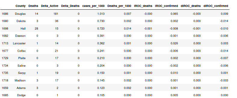
Nebraska data by county. 5/14/2020
In the table above, we see that one county, Douglas, the home of the city of Omaha, is driving nearly all of the new cases. Their case growth rate (IROC_confirmed) is 3x the next highest county and about 30x the rest of the counties in the table above. This indicates that the steepness of Nebraska’s case curve is primarily due to what’s happening in Omaha. Looking this up, I found this link that talks about Grand Island, NE, the third largest metropolis in Nebraska (Hall County). They had a meatpacking plant outbreak back in April and the virus made it into nursing homes and long-term care facilities. Note that now, Hall County’s case rate has flattened. They kicked off a flurry of testing and contact tracing in the county, which seems to have worked. Perhaps the outbreak in Hall County triggered one in much larger Douglas County.
Time series for Confirmed Cases – Nebraska 5/14/2020
Summary
I’m interested in watching how the COVID-19 infection spreads now that we’re moving into warmer weather in much of the US. I’m also interested in how “new” regions like Douglas County respond. Are the hospitals, the health agencies, and the governments learning from hard-earned lessons back East? If so, we may see cases with much lower death counts through the summer.
States ranked by growth of cases per 1000 persons – 5/12/2020State Data Table sorted by growth of cases per 1000 (IROC_confirmed) – 5/12/2020
I’m following a new trend that seems to have emerged with increased temperatures. Case growth has slowed in the hardest-hit regions but is increasing in new areas such as Nebraska, Iowa, Minnesota, Kansas, etc. The chart and table above are sorted by the case growth (IROC_confirmed) and you can see that the death rates for most of these new regions are very small. Keep in mind that case growth isn’t the thing we should be scared of (I predict people will continue to get infected by this coronavirus for years). The media is reporting case growth to support state lockdown extensions. I recommend instead that we watch the case growth closely (remember, some of it is surely due to the increased testing that’s happening across the US) and watch the death rates even more closely.
In the cases of the states that have had longer experiences with the virus (Rhode Island, the DC area, Massachusetts, Illinois, Indiana), note that though the current death rates (IROC_deaths) in those states are larger than in the new states, these rates are decreasing every day (dIROC_deaths). This also seems like good news.
Summary
It seems like 1) New infection outbreaks are being managed better due to what we have learned from the older outbreaks and this is resulting in more cases without deaths, 2) COVID-19 has not overwhelmed hospital systems in these new regions, most likely because hospitals have learned better ways of treating COVID-19 patients and are limiting ventilator usage (and using blood thinners), and 3) hopefully nursing homes have learned how to better keep COVID-19 out of their facilities. Perhaps this high case – low death trend continues through the summer.
Where are the cases/deaths and the hotspots in the US?
Cases and Deaths per 1000 persons by latitude – US States 5/11/202
The above chart shows that the United States follows the trends of the rest of the world regarding zones where the highest numbers of cases and deaths are occurring. The table with the data for this graph is below.
What do we see here? The band from 40 to 45 degrees North latitude has over 3x the number of COVID-19 Cases and pretty close to 5x the number of COVID-19 deaths than the next highest 5 degree latitude band. Regions in this band include NYC, Philly, Detroit, and Chicago, all harder-hit localities. With this region, the US has around 4.0 Cases per 1000 people. Remove this region and it drops to about 1.5 Cases per 1000 people. The former number places us 10th in the world by cases per 1000 and the latter number places us around 40th. So you can see this one 5 degree band makes a very big difference in our case numbers. It has an even more pronounced affect on the death numbers.
I also note that the slope (today’s rate) of the 40-45 band leads the pack but that 35-40 is catching up. No other region is close on this case (and death) growth measure. See below for a graph… This is a picture of “hot-spots”, i.e., regions with more rapid increases.
Fortunately in the harder hit regions, we’re seeing many of the growth rates slowing down (decelerating). Below are regions that have case numbers that are accelerating the fastest. Note that some of these are outside that hard-hit Northeast corridor. Also note that most of these ‘accelerating’ regions still have low case numbers (their case growth is just starting). And the measure we really care about (deaths) is still very low in these regions. As testing increases, this is a trend I’m seeing more… high numbers of cases and low numbers of deaths. Just something to watch.
Cumulative monthly influenza vaccination coverage estimates for persons 6 months and older by state, HHS region, and the United States, National Immunization Survey-Flu (NIS-Flu) , 2018-19 influenza season
Above is the flu vaccination rates for 2018 across states. The darker color is higher percentages of the population getting the vaccine. The highest states are RI and Mass with about 60% of the population vaccinated. The lowest are Nevada, Wyoming, and Florida, with about 40%. You’ll notice on the map of COVID-19 cases and deaths per 1000 persons that in general, though, states with lower flu vaccine are also states that haven’t been hit as hard by COVID-19 (and vice versa). Aha! Some may say, the anti-vaccination folks are right! Hold on, slow down…
US Cases and Deaths per 1000 up to 5/8/2020
Is this Causality or Just Correlation?
Many events share dependence with a third, less directly-related event. This can result in something called a spurious correlation. Many times, these spurious correlations can be uncovered quite easily once the “excitement” at the correlation has passed. A textbook example is the correlation between ice cream sales and drownings. This is true. Drownings are always highest in months that have the greatest number of ice cream sales. Of course, thinking about this, you will realize that these are really two independent events that both share a correlation with this thing we call “summer”! There are whole websites dedicated to the comedy value of uncovering spurious correlations. Here’s one of those sites.
Back to the Flu Vaccine – is this a spurious correlation?
Lets mull this over a bit. Our null hypothesis would be that there is no causal relationship between getting the flu vaccine and getting COVID-19. We would have to disprove this null hypothesis in a statistically-relevant way to prove that there IS a causal relationship (i.e., the flu vaccine causes someone to be more susceptible to COVID-19 or some such).
This would likely be very hard to do, because one would have to overcome the challenge of multiple third events correlated with both Influenza Vaccination rates as well as COVID-19 infections. One of these events may be that some regions have a perception of historically higher incidences of infectious diseases (like influenza and COVID-19) and have learned to get the flu shot. This seems very likely to me. Conversely, regions that traditionally don’t perceive great challenges with the infectious diseases won’t get flu vaccines as readily as those regions that do. These same regions that don’t traditionally get the flu as badly and therefore don’t get the flu vaccine, are also not getting hit hard by COVID-19 for the same reasons that they don’t get the flu as badly! Population density, cultural expressions, collectivist vs. individualist tendencies, and other factors may be at play, but from a scientific standpoint, if one wished to set up experiments/studies to determine if our null hypothesis was correct or not, they would have to control for these pretty large variables.
Funny Correlations
Here’s a funny example from https://www.tylervigen.com/spurious-correlations
I have added some factors and am exploring the correlation between these factors and overall numbers of cases and deaths (previously, I have been attempting to correlate factors with the severity of rates of cases and deaths. There is enough data now to try to tease out factors that share some dependence with the numbers of cases and deaths.
Correlations between various factors and total number of Cases per 1000 persons in a country
Things I find Interesting – Case number correlation:
Average rates of Tuberculosis have the strongest negative correlation with the total number of COVID-19 cases in a country. There may be many reasons for this, but it is an interesting datapoint. Perhaps more so because of the studies into the potential that a TB vaccine might be providing some kind of protection in the regions that still get it (which may well be regions that still have a high TB rate).
Countries with large numbers of deaths due to Zinc and Iron deficiency have experienced less COVID-19 cases. This might be simply that these deaths removed some potentially susceptible people from the pool of potential cases. Factors that might show this same effect are HIV percentage and even TB percentage (though the latter are more strongly negatively correlated with cases).
A country with a high Female Smoking Rate is more likely to have larger numbers of COVID-19 cases. This has been pretty consistent. Mean BMI number is also highly correlated with cases. My suspicion is that these individuals present with symptoms more quickly than others and therefore are formally counted as a case whereas others might not be counted. This concept also applies to people over 65. The same theory applies to the number of nurses per 1000. In countries with low numbers of nurses, perhaps many people never get diagnosed, and therefore recorded.
Population density is less correlated than the above factors, but is still positively correlated with the number of cases.
Deaths Per 1000 person – Correlations
Things I find interesting – Death number correlation:
Here we find the co-morbitities for COVID-19 as well as factors that may have a dependency with the number of deaths per 1000.
Note that having a high number of citizens over 65 is the highest factor that is positively correlated with deaths due to COVID-19. This is not surprising, but confirms what we are hearing.
Female Smoking rate is equally correlated with cases and deaths in a country. This would make me suppose that in this case, countries with a high female smoking rate are seeing more females die due to COVID-19 than other countries.
Countries with a high number of deaths due to eating red meat (how is this measured??) also have a higher number of COVID-19 deaths, but I suspect there’s a lot of similarity between this measure and Mean BMI.
Countries with a high number of deaths due to lack of calcium also see a high number of COVID-19 deaths. Not sure if this is just correlated (i.e., how drowning deaths are correlated with ice cream sales every year), but it’s one of the few factors related to nutrition that is postitively correlated. Other nutrition-related factors (deficiencies in Iron, Vitamin-A, Zinc) are negatively correlated and the rest of the nutrition factors here have no correlation at all.
Temperature is very negatively correlated with deaths (as well as with cases). My intuition is that this is causal, but I can’t support that exactly.
Finally, the Income Group and the Growth Rate are both highly negatively correlated with deaths. I see these as measuring similar things. Countries with a high Growth Rate are also generally growing in weath and moving up Income charts. This weath and what it brings the society (ability to shelter in place? Better health care?) makes them less susceptible to COVID-19 deaths (and cases).