COVID-19: Arizona Age Normalized Cases

Arizona Cases Normalized for Age Groups – 8/19/20

This above chart is a bit different because it shows the cumulative number of COVID-19 cases in the state for each age demographic divided by the total population in the state of that age group. This allows us to see how COVID-19 is really affecting the different age groups. A few things that are interesting…

1) The true rate of infection for 3 groups is pretty much the same. The 20-44 age group always has the most cases by raw number, but when you consider there are more of them than any other group, you can then see that they’re not excessively effected compared to other groups.

2) The 65+ group has less cases by close to 1/2 of the top groups. This makes sense because I’d imagine that many of them are being more careful due to the severity of the disease for those groups.

3) The under 20 group is much less likely to get infected. This may partially be because a good number of people in this group aren’t economically active and schools have been closed. Or maybe their immune systems are better tuned to the disease and they never show symptoms. Remember these cases are confirmed by tests, so there may be many people who never show symptoms and never get tested who have been infected.

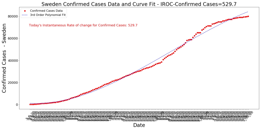
4) I’m very surprised at the lack of effectiveness of the state measures taken in late June. Pretty much every county in the state issued facemasks in public proclamations and the economy was essentially closed again. Still, we see no impact on cases for basically 6 weeks, then all of a sudden all the age groups show a marked decrease (the red vertical line). I truly expected the state measures to show a dramatic effect in 2-3 weeks (since the cycle time of the disease ia about 18-21 days). Very strange, but similar to what has been seen in other regions. Sweden (see below) had a sharp downturn in cases just like this and they had very few state measures taken. Makes me curious about what is really causing the rates to make such sudden changes.

5) Testing: The chart below tells the testing story. People have noted to me that media outlets are suggesting that falling case numbers have to do with the decreasing numbers of tests. The way I look at this data is this: First off, testing in Arizona is not strategic and random. People get tested because they feel sick or they work in jobs where there’s a high probability that they could be sick. This means the numbers of tests conducted has a high severity bias. So what this data might be telling us is that every day there are fewer people who feel sick who decide to go get tested and that an even lower percentage of these people are actually confirmed positive with COVID-19. This seems to indicate to me that the decreasing case numbers are probably legitimate.

Number of tests and % positivity. Note that I have no way of aligning the dates to determine if a positive test today = a confirmed case today. We’re counting on the effect of big data to give us information despite this.

COVID-19 Topic: Excess Deaths

I’ve been seeing a lot of confusing excess deaths charts floating around on Facebook and in the news media. The consistent story is that 2020 is seeing excess deaths due to COVID-19 over previous years. So I decided to see if I could replicate this using CDC data. Fortunately CDC seems to be actively (?) counting COVID and COVID-like deaths for 2020 at this URL. Also, CDC’s “Wonder” system allows one to pull data from previous years. So my strategy was to take deaths from the two most recent years in Wonder (2017-2018) and average these deaths to get a baseline that we can compare 2020 deaths to. Of course we are just over halfway through 2020, so I have to account for that as well (it’s interesting because we only have about 5-6 months of COVID-19 deaths, but we have an additional month or two of other deaths. I just assume that we’re halfway through our deaths to simplify.

Results

First, doing the work to connect this data resulted in some interesting insights. Below I show the state demographics sorted by the Excess Deaths in 2020 and we see some surprising things.

Table showing Excess Deaths in 2020 compared to an average of deaths from 2017-2018. Also shows the percentage of 2020 deaths coming from COVID-19, Pneumonia, and Flu compared to the 2017-18 average. Data from CDC, therefore it’s probably about a month old

What does the table reveal? First off we see that the demographics that have the highest number of excess deaths in 2020 compared to the 2017-18 average are the older demographics from DC and New Jersey. This makes sense due to the large numbers of deaths per capita in these states. We also note from this data that there are clear gaps in the CDC data because we’re not seeing New York at the top of the excess deaths list. Right now the CDC data for 2020 seems to only have about 1/3 of New York’s deaths captured. This is a big liability with using CDC data…

Another interesting thing to note are the rows with yellow highlighting. These are all demographics in states that have had very little COVID-19 death impact compared to the 2017-18 baseline. However, they still have a high Excess Death number. There are many reasons why this might be the case, but I’m suspicious because many to most of these state/age demographic groups are also at high risk from suicide. I wanted to check this by looking at 2020 suicide statistics, but apparently no one has this data. The most recent suicide statistics you can find are in 2018 CDC data.

Histogram of Excess Deaths

Now I want to evaluate what the distribution of excess deaths looks like across all demographic groups in all states. This will give us an overall sense of the probability of having excess deaths in 2020. I do this with a histogram. See diagram below.

Histogram of Excess 2020 Deaths compared to 2017-2018 baseline. CDC Data 8/12/20

This histogram shapes up to look a lot like a Gaussian Distribution with a mean around 110% and a standard deviation of roughly 15%. This means roughly 70% of our demographic groups in the country are projected to have excess deaths ranging from 95% of the 2017-18 baseline all the way up to 125% of the baseline. This indicates to me that yes, 2020 is a worse year for deaths. Based off the data in the table above, we can safely assume that in many regions this is due to COVID-19. The data shows that for some states and their older demographics, COVID-19 is projected to exceed the 30% of total deaths that heart disease consistently accounts for.

Notes:

  • I’ll mention again that I have accounted for the roughly 1/2 of a year of death data that we’ve collected in 2020.
  • I averaged 2017 and 2018 deaths to make sure that I didn’t pick a year with unusually high deaths (2017 had a lot of flu deaths) as my baseline. It is not possible to get this data from 2019 off the CDC site yet.
  • Yes, the CDC data is spotty. Normally the older data is pretty solid, but newer data always has data staleness issues with the CDC. They call this provisional death data to make the point that they’re slow and we shouldn’t assume it’s as good as the older data is.
  • Remember, since I’m assuming the death rates will continue at a similar rate throughout the rest of the year, this is a projection.
  • It is very possible that COVID-19 deaths will accelerate or decelerate and the excess deaths will look different at the end of the year than I project right now.

Conclusion

  1. Data truly gives us reason to believe that 2020 has been an unusually high year for deaths. This is unsurprising due to the focus our news media gives to COVID-19 cases. The mean value for excess 2020 deaths over the 2017-18 baseline is about 110%. This means that if there were 100 deaths in a region for the first 6-7 months of our baseline, on average, demographics have seen 110 deaths in 2020. This may seem like a small number, but an additional 10% is pretty significant and adds up.
  2. Some demographics in some regions will see COVID-19 be one of their top overall sources of death in 2020. About 15% of the rows in my table (that I just show just a small portion of above) will have COVID-19 account for more than 15% of their total deaths. To give an idea of the significance of that, normally heart disease accounts for 30% of the total deaths in the country and cancer accounts for 25%. The next highest source of death across the board is accidents at 8%. Flu and Pneumonia normally account for around 2.5% of total deaths. Recall too that the CDC numbers seem low, so this percentage is likely to increase.

COVID-19 Topic. Has Sweden’s Response Really Been a Disaster?

This article started with a simple graphic that I posted on Facebook for people to comment on.

Deaths across Age Demographics comparison for Arizona, Sweden, and NYC. Data from AZDHS, NYC Public Health, and Statistia. 8/7/20

I got the idea from a post on Linkedin that compared Sweden’s deaths with those in the US and it was really surprising, based on the constant media denigration of Sweden and their modified lockdown strategy. As the data shows above, despite not locking down their under 65 population, Sweden has to date had very few deaths under age 65. Less so than regions where lockdowns of the under65 populations were intense (and in Arizona’s case, happened twice). This comparison also made sense due to population size similarity between the regions (Arizona is about 7.3M, Sweden about 10.2M, this part of NYC is about 8.4M). Another interesting datapoint on Sweden’s unique management of the COVID outbreak is pasted below. Around early July the case rate adjusted sharply and now new case growth is a very small number per day. This is interesting that the case growth slowed so quickly, especially in light of their strategy to not close schools, restaurants, etc.

Sweden Cumulative Confirmed Cases since early March 2020. Data from JHU. 8/1/20

Population Density

One of the persistent questions about this comparison was whether it had merit since NYC is much more dense than Sweden and Arizona (I assume that’s true, but haven’t looked at the numbers). So since NYC is more dense, it makes some intuitive sense to us that the density factor may account for a greater number of deaths. Does it?

Correlations of different societal and geographical factors with COVID-19 Cases and Deaths has been one large area of interest of mine through this outbreak. I have reported on this in this blog multiple times as the outbreak has spread. In the past, I observed that population density is slightly correlated with case count across the globe but is basically uncorrelated with deaths. Does this still hold today now that the virus has spread to new places?

Correlation of Various Factors with Normalized COVID-19 Death Count

COVID-19 death and case data from JHU, Other data from the World Bank.

Note that the factor most positively correlated with Deaths in a region is the number of Cases in the region normalized by the population. This is followed closely by the Instantaneous Rate of Change of Cases (the slope of Case Growth). You would expect this to be the case, but it’s a bit surprising to see that the number of cases in a region is only just over twice as correlated with deaths as the Body Mass Index mean for males! This would also indicate that there are regions where the BMI of the population has had more of an impact on deaths as the case count in the region. As evidence that high case count does not always lead to high deaths (and conversely that lower case counts can lead to high deaths, see the chart of Arizona counties, where we have results all over the board. The counties with the highest death rates are generally the ones with lowest population density and highest pre-existing morbidities. Some counties (cities) have very high case counts and low to moderate deaths. Other counties have low case counts and high deaths. It’s all over the map.

Arizona COVID-19 Stats by County

Arizona stats by county, 8/7. Data from JHU.

Conclusion

I did the original assessment to compare what has happened in Sweden vs. other regions largely because of the negative media attention that Sweden has received from their COVID-19 lockdown strategy. As it turns out, for populations under 65 (the ones who were actually not on lockdown) there has been very few deaths (but lots of cases). This is surprising considering that in Arizona and NYC, government interventions such as lockdowns, closing businesses, and mandatory face masks have been credited with slowing the growth of the outbreak. There are many surprising things I’ve noticed through this time of COVID. I point out a few others in this post regarding the unintuitive role population density plays in COVID-19 deaths as well as the observation that the correlation of COVID deaths with high COVID case counts is much smaller than we would have guessed (I would have suspected 90% or higher correlation).

Overall what does this show us? Our intuition is not necessarily to be trusted and should be assessed more critically using data rather than prior beliefs. The same applies to media reports, which tend to only show data in support of a pre-existing narrative.

COVID-19 Topic: The Scarcity of Counties with High Cases per 1000 people.

I have been watching COVID-19 Cases per 1000 numbers flatten off around 15 or 20 in counties regardless of whether they were actively managing the outbreak or not. This has made me wonder if there were not a biological reason why the outbreaks tend to hit limits. Collecting and visualizing existing data would give some insight as to whether this hypothesis had enough merit to evaluate more closely. Below is a quick analysis of what the data actually tells us about the commonality or scarcity of counties with high normalized case counts.

Methodology

First, I’ll explain what a histogram is. Whenever you have data that falls into a certain range, say 0 to 10, you can take a count of the number of examples of that data that fall into bins within that range. The simplest way to bin this 0-10 range would be 0-1, 1-2, 2-3, and so on. This would give you 10 new ranges as your bins. Counting the number of examples in your data that fall between 0 and 1 gives you the number in the y-axis of the histogram (the bins become the x-axis). For many processes, we may see the histogram form that looks like a Gaussian (or bell-shaped) distribution with low numbers in the bins towards the edges and high numbers of counts around the mean (say 4-5 or 5-6). The histogram then gives us a sort of probability distribution if done correctly that can tell us a lot about the process we’re measuring.

So below you’ll see a histogram where I have bins that each represent 2 Cases per 1000. This covers a range up to our highest COVID Cases per 1000 number (around 140). As you can see, the highest counts cluster in the bins toward the left side of the chart. This resulting histogram (the gray bars) looks like the discrete Poisson distribution and the shape of the distribution can be modeled as an exponential decay (the red line). This is pretty interesting because I’ve found that the slope of cumulative case growth is best modeled with a third order polynomial, but the exponential decay is a much steeper slope than a polynomial. I’m curious about what this might be indicating, but this is the same type of process as radioactive decay.

The formula for this exponential decay is y = a*(-b)^x + c , where a represents the original amount, b represents the amount of change (note that since this is decay, b is negative), x in this case represents the growth in cases per thousand, and c is a constant. The b parameter is a measure of the steepness of the curve at any position x, so it is interesting to see how b changes over time.

You can see the values of a, b, and c in the upper right of the graph below. This is the most recent histogram. We can see that there is a steep decay down to the asymptote where we see counties with more than 60 cases per 1000 to be somewhat of a black swan event.

Histogram of Number of Counties across Cases per 1000 – 8/4/20

Now we’ll look at the histogram from 2 weeks earlier on 7/18. As you can see the b value is a bit higher, which makes the slope a bit steeper.

Here’s the histogram from 7/4, one month earlier than the top chart.

And the histogram from 6/4.

And finally 5/4


Conclusion

Overall, what I note in this data is that the probability of counties with large numbers of cases per 1000 is increasing over time. The trend on the steepness of the exponential decay curve that fits these Poisson distributions is that it seems to half every month. This is also an exponential decay signal in itself. Interesting…

However, there does appear to be some fundamental limiting factor based on the total number of cases in the country. The exponential distribution has a finite variance, which limits surprising “black swan” events in the tails of the distribution. The fact that the counties with large numbers of normalized COVID-19 cases are rare and that this trend follows this distribution and is best fit with an exponential decay curve indicates that the system that generates COVID-19 cases in counties (a system which includes natural and geographical features, societal control features, and cultural elements) naturally limits the cases. At least this is what the data has shown so far.

However, there does appear to be some fundamental limiting factor based on the total number of cases in the country. The exponential distribution has a finite variance, which limits surprising “black swan” events in the tails of the distribution. The fact that the counties with large numbers of normalized COVID-19 cases are rare and that this trend follows this distribution and is best fit with an exponential decay curve indicates that the system that generates COVID-19 cases in counties (a system which includes natural and geographical features, societal control features, and cultural elements) naturally limits the cases. At least this is what the data has shown so far.

Update – 9/6

The peak of the histogram has shifted to the right as more and more counties have experienced COVID case growth. However, the exponential fit of the slope (-b) from the peak downward is still in the same ballpark as it was a month ago. What does this indicate? I’m not completely sure, but it seems like the fundamental nature of the ecosystem (the world, the US, political systems, etc.) that generates “cases” remains consistent. Outlier counties in normalized case count are still very rare.

COVID-19 Topic: Hospitalization Flow

cumulative flow diagram for Pima County hospitalization charts. Data source: Pima County

Here’s a topic I have written about in the distant past (March?) that is of high interest to me. I agree with the “flatten the curve” strategy if an area is in imminent danger of overrunning their capacity to hospitalize people. One challenge with the strategy, though, is that to do this effectively one needs to understand the “flow” of patients through a hospital system. The chart above (that I hand built using reports from Pima County located here) is a rough start at this. What is it?

Cumulative Flow Diagrams

I use cumulative flow diagrams often at work to understand how “value” flows across a process consisting of a number of steps into the “hands of the customer”. The best way to visualize this is to think of a factory with a number of assembly and test operations that a product flows across on its way to the customer. At each one of these operations, some set of unique actions takes place. These actions all take some amount of time and then the product moves to the next operation (the movement takes time too!). This is how we assemble something called a value stream map. This map is a supremely valuable thing because it allows us to understand what’s happening in the factory. Are the operations taking the correct amount of time? How many products (Work in Progress) are flowing in the factory? Are products stalling at one of the operation and creating a problem by backing up the factory? The cumulative flow diagram can give us a nice visualization of all this.

What can we see regarding Pima County Hospitalization from this Diagram

First, the only data we can measure about the “hospitalization flow process” comes in the reports of hospital admissions, deaths, and recoveries. In a sense, these are the “operations” in the value stream map. I agree with you that these are pretty crude measures to use to try to understand something as complex as the hospital network in a county. But apparently its all the county asks for. What would I want to measure in order to do a better job of understanding the flow through the hospitals?

How about these potential measures:

  1. Time/Day a person arrives at the hospital and checks in.
  2. Time/Day the person’s symptoms are reviewed and a disposition is made (send them home, refer them to a doctor, assign them a bed).
  3. Whether a person tests positive for COVID (we might filter this data on this field)
  4. Time/Day a person is assigned to a more specialized form of hospitalization (ICU? Other?)
  5. Time/Day a person is put on a ventilator/intubated?
  6. Time/Day the person is discharged from the hospital (Recovery)
  7. Time/Day of death if appropriate.

With the above, we could build Cumulative Flow Diagrams that could tell us an awful lot about why the COVID recovery rate is over two weeks. We would learn where most of the time is spent (the bottleneck). If one knows this information, then they can take measures to relieve the bottleneck (add new nurses, add beds, improve the check-in process, etc.). I have to believe that the hospital already has very detailed measures like the above for their internal purposes, but from the standpoint of a County or a State evaluating the state of their hospital networks, this approach could be a game changer.

What do We See in Pima County?

Even from these crude measures which I assembled by hand into this CFD chart, we can see a few things.

  1. The “Work in Progress”, i.e., number of COVID-19 hospitalized patients in the system right now appears to have grown during our current summer outbreak from about 700 in mid-June to about 930 right now. It isn’t clear where these people are in this system, because we have no information on ICU discharges.
  2. The “Cycle Time” of the COVID-19 treatment process in the hospital system appears to be about 21 days. I’ll show a CFD or two from some European countries next and we’ll see if that’s good or not. This is the measure of the horizontal line between admissions and recoveries+deaths. You can think of it this way, go to any point on the y-axis (I’m showing this from 1500 counts) and calculate how many days it took the 1500th individual to get admitted to leave the hospital system. Obviously this presents an average since we don’t know the disposition of individual cases, but essentially the time between the 1500th admission and the 1500th “departure” is around 21 days. Note that this is an improvement from around the 500th count where we can see the cycle time was 28 days. I presume this positive trend has a lot to do with the improvements in the efficiency of care at the hospitals, along with new, better treatments, etc.
  3. The slope of the Recovery line is roughly the same as the Admission line. This is not optimal because we want the cycle time to close. Once we see the slope of the Recovery line increase and become larger than Admissions, we have a good idea that either the cases are slowing or the hospitals are improving, or both.
  4. Remember that much of what we believe that we can learn from this chart could be bogus if the data collection is haphazard or if the data is wrong. All the more reason for taking this seriously.

Cumulative Flow Diagram for Germany

Here is what a very good CFD looks like for Germany, where data collection was prioritized. This is not exactly the same CFD as what I show for Pima County, because we don’t have good access through the John’s Hopkins data to hospitalization numbers. So instead of hospital admissions, this CFD shows confirmed cases. If we had the hospitalization data, it would be a line somewhere in between the orange and the green lines.

If you draw the horizontal line connecting the orange and green curves pretty much anywhere, you can see that the cycle time for “Case to Recovery” ranges from about 14 days (each vertical line is 2 days) to maybe 18 days. Compare this to the hospitalization cycle time for Pima County of about 21 days! Note how the number of active cases (the WIP) in Germany was well over 50K cases back in April but closed to maybe 1000 cases or so in recent months. One thing, though, that I’ll also point out is that the WIP has opened a bit in the last week. Note how the orange line is curving upwards and the green line isn’t? That’s a reminder that even when this pandemic seems under control, one needs to keep measuring and watching the trends to be able to take quick action.