The diagram below shows COVID rates per 1000 person of the affected age group. So for example, currently the 55-64 year grouping has seen close to 100 members out of the total Arizona 55-64 population come down with COVID-19. This helps us understand how each age group is affected by COVID. We know that there are far more 20-44 year olds than any of the other groups, so obviously they have more COVID cases. But when you divide by the total number of 20-44 year-olds in AZ do they see a greater rate of infection? As you can see below, no, they’re near the top, but they’re actually below the 55-64 group and right equal with the 45-54 group. This is pretty interesting and gives us some food for thought:
The 20-44 and 45-54 groups make up the majority of the active workforce and are more likely to be taking public transportation to work.
These two groups are also probably more likely to be working out in gyms and going to bars.
From my observation (no data to prove this) all the groups other than the less than 20 appear equally likely to be going to restaurants.
Why has the 55-64 group accelerated ahead of the other groups though? You can see they were right there with the 20-44 and 45-54 groups right around mid-November. One guess that I might hazard is that this is a reflection of growing numbers of 55-64 aged persons in the state from winter tourism. This would cause the number of persons in this group in the state to increase from the standard number of permanent residents that I use for the rest of the year. Note that the slope of the 65+ group also seems similar since Mid-November to the 55-64 group, but the slope of the 20-54 grouping (most likely there are few winter visitors in this group) is lower. So I suspect we’re seeing an increased COVID rate in AZ since mid-November due to an influx of winter visitors.
Note that the 20-44 and 45-54 groups have the appearance of a decreasing slope and the under 20 group definitely has the appearance of a decreasing slope. This makes me think that the disease is slowing in its transmissability and we will continue to see case rates flatten out in the next week or two. Other reasons I might think this is because hospitalization rates have been slowing for a week and a half and death rates in the under 65 groups have also slowed significantly.
The below is the hospital bed comparison from the AZ DHS COVID dashboard. The red bars represent the % of ICU beds (in this case) that are in use by COVID patients. The dark grey is all other patients and the light grey is available beds. Note how the red bars are starting to trend over. This is a sign that the hospital COVID recoveries (and deaths, I suspect) are starting to exceed new admissions. This could be a false alarm and the hospitalizations will spike, but it doesn’t seem to be the way this disease works. Note that there are no real secondary spikes from the previous summer spike.
The second chart below is the one I have been maintaining that is more of a curiosity to me than anything. However, it has been interesting to note that at the same time that the AZ DHS bed usage chart started to slow, the percent of 65+ year olds that was hospitalized one week after being diagnosed with COVID started to trend down too. If you scroll a bit on this site you’ll see that for a long time, the 65+ year old trend line (maroon) sloped upward while all other groups sloped downwards. Now they all slope downward, indicating that less people are being hospitalized after being diagnosed with COVID.
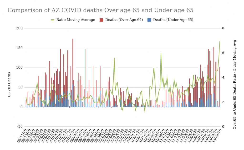
Below is another sign that the potency of the disease in society (note that the words “in society” are important here) is slowing. The below chart represents a comparison of deaths in people over 65 due to COVID with those in everyone else in the state. The green line is the 5 day moving average of the ratio of over65 to under65. Note that during the summer outbreak the ratio was pretty constant at around 2.5 deaths over 65 to 1 death under 65. During the virus’ “off-season” between August and November the ratio was all over the place because there were very few deaths. However, once the winter surge started, the ratio has been steadily increasing and hasn’t really gone down to the ratio of the summer months. What might this mean?
Perhaps the most susceptible people under 65 already died during the summer outbreak (or maybe they’re laying really low right now)? It does appear that people under 65 are far, far less susceptible to COVID absent comorbidities.
The overall death numbers in the over65 population do appear to the eye to be around the same as during the summer (but from my zip code analysis, they seem to be distributed more widely across the state). I wonder if this implies that there is a fixed number of people whose immune systems are “rigged” to fail under attack by COVID? Rigged, of course, through the mysterious operation of some unknown genetic markers or existing conditions of the immune system?
Finally, here’s a view of the case rates in both Pima (Red) and Maricopa (Blue) counties compared to the overall testing per day in the state (yellow). Note that testing peaked around Thanksgiving (probably people hoping to get a negative test prior to a Thanksgiving gathering). Testing seems to have fallen from Thanksgiving until New Years. Note that as the first wave flattened off around the start of August, testing decreased steadily. Since testing is an indicator of people that think they’re sick or think there may be a reason they’ve been exposed, it may well be that this is a sign of the surge slowing.
Here’s a quick Christmas Eve update of the Arizona Data by Zip code. This is a pretty interesting dataset because it allows me to look into much smaller areas than counties and see more granular trends. I can sort this data a number of ways and generally compare one or two weeks of data by zip code to see where the trends are. The below table is sorted by the percent growth in the zip code, but I also like to look at the data sorted by Normalized Growth (growth per 1000 persons in the zip code area).
As you can see, Pima county is topping the list for percent growth. This represents a surge in cases that is independent of the population in the region. It really surprises me that zip codes in Pima county are at the top of this list because Pima probably has the most restrictive anti-COVID rules in the state (including an evening curfew). The 85710 zip code is interesting because it is an older suburban area East of Tucson and the Median Age is over 40. This is kind of unique for a zip code in the top 10 by percent growth. Note that their normalized growth as a percentage of the population is very low, so what this tells me is that this zip code has had very little impact from COVID until the last week and then they saw a 23% surge. Note that the zip code in Douglas, AZ, (on the border with Agua Prieta, MX) has very different statistics. They saw almost 19% growth last week but have had a much bigger impact from COVID (their normalized growth is 4x larger than 85710). That means that their population was 4x more saturated by COVID last week than 85710. The next four zip codes by % growth are Pima county zip codes. The one with the highest normalized growth is 85706, which has had higher overall case numbers and also experienced higher normalized growth. Incidentally, it is also the zip code with the lowest median age and median years of education. Not sure what that means, but if I were to guess, I’d say this zip code has more people that can’t work at home.
Comparison of Normalized Case Growth with Population Density
Earlier I posted this interesting visualization showing how the zip codes with the lowest population density seemed to be experiencing higher than normal cases per 1000 persons. Below, I re-ran the data for last week and we see that at least for last week this interesting trend continues. There may be a multitude of reasons for this, but one interesting possibility is that the areas with higher population densities have more effective COVID restrictions in place and the areas with lower population densities may have less or no restrictions in place. This could be over-simplification, but it does seem to be the case that the counties with the most restrictive COVID measures are the largest by population.
Comparison of normalized Case growth from 12-13 to 12-21 with Population Density (AZ Zip Codes)
Is the Arizona Surge Slowing?
Quickly, below is the cumulative case curve for Arizona as of 12/24. The blue dashed line is my polynomial curve fit, which as you can see has fit the red daily cumulative case counts very nicely until about a week ago when we saw the case acceleration rates start to slow. As I’ve noted in the past, the slowing acceleration rates are generally an indicator of the slowing of a COVID surge. So keep your fingers crossed. I also have another post that I recently put up that is looking at decreasing hospitalization as another leading indicator of the slowing of a surge.
Here are a couple of visualizations that give me hope that the hospitalization surge is easing… The below is from the AZ DHS Dashboard. Red bars represent the percent of ICU beds being used by a COVID Patient, Dark Grey are ICU beds in use by non-COVID patients, and Light Grey is available beds. Note how the last few days have seen a flattening of the COVID percentage. This is the behavior we noted as the first Arizona ICU bed surge happened in July.
AZ CU Beds Available and In use (from AZ DHS Dashboard) 12/22/20
See below for my own metric, percent hospitalized today compared to cases from one week ago. If you scroll down to a previous post, you’ll see that the over65 group was still trending up on this metric. About a week ago (when I first noticed the AZ DHS metric flattening) the over65 trend on my metric flattened and then started decreasing.
Percent of current day’s hospitalization to new cases from one week previous. 12/22/20
None of this is certain, of course, but maybe these are leading indicators that the virus is starting to run its course. Looking at the AZ Cumulative Case curve below, you can see that the current outbreak (which started in late October) is getting close to two months in duration. Since I’ve noticed in other states that non-linear case surges last about 2 months in states that enforce COVID protocols, perhaps we’re nearing the end of our winter surge?
Since the Thanksgiving Holiday season I’ve seen a number of major media outlets leading with stories about how Thanksgiving led to an increase in cases. Examples from WebMD, NPR, and others. So is this real, or is it an example of Confirmation Bias? It’s hard to know and even harder when one looks at just short-term trends.
Parts of the justifications of these publications for their assertion that Thanksgiving led to an increase in cases is that contact tracing has discovered a number of cases that can be traced back to Thanksgiving gatherings. The NPR article reported that:
“We are seeing a tremendous surge in cases in many locations around the United States that are associated with the Thanksgiving dinners, family get-togethers and social events,” says Michael Osterholm, an epidemiologist and director of the Center for Infectious Disease Research and Policy at the University of Minnesota. Much of the evidence comes from health departments that are tracing clusters of cases, but Osterholm suspects that hospitalizations and deaths — “lagging indicators” — will reveal the full impact in a few more weeks.
So, can we determine that the Thanksgiving Holiday gatherings were causal for increased case counts?
Lets start by looking at the data. Below, I picked a few different states to compare their case rates in one chart. Since I’m normalizing the raw case counts by the population of the state (actually, per 1000 persons), I’m able to compare cases in a relatively “apples to apples” way. Therefore, we see a number of things in the chart below…
Select states cumulative case growth per 1000 residents since mid April 2020.
The Dakotas ran up to the highest numbers of cases per 1000 residents in the country. Their surge started around mid- to late-August where it appears that they transitioned from linear case growth to non-linear (3rd-degree polynomial) levels of case growth. During this latter stage, the growth rate increased every day (it accelerated, actually) until somewhere around mid-November when the cases began decelerating. You can see when this happens by looking at where the upward curve switches to a downward curve. Nebraska seems to have started decelerating around the same time. The Dakotas’ period of case acceleration appears to run from mid-August to mid-November (3 months) whereas in Illinois it ran from late-September to late-November (2 months). We see a similar outbreak range of 01 October to the end of November for New Mexico, which has had some of the strictest COVID policies in the nation. I’m curious if this is a sign of an effect of the stronger government COVID policies in Illinois and New Mexico, but this would take much more analysis to prove.
While the Dakotas were surging, California (the light blue line) was maintaining linear case growth. However, sometime around mid-November, California’s linear growth began accelerating and you can see that their rate of acceleration (the highest in the country right now) is starting to approach that of the Dakotas from mid-November.
We can also see a handful of other places where states transitioned from linear case growth to non-linear case growth. I’ve tried to eyeball these and place a blue diamond where I think the transition occurred. After the transition, as a reminder, every day the case growth rate increases. I did a quick peek over at Accuweather.com to see what the high and low temperatures were in the largest city in each “blue diamond” state during the timeframe the transition from linear to non-linear growth occurred. In most to all of these cases, the non-linear transition occurred during a notable weather shift where the night-time temperatures went from somewhere in the 60’s or above to 50 or below (degrees F). In some cases, the low temperatures dropped more than 5 degrees in a day or two.
I’ve marked the Thanksgiving holidays with a blue rectangle. At least of the states represented here, none of them had a linear to non-linear transition after Thanksgiving.
Since the NPR article mentioned a surge in the Southeast, I re-ran the code that generates the above chart using different states, mixing southeastern states with other warm states as well as NY and Mass. See below. Tennessee has a very high rate of acceleration right now (almost as high as California), so you can see that it is curving strongly upward. It seems like it’s inflection point between linear and non-linear happened sometime in early November. Looking at the other SE states, I see inflections in similar timeframes. I don’t really see any states here that were linear until Thanksgiving and then go non-linear (signal of a major outbreak). Since I live in Arizona, I paid special attention to the Arizona curve. You can eyeball on the green line below that all was fairly linear until mid- to late- October. Guess what, accuweather (see image below the curves) tells us that Phoenix had it’s daily low temperatures crash from 69 degrees to 54 degrees on October 26th.
Select states cumulative case growth per 1000 residents since mid April 2020.Phoenix October 2020 daily highs and lows for Mid- to Late- October
The Rate of Deaths per 1000 – the Lagging Metric
Below is a different metric that might give us an insight. These are the top 8 states by Cumulative Deaths per 1000 persons. The initial states that were hit hard by COVID back in May experienced much more than their shares of deaths for reasons that are probably fairly obvious… the virus was new and these states were first up to bat. They made mistakes as well as breakthroughs in how a community would respond to this virus and that resulted in higher death rates. But note that after June their death rates flattened off or at least became linear. The Dakotas are a very interesting comparison, however. They experienced very few deaths during the first six or so months of the COVID pandemic but then saw pretty high death rates (which are still increasing at a fairly high rate) ever since. In just the last month or so, though, the northeast states have seen a transition from flat or linear death rates to non-linear. But the slope of the current increase is pretty low. So what might all this tell us?
I suspect many of the people who died in the Northeast during May and June contracted the disease before anti-COVID policies (Masks, Lockdowns, Improved Retail cleanliness policy, etc.) went into place.
I also imagine that ND and SD didn’t have a whole lot of COVID floating around early on. The weather was nice and people likely were outdoors, where evidence is showing that transmission is less likely.
I hear anecdotally that ND and SD had no official policy about Government COVID intervention. I haven’t checked this, but it is what I heard and that seems to make sense as those states have a more independent streak to them. So what we see on their death rates is what happens absent a defined policy. My suspicion is that like most other states, their first death wave is in the susceptible community of people who have susceptible immune systems.
Right now the death increases in the Northeastern states appear like they will be much less severe than their earlier deaths.
As the Dakotas’ case rates have already slowed down and are decelerating further, I presume that their surge is over for a while. At some point I’d imagine that their deaths would flatten off too.
Top 8 states by deaths per 1000 residents since mid April 2020
Takeaways
Though the articles state that contact tracing data indicates that a high percentage of current cases stems to Thanksgiving gatherings, I can’t see any evidence of a surge of cases in any state that started after these holidays. What might this mean? First, as with any subjective human measurement and data collection system, I don’t think contact tracing is anywhere near 100% accurate. COVID is everywhere these days and there may real difficulty determining if new cases were acquired during a holiday meal (or if they were acquired at the grocery store, or the office, or the Starbucks that one stopped in at on their way to the gathering). Second, if Thanksgiving led to a surge and the existing transmission rates just before Thanksgiving held constant, then we would see it in an increase in the existing case acceleration. I think that would be a hard case to make looking at these curves.
COVID is very complex because it is interacting with a highly complex society. As such, attempting to find one causal reason for anything to do with COVID is probably going to be frustrating. That said, there does seem to be a strong correlation with temperature and COVID transitions to non-linear growth. I haven’t checked each one of these states (feel free to go off and check the others and report back!), but in the cases where I did, it seemed to be where there was a sharp fall in the nighttime temperatures.
The concept of seasonal outbreaks of influenza has been investigated for years, but recently there is consensus around the causality of temperature and humidity for influenza outbreaks (see paper from the Journal of Virology). The temperature number that the linked paper references as being ineffective for influenza transfer is 30 degrees Celsius (86 degrees F). The paper also states that influenza transmission is highly efficient at 5 degrees C (41 degrees F). I’m not aware of any top-notch papers on the effect of temperature or humidity on COVID, but the NIH has a nice summary of around 20 primarily non-peer-reviewed papers on the subject, most of which found that COVID has higher transmissability in colder weather and less humid conditions. One of the papers they summarize indicates that COVID survives and transmits most effectively between 13-19 degrees C (55 to 66 degrees F) and 50 to 80 percent humidity. This seems to line up nicely with the weather during the times where states transitioned from linear case rates to non-linear case rates. It would make sense that a healthier, happier virus would be more effective at infecting its targets (us!).
The Oxford Dictionary defines Confirmation Bias as “the tendency to interpret new evidence as confirmation of one’s existing beliefs or theories.” As such, the observations that most states were already in non-linear growth regions well before Thanksgiving and lack of any real evidence that any change in these acceleration rates occurred after Thanksgiving makes me qualify most of these articles about the Thanksgiving outbreaks as likely colored by confirmation bias (I’m sure we all saw lots of articles before Thanksgiving on how it would result in significant case surges). No one can prove that Thanksgiving DIDN’T create any increase in case growth, but there’s really no good evidence to indicate that it did.
Bonus – Top States by Case Acceleration and by Case Deceleration
Note that California has the highest case acceleration rate in the country. This means their IROC_Confirmed Case Slope (New Cases per 1000 residents per Day) will increase by .1211 or higher tomorrow. Note that North Dakota’s case acceleration is still decreasing and appears to be near to the point where they have just a handful of new cases per day.
Top US States by Case Acceleration (dIROC_Confirmed) on 12/22/20Top US States by Case Deceleration on 12/22/20
Here’s a bunch of Arizona (and some US State data) that touches on case growth as well as death and hospitalization trends.
Case Growth for top 10 Zip codes by raw cumulative case count. 12/14/20
Above is an interesting chart showing the case growth trends for the 10 zip codes in the state with the highest case counts. You can see a few things here:
Yuma again has the fastest growing zip codes (the dark blue and orange lines at the top). The next 8 highest are a mix of Phoenix and Tucson (and a couple of suburbs of Phoenix).
The aqua line that looks weird is likely a data error that happened a while back. Note how this line doesn’t follow any of the trends that the others do. It appears like whoever was collecting data messed that zip code up on 9/12 and kept messing it up a little bit undil 12/12 when they “fixed” the data suddenly. I point this out because this is pretty common. I presume that the state DHS collects this data and manages it (it does come from their site) and it does seem to be their habit to suddenly “fix” data. That’s probably better for them than backdating it due to their unwillingness to share historical data (their dashboard only shows the current day, so to build these plots I have to scrape the data manually every single day). One outcome of this habit is that much of their data is not very trustworthy (Hospitalization is a good example. They have messed that up multiple times).
Case Growth for top 10 Zip Codes when Normalized by Population. 12/14/20
Showing the same data as the previous chart above, except this time it’s normalized by population. This shows that the Somerton zip code of Yuma County is far outpacing the others per 1000 residents.
AZ Zip Codes with highest percent increase over last two weeks. 12/14/20
Above are the Zip Codes in Arizona with the largest “surges” in COVID cases over the last two weeks. This is a percentage of their previous case count, which isn’t the metric to end all other metrics, but it is interesting to note that for whatever reason, that region experienced an unusually large surge. In this case, we see Yuma County with the highest surge in 85349, followed by two zip codes in Coconino County. After that it is a mix of the two largest counties, Maricopa and Pima. Interesting things to notice:
The median age of all of these is pretty low, as is the median income. One exception to this stands out, 85383 in Peoria, AZ, which has the highest median age and median income (the two do tend to go together, of course). So it would be interesting to study this zip code to see what happened.
The two Flagstaff zip codes have very low density unlike the other zip codes which (other than Peoria above) are very high density. These two zip codes are north and east of the city of Flagstaff, so they are more rural. Both have a relatively sizable population of Native Americans. These represent areas that someone ought to investigate.
U.S. States sorted by Case Growth Rate (IROC_Confirmed). 12/14/20
Above we can see US States sorted by Case Growth Rates (IROC_confirmed). Note that some of these states case rate numbers are rising (Red Up Arrow) and some are falling (Green Down Arrow). What I have noticed is that once the dIROC_confirmed column goes down to near zero (or negative), the case growth flattens out shortly after. I saw this recently with North and South Dakota, and that did prove to be the leading indicator that their case rates were flattening out. I suspect that Indiana, New Mexico, and Utah are now through the worst of their winter outbreak (they all started before Arizona and California, who are now both on the rise). This is a good field to watch to understand when a state will stop accelerating in growth.
U.S. Counties sorted by change in Case Growth Rate (dIROC_confirmed). 12/14/20
Above we can see that two Arizona border regions have risen to the top of the list of Counties with the highest case growth and acceleration rates again. Santa Cruz and Yuma counties both had large outbreaks during the Summer and I had hoped to see them be relatively unaffected during the winter, but that seems to not be the case at all. Val Verde County in Texas is another border county, which makes me wonder if there’s another big outbreak in Mexico (I haven’t been looking).
Comparison of Arizona Over-65 and Under-65 Deaths per day and the Cumulative Case Curve for all demographics. 12/14/20.
I’ve showed this chart once before, so here it is updated. You can see a few things here:
The case growth for Arizona (the orange curve) continues upwards unabated. You can see this in the tables above too, of course.
Over-65 deaths continue to be the large majority of deaths. Even when the data isn’t normalized by population, the over-65 group (only 13% of the state’s population) dominates the death numbers. You can’t see this easily in this chart, but the ratio of over-65 deaths to under-65 deaths has risen from 2.8 during the first outbreak during June-August up to 3.7 since late October. This seems to indicate that the disease is either more dangerous for the over-65 group this time around or that it is less dangerous for the under-65 group. I’d lean towards the latter since the overall death numbers are still lower during this winter outbreak than they were during the summer outbreak by quite a bit.
Hospitalization Trends by Age Demographic. 12/14/20
The above chart is more experimental than anything. I was curious about what the ratio was of hospitalizations per day divided by the number of Cases from one week earlier. Then I calculated this ratio as a percentage for each age demographic. In theory, this represents the percentage of people that have a COVID case confirmed and then enter the hospital one week later. This isn’t a perfect metric (what if they enter 2 weeks later?), but it seems interesting and the trend has been pretty consistent for a while. Note the what I have done to see the trends is to fit a trendline to the data for each age group. The over-65 trend line slopes upward (maroon-ish color), which may indicate that the hospitalization is increasing for over-65 people as a percentage of over-65 people getting confirmed cases one week previous. For some reason, though, this ratio is decreasing for all other demographics. This may be meaningless (there’s not a whole lot of data yet), or it may indicate that the likelihood of going to the hospital due to COVID is decreasing for everyone but over 65 age people. I’ll keep building and tracking this.
Comparison of Over 65 and Under 65 Deaths in Arizona due to COVID along with the cumulative case counts. 12/1/20
Above is an interesting way to look at the two outbreaks we’ve had in Arizona and the cumulative number of cases (useful because it shows us the case trends).
Note that the deaths seem to be higher during the summer outbreak than during the current one considering the rate of case growth. During this current outbreak the deaths are so far staying under 50 per day, but back even in the earlier phases of the summer outbreak they were inching up to 100 per day.
Also, the deaths are just the raw number of deaths and aren’t normalized by the respective populations. What this means is that the red lines represent the total number of deaths over 65 years old (about 13% of the AZ population) and the blue represent everyone else.
Deaths during the current outbreak have a ratio of 2.95 deaths over 65 to 1 death under 65. During the summer outbreak the death ratio of over 65 to under 65 was 2.31. This is a pretty big difference and indicates to me that the virus might be getting less deadly for society as a whole. If I knew exactly how old the people dying were it would help (if they average 85 that’s much more informative than just knowing they’re over 65). This may indicate that the “Years of Life Lost” due to COVID is decreasing.
In the chart above, the state had lockdown restrictions in place until May 15, then most counties put mask requirements in place on June 9th. Early October is when most of the second set of restrictions on bars, gyms, and movie theaters were lifted. It doesn’t seem like any of these dates are correlated with anything the virus did. Seems like it has it’s own mind…