

As COVID numbers slow in my state (Arizona) and across the US, it’s difficult to see much in the way of trends. Here’s a quick update since the news outlets aren’t talking about the data much anymore.
Arizona Overview

Things to note. 1) The case rate is very low, even in the highest county (Mohave). I do believe this is a strong indicator of “herd immunity” through vaccination and natural immunity. 2) The counties at the top of the list are fairly rugged, individualist counties. I’m not sure their vaccination rate, but I could imagine that it might be lower. 3) Maricopa (more permissive) and Pima (more strict) had very different approaches to governmental restrictions about COVID. But at this point, their numbers are pretty much identical when normalized by population. There are a lot of papers coming out evaluating the effectiveness of governmental action during COVID. They’re not being highlighted much, but in general there’s not much confidence that the governmental actions accomplished much. Here’s a small sign that might demonstrate that point. 4) Yuma and Santa Cruz are both border counties that have the highest cases and deaths per 1000 persons. They appear to have been most affected by unconstrained outbreaks in Sonora, Mexico. This may point to the outcomes experienced with little to no government action (on the part of Sonora). Combined with the point from 3) above, this might demonstrate that there is an effect from some level — even small — of government measures, but that at some point, government action becomes ineffective.
US Statistics
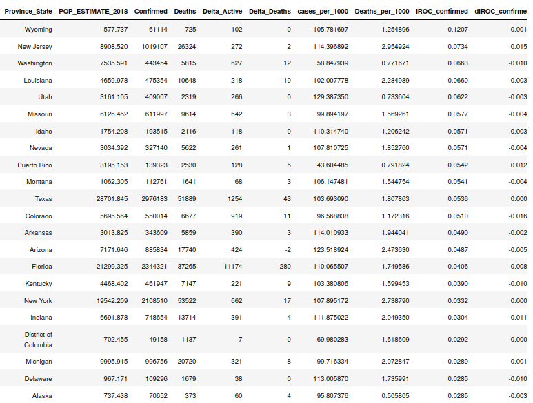
This table shows us that the case rate is very, very low for the majority of US regions. The only two regions with any rate growth (acceleration) are New Jersey and Puerto Rico. The rest of the states have essentially zero change in their case rates (which as stated before, are already very low). New Jersey is very interesting, as they’ve had the most consistent rate growth of any state through the whole COVID pandemic. When other states’ rates would flatten out, New Jersey’s would keep creeping upward. They also have the highest death count per 1000 persons of any other state. No idea why this might be.


The above two charts represent 1) the top 8 states by deaths per 1000 persons and 2) Cases per 1000 for a selection of “interesting” states. I include the deaths chart just to show the crazy effect of the big outbreak in the Northeast during the first few months of the pandemic. It took most of the others in the top 8 until November 2020 to catch up to the death rates that New York and New Jersey had in July. The other chart shows that high cases and high deaths are not correlated. Note that the top three on this list don’t appear in the top 8 deaths chart. New Jersey and New York are the only two states that appear in both charts. Of interest is New York’s and New Jersey’s unique case slope. They is mostly linear between November of 2020 and May of 2021 where all the other states here experience steep surges offset by plateaus. No idea why this might be.
World Data


These two tables sum up the two stories around countries around the world. The first shows the ones with overwhelming numbers (India, Brazil, Columbia, etc.) that make the news. The second shows countries that are disproportionately affected. In many cases, small countries like the Seychelle and Maldive Islands top the list, but you can see that Sweden, Czechia, and Chile are crowding them. These all have pretty high case counts for their populations. Finally, below you will note the countries that are experiencing high death rates normalized by their population sizes. These are places where deaths are very disproportionate. Note that Brazil and their near neighbors are high on this list and India is missing. The large numbers of deaths in India are just as tragic as deaths anywhere, but the ratio of deaths to people in Peru and Brazil are likely more overwhelming to those countries.
