Update on the Delta variant Surge – 7/31/21

As always, I’m capturing the state of the COVID pandemic through data. See below for the latest data across the US on the “Delta Surge”.

Current US State Status

State Data Table – 7/31/21

Above is the standard Data Table that I build from the Johns Hopkins COVID data. You might note that the Case Rates (IROC_confirmed) and Case Accelerations (dIROC_confirmed) are increased over the previous two posts here and here. The rate that Lousiana’s case rate is increasing is surprisingly high… perhaps the highest acceleration I’ve seen yet for a whole state. This may be another data point demonstrating how quickly this delta variant spreads.

Hot Spot Counties

Hotspot County Data Table – 7/31
Hotspot County Map – 7/31/21

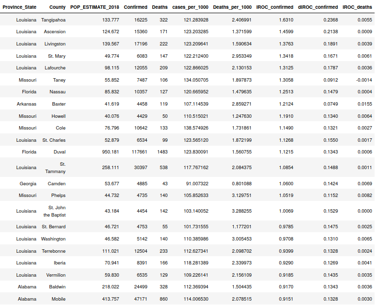
Above we can see a number of interesting things about the current Delta outbreak. First, the Louisiana Parishes at the top have really high rates and accelerations. This is one of the big reasons the whole state of Louisiana is surging. The top three parishes are all medium sized parishes that sit in between Baton Rouge and the New Orleans area, so perhaps their outbreaks are related.

The case rates and accelerations continue to inch upwards in the previous hotspot areas (Missouri/Arkansas border and Jacksonville, FL, area) but they’re not racing up anywhere near as quickly as Louisiana.

Finally, despite all these new cases, death rates are still extremely low… about 5 to 10 times lower rates of deaths per 1000 persons per day than back in January during the winter outbreak. For instance, Apache County, AZ, had the highest case rate in the state at this time (.728) but had a death rate of .033. Compare to any of the counties in the table above. They all have higher case rates than Apache County during January of 2021 and the highest death rate I see is .0082 in Phelps County, MO.

All I can take away from this is that 1) the Delta Variant is less deadly than the variant spreading in January, 2) our medical system has gotten much better at treating COVID, or 3) the deaths are lagging and we’ll start to see them showing up later. Of course we have the variable of vaccinations present now which could be impacting 1) above by making the virus less deadly in a society of a mix of vaccinated and unvaccinated victims.

Hospitalization Status in AZ due to COVID

ICU Hospital Bed Capacity (https://www.azdhs.gov/covid19/data/#hospital-bed-usage) – 7/31/21

Above is the current status from the state of Arizona of hospital beds. The Arizona case numbers are creeping up but are still relatively low (see below). Hospitalization (ICU) due to COVID is increasing, but it hasn’t yet hit the rates that were seen even in April of 2020. The trend here will be a good indicator of how serious this Delta outbreak is.

Arizona State Data Table – 7/31/21

Delta Variant Updates – US States – 7/24/21

Here are the latest updates for those of you who want to see the data.

COVID by State

State Data Table sorted by Case Rate – 7/24/21

The most interesting thing to note from above is that the acceleration column (dIROC_confirmed) is getting larger in the top 15-20 states ranked by their Case Rates (IROC_confirmed). See my post from July 15 to see the difference. You’ll also note that the case rate is increasing pretty much across the board, but for most of the lower-ranked states, it’s a small increase. So where (which counties) are driving these increases?

COVID by County

County Data Table sorted by Case Rate – 7/24/21

So we’re continuing to see a large case rate in some rural Missouri and Arkansas counties. Nassau and Duval Counties in Florida have jumped onto the list. These two counties are both in the Jacksonville metro area. If you add Camden County, Georgia, (just north of Nassau county) into the mix, it looks like some sort of local spread event, perhaps. The outbreak might have begin in Camden County and worked it’s way down… This article from mid July indicates that only 28% of eligible people in Camden County had been vaccinated. This Jacksonville, multi-state metro area has an overall case rate and acceleration that might be driving much of the overall Florida numbers.

Therefore, I see basically three major local events in the top 20 or so counties: 1) Arkansas, Missouri, Oklahoma border area 2) Jacksonville, FL, metro area, and 3) Midland, TX (why?). This leads me to believe that this variant IS extremely transmissable — it has spread pretty quickly in these areas, but I believe these areas have relatively low vaccination rates.

Arizona COVID by County

Arizona Data Table – Sorted by Case Rate – 7/24/21

Above is the data for Arizona as of 7/24. Here we see the bottom four counties in case rate (and all with pretty low accelerations too) along the border. Note in the NYT visualization below that Pima, Santa Cruz, and Coconino Counties all have pretty dark colors, i.e., high vaccination rates. Mohave, Pinal, Maricopa, Greenlee, and Yavapi Counties all have the lowest vaccination rates. This is similar to what we see above… the Delta variant seems to be growing fastest in low-vaccination areas. I’m not sure if this trend holds… things may change. But for now it does seem like Delta is very transmissable, but very localized (and possibly highly correlated with low-vaccination areas). And fortunately, as you can see, deaths remain very low as of this date.

NYT Vaccination Map – 7/24/21 (https://www.nytimes.com/interactive/2020/us/covid-19-vaccine-doses.html) – Note that the tan color (GA, WV, VA, etc.) represents missing data.
COVID Case Rates and Accelerations (diameter) – 7/24/21

Above you can see in my map of case rates and accelerations by counties there are a couple of large regions of outbreak. One hovers over the Arkansas, Missouri, and Oklahoma border areas and the other hovers over Jacksonville and S. Georgia. This is a pretty good picture of how non-uniform the current COVID Delta Variant outbreak is. The outbreaks also appear to correlate strongly with the low vaccination (light green) areas on the NYT visualization.

COVID Update – 7/15/21: Is the Delta Variant Running Rampant??

I’ve been seeing lots of articles alleging that the rate of infection is shooting up across the country. LA County is re-ordering the wearing of masks indoors, even by people who have been vaccinated. Does any of this make sense?

State Data Table: 7/15/21

Above you can see the current rates. Anyone who has read this blog for a while is likely to notice that the case rates for each state (IROC_Confirmed) are still quite low (see the table for April 28th here for a comparison). If you look around at my older reports you’ll find that Arkansas’ rate of .229 cases per thousand persons is a pretty low rate compared to previous leaders which were 3 or more times higher. But are the rates growing each day (accelerating)? In some states we see non-trivial accelerations. Nevada’s acceleration (dIROC_Confirmed) is causing the case rate to increase by .0171 cases per thousand every day. Missouri is at .0182. However, most states’ accelerations (while they are non-zero) are fairly small. Texas is pretty close to zero. My guess is that their case rate is falling. California doesn’t even show up on this list (their case rate is .031 and their acceleration is .0021).

I suspect that some of the panic amongst our journalists is the fear of the case rates doubling or tripling again like they did last summer. Or perhaps there’s just not enough to write about? If you look below, you can see that there ARE some counties that have really high rates. Most of these are in Arkansas and Missouri. As these states share a border, this appears to be a local situation more than a US national trend. You can see that the case rates in Baxter County, Arkansas (in the north of the state near the Missouri border), are about 4 to 5 times higher than the overall state rate. The second highest case rate is in Taney County, Missouri, which is quite close to Baxter County. I can’t figure out why the case rate is high in Midland County, Texas. There’s nothing about an outbreak on their County COVID website, so who knows.

Do take note however, that the rate of deaths is extremely small. This is likely to do with the better resistance that vaccinated people’s immune systems make to an infection.

County Data Table: 5/17/21

Los Angeles County Case Rates over Time

Below you can see the Confirmed Case curve for Los Angeles. An increase in slope is barely perceptible today, but you can see that cases have essentially been flat since about February.