

Arizona is about three weeks after reopening and there has been a lot of increase in case growth. Headlines like this are catching attention with the leader:
PHOENIX – Experts around the country and in Arizona are raising alarms about the state’s COVID-19 situation because cases and hospitalizations have increased for the past two weeks. The increase in cases can’t solely be attributed to increased testing in Arizona, experts say.
Lets look at the data and see if it doesn’t give us some clues. There’s a good chance the “experts” haven’t done this…
Here is data on all the counties in Arizona from 6/10/2020. I have sorted these by the case growth rate, which as you might remember is the slope of the tangent to the curve (involves calculus, just trust me, this is how you find the change rate of a curve).

What do we see here?
- The highest two counties by instantaneous rate of change (IROC_confirmed) are Santa Cruz and Yuma. Both of these happen to have highly traveled border crossings. The Nogales port of entry in Santa Cruz County sees around 10M people cross this border legally per year. The crossing near Yuma sees about 7M people cross. The Calexico crossing in California an hour or so west of Yuma sees about 12M people cross per year (and yes, Imperial County, CA, is seeing similar numbers to Yuma and Santa Cruz counties. So I have to assume that there is some contagion between Mexico’s cases and these two port of entry counties. Depending on how the state’s case growth is being counted, the numbers from these two counties could be significant. The high acceleration in case growth in these counties (dIROC_confirmed) indicates that they are seeing exponential growth. This is concerning and there’s a possibility cases may spread northward in Arizona from these counties. Both are fairly isolated, however, so perhaps that will minimize it.
- Maricopa county continues to see the majority of the actual cases in the state. This isn’t surprising due to their large population (about 4x larger than Pima county). We are clearly seeing exponential growth in cases — but not deaths. See time series charts later in this post. I’d guess that in this large, wealthy county most of the case growth is due to increased testing and social distancing lapses. There’s no data to indicate that protests are causing any of these cases. Note however that the acceleration of case growth is very small still, so most likely we’re not seeing a major exponential growth situation like we saw in New York City.
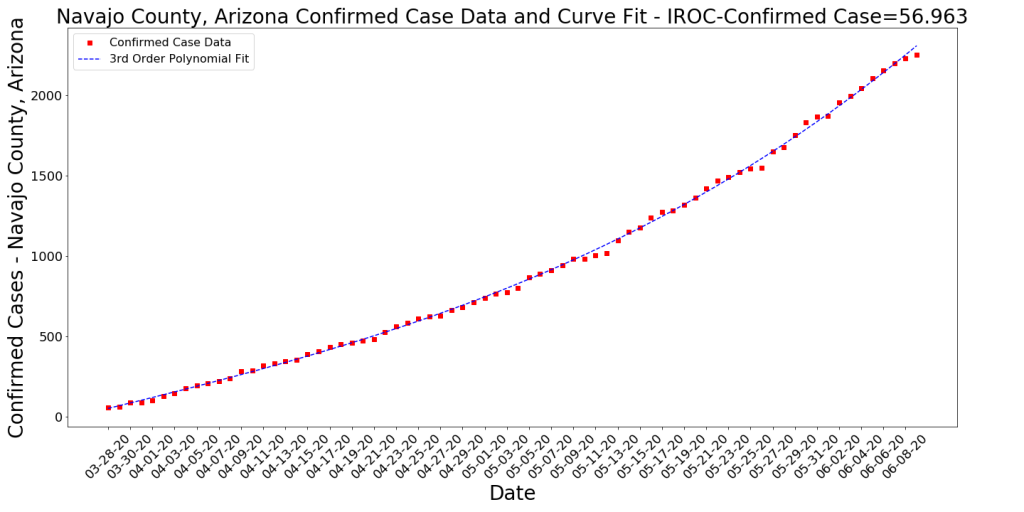
- Apache, Navajo, and Coconino counties all have Native American reservation outbreaks. It does seem like these are slowing down (see time series charts).
- Deaths per 1000 persons in the state is still very small compared to most other states.
Testing

As you can see in the chart above, AZ started a testing blitz a bit before they took the first phase of opening the economy. They report that they’ve conducted 416K tests so far. It does appear that the lions share of these testa have occurred after May 1. Assuming an average of 9K tests per day and over around 25 days (maybe some days they took off), we get at least 225,000 tests since May 1. The state’s advertised average positive test rate is 6.4%. Multiplying these, we get 14,400 positive tests that came from the increased testing. This accounts for nearly all the cases shown on the AZ Case curve above. Since it is widely reported that 50% of people with COVID-19 never know that they have it, lets assume only 7K of these new cases are symptomatic. Compare this to the 8-9K of cases before May 1, which one might assume are nearly all symptomatic (because testing was only given to symptomatic people), then you may see that symptomatic cases are flattening out. Not sure if this is true, but it seems likely that the graph now is showing at least 7K cases which would not have appeared before May 1.
Arizona’s Rank in the US per COVID-19 Cases
There’s a misleading chart that NPR has put out (it’s an experimental graph that Johns Hopkins is showing) in this article that makes a comparison between Arizona and New York. Both axes are logarithmic, largely because the New York data is so much greater than any other state, but the X axis is measuring total cases since January. The y-axis is averaging the last seven days’ worth of cases. The intent is to highlight case growth late in the outbreak cycle. In theory, states who had their outbreaks early will look as if their cases are dropping and states who did not have early outbreaks will show increases as large spikes. I think the whole format is not informative and is very misleading when comparing two states. Also, the cases aren’t normalized (which would allow them to not use logarithmic axes). Anyway, very bad plot which tells us nothing. It certainly doesn’t tell us that AZ is in crisis. See below for more measured data that tells us to be cautious, but not that we’re in difficult straits. First, I show a chart of the top states ranked by the Rate of Change of Confirmed Cases per 1000 persons.

Note that Arizona has moved up to 4th on the list. This (IROC_confirmed) is a volatile metric as the case growth curves are not a cumulative measure and can change to represent recent trends. But it is far more accurate and informative than a 7 day case average! To demonstrate the volatility, Arizona was 10-15 places further down the list earlier in the week. Here we see a bit of a resurgence in Louisiana along with some spillover cases from DC (which had a very steep bloom in cases a few weeks back). I was told by a friend in Virginia that the bars in DC are far more accessible right now than those in VA or MD due to more extreme social distancing in those states. So this might explain the VA and MD cases. Things to note:
- Note that there is a really legitimate difference between Deaths per 1000 and Cases per 1000 between Arizona (and Alabama) and the other states at the top of this list.
- Also, note that the COVID-19 deaths that occurred on this day in these states (Delta_Deaths) is fairly low. This has been the trend ever since probably mid-May. For an idea of the magnitude of these deaths, see below:
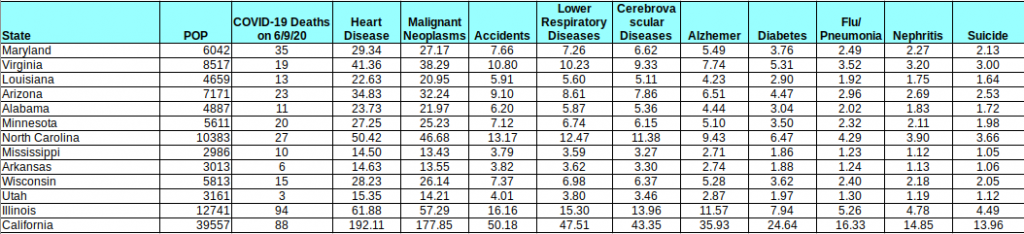
I put this table together using CDC US-wide stats and assuming uniform distribution of these deaths across all states (may not be a perfect assumption, but I imagine it’s good enough for demonstration). The table shows the COVID-19 deaths on 6/9 compared to the expected deaths per day of the top causes of death in the US (2017 numbers — the CDC always seems to be behind). As you can see COVID-19 deaths, even in a period of lower death rates ARE STILL A MAJOR CAUSE OF DEATH. However, they are not the leading cause of death in a majority of these states (and in California, they are well below the top 2). The point is that numbers like this, while troubling, do not pose a threat to our existence. Hopefully that is helpful. Keep this table handy as the numbers change. If deaths go up or down, this will remain a handy reference to risks that we are already capable of understanding and accepting.
Hospitals
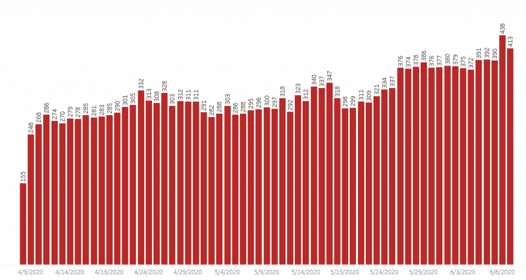
This is a different issue, as there’s not clear data on the hospital situation. Headlines like this from Tucson’s newspaper are very concerning. The assertion is that ICU space is running out in Maricopa and Pima counties. Arizona doesn’t collect data very well (although they have improved quite a bit since the crisis started) and therefore we’re lacking good access to hospitalization data and recovery data. We know from the above table that there were 595 new active cases in the state yesterday. How many of those will eventually wind up in a hospital? This is hard to predict, as it depends on who is getting infected. If 300 of the 595 are younger people who have lapsed in social distancing then the number could be small. We don’t know this, because the state doesn’t break down new cases by demographics (see AZDHS data dashboard). All the state tells us is the number of hospitalizations per day (and it appears there’s about a 1 week lag on this data) and some data on the numbers of different kinds of hospital beds in use. In the chart below, we see that the percentage of ICU beds that are in use right now has gone up from about 62% of capacity (the chart tells me this equals 741 beds) in early March (before COVID hit AZ) to 79% (1302 beds) yesterday. This seems very significant, but I wonder how many of these 1302 beds are in use due to COVID-19? Fortunately, we have that data from the state (assuming it is correct and there’s no lag) and I have pasted it below. It does seem like there’s some average number of beds that were in use during the early COVID-19 period from looking at the first couple of months and averaging… (ignore the first day, that looks like bad data collection). So it would seem that before our recent surge in cases there were around 300 beds in use on average due to COVID. So our number today (413) minus 300 would seem to be the growth in ICU usage due to the recent surge in cases. From the top chart, I infer that there must be around 1650 ICU beds in the state. Therefore, since the lockdown was ended, Arizona has seen COVID-19 cases consume 25% of its total ICU bed capacity (413/1650), compared to 18% (300/1650) during the lockdown period.

Ventilators
From the chart below, it would seem like ventilator capacity is still fairly significant. From a different chart that the state puts out (again, assuming all this data is accurate), it would appear like ventilator usage is up about 70 from the lockdown period. What we don’t know is if these ventilators are in the right places or not… There are other charts on the AZDHS data dashboard that show details about different kinds of hospital beds, etc. It would be very useful if they could show cumulative hospital admissions and recoveries over time, because if that data was available, it would be easier to understand the cycle time of this disease on the hospital system.

Time Series Plots by Arizona County
This is for the Data Nerds. Here are a few of today’s time series plots of cases by county (and deaths for a couple of counties). Note that most of these counties are seeing acceleration of case growth (i.e., exponential growth) but the two largest are showing potential deceleration in their death rates.
Conclusion
Essentially, yes, cases are growing but deaths are decreasing. We don’t know enough to understand how much concern to have. I continue keeping in mind that most people are going to get this virus. I read that it binds 10x better to the ACE2 receptor than SARS, so while SARS may not have been a threat to most of us, COVID-19 will likely hit us all… Probably no reason to be panicked, but certainly reason to take caution.


Is Yavapai not listed due to the low number of cases (and maybe testing)?
Ugh. Yavapai wasn’t listed because I was limiting my results to the top 16 counties by Case Growth Rates and Yavapai is about 20th! Oops!
Wondering if you plan to turn your data cannons to LA…..I have to think there are some hidden treasures in the data from LA County. One of the early places to go on lockdown, high population density and total pop. Near real time telemetry has been substantial
(cases, hospitalizations. etc), and also earliest to ramp testing capacity, so there’s a decent history of data (relative to the short history of COVID). I’ve been watching the #s daily, and it’s been an exceptional plateau. Through lockdown, reopening, protests, etc. Every day it’s 1000-2000 new cases and 20-60 deaths. Every day, day in day out. I’ve been tracking hospitalizations mostly, since it’s independent of testing capacity or demand. 3rd week of March an elderly neighbor died of COVID (week after shutdown), and only 6 others in our county ITD…..just seems it’s been a weird slow burn…. I know nursing/institutional homes were a significant fraction of cases for a while….wondering if that creates a base of cases in the slow burn….but if I were running SPC, this would all look like natural variation, with no special cause….. Very curious. https://calmatters.org/health/coronavirus/2020/04/california-coronavirus-covid-patient-hospitalization-data-icu/
http://publichealth.lacounty.gov/media/Coronavirus/
Thanks Kelly, lots of interesting things to mull over there. I’ll look into it. LA and Orange county have been interesting to me… I’ll put some analysis together for them next.