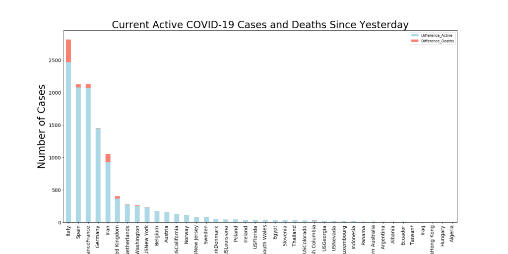
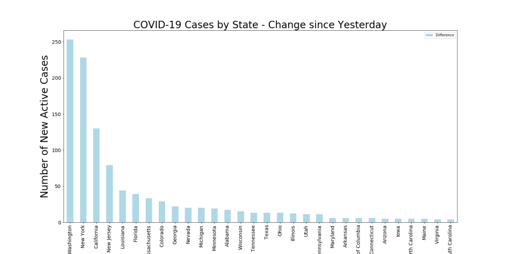
COVID-19 Daily Update – Who’s Not Reporting Data?

An article in the Guardian from a day or two ago detailed how Europe was wringing its hands over China’s potentially misreported COVID-19 statistics. I’ve been watching this for a long time, and in case you might think that China is just slightly under-reporting their COVID-19 deaths then take a look at the diagram below. These are all countries/provinces between 30 and 40 N. Latitude, so there ought not be any huge differences due to their region.

Population and Deaths for Localities in North Latitude 30-40

How to read this chart:

  1. My intent is to show which countries have sizeable populations in this region at the same time as visualizing their COVID-19 deaths. I have sorted from smallest to greatest number of deaths and you can see that plotted from left to right. The pink deaths columns have a transparency that allows the blue population bars to shine through… when this union between the two happens it has a maroon look to it.
  2. Both the left and the right y-axis are in the Logarithmic Scale. I did this because of the huge range of populations and the range of deaths, all the way from 0 (Tibet) to 22,524 (Spain). The Logarithmic scale lets us see all the data. Keep in mind, the logarithmic scale means that the lowest range is from 1 to 10 deaths, the next one ranges from 10 to 100, etc.
  3. Understanding this, we see there are 16 regions in this Latitude Band with less than 10 COVID-19 deaths to date. Of these, 2 are NOT in China (Jordan, Syria) and have a combined population of about 27 Million (and Syria probably has cases/deaths but due to Civil War state they’re likely not keeping records).
  4. This means there are 14 regions in this band with less than 10 deaths that ARE provinces in China. They have a combined population of about 450 million people. This is about 100 million people greater than the entire United States.
  5. So, to believe that China is reporting COVID-19 data responsibly, you also have to believe 1) that only one country on Earth (maybe 2 if you want to count North Korea) has solved this problem across essentially all but one or two of their provinces. (By the way, a chart from 20-30 N. Latitude looks just like this one, with essentially no deaths in Chinese provinces). And as you note from the graph, the population density of the graph is largely clustered on the left, no-deaths side. Therefore, you’d also have to believe that 2) this one country has accomplished this on a monumental scale across over 1 Billion citizens. This would be an amazing accomplishment of organization, communication, and synchronization of data and information across the largest country on Earth. Oh, and also, you’d have to believe that 3) they only had a slip-up in one province, Hubei, where the virus originated (and they’ve already revised death numbers upwards). Perhaps these numbers would be plausible if 4) there was some factor in the genetics of the Chinese people that protected them from COVID-19 or if they had a historical immunity to COVID-19 (in every province except Hubei…) from a previous undocumented outbreak…
  6. To believe that China is faking their data, you pretty much just have to disbelieve any of the above points. They have 5 provinces on this chart totaling 117 million people who are advertising a collective zero deaths right in a latitude range with around 43% of the worlds COVID-19 deaths. Yes, they have a disciplined society and the Communist Party can take a lot of control, but there are countries with similar cultures and governmental organizations that are reporting more believable numbers.

This obviously isn’t helpful as we’re trying to learn more about this virus and its impact. And it’s not even remotely believable. Sure seems like a bad political strategy on the part of China.

Here’s the same chart for the Latitude range from 20 to 30 N. Latitude. As you can see, the results are similar. One difference for this region is that it hasn’t been as hard hit as 30-40 N latitude.

Population and Deaths for Localities in North Latitude 20-30

COVID-19 Special Update – Latest on Factor Correlation with COVID-19 Death Rates

Latest correlation between multiple factors and current Death Rate due to COVID-19

This is the third time I’ve written about results from my ongoing study of factors that might be correlated with COVID-19 death rate. The first two are HERE and HERE.

Why Revisit This?

First, because I’m measuring correlation between these factors across the world and the current Death Rate, things change every single day. In my previous posting on this we examined the relationships between these factors and the death rate at that time. When that was done, Italy, San Marino, and Spain had the highest death rate (numbers of deaths per day) of any countries. What we saw then was a much higher correlation between the death rates at that time and Female Smoking (about 10 points higher then). The correlation between numbers of citizens over 65 and the death rate was also much higher then. This can be explained by looking at the countries that had the highest death rates at that time and realizing that they had very different demographics than the countries leading the list now. For instance, the state of New York has about 16% of its population over age 65 whereas Italy has 23% over that age. Therefore, there was a stronger relationship at that time between the age over 65 factor and the death rate. This is an example (a light one at least) of correlation that may not be causation. The fact that Italy had more people over 65 per capita did not necessarily result in those extra deaths (although it could have been causal) just as the fact that New York has less people over 65 than Italy doesn’t mean that their death rates are any smaller now. It’s just a less correlated factor now because the peak of the outbreak is in NY.

What do we learn now?

As I stated, we still see that the Age over 65 is still correlated with death rate, just not as strongly as before. The same thing applies to Female Smoking. A few weeks ago, countries with higher Female Smoking rates also had higher Death Rates. I postulated at the time that Male Smoking rates have much less variation between countries, so therefore, was less of a factor in potential causality of extra deaths. The correlation between the number of nurses per 1000 people has increased a bit, which still seems counter-intuitive. This may just be correlation without causation because the outbreak currently is peaking in countries with more nurses. If there is causation, I can’t imagine why it would be so. Male mean body mass index has remained more highly correlated than most factors and has stayed at about .15 for the last month. This may indicate that countries with higher BMI’s for men are more likely to be experiencing COVID-19 deaths with the advertised co-morbidity of Obesity. This also is consistent with the numbers from around the world that show a slightly to greatly higher percentage of COVID-19 deaths are men. This might indicate that females with a high BMI are surviving but men with a high BMI are not (since female mean BMI is less correlated with death rates). Density remains correlated with deaths as one might expect. The manners the disease is spread seems to indicate areas of high population density might be more likely to see a higher death rate. We know NYC is a very dense area (See table below) and it stands to reason that this density is correlated with the high death rates there. New York City has 8x the density of the next highest county (Nassau County), and has more than 10x the total deaths and 14x the death rate currently.

Negatively Correlated Factors – What do We Learn from These?

What has stayed the same? Temperature remains negatively correlated with the death rate at about the same level. What this tells me is that either 1) the areas affected both now and a couple of weeks ago were coincidentally at similar relative temperatures or 2) temperature does have some sort of causal effect on the death rates. This seems to have been borne out in some recent studies. Also, the negative correlation with Tuberculosis deaths has remained constant over the last few weeks. This indicates that countries with higher deaths from TB have seen lower COVID-19 death rates. Again, might be due to the fact that countries with higher TB rates have had less COVID-19 deaths due to other reasons (temperature, malaria, deaths to TB that then couldn’t die from COVID-19, etc.). However, it is interesting that this has been one of the more negatively correlated factors for a while. This indicates to me that perhaps there is a small causal effect from something due to a country’s susceptibility to TB that is affecting COVID-19 death rates. There are two studies underway to evaluate whether the BCG vaccine for TB offers some protection for COVID-19, but the WHO is cautioning that the evidence is still undetermined. Diabetes rates also are negatively correlated with COVID-19 death rates. This is surprising as Diabetes is a known co-morbidity. However, it may suggest that the areas with the highest death rates right now have a lesser issue with Diabetes rates. Perhaps this is because the regions getting hit hardest now have histories of excellent health care of patients with diabetes.

Conclusion

Again, there may not be much to learn from doing these correlations, but in general, this is a good practice to evaluate the sensitivity between variables and especially target variables that we care about, such as death rates. This shows a number of unsurprising correlations, some of which likely have some element of causality for COVID-19 deaths (but probably not a high rate of causality). It also reveals some surprising correlations that might present opportunities for further research and evaluation. This is sometimes how great breakthroughs are discovered because they can give us better understanding of the likelihoods of our prior beliefs about a subject. Sometimes (maybe even often) our priors are wrong and unevaluated until we look at the data holistically. This can help break us out of groupthink that is driven by emotional responses and not data-driven responses.

COVID-19 Daily Update: 4/23/20 – Interesting Stuff

New Active Cases and Deaths (raw numbers)

This chart has been uninteresting for a long time because it has shown some variation of US, Italy, Spain, and UK dwarfing all the other countries. The US is still in this position, of course, but there are a number of new countries in the top ten now. The fact that Russia has only started confirming large numbers of cases is very interesting. They’re a large country, so 5000 new cases is a small number when divided by their population. Still, the fact that they’re releasing large numbers now is a sign that perhaps things are getting worse. They seem to have avoided case growth up to this point somehow. We also see Brazil and Mexico creeping up the list. Brazil is also showing around 5K new cases but is also seeing an increase in deaths. Mexico’s numbers are lower, but up until recently, their cases and deaths numbers have tracked with Arizona’s, something that seemed very curious. Their reporting may have caught up to their cases, however, because they have had steep jumps in the last few days.

Sweden barely makes this list, but they have received a lot of press (bad press?) about their strategy to build herd immunity more quickly. As a result, they are only doing targeted social distancing. People who are not in high risk groups are going about their lives and businesses. This seems to make a lot of media people mad. I read a bunch of health department materials and statistics published in Swedish trying to understand what they’re doing (thanks again Google Translate). Essentially, I think I can summarize it this way. First, they ask people with high Body Mass Index and/or who are 70 and over to self-quarantine. Second, they provide instructions on what responses to take to symptoms. If you have lost your sense of taste or smell, then you are asked to quarantine for 7 days and then perform some set of actions with the health department before leaving quarantine, third, they have a network of people who are tracking cases and contacts and providing assistance to those in quarantine. Finally, they are conducting “symptom surveys” to understand where breakouts might be starting and find places to start contact tracking.

The net affect of this is that their strong communications and planning are resulting in a sense of confidence in the citizenry. This is impacting the number of people who are needing hospitalization for COVID-19 to quite a degree. Below I’ve pasted their hospitalization numbers per day. You can see that the numbers are already tapering off, but never reached much higher than 40 cases per day. This is manageable and keeping people out of the hospitals seems to be one of the key factors in keeping the death rate low. Their cases continue to increase, but remember, that’s the strategy! Get the population quickly immune and strongly mitigate symptoms along the way.

Singapore continues to be interesting to me, not least because I’ve seen a number of articles that are expressing shock that Singapore continues to see COVID-19 cases. Here’s one from CNN and one from Bloomberg. The Bloomberg article’s title is kind of irritating, “How Singapore Flipped from Virus Hero to Cautionary Tale.” What that title doesn’t tell you is how Singapore has done such a good job managing their cases. Yes, they are seeing case growth and at one point we were excited that they were one of the first countries to “flatten the curve.” But if you look at the charts below, you can see that any flattening that happened was probably premature. However, despite their numbers of cases, they still have only 12 deaths! They are doing similar things to Sweden and Iceland, and seem to be managing cases outside hospitals and addressing symptoms early.

Singapore cumulative number of Cases.

Finally, back to the theme of strong communications. I was listening to the Peter Attia – Drive podcast the other day and heard his interview of John Barry, who wrote the most important book about the Spanish Flu. I listened to this 2+ hr podcast twice because it was so compelling. One big takeaway from John was that one of the main lessons from the Spanish Flu was the importance of trust in leadership that was established by truthful communications. He also showed cases where the media’s not telling the truth led to larger outbreaks and greater fear. Apparently the Philadelphia media were still saying “nothing to see here” after over 14K people died in 3 weeks. So, in general, then, honest, direct, unbiased communications are critical in a time of uncertainty like this. This is why I continue to try to write about what I see in the data. Hopefully it’s helpful to someone.

COVID-19 Daily Update: 4/22/20

Active Cases (Diameter) and Case Growth (color)

Above we can see the state of confirmed COVID-19 cases across the US. A handful of things have changed. We’re seeing some localities reduce their number of active cases (mostly through recoveries) and thus, their bubbles are getting smaller. The purplish color is an indicator that the number of cases isn’t growing.

Interesting things to note include that Louisiana’s death and case rates have essentially stopped increasing. Michigan is in a similar position. Most of the new cases in Louisiana were outside the two hardest-hit parishes, Orleans and Jefferson. So maybe this is a sign that the first wave is slowing. Washington also seems to be through the worst part of the first wave too. No telling what a second wave will look like, but getting through the first wave is probably notable regardless. Finally, on the sad side, New York State is now approaching a death percentage of 0.1% of their population. This is about double the second highest (NJ) and over 10x of what most other states have seen. I still struggle with the huge disparity here and would love to understand why it came about.

State Data Table from 4/22/20

Below I show Case Growth curves for some states. Louisiana and Washington are both starting to decelerate while Texas is probably getting close. Again, as oft stated here, the case numbers aren’t the best indicator, as most studies are now showing that many, many more people are getting this virus than are being reported. Some of this is due to severity bias (i.e., you get no test and don’t get counted if your symptoms aren’t very severe).

Louisiana’s current Case Growth Curv
Washington’s current Case Growth Curve
Texas’ current Case Growth Curve

Finally, here’s the current US breakdown across 5 degree latitude bands. As you can see, most of the cases and deaths remain in one band.

Normalized Cases and Deaths by 5 degree latitude bands – US States only.

COVID-19 Special Update: Iceland continues to point to the real COVID-19 numbers

Cumulative Flow Diagram for Iceland showing number of active cases decreasing

The above is exactly what I have been looking for in my cumulative flow diagrams… the top line curving over and flattening out while the recovery line (green) steadily increases. When the green and orange lines touch, it will mean that there are no active cases remaining. A couple of interesting things about this diagram.

  1. New cases seem to be shrinking down to zero. This might mean that the infection is close to running its course. There may be new waves, but Iceland is one of the most likely countries in the world to catch it quickly.
  2. The cycle time for recoveries is now slightly longer than the 14 day quarantine period. Not sure what this might mean, unless maybe Iceland has learned that 14 days is too short to declare a recovery?
  3. The death line on this chart (red) looks flat but it actually isn’t… the number is 9. This means the infection rate (ratio of deaths to all infected) is around 0.5% The news outlets are very impatient to present the infection rate in each locality and are rushing forward numbers like 4%-10%. Of course most of us know that’s bogus and irresponsible because no one has any idea (except in iceland) how many people were truly infected. We know that the infection rate for influenza during this COVID-19 period has been between 0.06% and .11% based on the CDC’s estimates and models. I suspect the media outlets are scrambling to document infection rates so they can provide this sensational comparison (or perhaps make a political point in the process.
  4. Case Rates vs. Infection Rates. Above I showed infection rates, which is the total number of deaths divided by the total number of infections. Sometimes the case rate is shown interchangeably with the infection rate, but it is a different thing and is typically defined as the number of deaths divided by the number who report for medical care due to the infection. The case rate, therefore, is very hard to calculate unless hospitals keep good records and release them (something I’m not seeing right now). We know infection rates because the numbers of tests and the numbers who “fail” the test and are infected are both released.
Iceland Statistics from https://www.covid.is/data

In the diagram above we can see some of the same data from my chart, but what is interesting is the low number of the active cases that are hospitalized. This would translate to something like 6% of all the confirmed cases that are getting hospitalized. Only .8% of the cases go to the ICU.

Iceland infections as a percentage of tests conducted from https://www.covid.is/data

The above chart is also interesting. Iceland has two different techniques for testing for COVID-19, the NUHI (government) and the deCODE (private). What’s most interesting, however, is that in the last month, the percentage of tested people who show up as infected has dropped to nearly zero. This might show that the outbreak is dying out there.

Icleand active infections, recoveries, and deaths by age https://www.covid.is/data

Finally, Iceland’s infection demographics is very illustrative for the rest of the world. As you can see above, the age groups that have been confirmed as a COVID-19 infection range largely from 18 to 70. I presume that this is because the outlier ages are quarantined more effectively (not going out to buy groceries, etc.). However, we see most of the deaths in the over 60 age group (consistent with other European findings). What this doesn’t show is that contrary to other news reports, Iceland is seeing essentially zero difference in cases between the genders. It’s essentially 50-50.

Wrapup

What does studying Iceland help us understand? Because they are approaching this outbreak scientifically, they are learning more and faster than any other nation. I’d imagine that this is also preventing their media folks from sensationalizing and being creative with numbers. One of the conclusions from the 1918 Spanish Flu outbreak was that the media’s type of reporting could truly influence the direction the outbreak went in their region. In Philadelphia, the city that was hardest-hit during the Spanish Flu, the media was trumpeting “Nothing to worry about here” even after the city had seen 14K deaths in three weeks. In other cities, the media (and government) focused on telling the hard truth and the outbreak was more controlled.

COVID-19 Special Update – Can Unsupervised Machine Learning Predict Outbreaks?

Maybe that’s a provocative title, but one of the questions I’m exceptionally curious about is if measurable factors about a locality can be used to predict the locality’s response to a COVID-19 outbreak. I’ve attacked this through a correlation study using features measured by WHO and the World Bank (see LINK here). This project is another attempt to address this question.

Background

The Census has a feature online called QuickFacts. This is a really nice tool where you can pull a lot of information about localities in the US (cities, states, counties, etc.). This information covers broad areas of each locality and consists of elements like population, age/race demographics, housing, family/living arrangements, computer/internet access, education, health, economy, transportation, income, business info, and geography/density. As you can see, this amounts to a whole lot of data about specific localities. See image below. The downside of this tool is I haven’t yet found a way to automate the pulling of data, so I had to collect this data on a number of carefully selected counties by hand. My data collection strategy consisted of ensuring I captured data on counties with a wide range of COVID-19 impact as well as counties of different sizes and types. Once I captured a number of counties in the QuickFacts tool I then blended in my data for the Deaths per 1000 population statistic for that county.

Technique

Unsupervised Learning is a form of machine learning which allows one to find hidden structure in data when there isn’t a natural label present. I chose this approach to evaluate whether the Census QuickFact data could be used to build a predictive model for COVID-19 impact because it provides a more visual and explainable way of evaluating the predictive model. Also, I can demonstrate results well despite a small dataset. Both of these reasons should hopefully become more evident a few frames down. QuickFacts provides me 65 different data features for each locality, and this is way too much data to evaluate as one would with normal visualization-based analytics. In general, the human brain is wired for three dimensions of data (x, y, and z; also length, width, height). This is why 3D visualizations are easily consumed by humans. Add a few more dimensions of data, however, and it becomes very hard for our brains to see the patterns. To get around this problem and create a model that lends itself well to human visualization, the first step I take in my approach is running an algorithm called Principal Components Analysis. PCA is a technique that in a nutshell can take X features of data and provide the user with n uncorrelated features. In my case, X is 65 and I choose n to be 2, which will allow me to put the data into a 2D plot. This is a very clever trick that was invented by the great statistician Karl Pearson over 100 years ago. The downside is that when I do a plot where the X axis is Principal Component 1 and the Y axis is Principal Component 2, there’s no obvious mapping of the X-Y relationship in my mind because I have no idea what PC1 and PC2 represent other than orthogonal views of my 65 data features. What you have to keep in mind, though, is that even though we can’t explain to our boss what this relationship really means, we DO know that the Principal Component space represents real information and variation on information from all of those 65 features. If you believe me that the location of a datapoint (a county in our case) in PC-space is important, then you can start to understand why this approach is useful. If you look in the diagram below, this is what plotting these 65 features crunched into 2 Principal Components looks like. To make it clearer which of the datapoints are most similar, I also run an algorithm called K-Means, which is a simple unsupervised learning clustering algorithm where I tell it that I believe there will be X clusters (I chose 6 for this example) and it fits the data to that number of clusters. The clusters are identified on the chart below by the large blue numbers. Note that the crude red and green enclosures and the “Heavily Affected” and “Lightly Affected” labels are done by hand after the plot is generated.

What the Unsupervised Learning Tells us

When I run this algorithm and build this plot, I can see a clear boundary between the counties on the left of the diagram and the counties on the right. At this point, I won’t know what that means until I do a further evaluation, which I show below. I dump all my data including cluster ID’s into a table and then blend in the Deaths per 1000 population numbers for these counties.

Once I sort the data by cluster and apply conditional formatting to the Deaths per 1000 column, I can see a crude trend emerge. In clusters 0, 1, and4 I see more COVID-19 impact than in 2, 3, and 5. Noting this and returning to the PCA chart, you can see that the more heavily affected clusters are on the left side of the chart and the more lightly affected clusters are to the right.

Of course there are exceptions and strangeness that I can’t readily explain here… Maricopa County is clustered with two other large cities (Chicago and Seattle), both of which were hard hit. But when I look at that cluster, it’s not exceptionally tight… there is some Principal Component “distance” between all three. I believe this distance is meaningful. Another strange cluster is number 4, which includes a number of lightly hit suburbs outside the Northeast and the worst-hit county in America, New York. This explains perhaps why it is on the same side of the chart with the more heavily-hit clusters, but I have no idea why they’re together. There’s a reason, but I can’t decipher it without a lot of digging (which I just don’t have time to indulge in). However, overall, this is an interesting trend.

How this could be used

IF I was able to collect significantly more data and I continued to see this trend where location on the PC graph had strong correlation with deaths, then I could run PCA on a number of counties that had very few COVID-19 cases and evaluate where they landed on the PC graph. If a county landed in the area occupied by a hard-hit cluster of counties, there’s an indicator that that county may have similar characteristics to those counties and might be at greater risk to COVID-19. Not a certainty, but even an indicator of risk might trigger extra precautions (and even save lives).

Other Work I’ve done on This Idea

I mentioned that my notion is that the PC distance between counties might also represent something real and have separate correlation with death rates. I did a quick experiment where I calculated the PC distance between each county using the Pythagorean theorem and then graphed the difference in Deaths per 1000 for two counties against the PC distance between those counties. The results are a bit noisy, but I’ll paste the overall results below for you to review. As you can see, there are three major outliers… NYC, which has been crazily hard-hit and Arizona/LA, both of which have been lightly-hit. The coefficient of determination (R2) of .12 tells me that the trend line in the lower portion of the chart is not a good fit. My eyes tell me the same thing… Therefore, I can’t create a good model that relates the Death Rate to the Distance using all the data. I tried different things like removing the outliers and essentially, the trend line on the data in the lower left of this chart gets about as high as a R2 of 0.45, which is interesting, but certainly not compelling.

Stuff that Remains

I’d like to collect more data and do so as the COVID-19 outbreak progresses. There MAY be a better relationship between the deaths and the PC distance, but we may not be able to see it until the disease progresses further. I might spend some calories looking into automating the pull of the census quickfacts data. It’s too time-consuming to do this manually to get the kind of data I think we need.

Supervised learning. There are additional approaches using supervised learning we can try to map the quickfacts features to the deaths per 1000 label. This could also be used to build a predictive model. I chose the Unsupervised approach first so I could demonstrate it with better visualizations, but I have much better algorithms at my disposal using supervised learning. This needs to wait for more data, unfortunately, so stay tuned.

COVID-19 Daily Update: 4/16/2020

Today I’ll share a few different views into how the outbreak is manifesting in different regions.

  1. Raw Numbers of Deaths: This is what gets the headlines, but 1000 deaths in the USA is much less severe than 500 deaths in a much smaller country. Regardless, it is a number we intrinsically understand, so we keep being bombarded by it. Normally I show deaths per 1000 population these days, but the following graph is just cumulative deaths across a number of countries. I put it up here to demonstrate what the trends are.
Cumulative deaths per country (US, China, and Iran excluded)

In the above, we see the rate of deaths per day decreasing in a good number of the hardest hit regions. Spain and Italy’s death rates have been decreasing for about a week. Note that of the 4 most affected countries, though, two (France and England) have death rates that are steadily increasing. At one point, it looked like France would be joining Italy and Spain and start decelerating its death rate, but in the last few days, we’ve seen a new spike. The next grouping of countries (Belgium, Germany Netherlands) has a much lower rate than the top four. These countries have seen similar numbers of cases to the top four, but have managed to keep the death count lower. The third grouping of countries (Brazil, Turkey, Switzerland, Sweden, Portugal) are a mix. Brazil has joined this group recently and is seeing growth in numbers. Turkey has been here for a while, but has kept the death rate low, but steadily increasing. Switzerland has had even more success in keeping their death rate low while still managing an equivalent number of cases to their neighbors. Sweden has moved up into this group recently, with their famous “no-distancing” approach possibly being a contributor. As you can see, different countries are being affected differently by this outbreak, particularly in the number of deaths, and it will be interesting to evaluate what factors contributed after this has passed on and the data improves.

2. Confirmed cases: I think we all know by this point that the confirmed cases metric is a bit inconsistent. However, I assume it’s showing us something of interest, we just need to figure out what it is. One thing I’m assuming from doing a little research is that in most countries, cases get confirmed through a similar process. First, a person gets COVID-19 symptoms, then they beg someone for a test, then they either get sent home to quarantine or they get sent into a hospital (Iceland’s the only country I’ve heard of that probably follows a different process since they’re systematically testing non-symptomatic people). In this process, there’s one common denominator, COVID-19 symptoms. So the confirmed case metric might be a proxy for the number of symptomatic people in a country. It’s probably not a good measure for hospitalized people in a country (unless that country is China and wants to keep its numbers low). In most cases, it’s hard to come by the percentage of confirmed cases that end up in the hospital, so we can’t even calcuate that interesting metric. The table below shows the current state of the world, sorted by Confirmed Cases per 1000 people. You can see lots of interesting things in this table. It makes me ask a number of questions… Why are the outcomes so different for Portugal and Spain? Portugal’s numbers are very similar to Germany’s. And what can explain the differences in the numbers between Italy and Germany? Looking at Israel, they have some of the lowest death numbers in the world. I hear their armed forces are playing a part. How is this working? Why do Iran and Turkey have such different numbers? And so on…


3. We’re starting to see case growth in South Latitudes. The chart below is only looking at how the rates of cases and deaths are growing, so they can change more quickly than overall numbers of cases and deaths. These rates can tell us where the current hotspots are. I’ll be posting this chart periodically so we can watch how COVID-19 spreads (or fails to spread) across the world. Of interest here are the rate of case growth at the far left. This largely represents New Zealand and Australia and might be showing that the conditions are starting to be more supportive of the virus in this region. The latitudes to the right continue to show the same kinds of growth. The actual data for this chart is below. Remembering that the graph below is showing rates of change, note that the deaths per 1000 people for latitudes 40-50 are still higher than any other region (although it looks like other latitude ranges might be growing faster from the chart below).

rates of change for deaths and cases across latitudes.

COVID-19 Special Update – World Data Combined with US Data

Since JHU started separating COVID-19 data into world and US categories, I have mostly been showing the data separately. Now with the US cases emerging as the worst in the world, I’m showing them combined to give people a sense of what is happening.

World Sorted by Deaths per 1000 population

World+US COVID-19 Numbers combined

Above is the data sorted into the categories that I think are the most informative. These are the ones I’ve been showing for a while. What we see here when sorted by Deaths per 1000 population is that the worst-hit US States are at the top of the list. We also see some of the European countries which had previously topped this list moving their way down the list. Of course, as a death is kind of final, the only way to move down is for someone to pass you up. Note that Sweden, who is famously not really doing social distancing is moving up the list with a fairly high rate of change in the deaths category.

World Data sorted by the Highest Death Rates.

World+US COVID-19 Data sorted by the Death Rate

The above is sorted by the slope of the Deaths per 1000 population curve (IROC_d_n), so it represents the areas where the death rate is currently the highest. Note that this number can change from day to day, so more than the Deaths per 1000 table at the top, this represents today’s status (vs. deaths that happened a week ago). In this table we can see that countries like Spain have slowing death rates. They still reported 300 Spanish deaths yesterday, but the rate is slowing. New York’s rate of change for deaths is about 4.5x greater than Spain’s right now. Since these deaths are normalized by population, this is a legitimate comparison. Also note that the change in the slope (dIROC_d_n) shows that New York and Belgium’s death rate is increasing. This means that their death rates are accelerating more than others. New Jersey is showing a much lower rate of acceleration despite having one of the largest rates. What this shows us is that the situations which create these relationships are very different across different localities.


New Active Cases and Deaths that Occurred Yesterday worldwide.

COVID-19 Daily Update: 4/14/2020

Largest numbers of Active Cases and Deaths, Normalized by Population – Non-USA

Not much has changed in a few weeks in the chart above. Italy and Spain continue to have large numbers of active cases but Switzerland has less than 1/10 of the total deaths as Spain and Italy (1/3 of the deaths of those two when normalized by population). UK has a growing number of deaths, but when normalized, the UK numbers are in the Switzerland camp, not the Italy camp.

Iceland continues to recover. Their cumulative flow diagram below shows that they’re managing to maintain a consistent number of active cases with still extremely low numbers of hospitalizations and deaths.

Iceland: Cumulative Flow Diagram of Confirmed Cases, Recoveries, and Deaths

Russia is also experiencing rapid growth in cases. Lots of concern being expressed by Boris Yeltsin. Very different from the articles from a few weeks ago when Russia was apparently able to keep their growing case numbers under wraps. See the exponential case growth in the chart below.

COVID-19 Daily Update: 4/13/2020

Map representing numbers of COVID-19 cases (color) and Case Growth rates (diameter)
Map representing numbers of COVID-19 cases (color) and Death rates (diameter)

In the above two maps, you first can see where the cases are growing fastest and then second where the death rate is increasing fastest. Obviously, case growth is occurring across the US. This is unsurprising, especially since there is more testing happening now. What we don’t really know from our data is whether these cases are symptomatic, whether they’re hospitalized, etc. The second map shows us that the deaths continue to happen in the same cluster areas, NYC/Mass/NJ/Conn, DC, New Orleans, Detroit, Chicago, Denver, Las Vegas, and Seattle. The majority of these are occurring in the NYC cluster.

State Data Table for 4/12/20

State data from 4/12

Latitudes of Cases / Deaths for US States

Cases and Deaths per 1000 by Latitude Ranges in the U

Just like with the rest of the world, the US also seems to be following the Latitude effect. Most of the cases/deaths to date have occurred between 40 and 45 degrees North. I’m currently evaluating if the fastest case/death rate growth also follows this latitude trend or not.