Is Google’s Chatbot Sentient? “Logical” Reasons to Disagree

File:Chatbot.jpg - Wikimedia Commons
“Chatbot” from Wikimedia Commons

I have some strong reasons why I think it’s useful to weigh in on the recent drama around a Google Ethics Engineer’s declaration of the LaMBDA product having reached sentience. Slate has a great article about this that I think may bring you up to speed if you’re interested.

Slate’s position on why the assignment of the sentient label to the chatbot was misguided revolves around LaMDA’s complete reliance on human inputs and foundational language models. My assessment extends their position in a different direction and I’ll explain why.

Deductive Logic

All of these foundational models rely on two different types of logic that are common to the software community. The most common is called deductive logic and describes the process where the software compares the truth (or lack) of multiple assertions to determine actions to take. This is a pretty high level explanation (forgive me) which summarizes a significant body of research and work in deduction, but in general, deduction describes the application of rules and logic.

Inductive Logic

Inductive logic is useful for drawing inferences or conclusions from historical observations. If you draw eight black marbles out of the bag in your first eight tries, you might infer from this data that the bag is full of black marbles. Induction has recently experienced a resurgence in software due to the recent interest in deep learning and other machine learning techniques. Machine learning is a form of inductive logic where historical data are trained into models which allow the machine to infer likely outcomes due to current sensed parameters. So in the example of my weather data systems, I have sampled parameters like temperature, pressure, humidity, luminosity, etc., for years. I have also captured when rain occurs (easy to do in Tucson… it doesn’t happen much) and can then label every example of weather data with “rain” or “not-rain”. THEN, if I want to predict whether it will rain at some time in the near future, I conduct inference into my trained weather-rain model using the current values of the weather sensors. This is a very simple description of how machine learning works.

Combinations of Logic

Much current software relies on combinations of traditional deductive logic that makes decisions on when to incorporate inductive logic inferences in order to solve problems most effectively. I always imagine traditional software logic that is evaluating and connecting hundreds and hundreds of small trained machine learning models. This is an example of the combination of these two kinds of logic. This, very simply stated, is what the large foundational models like LaMDA and GPT-3 are doing. The difference is that they are generally using deductive logic rules and VERY LARGE trained models. Most of these foundational models are so large and computationally expensive that most normal people don’t have much ability to use them in any other format than toy applications provided by Google or OpenAI. The very large body of language used by these foundational models allows them to do incredible inference based off of language created by real humans. All the text in Wikipedia is an example of some of the language used to train these models. Inferencing these models using questions from humans (such as the Google employee) can yield surprising, even spooky results. Deductive logic rules can eliminate ridiculous or meaningless responses.

What’s missing? (Who knows what lies in the heart of a machine?)

Despite the fact that these foundational models can be VERY useful, they’re missing something major that prevents them from truly understanding language. How can I say this with confidence?

Abductive Logic is What’s Missing!

It is easy to point out that machines do not (and will not in the near future) have the capacity for abductive logic. Abduction describes an ability that humans have to make an observation Q and conclude that some general principle P must be the reason that Q is true. Notice that this is quite different than deduction and induction. The complexity of the various principles in the world makes abduction very difficult to perform. Sherlock Holmes was a renowned expert in using abduction when he would see, for instance, a wedding ring that was more shiny on the inside than the outside and make the conclusion with no further information that if a person removed the ring frequently it might have that appearance. Machines are not able to make these kinds of intuitive “leaps”. Our current, modern view states that science itself is an example of abduction. We seek hidden principles or causes that we wish to use to actually deduce the observable facts, “Frequently removing a ring might explain why it is shiny and clean on the inside but not the outside”.

There is plenty of research out there telling us that machines can not perform abductive logic. Part of the reason is that in abduction, a likely hypothesis needs to be inferred from a nearly infinite set of explanations. Something in the human brain protects us from getting locked in the infinite loop required to evaluate all these explanations. It is likely to be some mashup of intuition and mental models of rules and value systems that we use to jump to the most likely causes to explain the data. To go deeper, Mindmatters has a great discussion of all these concepts here. They also have a three part series on “The Flawed Logic Behind Thinking Computers”. Part1, Part2, and Part3. There are many more articles out there that explain this gap of machine intelligence including this one from VentureBeat.

Abduction and Natural Language

There is a growing body of work that indicates that abductive reasoning is part of the reason why humans can understand language (Neurips Proceedings link). Some of this is due to the need to interpret to decode errors in language. A famous example comes from Don Quixote where Sancho Panza, Don Quixote’s assistant says: “Senor, I have educed my wife to let me go with your worship wherever you choose to take me.” Don Quixote, immediately identifying the improper usage replies, “INDUCED, you would say, Sancho. Not EDUCED.” By our definition of abduction, we can see that here, Don Quixote uses abductive logic when he adopts the hypothesis that “induced” is the intended word given the context and the similarity between the two words. According to Donald Davidson, This kind of abductive interpretation can occur in natural language understanding when:

  1. Applying a hypothesis to understand new names or labels
  2. Revising prior beliefs or interpretations about particular phrases
  3. Altering interpretations of predicates or other grammatical constructs to fit the context

Conclusion

In the light of the growing numbers of applications of Machine Learning, there has been much more discussion of deductive and inductive reasoning than there was even ten years ago. It’s likely you’ve seen some of this.

It does appear, however, that the understanding of abductive logic is lagging. Though there have been efforts to simulate machine abduction, it has still yet to have been accomplished and for legitimate processing tractability reasons is likely not to be accomplished on traditional (not quantum) computing. This severely limits a machine from true natural language understanding, which would be needed by any sentient being to understand language and communicate. This would also apply to chatbots and describes why they are just examples of the Chinese Room (or a human-language-speaking parrot), neither of which demonstrate understanding of the languages emanating from them.

Organizing for AI&ML Success – from Conway’s Law to the CDAO

Here’s a topic that I have given a great deal of thought to after observing lots of examples of how companies organize to identify, sense, collect, and use their business data. In a nutshell, HOW a company chooses to organize their data strategy and teams determines how successful they will be in delivering business value through data. Why is this? Conway’s Law gives us the reasons…

Conway’s Law

In short, in 1967, Melvin Conway, a computer programmer proposed that organizations design systems that mirror their own communication structure. This sounds very simple, but I’ll give some examples of why this provides really great insight into the power of architecting organizations around desired business outcomes.

First, why does this make sense?

Conway suggested that the architecture of products by organizations who are broken into functional competencies will tend to reflect those functions. For instance, an application developed by a firm with four functions: mechanical engineering, electrical engineering, software engineering, and signal processing will develop applications with distinct modular capabilities that reflect those functions. A module that manages thermal loads, center of gravity, control systems, structural sensing, and power will emerge and be developed by the mechanical engineering group. This module will interface to another module that contains embedded processing and memory through interfaces that carry power and sensors that provide data. This second module, of course, will be developed by the electrical engineering team. The software engineering team will develop a module that will be loaded into the electrical engineering’s processing system through some programming interface and will receive signals from sensors as well as elements within the mechanical engineering modules and will use logic to make decisions. The signal processing team will also develop a module that will be triggered by signals from the software engineering module and will provide outputs that interface with control modules in the mechanical engineering module. Phew! See below for a very high level visualization of how this might occur. Note how each department “owns” their own content and then someone (hopefully a systems architect or systems engineer) manages the interfaces.

Very high-level block diagram demonstrating Conway’s Law – Tod Newman, 2022

Conway’s Law and Data Science / AI&ML

I have seen Conway’s Law borne out over and over with regards to Data Strategy in an organization. Organization one (lets say Mechanical Engineering) understands their business function well and is intent to optimize for this function. They develop a strategy around data collection, storage, and analysis that helps them achieve their goals. Organization two (Finance, we’ll say) does the same thing. Then Organization three follows suit, and so on. Eventually what we have is 10-15 different data silos, each of which works relatively well for the owner (but each of which requires attention and sustainment — something that’s not always present). However, in traditional organizations (companies not named Uber or Google or SpaceX or similar) there is rarely a central figure like the systems architect who designed the complete business data system and who manages the interfaces. Therefore, Conway’s law results in the isolation of multiple, locally-valuable data sources. Frequently because these organizations design their data strategy to their own unique needs, there’s not even a clear way to connect these data stores!

Are there Solutions?

There are lots of examples of companies who have avoided the bulk of this negative effect by designing a centralized data strategy up front. As I alluded earlier, these companies are often data firms that offer a service like Google or Uber. They were born as data companies and developed from the ground up. If you’re not lucky enough to be a company that was born a data firm, however, there may be some possibilities, but I think they might be difficult and involve culture change management.

  1. Centralize the Data Strategy and Empower an Owner: This role has traditionally been called the Chief Data Officer and these days I’m noticing a positive trend towards redefining this role as the Chief Data and Analytics (or AI) Officer. Here’s a good explanation of the difference. This will have the effect of making the statement to the organization that data is now seen as a central business asset vs. simply a local asset. As the Harvard Business Review states, the trend towards naming CDO’s or CDAO’s “reflects a recognition that data is an important business asset that is worthy of management by a senior executive” and that it is “also an acknowledgement that data and technology are not the same and need different management approaches.” Note that redefining and centralizing the organization can leverage the positive aspects of Conway’s Law towards the goal of integrated, aligned data sources.
  2. Identify “low-hanging fruit” in your existing data silos for integration. You may be lucky and have a common key (employee number, part number, etc.) between two data silos that enables the data to be joined. This assumes that you can get permission to see the data by the silo owner, however, which might be a large assumption. Regardless, a demonstration of the power of integrated data could make the case for the difficult decisions and culture shifts (from local to collective ownership of data).
  3. Make a mandate. Jeff Bezos (legendarily) made his API Mandate at Amazon which required all data and functionality to be exposed publicly across Amazon through a defined interface called an Application Programming Interface (API). This interface managed both access to the data as well as insight into the structure of the data. It is said that this mandate changed the company and enabled their future high-value Amazon Web Services business.

Conclusion

If you’ve made it this far, then you probably have the gist of my argument. If you’ve skipped to the conclusion, here’s what I’d want you to know:

  1. Organizations the build a Data Strategy from scratch will fall into the Conway’s Law trap and are unlikely to have the ability to understand data interfaces.
  2. Conversely, a carefully-architected Data Strategy (everything from design of information to be sensed, sensing approach, collection, and application of Data Science, etc.) can be a surprisingly powerful lever for gaining business value. Some of the largest return on internal investments in process improvement I’m aware of inside large firms involve joining previously-unconnected data sources and gaining a new valuable insight for decisions, risk management, or even better understanding of the flow of business value from suppliers to the hands of the customer.
  3. It is hard to apply a new Data Strategy to an existing business culture. Unless you are leading an amazing business culture, it will require change management techniques (like John Kotter’s 8 steps) to succeed.
  4. An empowered role like the CDO, or better, the CDAO, may help this culture change and can make the kinds of “Bezos API mandates” that might be needed can aid success. It can also help with the next challenge, Sustaining the Data Business.

From Documents to Knowledge – Simple Ways of Building and Questioning Knowledge Graphs

Here’s an applied approach to the hard problem of what is referred to as “knowledge representation“, where we provide structures for machines to capture information from the world and represent it as knowledge that can be used to solve problems. There’s a long history of research into this challenging field and much of that research has failed to result in simple, approachable methods.

As someone who thinks hard about building intelligent assistants that enable more effective human decisions (rather than intelligent agents that make their own decisions), I have spent time and energy to approach the knowledge representation problem from this context. This means I work to build systems that can extract and build knowledge from sets of texts and documents that humans will never be able to read through. This system can then provide the human decision maker information visualized in a simpler way that will then improve their decisions.

Example

Context: I was looking for a set of documents to demonstrate my techniques on around the time the Ukraine war was about to begin. As it turned out there had been numerous reports and analyses developed anywhere from 6 months before the war begin right up to the days before the war started.

Goal: Determine AFTER the war began if there was anything in the early analyses that predicted what was going to happen.

Outcome: As you’ll see, interesting predictions could be distilled out of “questions” presented to the knowledge graph.

Process:

  1. One of the hard problems with this kind of analysis is puling data out of the texts that one finds scattered across the internet. I tend to use search engines to find files that I download and then process in bulk. Generally these documents are in PDF formats, which generally makes them a bit harder to process. Automating accurate processing of PDF files is beyond this scope, but it’s a bridge that probably must be crossed for someone interested in Natural Language Processing and Knowledge Representation.
  2. Knowledge Graphs: Building a knowledge graph isn’t nearly as difficult as it sounds, but it requires a few things. A toolkit like the python Natural Language Toolkit (nltk) is very useful, as it has the necessary ingredients like sentence tokenization, word tokenization, and parts of speech classification. Here’s a great overview from a notebook on Kaggle, the data science competition site. One first will use all the downloaded texts to build a “master” knowledge graph, that consists of Subject->Action->Object “triplets” built into a network graph. This graph will be incredibly dense, but what will emerge are central concepts that are frequently noted in the texts.
  3. “Questioning” the Knowledge Graphs: This may also be viewed as filtering central topics out of the master knowledge graph by asking questions of the graph. For instance, the question, “Will Russia’s invasion trigger an economic impact and increased immigration” provides a filtered view of the master knowledge graph that looks like the below:
Ukraine War Knowledge Graph filtered by “Economic Impact” and “Immigration

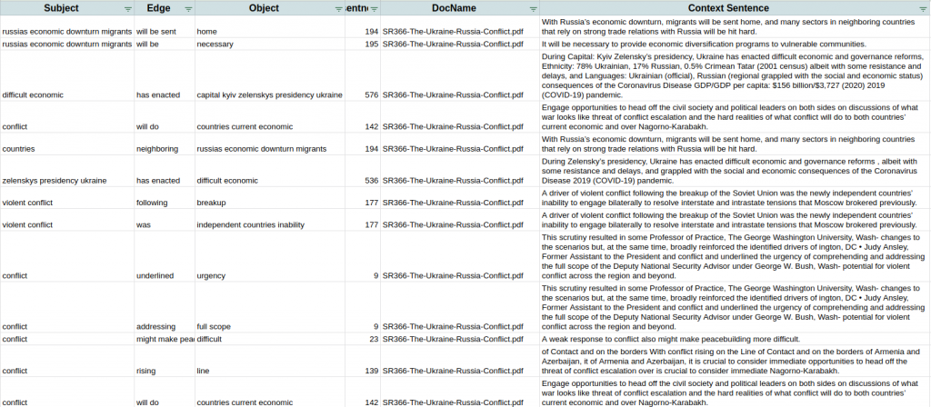
If you look closely, you will notice that the nodes (blue) are nouns and an arrow points from the subject to the object. The arrow is referred to as the “edge” and it is labeled with the action verb in red. This is interesting and makes nice pictures in presentations and papers, but it becomes useful when the graph is converted into a table of triplets from the filtered graph that point to the context from the document where the triplet was extracted. At this point, the researcher finds the sentences that generate the “answers” to the question. See example of this context below.

Context sentences corresponding with Knowledge Graph search for “Economic and Immigration Impact of Ukraine Conflict”

As you can see, there were multiple discussions of immigration and economic challenges in the set of documents and the “answers” to the question found in these documents are captured in the table (Note: I’m just showing the first few rows of the answers). If one wanted to conduct a very thorough literature search of a much larger set of documents, it is likely that this method could save countless hours of digging through documents and enable quicker and better decisions on the subject.

The Hidden Information that can be Extracted from Texts

The above title might sound boring, but it’s probably the area of “Artificial Intelligence” that I’m most excited about. If you squint just right, you can probably understand what I mean when I say that Texts are generated by Topics filtered through the human mind. What if we could uncover some of those Topics by processing the Texts in some way? What if we could also uncover information about the human mind that is evaluating those Topics?

Here’s a great link that gives some insights into the questions above in bold. It comes from Radiolab (NPR) and presents a couple of really interesting examples:

Agatha Christie.png
https://commons.wikimedia.org/wiki/Category:Agatha_Christie#/media/File:Agatha_Christie.png
  1. The story of Agatha Christie’s novels. A researcher conducted word frequency analysis (probably something like the tf-idf technique) and found that Agatha’s first 72 novels had very similar statistics around word choice and vocabulary. But the 73rd novel showed a huge shift that revealed something that was likely happening in Agatha Christie’s brain. This has a lot of interesting implications! Click the link above to listen to or read the story on Radiolab.
  2. A similar story about an amazing study done by the University of Minnesota on something over 600 nuns over the years that involved memory capacity and status assessments. At some point the dataset of “entrance essays” from each of the sisters was discovered and the researchers learned that information and grammar in the essays — written in the sisters’ youth — had correlation to memory issues in their older ages. This is correlation, not causality, of course, but still fascinating.

These are the kinds of analyses that I like to do on all sorts of text. There are techniques that allow me to uncover hidden (or “latent”) topics from large quantities of text and sometimes what these reveal is spooky! There are all sorts of other kinds of analyses like the word frequency ones from the Agatha Christie study as well as from the grammar and idea density metrics used in the University of Minnesota study. This may well be one of the most useful near-term applications of AI that we have today, one that is even able to reveal hidden truths about our own selves.


1/3/22: A View of Omicron a Couple of Weeks in

Here’s a bunch of views from the Arizona Dept of Health Services.

Cases per Day

Arizona cases per day, from AZDHS Data Dashboard, 1/3/22

“As you get further on and the infections become less severe, it is much more relevant to focus on the hospitalizations as opposed to the total number of cases,” Dr. Anthony Fauci

Hospitalization Stats (by Day)

Inpatient and ICU Bed status – COVID and non-COVID patients. From AZDHS. 1/3/22

Discharges are one of the best data points for showing positive trends in hospital capacity. Normally, discharges peak right before the hospital bed use peaks. There was a peak of discharges around 12/1 that signaled the bed use decrease you can see to the right of the chart above. I wonder if the second discharge peak we’re seeing now signals a larger bed use decrease?

COVID Hospital Discharges by Day, AZDHS, 1/3/22

Deaths

Deaths were already trending lower before Omicron arrived, but they might be trending much lower (need another week or two to know for sure).

AZ COVID Deaths by Day, AZDHS, 1/3/22

Other Visualizations

Here’s my standard Case Rate (color) and Acceleration (Diameter) chart. What do we see here? It does seem like the higher rates and accelerations are in the more dense parts of the country. Prior to Omicron’s arrival, the brighter colors were trending in the northern (colder) parts of the country. It appears like the case breakouts are trending more southern now. We can see big outbreaks in Miami, Denver, El Paso, and NYC.

Case Rates and Accelerations, 1/3/22

Data Tables

Note that a lot of states seem to not be reporting (Delta_Active is very unlikely to be zero right now). Case Rates (IROC_confirmed) are through the roof for most states. Deaths appear very low considering the case acceleration.

State Data Table, 1/3/22

Things that make you scratch your head

Here are two charts that I put together a while back when it became clear that the states with higher vaccination rates were doing much better than the ones with the lowest vaccination rates. Now we see opposite behavior during Omicron. I’m not really sure how to explain this. Weather differences?

Cases per 1000 per Day – States with Lowest Vaccination Rates 1/3/22
Cases per 1000 per Day – States with Highest Vaccination Rates 1/3/22

What do we see here? Pretty much all of these states (not New Mexico) is sharply accelerating cases per 1000 right now. The states on the top are accelerating at a much lower rate. My guesses are weather and higher density, but those are just guesses. Other ideas??

Transforming into a Resilient Digital Business Requires a Data Strategy

During the COVID outbreak, I have written extensively about the impact of the pandemic on regions and individuals. One of the unsurprising outcomes of COVID-19 is that organizations that were prepared and could transform into a full-time “data business” saw great advantages. Conversely, organizations who were not prepared and remained stuck in the old economy struggled mightily.

Grubhub: Data Company Disguised as a Food Delivery Firm

One firm (as we all know) that benefitted from COVID-19 was Grubhub. It’s revenues grew from $1.3B to $1.8B from 2019 to 2020, which comes out to around 38% growth. Their 2021 revenues are likely to be much larger as they saw Q1 revenue of around $550M. Why is this important to know? The leaders in this market segment made lots of money during COVID primarily due to their digital transformation preparation they did in the handful of years leading up to 2019.

Digital Transformation Approach made by the Food Delivery Service sector.

Here are a handful of things that the leaders in this sector thought wise before 2019 and turned into a win during 2020 and 2021. Grubhub in particular is known as a true champion of digital technology. One of the ways it sought to strengthen it’s partner restaurants is through its “Grubhub for Restaurants” data analytics services. At this Grubhub site, the company discusses data insights their partner restaurants can use to revolutionize their own businesses. They list a number of new metrics that can provide their partners with insights into potential areas of growth. Some of these include:

  1. Delivery Speed. This is an interesting metric to me, because it reflects the flow of goods from raw materials to the hands of the customer. In factories, it is common to build large value stream maps that detail all of the value that is added to raw materials through factory operations as the product makes its way through. This can reveal bottlenecks in the factory that fundamentally limit how much money one can make. Grubhub recommends to their partners that they research alternate routes or techniques to shave off minutes of their value stream. I’d imagine that if Grubhub were smart, they would also sell value stream data services to their partners to help them optimize. If they’re not, I ought to offer my services, as this is right up my alley!
  2. Average Order Size. This is another good metric that restaurants ought to collect consistently. It is a measure that can also increase cash flow and profitability, because it measures a company’s ability to upsell. Often, I’d suspect that the goods being upsold are higher profit goods like dessert, coffee, and drinks.
  3. Customer Reviews. I’ve noted that smart firms patrol their reviews carefully and collect these reviews as data, both to improve their performance, but also to demonstrate their business virtue. A respectful and thoughtful response to a bad review could well result in many times more business than one might expect. This data could also be aggregated together and clustered by artificial intelligence techniques like natural language processing to identify the types of feedback.
  4. Order Accuracy: This is another interesting metric. I suspect most restaurants or similar firms don’t collect this data assiduously, but I suspect a strong, good-faith technique to gain order accuracy feedback from customers could result in a really valuable data set. Perhaps offering drawings for free rewards for providing feedback on order accuracy would be low-cost and high-reward to the restaurant.
  5. Average Orders Per Day: This is relatively low-end data… I believe one could greatly improve on this data feature. At a minimum, trends in orders per day combined with other data features like accuracy and review results could result in a small predictive dataset. Ultimately this could be used to make fairly accurate predictions on business trends per day or week. This might help optimize costs like material and labor costs. Given time and information on a firm, I could certainly think up many more valuable data features to measure that could improve the results of these kinds of predictive analytics.

Data Transformation through Data Strategy

Grubhub had a data strategy and collected data for years before COVID hit. This allowed them to make better and faster business decisions when the emergency arose. Companies without a solid data strategy (measuring important, high information data as a matter of doing business) may do fine when the sun shines and skies are blue, but often lack resources to deal with crises.

Have COVID-19 Strains become Less Virulent?

Virulence: Virulence is a pathogen’s or microorganism’s ability to cause damage to a host. In most contexts, especially in animal systems, virulence refers to the degree of damage caused by a microbe to its host. The pathogenicity of an organism—its ability to cause disease—is determined by its virulence factors. (Wikipedia)

Here’s some Images from the Arizona Dept. of Heath Services data dashboard that I think tell a story that could indicate decreased virulence of the Delta variant.

  1. COVID Cases by Day in Arizona – Entire Pandemic: In the image below we see the cases per day since around April of 2020. You can easily see three surges of cases. The first happened in the summer of 2021 and coincided with a huge, relatively uncontrolled outbreak in Northern Mexico. Many of the cases during this time occurred in border counties of Arizona. The second surge occurred in the winter of 2020 where the entire U.S. saw a spike of cases that correlated with the average daily low temperatures dropping to below 40 degrees. The latest surge corresponded with the more-transmissible Delta variant and has seen two spikes. This surge has been less of a spike and more of a “slog” where perhaps we are seeing the combination of the arrival of the Delta variant in the late summer merge with the more traditional cold-weather pattern for a virus where the night-time temperatures drop. Understandably, the lack of relief is wearing out health care workers and challenging hospitals. Note that the number of cases per day for the second spike of the Delta outbreak is roughly equivalent to the first summer outbreak.
COVID-19 Cases by Day (https://www.azdhs.gov/covid19/data/index.php#confirmed-by-day) – 12/21/21

2. Hospitalization – Cases by Day: Below you can see hospitalization for the three major outbreaks. The winter outbreak hospitalization by day far exceeded the first summer outbreak. Likewise, the first summer outbreak’s hospitalization per day is just under double the peak of the Delta variant outbreak. The only problem with the Delta outbreak is that it is lingering. Similar cases per day and less hospitalization per day. Just over a longer time. This naturally creates problems in hospitals processing sick people through their system due to the need to navigate bottlenecks that form. Just like in a factory, bottlenecks are going to be less of a problem in a quick surge of production than they are in long, tiring runs of production where errors and inefficiencies compound.

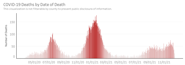
3. Deaths per Day: In the image below, we see similar patterns to hospitalization. If you look closely, you can see that the peaks of the deaths are a week or two behind the peaks of hospitalizations. Again, we see the same pattern as we see with hospitalization. Though cases during the Delta wave are roughly equal to the first summer wave, the deaths are around half.

COVID-19 Deaths by Date of Death (https://www.azdhs.gov/covid19/data/index.php#deaths) – 12/21/21

Thoughts

Does this data show that Delta variant is less virulent than the preceding variants?

Perhaps. It’s quite possible that during the first summer wave we did a worse job of measuring cases. COVID tests are pretty ubiquitous now in late 2021 and maybe we’re collecting a higher percentage of the cases. Conversely, it’s also possible that people have inferred or imagined that Delta is less of a risk to them and are not getting tested if they experience mild symptoms. Either of these could be true and both would impact the usefulness of the case number. Additionally, the new variable of COVID vaccinations that was introduced in early 2021 has certainly reduced the impact of the Delta variant. It would take some work to decipher whether the virulence of Delta to unvaccinated people was equal or less than previous variants.

This is one of the challenges of measuring cases for the purpose of scientific analysis. It is very hard in a real-world study to control for the measurement variables across numerous regions and measurement authorities (governments, hospitals, universities). This is one of the reasons why we still don’t know much about this virus, despite having measured it for around a year and a half.

My Opinion: Oftentimes the concerns around measures will balance out when data is considered in very large batches (“big data”). My suspicion is that human nature is the constant across the measurement of all of these surges and we can take what is presented to us and assume that Delta is less virulent than the previous strains, either due to the virus itself or due to the boosts to our immune systems from either natural immunity or the COVID vaccines that most people have received.

Omicron and the future: We’ll continue evaluating the hospitalization and death metrics in the context of cases. My suspicion is that as Omicron arrives, it will dominate and gradually eliminate Delta and previous variants still lingering out there. If Omicron is less virulent, perhaps then we’ll see a leveling off of the cases to some background number and then we can say that COVID-19 has become endemic. If Omicron is not less virulent, then we’ll have a rough month or two ahead of us.

Welcome to the Era of Omicron

I took a bit of a pause on monitoring COVID during the Delta outbreak as at some point, people seemed to be much less interested. However, I’m hearing folks with questions now that a new, more contagious variant has emerged. A recent pre-print paper (not peer reviewed yet, so might be revised in the future) shows that the omicron variant multiplies 70x faster in airways but 10x slower in lungs. This explains why the variant appears to be more contagious but less threatening than Delta. See here for a pretty good description of the findings.

Might Omicron be a Good Thing or a Bad Thing?

Some reports predict that the faster-spreading variant will create more risk for humans, especially since it seems to evade the defenses from vaccinations to some degree. Others are reminding us that most pandemics end with a very virulent but less threatening variant that out-competes all of the more deadly variants. This is how the Spanish Flu ended. Hopefully the latter possibility is true, but time will tell. There are already reports from South Africa that hospitalizations (or at least severe ones requiring oxygen) are significantly down under omicron than they were during a similar period of the delta outbreak there.

Latest Data – Before the Wave from Omicron Hits

Here’s the latest data by state. I’ll include some recent state data tables later in the post for comparison’s sake. Note that the case rates have peaked up a bit in cold states over last week’s data. Perhaps this is the effect of Omicron or perhaps it’s just due to cold weather. Some states (like Arizona) have fallen down the list in the last two weeks.

State Data Table, sorted by case rate. 12/16/21

Arizona County Comparisons

Here’s a view on the death rates and case rates across the top Arizona counties by population since about June of 2020. I found it pretty interesting for comparison’s sake. I see a couple of interesting things here:

  1. Pima County, Maricopa County, and Pinal County all show nearly identical rates throughout the pandemic. Why is this interesting? Pima County — at least to my eye — has taken much more stringent public health measures than the other two counties from day one. Pinal County in particular seems to have gone out of its way to take as few public health measures as possible. But their rates and numbers are very similar (although Pinal County has fewer deaths per 1000 persons than Pima or Maricopa). What does this mean? No one knows for sure, but there is a strong indicator here that the measures we humans think will keep a virus at bay may not be very effective in the real world (vs. the lab).
  2. Yuma County had the steepest surge during the summer of 2020, but the case and death rates have been very flat ever since. This could be due to a higher vaccination rate on this border county or might even be due to natural immunity. I have no idea.
Case Rates across top AZ Counties by Population – 12/17/21
Death Rates across top AZ counties by population – 12/17/21

Older State Data Tables for Comparison

Perhaps the below will be interesting to data nerds now or in the future.

State Data Table from 12/8/21

State Data Table – 12/8/21

State Data Table from 11/30/21

State Data Table – 11/30/21

State Data Table from 11/20/21

State Data Table – 11/20/21

Delta Surge Update – Demographics Focus 8/13/21

Hospitalization (Arizona)

One question that hasn’t been well addressed in the media (all political bents) is whether the COVID Delta surge was driving hospitalization and who, indeed, was being hospitalized. My thinking is that this is our prime metric of the danger of a COVID surge these days. Here’s a chart showing the Arizona hospitalization numbers by demographic. It’s a bit messy for a couple of reasons: 1) Arizona keeps “catching up” on hospitalization numbers by dumping large count backlogs into a single day. I suspect this is a hard metric to keep up with due to all the hospital systems in the state and their state of enthusiasm (?) about reporting data… 2) I stopped capturing the daily snapshot from AZDHS’ web site sometime in May when the data got really boring and moved to weekly (or so). This means my trends aren’t as granular as before, but they’re still accurate.

Arizona Hospitalization (beds used) Data by Age – AZDHS data, collected by T.N. – 8/13/21

What do we see above? Note that at the left of the chart, the hospitalization by age is fairly random and driven by low numbers and statistics. However, if you can ignore the glitch in the middle, the trend is pretty clear towards the right (the Delta Surge). Hospitalization numbers are clearly trending up (but are still not significantly higher than in May. What does this trend reveal? Surprisingly, the over65 age group is still getting hospitalized at much higher rates than their percentage of the population would indicate. No way to know if these are vaccinated people or not. That’s a big gap in the data. They’re matched in numbers by the much-larger 20-44 age group and followed closely by the 45-54 and 55-64 groups. The under 20 age group remains the least hospitalized. This seems to go against some of the news reports that are indicating that the Delta variant is having more severe outcomes in the youngest cases. That doesn’t seem to be the case right now in Arizona at least.

Below I’m showing the hospitalization numbers for all age demographics. As you can see, the Delta surge (furthest right) has not been surging in the hospitals the same way the earlier two surges did. Keep your eye on this chart as things move forward.

AZ Hospitalization since 4/20 (https://www.azdhs.gov/covid19/data/index.php#hospitalization)

Cases – Pima County

In my county (Pima) the Delta surge has resulted in proportionately less cases than in the much-larger Maricopa County. My suspicion is that this is due to the notably higher vaccination rates in Pima County. But again, the big question is which demographics are getting infected during the current surge?

Pima County Cases by Age Demographic – 8/13/21

Again, ignoring the loss of granularity by my moving to weekly data capture, you can see the trending on cases from the lows of May until now. It’s no surprise that the 20-44 age group is leading the case counts. In general, across Arizona, this group is much less likely than older demographics to get vaccinated. Plus, there’s more of them. However, the most interesting part of this chart is that the under 20 group is the next highest increase in cases. This group is largely unvaccinated, but it’s not clear how many of them are between 12 and 20 and how many are under 12. This is an error in data collection “strategy” that’s been a problem throughout COVID. Perhaps no one expected at the start that the under 16 demographic (school age) would be so interesting for this pandemic. The rest of the demographics (more vaccination and older) are barely seeing any case rate uptick since May. So, again, fairly surprising that the youngest demographics are the primary ones getting the Delta variant of COVID. No doubt “breakthrough” cases are happening in vaccinated people, but perhaps they’re not symptomatic enough to get counted. Or maybe there are just very few of them (despite what the headlines would indicate).

I just show Pima County here, but statewide, the trend is similar. At the state level, the case rates in the older demographics are slightly higher than Pima county and the younger demographic case rates are noticeably higher. This, again, is driven by the much higher rates and lower vaccination in huge Maricopa County.

Deaths

There isn’t much change to death rates during the Delta surge from the low period of May. Deaths are still very low, as you can see from the height of the stacked blue and red bars in the chart below. The only thing that *might* be interesting is that the ratio of deaths in the over65 demographic to deaths in every other demographic is much lower now. Sometimes we see this when deaths are low, but during the two previous surges, this ratio trended between 2.5 and 4. Right now it ranges around 2 or lower. This ratio is the green line in the chart below (and the red bars are “over65” deaths and blue bars are “under65” deaths). What might this mean? Again, I suspect it is the power of the vaccine to limit deaths in the over 65 community. I keep tracking this number and I hope that it doesn’t trend up again.

COVID Case Rates in heavy- and low-vaccinated States – 8/5/21

This may not be surprising at all, but the states with the lowest rates of vaccination are seeing case accelerations but the states with the highest rates of vaccinations are only seeing linear case rates. See below.

States with Lowest Vaccination Rates (as of 8/5/21)
States with Highest Vaccination Rates (as of 8/5/21)

I’m not sure what to make of the interesting spread in cases per 1000 across the 8 highest vaccinated states. Perhaps this makes the case that different approaches to state intervention yielded different results. New Mexico, for instance, had some of the more disruptive lockdowns and you can see that they flattened out earlier than New Jersey or Washington. But regardless, you’ll note that only a couple of these states have any case rate increase at all right now. However, the top chart shows states that have tended towards less government intervention and perhaps this is the reason their vaccination rates are low.

By County in AZ

I also see this result by county in Arizona. The highest vaccinated counties are all near the border (Yuma, Pima, Santa Cruz, Cochise) or near large Native reservations (Apache, Navajo, Coconino).

You’ll notice on the table and map below that these counties all have the lowest case rates and accelerations. In the map, the warmer colors represent higher case growth rates and the bubble diameter represents Zip code population. This shows the higher case rates are all in the counties with lower vaccination rates.

AZ State Data Table – 8/5/21
Arizona Zip Code COVID growth since April 2021.

Death Rates

I’m not including any slides on the death rates. They’re still low across the board compared with earlier outbreaks, but the states with lower vaccination rates do have slightly higher slopes, it seems.

Hospitalization (ICU beds)

# of ICU beds in use by COVID patients – 8/5/21 (https://www.azdhs.gov/covid19/data/index.php#specific-metrics)

It’s hard to know what’s going on with the ICU bed usage rates… You may notice that for about a week the numbers have plateaued. This could be a data collection issue, or it could be that the hospitalization rate for ICU beds has slowed. I have noticed that COVID discharge rates seem very strong, so this might be a testament to hospitals improvements in treating serious COVID cases. I continue to track this metric.