

Since my evenings are less occupied with 7th grade math and social studies homework, I have a bit of time to follow my curiosity about COVID-19 data and trends. I plan to update these daily to provide up-to-the-date visualizations. Here are my starting points… (data from Johns Hopkins Whiting School of Engineering — https://github.com/CSSEGISandData)
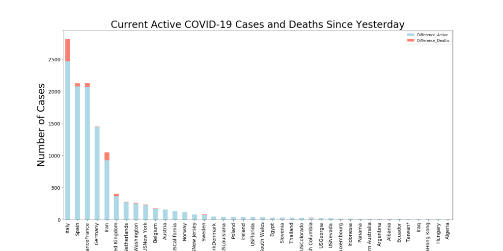
This chart shows a couple of interesting things… first, the current state of Active COVID-19 patients (color per the heat map to the right of the image) and second, the number of Active cases that have been declared in the last 24 hours. This gives an idea of both the velocity and the acceleration of the virus in these regions.
For instance, you can see Europe is overwhelmed by new cases (diameter of the bubbles) but Italy has many more Active cases in its medical pipeline than the other countries.

Here’s the daily trend map. Size of the bubbles reflects the New Active Cases in the last day and Color reflects the number of Active Cases
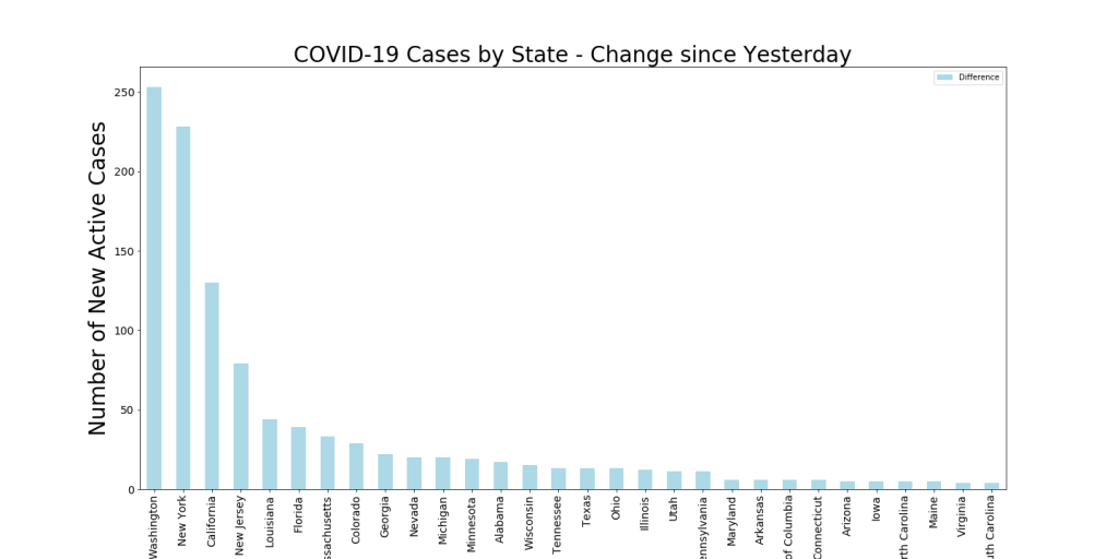
Below is the current change in Active Cases in the last 24 hours by State. Washington has had the most cases (they’re further along) but New York will probably pass them up tomorrow. New York has the greatest total number of Active cases of any state, with just under 1000.
Download a Table of the latest Totals of Active US Cases by State
Stay safe, and let me know if you have any particular analytics in mind that might be useful…