

Above we can see the state of confirmed COVID-19 cases across the US. A handful of things have changed. We’re seeing some localities reduce their number of active cases (mostly through recoveries) and thus, their bubbles are getting smaller. The purplish color is an indicator that the number of cases isn’t growing.
Interesting things to note include that Louisiana’s death and case rates have essentially stopped increasing. Michigan is in a similar position. Most of the new cases in Louisiana were outside the two hardest-hit parishes, Orleans and Jefferson. So maybe this is a sign that the first wave is slowing. Washington also seems to be through the worst part of the first wave too. No telling what a second wave will look like, but getting through the first wave is probably notable regardless. Finally, on the sad side, New York State is now approaching a death percentage of 0.1% of their population. This is about double the second highest (NJ) and over 10x of what most other states have seen. I still struggle with the huge disparity here and would love to understand why it came about.

Below I show Case Growth curves for some states. Louisiana and Washington are both starting to decelerate while Texas is probably getting close. Again, as oft stated here, the case numbers aren’t the best indicator, as most studies are now showing that many, many more people are getting this virus than are being reported. Some of this is due to severity bias (i.e., you get no test and don’t get counted if your symptoms aren’t very severe).


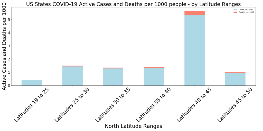
Finally, here’s the current US breakdown across 5 degree latitude bands. As you can see, most of the cases and deaths remain in one band.
Leave a Reply