Did Banning “The Shift” Actually Change Baseball? A Data Analysis

The Question That Started It All

In 2023, Major League Baseball introduced new rules restricting where defensive players could position themselves on the field. This change effectively banned “The Shift” – a defensive strategy that had become increasingly popular since 2006. At the time, I suspected this ban would be nothing more than a band-aid solution with little real impact on the game. Now, with a full season of data available, we can finally test that hypothesis.

Positioning of infielders under new rules'
image from https://www.mlb.com/glossary/rules/defensive-shift-limits

What Was “The Shift” Anyway?

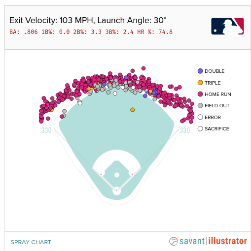
The concept of shifting defensive players isn’t new – teams have been doing it sporadically throughout baseball history. However, the modern version of The Shift was pioneered by the Tampa Bay Rays in 2006 when manager Joe Maddon used advanced statistics (sabermetrics) to devise a strategy against Boston Red Sox slugger David “Big Papi” Ortiz.

The data showed that Ortiz, a left-handed power hitter, pulled nearly every ball to the right side of the field. So the Rays stacked extra defenders on that side, leaving the left side of the infield nearly empty. The strategy worked brilliantly – Ortiz’s batting average dropped from over .300 (2004-2006) to .265 by mid-2006 as other teams copied the approach.

The Shift became controversial because it was primarily used against baseball’s biggest stars and most exciting hitters, making the game feel less dynamic and offensive. Eventually, MLB decided enough was enough and implemented restrictions for the 2023 season.

Image from Wikimedia Commons – By Jon Gudorf Photography – https://www.flickr.com/photos/jongudorf/16802945985/, CC BY-SA 2.0, https://commons.wikimedia.org/w/index.php?curid=112638138

My Approach to Testing the Impact

To determine whether banning The Shift actually changed anything, I needed to compare player performance before and after the ban. But this presented a challenge – what if other factors (like changes to the baseball itself or new pitching rules) also affected hitting during this period?

My solution was to analyze two groups of players:

Sluggers: The power hitters who were most likely to face The Shift (defined as players with above-average slugging percentage)

Non-sluggers: Regular hitters who rarely, if ever, faced The Shift

If banning The Shift was the primary driver of any performance changes, we should see significant improvements mainly among sluggers, with little change among non-sluggers.

The Data Collection Process

I used the Python library pybaseball to gather statistics from 2006 through 2024, focusing on key offensive metrics: at-bats, hits, doubles, triples, home runs, and walks. I divided this data into two eras:

  • “Shift Era”: 2006-2022
  • “Post-Shift Era”: 2023-2024

To ensure I was analyzing players who actually faced The Shift regularly, I set minimum at-bat thresholds (400, 600, and 800) and categorized sluggers by how far above average their performance was – from the top 50% down to the elite top 1%.

What the Numbers Revealed

The Initial Results Looked Promising

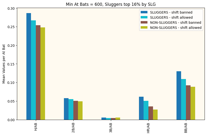
When I first compared the average performance between the two eras, the results seemed to support the idea that banning The Shift helped hitters. Across the board, offensive numbers were higher in the post-ban period. Problem solved, right?

Top 16% of Sluggers Compared Before and After the Shift was Banned. Also non-Sluggers for Comparison

Not so fast. Averages can be misleading, and I needed to determine whether these differences were statistically significant or just random variation.

The Statistical Reality Check

To get a more complete picture, I used the Kolmogorov-Smirnov test, which compares entire distributions rather than just averages. This test tells us whether two groups of data are fundamentally different or could reasonably come from the same underlying population.

Using a 95% confidence interval (the standard threshold for statistical significance), here’s what I found:

For Non-sluggers: Here’s where things got interesting. The non-sluggers showed statistically significant improvements across nearly all offensive categories – even more consistently than the sluggers did.

p-values comparing non-sluggers before and after the ban. The red line is our confidence interval. Any bars below the red line indicate that metric is statistically different before and after the Shift

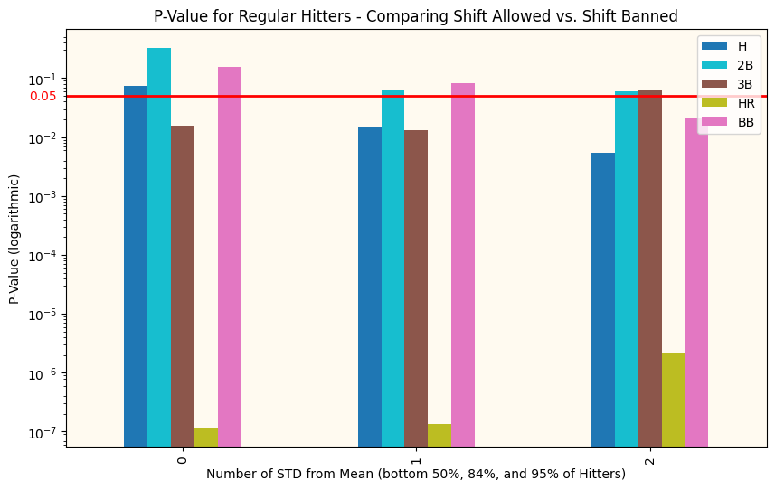
For Sluggers: Only the top 16% of power hitters showed statistically significant improvements in most categories (hits, triples, home runs, and walks – but not doubles). The other slugger groups showed mixed results.

p-values comparing Sluggers before and after the ban. The red line is our confidence interval. Any bars below the red line indicate that metric is statistically different before and after the Shift

The Surprising Conclusion

This finding was the key to understanding what really happened. Since The Shift was rarely used against non-sluggers, it couldn’t be responsible for their improved performance. Yet these “regular” hitters showed more consistent statistical improvements than the power hitters who were supposedly being helped by the ban.

The evidence points to a clear conclusion: something other than banning The Shift was responsible for the improved offensive performance across baseball.

Whether it’s changes to the baseball itself, new rules affecting pitchers, evolving hitting approaches, or other factors, the data suggests that banning The Shift had minimal impact on the game. In fact, sluggers (the players the rule was designed to help) showed less consistent improvement than the players who were never affected by The Shift in the first place.

Final Thoughts

My initial skepticism about the Shift ban appears to have been justified. While offensive numbers did improve after 2023, this improvement affected all types of hitters equally – not just the power hitters who faced The Shift. This pattern strongly suggests that other factors were driving the change.

Sometimes the most interesting finding is discovering that the obvious explanation isn’t the right one. In this case, banning one of baseball’s most visible and controversial strategies appears to have been largely symbolic rather than transformative.

Note: This analysis covers data through 2024. As more seasons pass, we’ll get an even clearer picture of The Shift ban’s true impact – or lack thereof.

To see categories of my sports analytic posts, pick one of the below:

Is this kind of article interesting to you? Let us know in the comments below.

If you want to be added to our newsletter (no worries, we won’t overwhelm you), we often create bonus material only for newsletter subscribers. Just sign up with your email address below.

Baseball Scoreboard, Part 2

Scoreboard at Chase Field, Phoenix, A

In the previous discussion (Part 1) on the measures seen at a Baseball park, I covered the pitching metrics seen here fairly heavily. It is possible that hitting metrics are reasonably well-known in many places, but there is at least one here on the scoreboard that some explanation may be required.

The Triple Slash Line

Review of the “Familiar” hitting statistics would start with what is sometimes known as the “triple slash line“. This is simply three statistics that are frequently seen shown in order separated by slashes, like this: AVG/OBP/SLG. This refers to, in order, Batting Average, On-Base Percentage, and Slugging percentage. The Batting Average definition is the percentage of at-bats ending in a hit. An at-bat is defined as a plate appearance that ends in an out (excluding sacrifice flies), a hit, a fielder’s choice, or an error. For years, batting average was the preferred statistic for comparing player performance, but in recent years, the other metrics in the triple slash line have increased in prominence due to their impact on scores (and thus, wins). On-Base Percentage is more simply defined… it is the percentage of plate appearances where a batter reaches safely (could be a hit, walk, or getting hit by a pitch), excluding reaching by error, fielder’s choice, or a dropped third strike. This metric goes back to the Hall of Fame manager of the Brooklyn Dodgers, Branch Rickey, who is still beloved for his innovations in baseball (including signing the great Jackie Robinson and breaking baseball’s color barrier). One of the breakthroughs of the Oakland General Manager, Billy Beane, that became famous in the movie “Moneyball” was a stronger reliance on OBP when signing free agents. FInally, Slugging Percentage is a metric designed to give weight to a batter’s power. The formula is (#Singles + 2*#Doubles + 3*#Triples + 4*#Home Runs)/Plate Appearances. This makes slugging percentage useful, but not necessarily perfectly correlated with runs and therefore wins.

As an example of how the triple slash line can aid in evaluating player value, consider these two players (2024 stats as of 6/20/2024).

Aaron Judge (Center Field, NY Yankees): .303/.429/.697

William Contreras (Catcher, Milwaukee): .304/.364/.461

Though these two players (both having very nice seasons) have almost identical batting averages, that doesn’t tell the full story. Aaron Judge has batted in 66 runs this season whereas Contreras has only batted in 48 (on very similar numbers of games played). Judge has 27 home runs to Contreras’ 9. Amazingly, Judge has been walked 30 more times (57 to 27) than Contreras. Obviously this means that in walks alone, Judge has had 30 more scoring opportunities than Contreras. This has translated to Judge scoring 5 more runs this season. But this is at the cost of 20 more strikeouts for Judge. Lots to think about! First, let’s discuss the impact of RBI and HR to wins .

The RBI, short for Runs Batted in, has always been seen as a fairly critical metric in baseball, as it recognizes a hitter’s role in a run being scored for their team. It can result from a hit, a sacrifice fly, or even a walk, but not an error. In a sense it is a really valuable metric because it shows impact on the most important measure, the runs a team scores in a game. In another sense, one may over-reach when comparing players by their RBI accomplishments, because a player who is preceded in the batting order by a player with a stratospheric on-base percentage has a much higher chance of having a hit bat in a run. So RBI isn’t comparing apples and apples. There is a big controversy over the RBI metric amongst baseball nerds due to this. If you want to go deep down this rabbit hole, here is a good article from Bleacher Report back in 2012.

The appearance is that more home runs lead to a greater number of wins for one’s team. The home run (especially one that ends the game!) is exciting and draws fans more than anything else. The modern era of baseball is often referred to as the “Long Ball Era” due to the prevalence of home runs in the game. A method to identify the value of the home run called regression shows that home runs tend to be highly correlated with win percentages. Conceding that home runs are correlated with wins, the next question would be if home runs CAUSE wins. These are two very different things. Ice Cream sales are highly correlated with higher temperatures, but we cannot say that the temperatures cause the sales. The answer to the question about home runs causing wins is a hard one, and there are plenty of scientific papers analyzing this (and doctoral dissertations!). What seems obvious is that teams value the home run highly — even in the face of the higher numbers of strikeouts that power hitters tend to rack up. One thing that we know, though, is that teams express value through the salary they give a player. In this respect, Aaron Judge stands out with his $40M annual salary compared to the $760K that the Brewers are paying Mr. Contreras! (I think he’ll be getting a raise after this season!) Here’s where I found these salaries

The Mystery Metric, OPS

All of this builds up to the final metric on the scoreboard that is less known, OPS. This stands for “On-base plus Slugging” and is actually a combination of two metrics from the triple slash, OBP and SLG. They’re just simply added together. I suppose this metric saves fans time (or the mathematical embarrassment) of adding the last two numbers in the triple slash together. The intent of the OPS is to provide a view into overall effectiveness of a hitter and their potential value for scoring runs. The historical record for OPS was rung up by Babe Ruth (1.16), followed closely by Ted Williams and Lou Gehrig. So clearly it is a measure of the historical greatness of a player. By the way, keep an eye on Aaron Judge’s OPS in 2024 (currently at 1.126), as he is threatening the Babe’s record!

Was this content useful to you? Let us know in the comments below.

If you want to be added to our newsletter (no worries, we won’t overwhelm you), we often create bonus material only for newsletter subscribers. Just sign up with your email address below.


A Quick Tour of a Baseball Park Scoreboard

In the modern era of more and more esoteric baseball metrics, how can one understand what the ballpark is telling us?

Scoreboard at Chase Field, Phoenix, AZ

This weekend I went to the Diamondbacks game at Chase Field, a treat I have enjoyed for a number of years. As a person who likes numbers, it struck me that the stadium was even more awash in statistics than ever. It brought a lot of questions to mind, some of which I’ll explore in this blog entry.

The Scoreboard, Explained

Much of this scoreboard layout looks fairly familiar to someone who may have looked at box scores or attended other big-time baseball games. The score by inning is something that has been featured for years. It tells us something interesting, the rate at which the two teams have been adding to their score. Knowing how pitching assignments work in major league baseball, one can quickly surmise that the White Sox starter got shelled early and seems to have stabilized a bit by the fourth inning. The Diamondbacks’ starter, however, seems to have pitched a fairly solid first four innings, because we can see that he has given up only three hits (less than one per inning). The White Sox scored one run off of him in the third inning, but we can also see that Arizona has one error. Did this error result in the one run? If so, that would be an unearned run and therefore wouldn’t be counted against the Diamondback pitcher’s Earned Run Average. We can see more about the White Sox pitcher, Drew Thorpe, because the scoreboard gives more info about active pitchers in the upper right (the D-Backs were batting when this image was taken). Drew hasn’t had such a good game to this point… in 3 innings he has given up 4 earned runs… that translates to an ERA of 12.0 at the moment. He has also given up five walks (BB) and six hits, which results in a WHIP (Walks and Hits per Innings Pitched) of 3.67. Additionally, his ratio of Strikes to total pitches (strikes plus balls) is 0.52, which is 0.1 lower than the MLB average. Top pitchers typically have numbers like .65, so clearly Drew is way behind the pace of the best pitchers here. All of these measures (WHIP, ERA, %strikes) are very bad for Mr. Thorpe’s year averages and we can get all of this from the scoreboard.

The metric FPS% refers to First Pitch Strike Percentage. The Major League Baseball average is 57% and we can see that Thorpe is sitting at 47%. This is a pretty interesting metric. Weinstein Baseball (here) tells us that “if a big league pitching staff improved their first pitch strike percentage from 57% to 80%, it would translate into 100 fewer runs allowed over the course of a season. That translates into 10 more big league wins.” So what the scoreboard is showing us here is that Drew Thorpe has a control issue today… He’s giving up a lot of walks (per Weinstein, “70% of walks start with first pitch balls”) and possibly in trying to get the ball over the plate “whatever it takes” he may also be giving up some easier pitches to hit.

One other metric regarding pitching that we can take away from the scoreboard here is “MVR”. This is placed just to the right of the Error (E) column. I actually had to Google this one during the game. It’s kind of new and stands for “Mound Visits Remaining”. So Mr. Thorpe has already had more than one mound visit during his first 3 innings and now only has two left. This is probably part of baseball’s desire to speed up the games and make them less tedious. The pitch clock is another similar effort, where there is only thirty seconds allowed between batters. ESPN tells us (here) that the pitch clock has reduced baseball games to an average of 2 hours and 40 minutes (24 minutes shorter) due to the pitch clock. This has also corresponded with a spike in batting average and stolen bases. It seems obvious that penalizing a pitcher by restricting their time between pitches is likely to reward hitters and base runners.

Pitch and Hit Exit Metrics

Another thing that I found very interesting is a display I had never seen before at the ballpark. See below.

I found that this was very distracting, because my brain wanted to identify the patterns of how they were classifying the Pitch Type. There were a number of different labels for pitch type, among these was “four seam fastball”, “cut fastball”, “slider”, “changeup”,”sinker”, “sweeper”, and “curve”. The “Vertical Break” and “Horizontal Break” numbers were very interesting. These data are captured by camera-based systems called Trackman or Hawkeye and are used across many different sports. There’s a great article in Baseball America (here) on how these pitch classifiers are able to label the pitch type. What I found is that the pitch types are calibrated to speed… a pitcher who threw a 100 mph four seam fastball also seemed to have their pitches in the 95 mph range that didn’t “rise” so much classified as a sinker. Whereas other, slower, pitchers may have had sinkers in the 80 mph range. Pretty interesting.

I also found myself looking after ball contact at the launch angle. A launch angle over 40% often indicated that a pitch that looked to the eye like a home run might actually just go to the warning track. Baseball Savant has a nice tool (here) where you can pick an exit velocity and a launch angle and see the actual outcome. For instance, below, 103 MPH exit velocity coupled with 30 degree launch angle was a Home Run 74% of the time!

Conclusion

Baseball parks have become inundated with information visualizations over the last few years. In some cases, advanced sensing and tracking systems like Hawkeye have enabled these new metrics to be collected. In others, new rules like the pitch clock and maximum numbers of mound visits have created demand for new metrics. But overall, baseball has always been a sport focused on its numbers, which is just one reason why many of us number people love it so much!

Link to Part 2 – Hitting Metrics

Was this content useful to you? Let us know in the comments below.

If you want to be added to our newsletter (no worries, we won’t overwhelm you), we often create bonus material only for newsletter subscribers. Just sign up with your email address below.