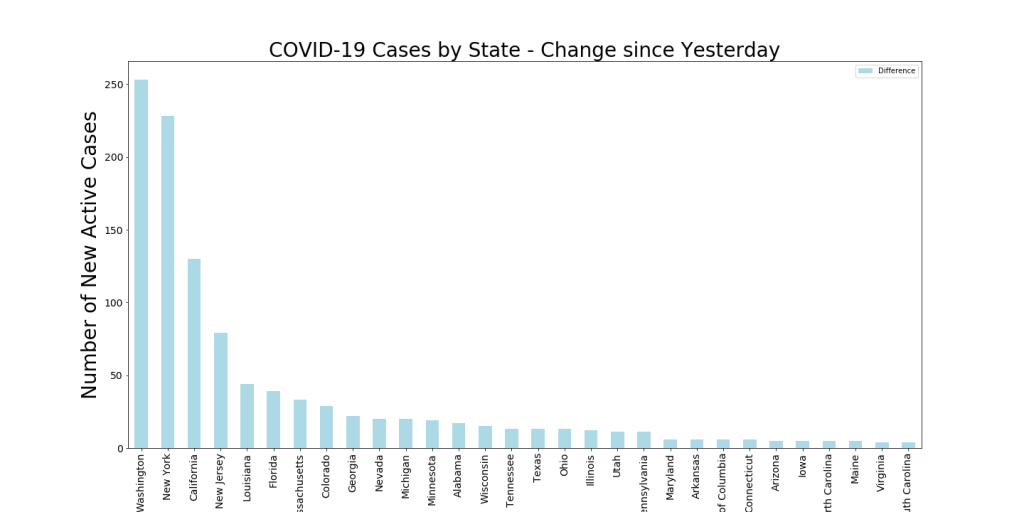
Quick update for new data. Yesterday saw New York state continue to soar in number of cases but Washington decrease. These are Active Cases, which are the difference between confirmed cases and recoveries, so that shows that our “WIP” (from the entry below) is decreasing in Washington. Other than this, for the US, things continue at about the same pace as the last few days.
I’ve been thinking about how to assess COVID-19 Confirmed Contraction rates with Recovery rates… this might be key for pointing at societal success in addressing the epidemic. Not sure if the data is mature enough, but what I’m finding does indicate either some potential tampering with the data or more rapid societal recovery after the cases flatten off (hospitals become more effective at that point? Here are a few examples from the most affected countries.
These charts look like something we use in the manufacturing world called a cumulative flow diagram. The interesting thing about a cumulative flow diagram is that the vertical distance between the two lines equals the cycle time. In this case, that refers to the time to clear your patient load. The vertical distance between the two lines, however, equals the “work in progress”, which in this case, would be the number of patients who have the disease (active cases). This may reflect some percentage of the hospital beds in use (what percentage of active cases need hospitalization? Probably depends on the country).
The last chart compares Italy and Iran. This data pretty much makes the case that Iran is way understating their infections and/or overstating their recoveries. The chart tells us that right now, the cycle time for both nations is undetermined (we don’t have enough recoveries yet). But it also shows that the active cases for Italy is 2-3 times that of Iran. That’s just not credible, considering that their case loads started at the same time, Iran has 20 million more people than Italy, and Iran has about 40% of the hospital beds per 1000 people as does Italy. Italians do smoke 36% more cigarettes per year per capita than Iranians (but almost zero percent women smoke in Iran, vs 19% of women in Italy).
Finally, from the China chart (if we can believe it), we can see that the cycle time to clear the patient load is consistently about 20 days. The Singapore chart might give us some concern, though, as it appears that they closed their WIP to just a handful of cases, then it opened back up significantly. Perhaps more data will help us understand this better.
One of the things I’m seeing a lot of discussion around is “flattening the curve” and the effects of social isolation. I’m very curious as to why some countries/regions have seen very different growth patterns in confirmed COVID-19 cases. One red herring I’ve seen a lot is the comparison of the first few days/weeks of the Italy outbreak with the first few days/weeks of the US outbreak. The reason this isn’t an honest comparison, of course, is that with an exponential curve one cannot know up front what the value of the exponent is or whether that power curve pattern will continue.
Here’s some time series analysis of the outbreaks in the top regions, first by the world then by US states.
It’s very interesting to see the differences. Assuming the data collection is accurate, it would appear that China and S. Korea have inverted their curves (looks more like a sigmoid curve now) — but for how long? Italy, Spain, and France still seem to be in their initial power curve phase, whereas Iran seems to be increasing linearly (yet another sign that their data is bad, most likely).
In the US chart I also included the Diamond Princess as a point of interest. Note how in a very small, contained sample the number of cases went flat quickly. This may point to the great value of the extreme social isolation that some countries have imposed (from reports I’ve read, Italy seems to have failed this step).
Due to the small size of the images embedded in this WordPress blog, I’m also starting to add PDF versions afterwards that can be downloaded in case you want to see higher resolution.
Time Series analysis for Top Outbreaks in the World. Data from JHU COVID-19 project.
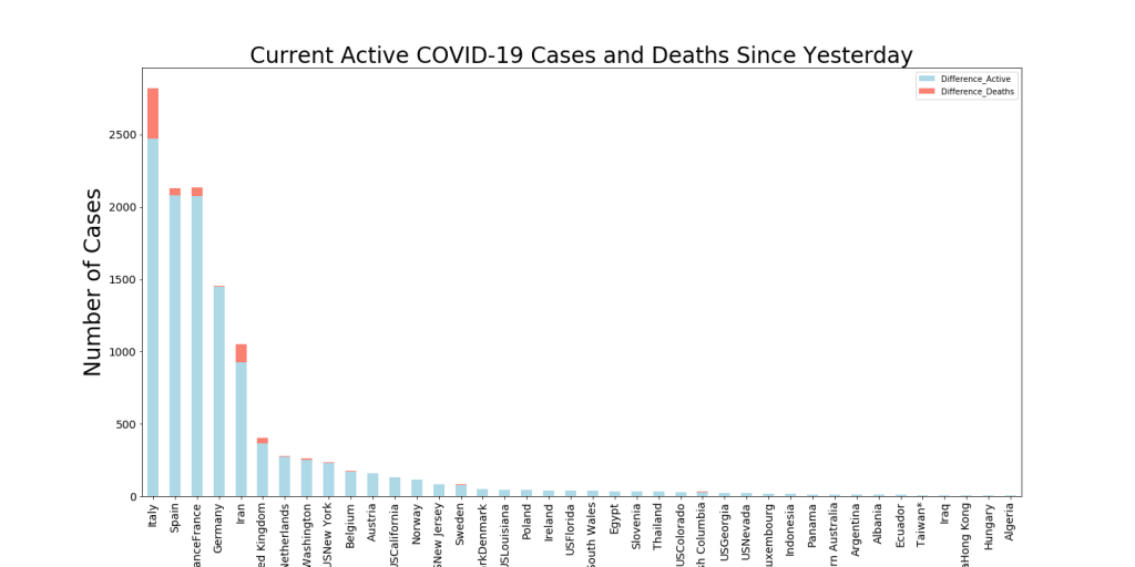
Most European countries are updating their data while we’re sleeping in Arizona. I have re-run analytics and added new ones. Things continue to get worse in Italy, Spain, and Iran. Total numbers of deaths in Italy will catch those in China today or tomorrow and Spain is catching up to Iran. Numbers of new active cases in New York state skyrocketed yesterday. New York and Washington were essentially tied yesterday. Perhaps this reflects that Washington is a week or two ahead of New York and maybe it’s new active cases are slowing down.
World Map showing the areas with the highest numbers of active COVID-19 cases along with the growth in active cases in the last 24 hrs.
US Map showing the areas with the highest numbers of active COVID-19 cases (color – Red is worst) along with the growth in active cases in the last 24 hrs (bubble diameter) .
Since my evenings are less occupied with 7th grade math and social studies homework, I have a bit of time to follow my curiosity about COVID-19 data and trends. I plan to update these daily to provide up-to-the-date visualizations. Here are my starting points… (data from Johns Hopkins Whiting School of Engineering — https://github.com/CSSEGISandData)
This chart shows a couple of interesting things… first, the current state of Active COVID-19 patients (color per the heat map to the right of the image) and second, the number of Active cases that have been declared in the last 24 hours. This gives an idea of both the velocity and the acceleration of the virus in these regions.
For instance, you can see Europe is overwhelmed by new cases (diameter of the bubbles) but Italy has many more Active cases in its medical pipeline than the other countries.
Here’s the daily trend map. Size of the bubbles reflects the New Active Cases in the last day and Color reflects the number of Active Cases
Below is the current change in Active Cases in the last 24 hours by State. Washington has had the most cases (they’re further along) but New York will probably pass them up tomorrow. New York has the greatest total number of Active cases of any state, with just under 1000.
Download a Table of the latest Totals of Active US Cases by State
The Rain predictor has continued working well through the monsoon season. Most predictions have been a couple of hours off, though. During the last week it has predicted four rain events correctly (including the start of our 2019 Monsoon season) and has missed one (see table below in red). The Green or Red labels align with the actual time it rained at the house.
Note this is rain at my house, not just rain in the Tucson area. So that makes it a bit more challenging. For instance, on 7/30, one could see heavy rain all around the Tucson area at the times the model predicted, but it didn’t rain at my house until about 3 hrs after the last predicted time.
Yesterday afternoon at around 4PM (at my house) our first monsoon rainstorm hit with a vengeance! Streets were flooded for a few hours and the temperatures dropped 40 degrees. My rain predictor (see below) predicted this storm 18 hours beforehand, but estimated a time about 2 hrs earlier. This means that the last two times the neural network has predicted rain at my house, it has been right.
See below for latest weekly chart and rain predictions.
Note the humidity spike on the right. Predicting Rain for Monday early AM and slight probabilities again throughout the day. This model predicts rain 12 hours in the future based on the previous 8 hours of data.
Noticed that my rain predictor popped up a strong prediction for about 18 hrs from now. Last time this happened (2 wks ago) it was about 2 hours off on the prediction. Here’s the week’s data plus the prediction chart.
See below for the weeks data and a more believable probability chart. Not sure what happened with yesterdays (It might still rain today as predicted, but I doubt it), but I’m working on it.