


Evaluation of Case Growth Over the Last Week
I notice a handful of interesting things in the data this week.
- University of Arizona cases APPEAR to have shot through the roof. Note that 85719 has most of the U of A population (see how big the zip code is?) and it appears to have a very large majority of the University-related COVID growth. The next highest zip codes in Pima County are residential zip codes from suburbs such as Oro Valley, Marana, and Green Valley and the growth percentage is based off of very small numbers of cases. These would all be very long commutes for an on-campus student. 85705 is the zip code just north of campus and it saw an 8% increase in cases, which is interesting, because I’m curious if U of A cases will start spreading to adjacent zip codes. But the 100 cases that make up this 8% growth is far smaller than the number we see in 85719 over the last week. Will continue watching this zip code to determine if the University outbreak is spreading. There’s a good chance this is just measuring COVID-positive students that are living off-campus in large complexes.
- The 85719 Case Growth captured by the state seems much too high based off of the number the University is releasing from their new dashboard. It’s not clear how numbers get from the University to the State, but I can’t see much consistency to date. More on this later in this post.
- I notice that Case Growth in Flagstaff (Northern Arizona University) has increased. The raw number is ~100 new cases, but this is based on a small number of cases to date. Last week we didn’t have many new cases from this zip code.
- I also notice that ASU’s main campus in Tempe doesn’t even factor in the top 20 any longer. I look at their numbers and see an increase of only about 20 cases. This combined with the official ASU reporting (here) makes very little sense. I’ll analyze this later in this post too.
- The 85709 zip code in the southwest corner of Phoenix continues to see large case growth. This zip code has seen a lot of cases and was frequently one of the hottest COVID spots during the June-August phase in the outbreak where case growth was the largest. Back then, there was evidence that the outbreak in this zip code was correlated with the similarly large outbreak in Sonora, Mexico, but this may not be the case now. It doesn’t seem obvious that this growth has any correlation with the university cases either. I can’t see case demographics by zip code, but I do know that the age demographic under age 44 accounted for 64% of the Case Growth in all of Maricopa County. Since 85709 has a median age of 28, there’s a good chance that over 64% of the new cases in this Zip code are under 44. I still feel that this is interesting and ought to be evaluated.
The Challenges of Understanding Case Growth Accurately
The confusing nature of the latest data from the state is something worthwhile to discuss because I’ve noted news outlets (tucson.com is terrible about this for instance) grabbing the latest U of A numbers, interviewing one U of A professor, and then writing a very scary but highly inaccurate article. It’s even worse now since the numbers are smaller and therefore plagued much more by statistical variation. So here are some thoughts about our current state of counting cases to help you understand what might be really happening.
- It is Difficult to Use Data that is Generated “by Accident” to Learn Big Things. In an application of data science within a field like epidemiology we often want to draw an inference from a selection of measured data that applies to a broad population. This is usually done by sampling a representative portion of the population to the overall population we want to understand. Just like conducting an election poll, this kind of representative sampling needs to be well-designed and well-measured. The collection of COVID-19 has come about “by accident” and thus has nothing in common with a well-architected election poll. This means we can truly extract very little inference about specific aspects of this outbreak from the data samples that come into the state DHS dataset. Due to the nature of collection of data in an emergency (without any pre-formed strategy, of course) we get what we get and if we’re lucky we can determine if any natural experiments can be uncovered in the data. Just keep this in mind and it will help. 🙂
- The University of Arizona Appears to be Relying too Much on an Inaccurate Form of Testing. The data sampling strategy at the U of A and apparently at the AZDHS has changed since school resumed on campus. U of A built their dashboard and this clarified some of their strategy but also revealed some real gaps. What does their strategy appear to be? Conduct low-cost Antigen tests that provide results in real time whenever there’s any evidence of a localized outbreak. This makes good sense based upon the apparent limitation of the Antigen tests (see point #x). Isolate the people with positive results and conduct more-accurate (but slowly scored) PCR tests on the symptomatic (or on football players with positive Antigen tests…). We know the numbers of Antigen tests vs. PCR tests (about 10 Antigen tests to every PCR test) and the numbers of tests conducted by Campus Health to those conducted elsewhere (10% of tests are being done at Campus Health). This seems to indicate that 10% of the U of A positive COVID cases have symptoms deemed worthy of a visit to the nurse. The upside is that this seems to be a pretty solid approach. The downside seems to be that the positive Antigen tests (about 1/2 of which are likely to be false positives) are getting inconsistently sucked into the AZ DHS case data. The reason I struggle with this is that the quality of the Antigen results is highly variable and likely to be wrong. This also drives more chicken little journalism. In my mind the only valuable positivity numbers are coming from the PCR tests being conducted at the health clinic. These will isolate the positive cases with symptoms (but will likely miss the much larger numbers of students that get COVID without symptoms). Unfortunately, the state seems to be recording all the positive numbers, including the many false positives.
- Yet Again, Arizona’s DHS Has Changed their Measurement Strategy in Mid-Stream. AZDHS has changed their collection strategy. My points above about these Antigen tests being less useful for serious data collection have kept results from these tests out of the AZDHS data up until this week. I noticed on their dashboard that they changed the name of a category from “PCR Tests” to “Diagnostic Tests”. This, combined with the large increase in tests at the same time makes it clear to me that they’re now equating PCR and Antigen testing and pulling in the Antigen test results from the U of A and elsewhere. My experience is that it is NEVER good to change your data collection strategy in mid-experiment. Now all the new test data is contaminated and will be statistically different than the first few months of data collection. What they should have done is added a third category of testing. Then they could report on PCR Tests (the gold standard), Antigen Tests (less accurate but valuable for speed), and Serology Tests (for antibodies). The willingness by AZDHS to change measurement strategies in the middle of a health care crisis continues to surprise me (no, this is not the first time).
- Arizona State’s COVID Stats are Not Very Transparent. ASU seems to not have a very solid collection strategy and their numbers make very little sense. Their numbers are surely not decreasing, but that’s what they seem to be advertising. They describe a decrease of around 120 cases in three days from their Tempe campus. This seems very strange considering that U of A is showing case growth at U of A of around 500 during that same time frame (this is both PCR and Antigen test numbers). Clearly the two Universities are not measuring the same way.
- The State DHS Numbers Don’t Seem Accurate for the Primary U of A zip code. The 85719 numbers from the AZDHS site showing growth of about 1400 cases in the last week seems out of line compared to the 890 cases (PCR+Antigen) the U of A reports. Only about 200 of those cases are based on PCR test results. This is further evidence that AZDHS has now started recording positive Antigen tests. This is another data measurement mistake. For the first X months of COVID all our results are based off PCR tests which have very few false positives. Now we’re adding a low-quality source of data to the high quality one and we can’t separate them. Most likely this number is erroneous and I suspect that the confusion in changing the method that the state records cases may be partially to be blame. I’d guess some accidental double counting is happening in this confusion.
- COVID Antigen Testing False Positives make the Test Less Meaningful: I’m disparaging Antigen tests a bit here. These tests have been used for years in other diseases to identify key proteins that will signify the presence of a viral infection. COVID-specific Antigen tests have been recently approved in emergency fashion by the FDA. In their interim guidance, the CDC says that Antigen tests have very low false positives, but the manufacturers indicate something different for their COVID Antigen tests. One of the main ones out there now is made by Abbot, who generally has some of the most accurate tests across the board. The Abbot press release from a month ago indicates a sensitivity of 97.1 and specificity (false positive rate) of 98.5. Assuming this is a reasonable representation of other Antigen tests that have been approved, it will more-than-likely result in 1/2 of the positive tests being false. Here’s how that works:
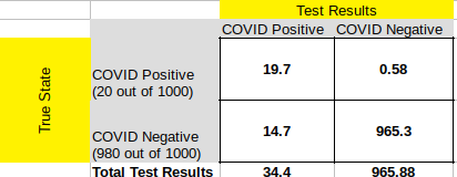
See the confusion matrix above for the case referenced. Right now 2% infection is a high estimate for just about any community we might sample (Arizona State is indicating that 0.4% of their student population is infected right now). If this number is truly lower, we see a case where nearly every positive result is false. If you take a moment to digest the diagram, you’ll note that the false negatives are very low (the upper right quadrant) where the false positives are about 1/2 of the total positives (lower left quadrant). This is why when a disease is rare (like COVID is — despite all the headlines) sensitivity is relatively meaningless while specificity is critical. The Abbot Antigen test’s specificity of 98.5 sounds great, but in a rare event, it really means that 1.5% of all the people who don’t have the disease (in our case 980 out of 1000) will show up as positive. When we only expect a small number of true positive results (in our case, 2% of 1000, or 20) then the false positives drown out the signal from the true positive. About 1/2 of the people who are told they have COVID in this example actually do not. Hopefully this helps make my case that the state should NOT be including Antigen test results with PCR test results (which since they use DNA/RNA testing to evaluate the presence of the virus have very close to 100% specificity).
Now if you target these Antigen tests in a more focused way, i.e., on a Sorority where you believe a population exists that has a much larger infection rate, then the test will be much more accurate at determining exactly who is infected. This is because there are less “well” people to inflate the false positive count. If the True positives are just twice the number of false positives, the test is now much more useful at evaluating who the sick people really are. BUT, if you deploy it broadly into your broader community the way the U of A is, with thousands of tests per day, the false positives will overwhelm the true positives.
I think the percentage of positive test is a completely worthless statistic. You don’t know anything about the folks being tested are they asymptomatic or have no symptoms? Also how many more folks either have had the virus and never been tested?
Yes, Tony, totally agree. I think they just needed to come up with a metric. The percent positive test measures two things… first, how many people are feeling sick or nervous and think they might have COVID and second, what percentage of those people actually do have COVID. Mildly interesting, but not useful. A better approach would be a randomized testing strategy across the whole population. I think the percent positive of that group would be well under 2%.